
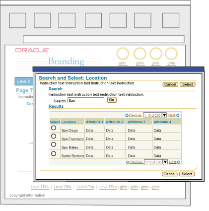
The Browser Look and Feel (BLAF) User Interface (UI) Guidelines support multiple types of business applications, where usage and users vary greatly. BLAF Application users have a wide range of skill levels and domain experience. They may use an application frequently (daily) or infrequently (once every 6 months to a year.) Regardless of these variances, they all are expected to have some level of exposure to the web, browsers, and use of computers.
Within the wide subtleties and variances of user types, across Oracle products there are 2 larger categories of users that emerge, a "self service" user and a "professional" or "power" user. A BLAF user who is considered a domain expert, and uses the application(s) daily to preform routine yet complex domain tasks is sometimes referred to as a "professional" or "power" user. On the other hand, there are other BLAF users that only make occasional use of an application, say once every 6 months to a year. They are expected to have little domain expertise. These users are sometimes referred to as "self service" users. Both user profiles, and a wide range of profiles in between are supported by BLAF.
This document outlines the high level differences between these BLAF user types and heuristics to use to design a BLAF application to accommodate their individual needs. Below summarizes the contents within this document:
Spec Version # - 3.1
Spec Contributors - Betsy Beier, Craig Louis, Ivy Leung
UI Models - all models
Example Products - all products
Related Guidelines - Introduction
to BLAF UI Guidelines, Introduction to
BLAF Page Templates, Introduction to Page Flows,
All BLAF Guidelines
Oracle produces 100's of different of applications that serve different domains such as Enterprise Resource Planning (ERP), Customer Relationship Management (CRM), Server Technologies, Tools applications, and Business Intelligence Applications. The user definitions for each domain and product within each domain can be varied, but as discussed above, the basic usage and user type falls within the 2 categories, Self Service Users and Professional Users. The table below lists examples of self service and professional users, the tasks they may perform and the application they use to perform the task.
Note: A professional user may also be a self service user. A professional user may performs some tasks infrequently and have little domain knowledge when using an application outside his/her professional realm. The table below illustrates this overlap. For example, a salesperson, who may use the professional Sales Online application daily to perform tasks, may also use a self service application to enroll in a class. Self service and professional applications can be used by the same person since they both follow the base elements and principles of BLAF and may have many overlaps.
| Self Service User | ||
| Role | Example Tasks | Application |
| Any Manager of Employees | Promote direct reports | HR Manage Employee Events |
| Set direct report compensation | HR Compensation | |
| View and create business intelligence reports | Business Intelligence Reports | |
| Any Employee | Update personal information, emergency contact information, benefits | HR Employee Information and Benefits |
| Look for a job | HR Recruitment | |
| Enroll in a class | iLearning | |
| View a business intelligence report | Business Intelligence Reports | |
| Fill out an expense report | Expenses | |
| Purchase some office supplies | Purchasing | |
| Professional User | ||
| Project Manager | Set up and manage an entire project lifecycle, manage a projects budget, etc | Projects |
| Resource Manager | Assign employees to jobs/tasks of a project | Projects |
| Human Resources Recruiter | Recruit new employees through requisitions | iRecruitment |
| Business Analyst | Perform complex data analysis. set up and run multiple reports | Business Intelligence Applications |
| System Administrator | Monitor systems and databases | Enterprise Manager (web version) |
| Marketing Campaign Manager | Set up and manage marketing campaigns and collateral | Marketing Online |
| Professional Buyer | Buy goods for mass distribution | Exchange/Purchasing |
| Salesperson | Manage leads, opportunities, customers. Create quotes. | Sales Online |
Self Service BLAF Users can be characterized with some of the following high level traits:
Since task frequency is low, a self service user may have little familiarity with the application layout and architecture. "Learnability" is not as high since each time they use the application, they may not remember the details from the last experience. To accommodate this user type, read below under Characteristics of a BLAF Self Service Application for details on design decisions that can be made within BLAF.
Professional BLAF Users can be characterized with some of the following high level traits:
Since task frequency is high, there is a greater chance that the user will become extremely familiar with an application's layout and architecture. This will increase the users productivity with the product. Also, with a high level of usage, there is a greater chance of using advanced features.
Pyramid of BLAF Guidelines - Self Service to Professional Usage Range
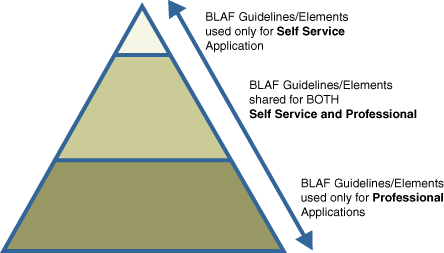
Many components, templates, and flows are shared for both user types. Some may be better tailored for self service users than professional users, and vice versa. Depending on the application, there may not always be an exact line between self service and professional. Some applications may have to balance between the two and use elements reserved for professional users in certain portions of the application where the flows are geared for these users, and more self service elements for other portions of the applications.
Many elements in BLAF are designed with BOTH USER TYPES in mind. The sections below outline many features of BLAF that are shared for both self service and professional users.
Basic BLAF Principles are true for both self service and professional applications:
Basic Page Flow Principles are true for both self service and professional applications:
Basic Page Template Principles are true for both self service and professional applications:
Examples
Image of BLAF Base Template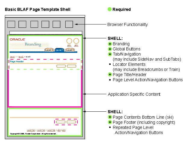
Related Guidelines
Introduction to BLAF Guidelines,
Introduction to Page Flows,
Introduction to Page Templates
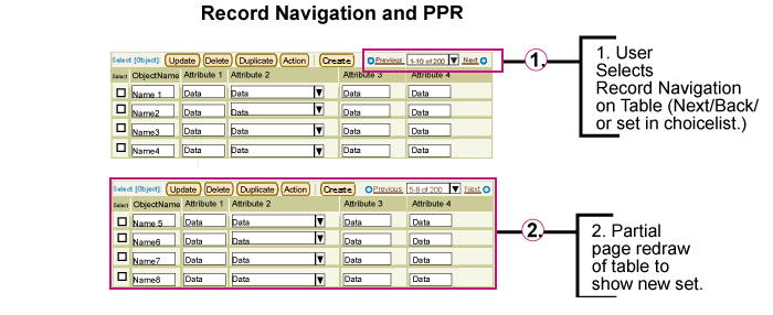
Performance gains are beneficial for both self service and professional users. Using Partial Page Rendering (PPR), Auto Rendering, and Auto Population regardless of application or user type will speed up production and prevent unnecessary errors, etc. There may be certain types of page layout that are more complex that use PPR. Those may be reserved for professional applications. Below outlines examples of PPR usage that are beneficial for both user types:
Examples
Example of PPR and Basic Hide/Show Component
Related Guidelines
Partial Page Rendering (PPR)
Table Guideline with PPR
Hide/Show Guideline with PPR
Locator Element: Record Navigation with PPR
SubHeader/SubSubHeader and Hide/Show with PPR
Tab: Side Navigation and Hide/Show with PPR
LOV with PPR
Content Layout and PPR
Validation on field exit should happen for specific fields that cause usability problems, and successive user errors. The validation, especially when associated with dependent fields, can greatly reduce chance of user error and increase performance and data accuracy when completing tasks. Examples of this type of intelligent validation are:
Example of Intelligent Validation with the LOV
Scenario


Related Guidelines
LOV (List of Values)Template Guideline: LOV Choice List
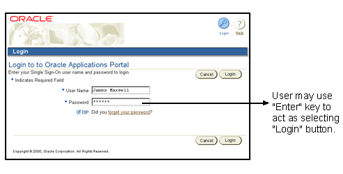
For both user types, values and/or content in widgets on pages should be defaulted to the most frequently used values. Defaulting values can greatly reduce user task completion time. Below are examples where default values should be used:
Examples of Intelligent Defaulting
Example of Defaulting Fields based on Country Selection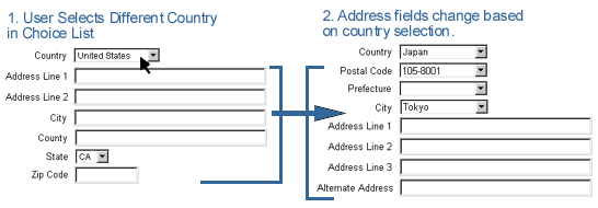
Related Guidelines
LOV (List of Values)Template Guideline: LOV Choice List
Standard Web Widgets
Keyboard Shortcuts
Staying within the confines and limitations of HTML, cross browser capabilities, and accessibility, there are still opportunities to have some level of statefulness within a UI. Both user types benefit from this type of behavior because the states can clearly indicate to users what choices are available while following a task flow. Below outlines usage of statefulness that should be used for both user types:
Examples of More Stateful Environment
Example of Portion of Page Being Redrawn Based On Choice List Change - Button Becomes Disabled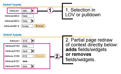
Related Guidelines
Action/Navigation Buttons
LOV
Content Layout Templates: Content Layout and PPR
Regardless of user type, auto calculation techniques can increase user production and prevent user errors, depending on the task at hand. For self service applications; calculations typically are simple column totaling, but occasionally there may be some slightly more complex calculations (i.e., calculate an employee's salary increase by percentage or by amount). For professional applications, the calculations may be quite complex and robust depending on domain. Either way, each user type benefits from some level of auto-calculation to speed up work and decrease errors.
Examples of Auto-Calculation
Example of Auto-Calculation with Total Column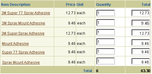
Related Guidelines
Table Footer Guideline: Refresh Action Area
The ability to have portions of content that need status refreshes updated in real time (push/pull) to ensure content is fresh.
Examples of Real-Time Updated Information
Example of Processing Template with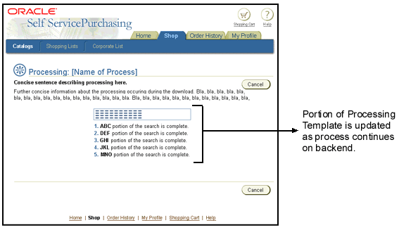
Related Guidelines
Processing Templates
Content Containers in Page
Like all page templates, but especially true for self service pages, templates should have clear information organization, and should keep information density light. Information overload in a self service environment may hinder rapid and correct user task completion. If a page becomes cluttered, or too much information needs to be present to fulfill the application requirements, consider using different techniques to break up content more appropriately on the page, or among pages. For instance, if a page becomes too long, consider using Quick Links at the top. If a page becomes too dense with updatable fields, consider using a different method for the task flow, such as breaking the pages into 2 steps and/or 3+ steps.
Examples of Lighter Density Screens
Example of Low Density Screen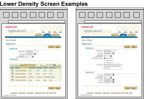
Related Guidelines
Introduction to Page Templates
Quick Links
Object Templates
Step by Step (3[+] Steps) Page Template (Wizard)
2 Step Templates
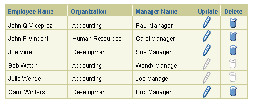
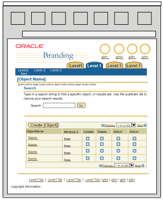
For a self service user, it may be more appropriate to use less complex widgets or standard widgets that can be found in web sites across the Internet. For instance, a table of data is common on many web sites and web applications, but a hierarchical table (or HGrid) is not common. Although BLAF components have been well tested in usability, simpler elements are still recommended for self service applications. Below lists examples of BLAF components and/or templates that are recommended and not recommended for use:
| Recommended Components/Templates | Not Recommended Components/Templates |
| Standard web widgets such as: field, choice list, radio group, check box, text area | Less standard web widgets such as: list box (use radio group instead) |
| BLAF table with minimal functionality (i.e., action icons in column, potentially control bar) | BLAF tables with overloaded functionality or too many table options exposed (i.e., do not have an updatable table including icons, control bar, totaling, record navigation, add a row, hide/show, etc.) |
| Label/Data Layout: Use single column layouts as default | Label/Data Layout: only use double column layouts if necessary. |
| Search: Keep to simple search or search with a few key attributes to minimize user from not finding data or too complex advanced search. | Search: Avoid overly complex advanced searching. |
| Other: Shuttle use only when necessary, basic hide/show. | Other: Avoid complex shuttle usage, too much usage of hide/show feature, multiple navigation methods (such as switchers). |
Examples of Less Complex Widgets
Example of Basic Standard Web Widgets in Single Column Layout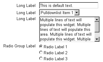
Related Guidelines
Standard Web Widgets
Tables
Content Layout
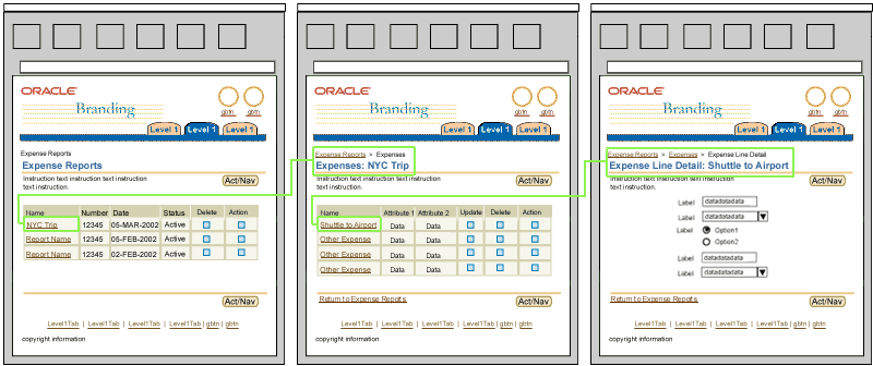
For self service users, task flows should be clear and concise. They should not be overly complicated, with multiple branches, extensive functional possibilities, complex flow drilldown and/or nesting, etc. Traditional self service applications make heavy use of BLAF Step by Step flows to guide the user through a process. Another guide for designing a self service application is to follow the "80% rule". Do not try to design the self service application to try to accommodate every possible task scenarios, situation, or far reaching, outlying case. Design for the main audience. Below are more heuristics to follow to keep clear and simplified task flows for the self service application:
Examples of Simplified Task Flow
Example of Step by Step Flow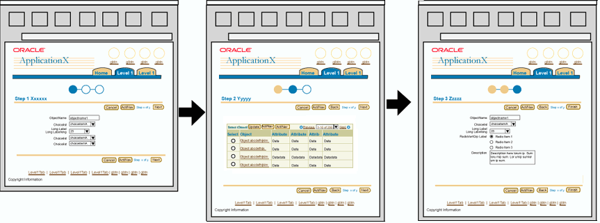
Related Guidelines
Introduction to BLAF Page Flows
Step by Step (3[+] Steps) Page Template (Wizard)
Step by Step Page Flows
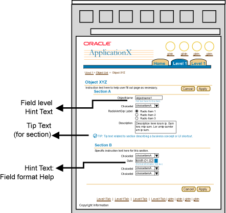
For self service applications it may be necessary to show an increased amounts of help information in the pages (i.e., instruction text, hints, tips, content container help) to guide the user through the application tasks and flows. Below are summaries of varied types of help methods that can be used. See the Help Methods guideline and the individual guidelines for complete usage and details.
Examples of More Page Level Help
Example of Varied Help Methods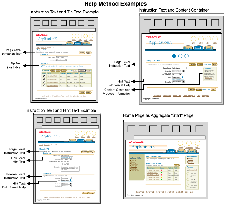
Related Guidelines
Help Methods
Instruction Text
Inline Messaging, Tips, Hints, and Bubble Text
Content Containers in Page
Home Page Template
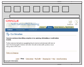
Messaging is important for both self service applications and professional applications. For a self service user, though, messaging may be increased to ensure that the user is following the flow and/or understanding what is transpiring regarding his/her work. Examples of messaging that may be shown more often in a self service environment include inline messaging (particularly information messaging and confirmation messaging), hints and tips.
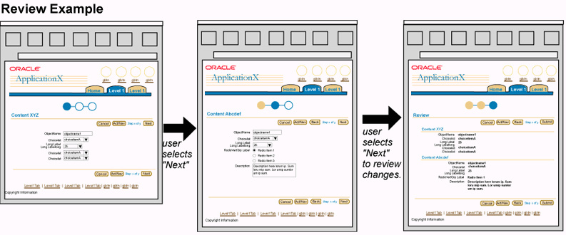
Reviewing work before it is committed to the database, or submitted to a workflow process may also be used in both application types, but it is more commonly used in self service environment. A user may only perform a task once every 6 months to a year. Providing review information before the data is committed provides the user with a sense of security that the changes they made are being saved, as well as provides an opportunity for the changes to be looked over to make sure they are correct. Reviewing may be after a one step flow (if page is complex [not common task/procedure] and/or extremely sensitive data is being altered), but is more often used after a multi-step process where changes are made across many pages, like a step by step process. The review step is the last step in the process. Confirmation that the process is complete is after the step by step process.
Examples of Reviewing and Increased Messaging
Example of Inline Information Messaging

Related Guidelines
Step by Step (3[+] Steps) Page Template (Wizard)
Step by Step Page Flows
Inline Messaging, Tips, Hints, and Bubble Text
Messaging Templates
Messaging Flows
Professional users may be able to handle a higher density screen since the frequency of use of the application is high, and the location of the information on the screen will be remembered. Basic design principles, though, should not be ignored, even for professional users and professional applications. Enough white space, content grouping, and spacing is necessary and essential for any user type. These design principles are core to readability, and ease of use. The visual queues are essential in aiding the user to remember the screen layout and content location.
Key pages in a professional application may be denser than others. For instance, aggregate content pages such as portal and application home page may have more content, since the content displayed is not intended to show all the minute details, but be higher level aggregate views of contents, status, and actions. These aggregate pages tend to show a variety of amount information, some information may not necessarily have direct correlation with another section of information. Again, to ensure ease of use, and learnability, it is important to follow the proper layout and structure for these templates such that content is consistently shown in similar locations.
Other types of dense pages may be Object Lists, Object Templates, Master/Detail Templates, Compare Templates. As the user successively drills down to more detailed information, typically there may be more content, but the content tends to be less varied, and more homogeneous based on the context selected.
Below outlines BLAF principles that can be applied to increase screen density for professional applications:
Examples of Higher Density Screens
Example of Higher Density Object Templates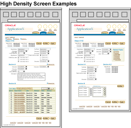
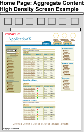
Related Guidelines
Content Layout Templates
Home Page Template to be updated
w/high density exs...
Master/Detail Templates
Object Templates doc to
be updated w/high density exs...
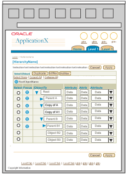
Typically, professional applications contain robust functionality and complex or large amounts of information. Given the professional user profile, and to accommodate these requirements, it may be necessary to use some of the more "complex" components or widgets available in BLAF to display the application data or functionality. For instance, hierarchical display of tabular information is a common need in professional applications. One could take the approach of drilling down through successive tables to see children information, but this method has the drawback of not retaining full context of the hierarchy as children are seen. The HGrid component is a good solution that can be used in this scenario.
Below is a list of more "complex" components or configuration of components that may be appropriate to use in professional applications:
Examples of More Complex Components/Widgets or Configurations
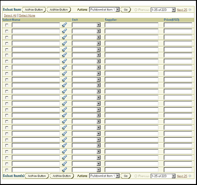
Example of Master Detail (Table/Table)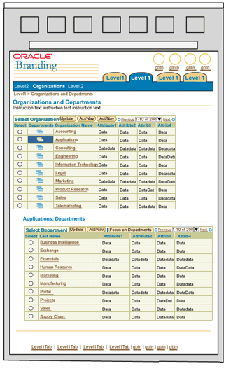
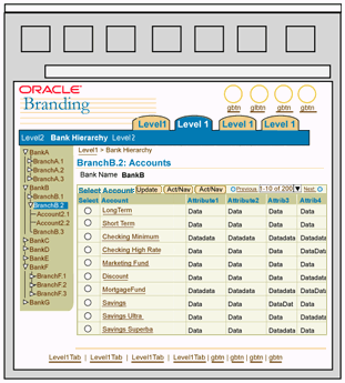
Related Guidelines
HGrid Flows
HGrid (Hierarchy Grid or Tree Table)
Master/Detail Templates
Tables
Table Flows
Shuttle and Reorder
Standard Web Widgets
As the complexity of the application increases, it may be more likely that increased data dependencies exist. For example, when an item in a choice list is selected, a portion of the page redraws with dependent information. This may be common for both self service and professional applications, but in a professional application environment, there may be successive levels, or multiple dependencies per page. These dependencies, and/or dynamic redrawing of sections based on selected contexts is supported in BLAF by using PPR technologies.
Examples of Increased Data Dependencies
Example of Dependent LOV's Choice List and Field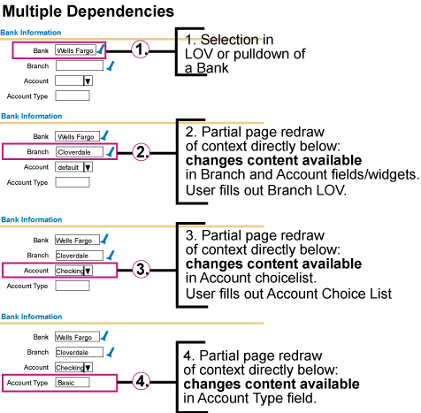
Related Guidelines
Content Layout Templates: Content Layout and PPR
LOV (List of Values) Template: Dependent Fields and LOVs
Content Layout Templates :Content Layout and PPR
As mentioned above, in a professional application environment, it is common that a user performs a specific task or specific tasks often, in many cases several times a day. Likewise, a professional user may need to refer to specific content in an application frequently. To ensure the user can access this content and these tasks easily, a professional application's information architecture should be structured accordingly as well as make use of several specific elements in BLAF that provide quick shortcuts. Below outlines examples heuristics, components and techniques that can be used to facilitate fewer clicks to tasks and information.
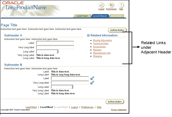
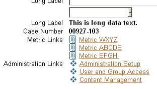
Examples of Fewer Clicks to Information/Tasks
Example of Related Links on Home Page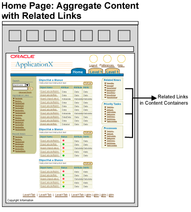

Related Guidelines
Related Links/Shortcuts
Content Containers in Page
Intra-Application Navigation
Home Page Template
Object/Item List Templates
Object Templates
Master/Detail Templates
Switchers: Application and Context Switchers
Keyboard Shortcut features include many of the features discussed above under Intelligent Defaulting (i.e., "Enter" key behavior, etc.) but for professional applications it also useful to take advantage keyboard shortcuts, or access keys (mnemonics). Access keys can be a learnable feature that can greatly increase speed for common tasks or common actions that need to be performed. The BLAF Keyboard Shortcuts guideline outlines standard the English mnemonics, and recommends approaches for internationalization.
Note: It's important to follow the Keyboard Shortcut Guideline since some shortcuts are reserved by the browser. Overriding these shortcuts prohibits the use of the browser functionality and can be extremely problematic for savvy users.
Examples of Increased Keyboard Shortcut Usage
Example of Mnemonics Placed on 2 Standard BLAF Action/Navigation Buttons
Related Guidelines
Keyboard Shortcuts
Batch Detail Mode provides the user with the ability to "page" through object details without having to return to the object list page. The object details in Batch Detail Mode may be updatable. Batch processing allows the user to perform an action on multiple objects at once. Both these modes decreases the number of clicks a user may have to perform, as well as increases speed in completing routine tasks. Below outlines suggestions for usage of these flows in professional applications:
Examples of Batch Detail/Batch Processing
Example of Batch Detail and Batch Processing Flow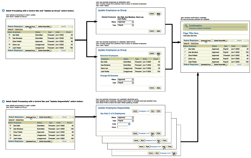
Related Guidelines
Batch Detail Mode and Batch Processing Templates
Processing Templates
Professional applications can be quite complex containing much functionality and content. It may be appropriate (depending on the architecture of the application) to allow for deep hierarchical navigation. Basic principles in the concept of progressive disclosure should be applied. As the user drills down deeper in the application more content and details are exposed.
There are many techniques to use to help prevent an application from having too deep of a hierarchy. For instance, using as master/detail template allows 2 levels of information to be displayed on one page. Exploring many of the techniques outlined in this guideline can help with a deep application.
Some companion UI architectures are being used to also help the user quickly navigate to information without necessarily having to navigate deep within an application structure. This model is good when content may be needed to be viewed in context of a master object, but also may relate to other master objects. For instance, in Oracle Projects, there are many details associated with a single project. The individual project and all the associated functionality and information is shown in a typical tabbed environment. Some information pertaining to a project may also be used in other projects. For instance, a resource may work on 2 projects. Thus, it may be important to not view this resource in the context of one project, but instead in no context or just by itself. This is typically a no-tabs environment.
Examples of Deep Navigation
Example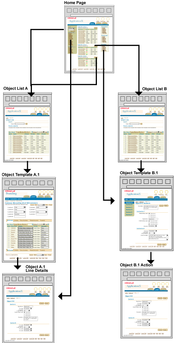
Related Guidelines
Batch Detail Mode and Batch Processing Templates
Master/Detail Templates
Switchers: Application and Context Switchers
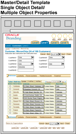
Master/Detail templates can provide a high density UI with access to an object and object details or many objects and their respective details. This template is ideal for professional applications where the ability to update many objects and detail information is necessary. Below provides a high level outline of the master/detail template options. For full details, see Master/Detail Templates guideline.
Examples of Master/Detail Template
Example of Master as Object with Multiple Details/Properties
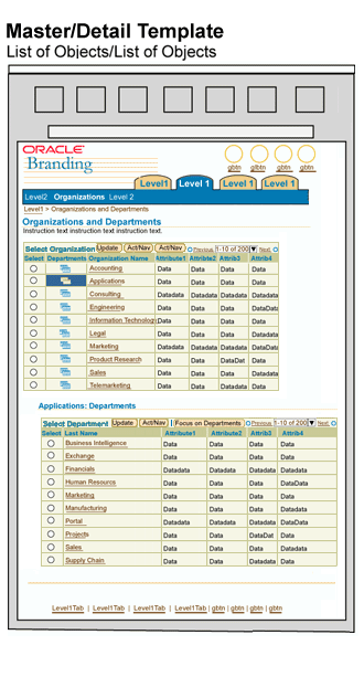
Related Guidelines
Master/Detail Templates
Partial Page Rendering (PPR)
Tables
HGrid (Hierarchy Grid or Tree Table)
Content Layout Templates
Tree
Comparing is a common task seen in many professional applications. A user may need to make many different type of comparisons to know how to proceed with a task. For instance, a professional buyer may need to compare many objects (object attributes) for buying decisions, an executive may need the ability to compare budgets and forecasts easily, a system administrator may need to compare metrics of a target to make administrative decisions. BLAF provides methods for allowing users to compare these objects, items or graphs. See below for examples and related guidelines.
Examples of Comparison
Example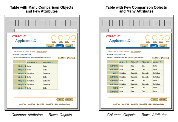
Related Guidelines
Compare Page Templates
HGrid Flows: Compare Hierarchies and Branches
Even in a professional application, Help Methods (hints, tips, instructions, etc.) should not be ignored. There may be many situations where regardless of user type and level of sophistication, these methods are valuable in helping the user prevent errors and or speed up task completion. That being said, in a professional application, it is important to evaluate where Help methods are needed, and only use when necessary. For instance, within the application it may be more appropriate to display the necessary help methods on less frequently used functions, but display less on tasks with high frequency usage.
Another method to use to provide help to the user in a professional application without adding to much information inline is to use more contextual help links. These links are exposed in content where necessary, and point the user to the Help system if detailed information is necessary.
Note: Error, Warning and Confirmation messaging does not fall under the above Help Methods category. Professional applications must follow all standard BLAF messaging templates and flows for errors, warning, processing, and confirmation messages.
Examples of Fewer Help Methods
Example Contextual Help Links
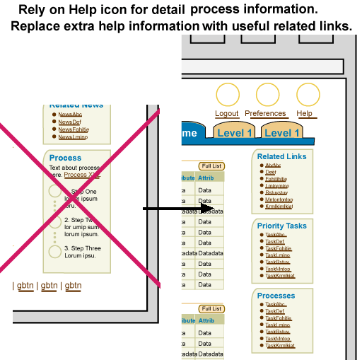
Related Guidelines
Help Methods
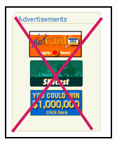
Less ancillary information and non-task critical information should be displayed in professional applications as applicable per application and task. Consider omitting non-essential news articles, ancillary "did you know" type information unless this is extremely useful given the task at hand. It is not recommended to expose advertising features in a professional application.
Examples of Less Ancillary Information
Recommended Not to Use Advertising in Page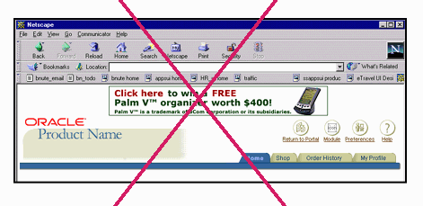
Related Guidelines
Advertising Usage
Content Containers in Page
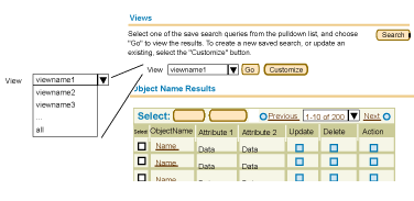
Personalization provides the end-user with the capabilities of customizing data, information display and/or layout to accommodate his/her individual needs. This feature can become increasingly useful in a professional application when a user is exposed to an interface every day. Below outlines examples of personalization that are available in BLAF:
Note: Intelligent Defaulting should be used regardless of whether or not personalization capabilities are exposed.
Examples of Personalization
Example of Views that Can Be Personalized
Related Guidelines
Personalization and Set Up Functions in BLAF: Overview
doc in development...
Personalization of Views (Tables and HGrids)
Personalization (Display and Data) of Tables Flow
LOV (List of Values) Template: LOV Choice List
Implementations under development
All BLAF applications should provide a seamless and integrated experience when using the full product line. It is obviously not possible to put all the functionality across all the application domains into one giant application, but there does need to be tight product integration when domains and/or tasks are highly related or are performed frequently together as part of the user task flow. For instance, Notifications is an integral part of all applications. A user should not need to navigate in and out of an application to find related notifications to the tasks at hand. This functionality should be tightly integrated within each application such that from a user perspective it is a seamless environment.
A professional application may also have an increased amount of integration with different applications such that tasks and functions are available. Below outlines some common types of integration between different types of applications and application environments in BLAF:
Examples of Increased Integration
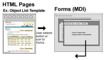
Example Integration of Other Application Functionality within A Single Application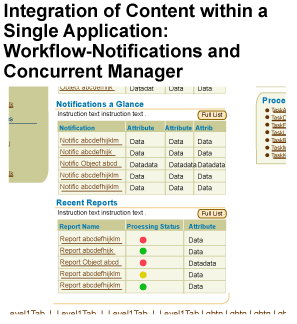
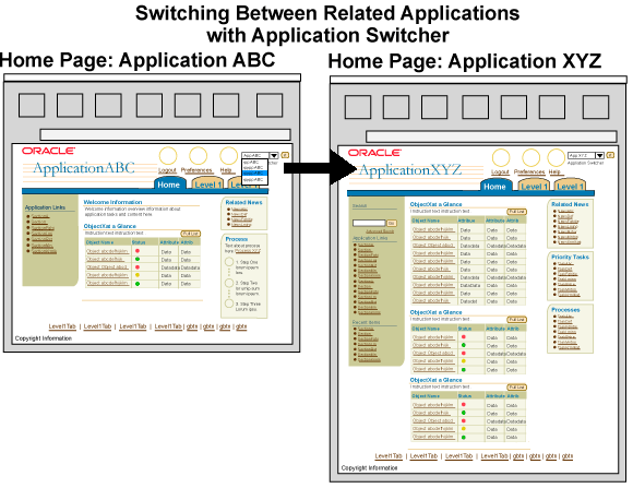
Related Guidelines
Related Links/Shortcuts
Interapplication Navigation
Switchers: Application and Context Switchers
More details regarding auto-calculation and complex calculations in professional applications to come.
Related Guidelines
Table Footer Guideline: Refresh Action Area
GUI vs. Web-based Application
High Level Differences and Similarities Between Forms and BLAF
The high level architecture of both forms and BLAF applications are similar. They both follow an object centric model. Objects and/or large grouping of objects (functions) translate to the tab/navigation structure in BLAF. Pages are typically lists of objects or objects themselves. Actions that can be performed per object are within the page for BLAF, not navigation structure or menu items. To begin to map a Forms application to BLAF, it's important to understand not only the high level concepts listed above, but also understand the structure of BLAF guidelines and BLAF applications. For the complete overview of BLAF, see Introduction to BLAF UI Guidelines.
BLAF Bull's Eye - Flows, Templates and Components
The BLAF Bull's Eye is a metaphor to think about how each level of guideline relates to your application. The entire bull's eye is a holistic look at the application. Your application requirements should be thought of from the outside of the Bulls eye, to the middle.UI Architecture of Application is a combination of Flows:
Specific Form Flow Elements Mapping to BLAF Flow
Mapping Form Templates to BLAF Templates
A Template is equal to a Forms Window or a BLAF Web page.
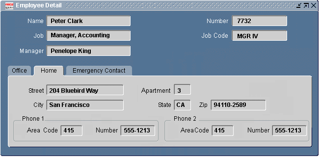
Common Template Mapping (Forms to BLAF):


Mapping Form Components to BLAF Components
Specific Component Mapping (Forms to BLAF)