Last Updated 02-Feb-2004
The LOV (List of Values) template allows users to select from a large list of values to help populate a field on a page or field in a table. The contents of this guideline are as follows:
Portions of this guideline are not yet implemented by UIX technology stack (LOV as choice list). The OA framework has implemented the LOV choice list, but not with personalization capabilities yet.
Spec Version # - 3.1
Spec Contributors - Betsy Beier, Mervyn Dennehy, Craig Louis, Lisa Serface, Ivy Leung
UI Models - all models
Example Products - all products
Related Guidelines -
Search Templates,
Introduction to BLAF Page Templates,
Locator Element: Next/Back,
Tables
- The LOV template is used in place of a standard Choice List when the list to choose from is too large.
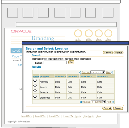
- The LOV template is a sub-task within a process or subprocess, and is displayed in a secondary, modal browser window. The LOV template is ONE OF THE ONLY SECONDARY WINDOW EXCEPTIONS in BLAF.
- The secondary window is displayed in kiosk mode, and does not have any of the browser controls available. It is a modal window -- if the user selects a region outside of the window, the system will beep. The modality will prevent the secondary window from being hidden behind the primary window.
- The secondary modal window is sized slightly smaller than the primary window default size. The secondary window should be sized at 750 x 550 pixels, yet allowed to be resized.
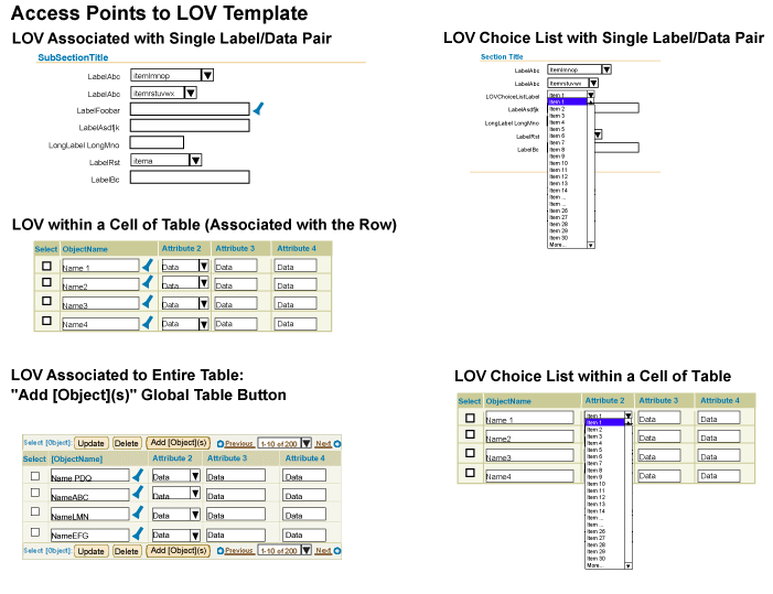
- The LOV page can be accessed in three ways:
- A text field with an active LOV/search icon in a form or table cell, where:
- The text field accepts exact or partial values to be validated on exit of field. See LOV Text Field Population Methods and Field Level Validation below for details.
- The LOV/search icon always opens the LOV in a secondary window which supports pre-searching based on full or partial values. (Selecting (clicking) the icon ALWAYS opens the LOV template window, even if the user enters an exact match LOV value in the text box and then selects the icon.)
- A choice list in a form or table cell that includes the entry "More...", where selection of "More..." opens the LOV secondary window.
- A global table button, "Add [Object](s)" can also be used with a table on the primary page to access the LOV. When selected, the user can choose one or many objects to populate as new rows of the table on the primary page. See Multiple Select LOVs below for details.
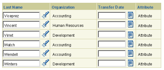
- The LOV/Search icon is associated with a label/field or label/text area combination, and/or associated with a field or text area in a table cell. (In the case of the table, the column name is the equivalent to a label name.)
- The LOV Template in a secondary window does not follow the standard BLAF page template. It does not include: branding, global buttons, tab/navigation, and footer.
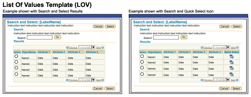
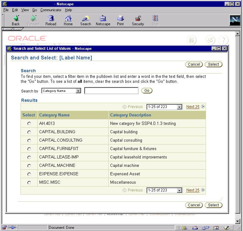
- The LOV template must have instruction text to help the user fill out the page. See the pictures below for exact wording.
- In the LOV template, the table containing the result list of values may also include a "Quick Select" functional icon column. This alternate method of selection is recommended in situations where users need to access single-select LOVs frequently.
- The single "Select" column with the "Cancel" and "Select" page level buttons are retained on the LOV page.
- The "Quick Select" column should be located as the far right column of the table.
- When the "Quick Select" icon
 is selected, it will behave the same as if the user chose one row and the "Select" page level button.
- The LOV field follows the same search principles as listed in the Search Templates guideline. For instance, the LOV field is not case sensitive.
- The tables (on the LOV window, and/or the instantiating page) shown in this document follow the basic Table Guideline principles.
- If the user clicks the page level "Select" button in the LOV window without making a selection in the object list, an Error Message Box should be displayed in the LOV window. The message follows the Tables guideline in this regard. (See User Non-Selection Errors in the Tables guideline for details)
- If the user clicks Cancel in the LOV window, the window is dismissed, and the LOV input field on the instantiating page is cleared.
Schematics of Access Points to the LOV Template

Schematics of the LOV Template

- A usability study was conducted in the Summer of 2001 to validate LOV flows and behaviors.
- An overwhelming number of users throughout multiple tasks (83%) took advantage of the LOVs pre-search capabilities and typed full strings or partial strings into the LOV field. Users only selected the LOV icon directly (without entering text in the field first) 17% of the time during the LOV tasks.
- These statistics support the pre-search methods and field-level validation: In over half the tasks, users did not open the LOV window because they entered the exact string in the field on the primary page.
- Validation occurs on exit of the text field (on the primary page), and any subsequent action is ignored until the validation is finished. Users may exit the field by:
- Tabbing out of the field (to the LOV/Search icon).
- Using the mouse to click another UI element in the page.
- Using the mouse to click "dead space" or "white space" in the UI.
- Validation on field exit allows robust pre-search capabilities. The value is checked against the database list of values, and based on the findings, the appropriate functions occur. For example, if there is an exact match, dependent fields may also be populated; or on field exit with a partial string the Search page may appear, allowing the user to select one of the partial string matches.
The following sections show example scenarios and flows for Populating the LOV Field. In each of these scenarios, the user is looking for "San Francisco"
(Or Partial String with One Match)
- The user enters "San Francisco" and exits the field:

- Validation occurs (the wait cursor is shown to the user.)
- Validation concurs this is an exact match.
Reformatting may occur if necessary or possible given context.
- Focus moves to Search icon. User continues to next element on page.
- The user enters "San Fran" and exits the field:

- Validation occurs (the wait cursor is shown to the user.)
There are no other elements in the database that contain all these letters except for "San Francisco."
- One match is found; the field is automatically filled.

- Focus moves to Search icon. User continues to next element on page.
- The user enters "San" and exits the field:

- Validation occurs (the wait cursor is shown to the user.)
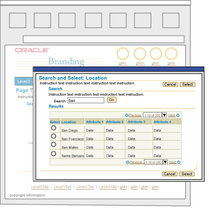
- Multiple matches are found; the LOV window appears with multiple matches to select from, according to the partial string "San".

Note: Search field on LOV window is pre-populated with criteria entered from the primary page (i.e., "San").
- User selects the radio button for the "San Francisco" row, and then the "Select" button. The LOV window is dismissed and the full string is returned to primary window.

- Note: If the user clicks Cancel in the LOV window, the window is dismissed, and the user-entered text in the initiating page LOV field is selected. If user attempts to exit the field, leaving the partial string, LOV window again appears.
- Cursor is set in the LOV text field. User exits the field.
- Focus moves to the Search icon. User continues to next element on page.
- The user enters "San Forsico" and exits the field:

- Validation occurs (the wait cursor is shown to the user.)
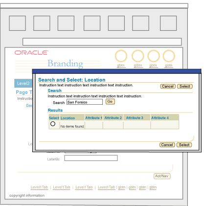
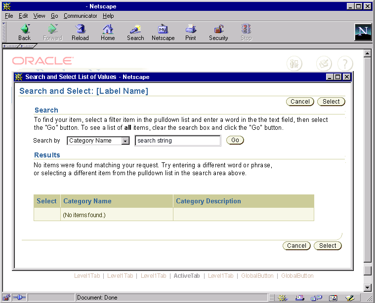
- No matches are found; the LOV window pops up with no matches found.

Note: Search field on LOV window is prepopulated with criteria entered from primary page (i.e., "San Forsico").
- User may either search in LOV window (or dismiss and search from primary page) to find item (see above flows for possible options.)
- When the user finds the item, they select the radio button for the "San Francisco" row, and then the "Select" button. The LOV window is dismissed and the full string is returned to primary window.

- Cursor is set in the LOV text field. User exits the field.
- Focus moves to the Search icon. User continues to next element on page.
- The user does not enter anything in field on primary page, but just selects the LOV Search icon:

- NO Validation occurs (nothing is entered in field.). Client side script on the LOV icon should check whether the field is blank before validation on server occurs.
- LOV window opens with 1st record set of all values retrieved. (This is the recommended behavior. Due to performance issues, this may not always be possible.)
Note: Since blind query is not supported in OA 11.5.10, the LOV window will display an empty table with the message "No Search Conducted" instead. User must enter a value in the search field of the LOV window or in the LOV text field on the originating page in order to display any results in the LOV window.

Note: Search field on LOV window is prepopulated with criteria entered from primary page (i.e., blank field).
- User may either search in LOV window (or dismiss and search from primary page) to find item; find item in displayed set; or use table record set navigation to find the item.
- When the user finds the item, they select the radio button for the "San Francisco" row, and then the "Select" button. The LOV window is dismissed and the full string is returned to primary window.

- Cursor is set in the LOV text. User exits the field.
- Focus moves to the Search icon. User continues to next element on page.
Note: If a user tabs into an LOV field, does not enter any information, then tabs out, client-side validation should occur on the field to see if it is blank. If blank, server-side validation should not occur. The field should be ignored.
The LOV Choice List is an alternative to an LOV Text Field.
General usage guidelines are as follows:
- LOV choice lists should be used when there is a high likelihood that users will choose among only a small set of values to fill out the page. There may be many values available within the LOV template, but most often users will only choose a small number of them.
- All LOV Template options and subsequent flow behaviors remain the same whether or not the LOV on the primary page is a field or a choice list.
- The only visible difference between an opened LOV choice list and a standard choice list is the entry "More..." to access the LOV window. The LOV choice list does not have an associated LOV/Search icon.
- An LOV Choice List may be personalizable, in which case it has an associated "Personalize" button. This option should only be provided in applications where users frequently work in the application, and have a high degree of familiarity with the data, thus needing the option of personalizing the list to fit their needs.
- Both the personalized or non-personalized LOV choice list should contain seeded values. These values should be based on several heuristics:
- Most commonly selected values given the context/task at hand.
- If personalization is exposed to the end user, seeded values may be set up so that they cannot be removed.
- If it is not possible to seed values, assess whether the LOV choice list or the basic LOV Field is more appropriate. The LOV Field will provide the user with quick pre-search capabilities that a non-seeded choicelist (choice list with a blank item and "More...") does not provide. If the LOV choice list is not seeded, it may be more cumbersome for the user to have to select the "More..." value to open the LOV window to add to the choice list, than to just use the LOV Field. Assess the frequency of usage of the LOV item and the task in general to ensure the right widget is chosen (LOV Choice List or LOV Text Field).
- LOV choice lists may contain a maximum of 31 values (including "More...")
- Application development teams and UI designers should determine the appropriate number of seeded values based on the task/context at hand.
- Less than 30 values may be in the choice list as a default.
- Behavior of the Items within the Choice List:
- If Choice List contains < 30 values:
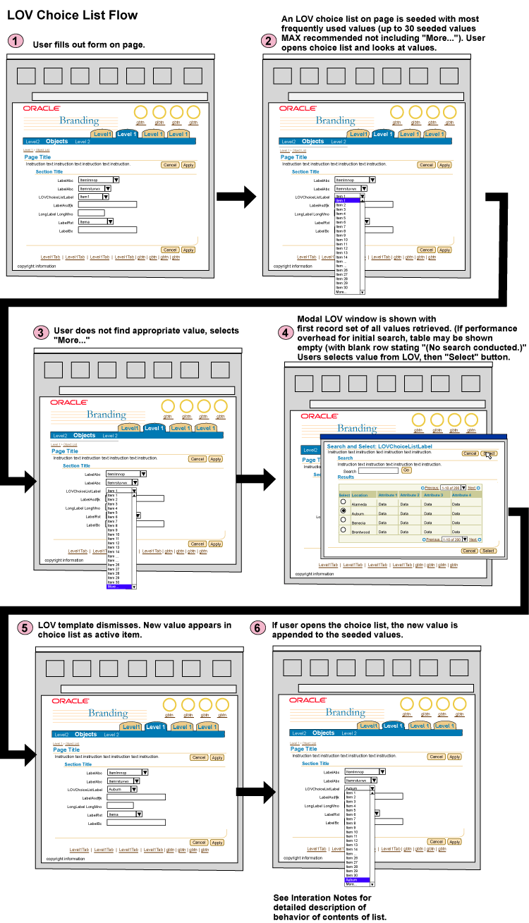
- If users do not find the value in the choice list, they select the "More..." item to access the LOV. When the value is selected in the LOV template, and the users return to the primary page, the newly selected value is shown as selected and appended to the bottom of the list.
- Users can continue to add values (as needed) until 30 maximum.
- The order of the values in the list should show the seeded values first (typically in alphabetical order), then the user-chosen values in order as selected from the LOV (most recent appears last on the choice list.)
- If the Choice List contains =< 30 values:
- Once the number of items in the choice list have reached the maximum (31 including "More..."), if the user selects another value from the LOV, the item replaces the oldest value selected by the user (the value that the user first added to the LOV). Seeded values do not get replaced.
- It is recommended not to seed a non-personalizable LOV choice list with the maximum number of items (30 excluding "More..."). If fewer values are in the choice list as a default, the user has more flexibility to add more of their own selected values to the choice list, without having to expose Personalization, which may be cumbersome in some applications.
LOV Choice List Flow

- As a default, the LOV Choice List should not contain more than 31 values, including "More...", but the choice list may be customizable, and users can add an unlimited number of values as they see fit.
- Application development teams and UI designers should determine the appropriate number of seeded values based on the task/context at hand.
- Less than 30 values may be in the choice list as a default.
- Behavior of the Items within the Choice List:
- If users do not find the value in the choice list, they select the "More..." item to access the LOV. When the value is selected in the LOV template, and the user returns to the primary page, the newly selected value is shown as selected and appended to the bottom of the list.
- The user can continue to add values with no limit or maximum.
- As a default, the order of the values in the list should show the seeded values first (typically in alphabetical order), then the user-chosen values in order as selected from the LOV (most recent appears last on the choice list.)
- The user has the ability to reorder the list in personalization.
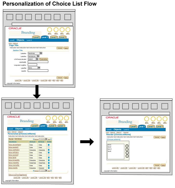
- To personalize the list, the user selects the "Personalize" button next to the LOV Choice List. The "Personalize [ChoiceListName]" page appears.
- Personalize [ChoiceListName] Page:
- The page displays a table of all the values in the list. There should also be some attributes associated with each value to help the user identify the item.
- Users can add new values to this page by selecting a global table "Add {ValueObjectTypeName}" button. Follow the Multi-Select (and/or Single Select) LOV Populating a Table flow later in this guideline.
- Users can delete values. The table features a Delete column with Delete functional icons in each row. For seeded values which have been deletion-restricted by an administrator, the delete icon should be disabled.
- Users may reorder values as needed. "Reorder" is a global table button. When selected users are taken to another page that includes the Reorder component. When the users are finished, they select "Apply" and return to the Personalize [ChoiceListName] page.
LOV Choice List with Personalization Flow

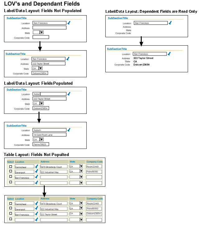
An LOV field may have associated dependent fields (or widgets). For instance, a user may select a bank branch location from an LOV field, then the associated address information may be automatically populated based on the selected branch.
- An LOV field with associated dependent fields may be in a label/data layout or in a table. There may only be just one dependent field, or there may be several. (Dependent widgets may be any standard web widget, a field, pulldown list, text area, etc.)
- If an LOV field has associated dependent fields/widgets, and users do not have the security privileges to change or input new dependent values, the dependent fields/widgets should be set as uneditable. The native behavior of an uneditable field/widget allows users to highlight the widget, but they cannot change or input any values in the widget. Forcing this field to be uneditable will prevent users from performing any unnecessary changes.
Note: If partial page rendering is enabled, dependent information should be redrawn as view-only values, with no surrounding web widget.
- In usability studies, it was found that users liked the feature of dependent fields being filled out automatically based on their LOV selection. When the LOV fields were autopopulated, no users attempted to change the dependent values.
- When LOV values and dependent field values were prepopulated, and the users were asked to change the value, some users did not realize that the dependent values changed after they selected the LOV value. In some cases, the users attempted to change the dependent values, but since the dependent value fields/widgets were uneditable, they were not able to change the value and thus avoided unnecessary errors. Users did pick up on this behavior during the study, and realized that the uneditable field was an auto-populated dependency of the LOV field.
- Note: When PPR is enabled, this issue is moot.
- Dependent fields placed in Hide/Show portions of a table should also be automatically populated with associated values returned by a primary LOV field selection. Note however that, as a general rule, fields in hide/show table portions should not be required fields.
Schematic of LOV Flows with Dependent Fields

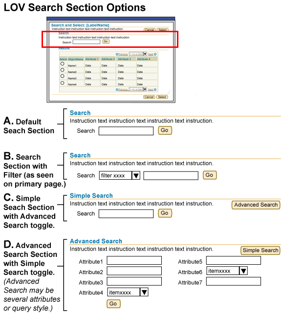
There are three options for searching within an LOV template:
- Basic Search: Search label and search text field with "Go" button.
- Search with Filter: Search label, filter pulldown list, search text field and "Go" button.
- Simple Search/Advanced Search Section Toggle: (Simple Search is the default section)
- Simple search section: Simple search with search label, search text field and "Go" button. Section level button that toggles section to be "Advanced Search."
- Advanced search section: Multiple criteria (label/data layout) with "Go" button or query-style advanced search fields with "Go" button. Section level button that toggles section back to "Simple Search".
- Note: It is not recommended to place an LOV field in the search criteria of the Advanced Search section of the LOV template. Tertiary LOV windows should be avoided as much as possible.
Schematic of LOV Search Options

- When the LOV page has the multi-select option, the "Select" column contains check boxes instead of radio buttons.
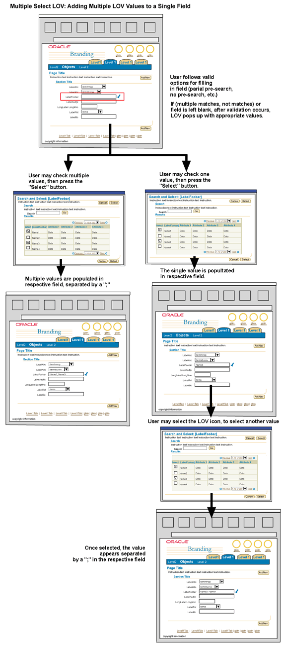
- A user may check multiple checkboxes in a single record set, or across record sets, and then press the "Select" button to return to the primary page with the appropriate values populating the LOV fields (in a table or label/data layout).
- Multiple select LOVs should allow the user to select all the values at once, or return to the LOV multiple times and append values. For instance, users may check one checkbox in the LOV, press the "Select" button, and return to the primary page. Then, they may return to the LOV and select another value.
- Selections in a table on the LOV template are persistent across record sets. Selections are not persistent after the user has performed another search in the LOV window with different criteria.
- A single field LOV may append multiple values (separated by a ";"), or multiple values may be added as rows in a table. See the outlines below for flow details of each.
- If the user clicks Cancel in the LOV window, the window is dismissed, and the LOV input field on the instantiating page is cleared.
A user may select single or multiple values from an LOV to populate new rows of a table. For instance, a user may need to "Add Competencies" to a table of competencies. These competencies are available through an LOV template.
- An "Add [ObjectName]" global table button may be associated with a populated or empty table.
- The user selects the "Add [ObjectName]" button, and the LOV template is displayed with the first set of values from the entire list pre-queried (in alphabetical order). If the list is a set of valid numbers, the first set is in numeric order (i.e., 0 to 100).
- The LOV template should display checkboxes in the "Select" column to allow the user to add multiple values to the table. The user finds the appropriate value(s), either using the search mechanism on the LOV template, or the record set navigation on the table of the LOV.
- The user selects the appropriate values, then presses the "Select" page level button.
- The LOV template closes, and the table on the primary page is redrawn with the new row(s) or value(s) in view.
- When the new rows are added to the table, it may either add the appropriate number of new rows (if the record set value has not been exceeded), or add the new items into the table, and add the new rows to the total number of records of the table.
- For instance, if a table on the primary page only has 3 rows, and a user adds 2 more rows from the "Add [ObjectName]" button/LOV, the table will then display a total of 5 rows.
- Or, if the table on the primary page has 1000 records, with 25 records showing per set, and the user adds 2 new items from the "Add [ObjectName]" button/LOV, the table will redraw showing at least one of the new records added, and the total records will read 1002.
- Note: Based on usability studies, users expect new values added to a table from this button to be shown in alphabetical order. For instance, if a user selects two employees, Richard and Ricky, from the LOV, the table on the primary page will return showing both Richard and Ricky in view in the record set. (This is true if there are not too many existing records between these new values.) If a user adds two employees, Barbara and Richard, from an LOV, the table on the primary page will show Barbara in alphabetical order, as well as provide an inline confirmation message box at the top of the page stating that 2 new employees, Barbara and Richard, were added. (Richard is not in view.) The newly added items in the table of the primary page are shown in alphabetical order no matter what order the user selected the values in the LOV template.
Schematic Flow of Multi-Select LOV Populating New Rows of a Table

- If a single field has multiple select capabilities, the LOV field should allow for robust search capabilities, and the associated LOV template will have checkboxes in the "Select" column.
- Adding multiple LOV values to a single LOV field should be closely evaluated to see if it is the appropriate method given the context and task at hand.
- A multiple select LOV field should be used only when it is appropriate to add a small number of values to the field.
- If a user is likely to add a large number of values, the single field approach may not be appropriate, since the single field does not provide an easy way for the user to see all values in the field (the values may scroll out of view in the single field.)
Options Other Than a Multiple Select LOV Field:
- Shuttle - A shuttle may be used to select entries from a larger list of values to populate a smaller list.
- Table with "Add [ObjectName]" Global Table Button - It may be more appropriate to use the method described above to allow a user to select multiple values. If necessary the table does not need to have many columns.
- Multiple Select LOV Populating a Text Area - Instead of using only a single field, make the widget a text area to allow more items to be in view once they are selected from the LOV (or typed in and validated.)
- On the primary page, the LOV field and LOV icon associated with the field appears the same as a single select LOV.
- The LOV template should display checkboxes in the "Select" column to allow the user to add multiple values to the single field.
- The user may use basic LOV field population and validation methods as mentioned above (pre-search capabilities, and field level validation on exit of field.)
- The user may simultaneously enter multiple values in the LOV field:
- In usability studies, almost 60% of all users entered both values (as full strings) and approximately 15% entered partial values into the LOV field on the primary page. Based on this result, it is mandatory to support multiple entries on the LOV field for a multiple select-enabled LOV field. (If the LOV field can only have one valid value, this multiple value feature should not be allowed.)
- If the user enters multiple values, they should be separated by ";" "," or "and".
- On field exit the values are validated against the values in the LOV. If the values match, the user may move on with the process. If there are multiple matches, partial matches or no matches it follows the appropriate behavior as mentioned above in this document.
- The user may leave the LOV field blank and select the LOV icon:
- A user may leave the LOV field blank, and select the LOV icon. The LOV Template opens, and the "Select" column has checkboxes. The user may select multiple values, press the "Select" button. The values are returned to the LOV field on the primary page, separated by semi-colons (";").
- The user may enter the values one at a time:
- The user may enter one value in the LOV field, and exit the field, (which performs field level validation). After the single value is validated, the user may select the LOV icon to add another value which is appended after the first valid value, separated by a semi-colon.
- When returning multiple values to a single field, the items should be displayed in alphabetical order.
Schematic Flow of Multi-Select LOV Populating a Single Field

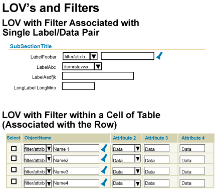
It may be appropriate to have a filter (as a pulldown choice list) associated with an LOV field. The filter limits the total number of values found in the LOV template, and/or values that can validated if entered in the LOV field.
- A filter may be associated with an LOV text field or choice list in either label/data format or in a table cell.
- If the filter is associated with an LOV field/choice list in a table, the pulldown list (filter) and the LOV field should be placed in the same cell of the table.
- Using a filter with an LOV field/choice list is recommended if the list of values:
- Has a well known set of filters that are appropriate to the entire set of values
- Is very large, and the filter will help reduce the time required to query the entire set of values, and/or time to show the filtered values for user selection.
- If there is a filter on the LOV field on the primary page, a filter must also be shown in the LOV template. The selected filter item in the LOV template should match the selected filter item on the primary page.
- It is recommended that a default item in the filter be set, and the item not be left blank.
Schematic of LOV Fields with Filters (Label/Data Format and Tabular Format)

This situation should be avoided whenever possible. In usability studies, when an item was not found in the LOV template, users immediately thought was that they were at fault (i.e., that they misspelled the word, or made a typo) or that the search itself was at fault. This may not be an issue in many cases. Users who have a high frequency of usage of an application, and a high level of familiarity with the data, may know whether or not an item exists. Thus, before even attempting to search for the item in the LOV, they would create the new value in the appropriate location of the application.
- To avoid this issue, it is recommended to first evaluate the content on the primary page. Are users aware that they may have to create new objects, say, before beginning the task at hand?
- A content container may be used to indicate all the items users may need to complete the task.
- A checklist of all the items needed for a task, and status, may be appropriate.
- If absolutely necessary, given a certain task with a HIGH probability that an item will not be found in the LOV because it has not been created, the following solutions may aid the user in finding the appropriate location to create the new item so that it appears in the LOV:
- Place a "Create" button next to the LOV Search icon adjacent to the LOV field. Selecting the Create button initiates the subprocess flow necessary to generate the new LOV value.
- Place a Hint beneath or by the LOV field in primary window (i.e., "If the {object} does not exist, select Create.")

- A typical use of this design would be for "process in process" flows. For more information on process in process, refer to the following guidelines:
- If the item is not found, Instruction Text in the LOV window may state the proper resolution procedure, (i.e., contact system administrator, go to another flow in application.) There should not be a link or a button from the LOV window to take the user to this transaction -- only directions.
- If entering a new value only requires one field to be filled, and can be done in the same page as the LOV field, then use a radio group. The radio group label would be the field label. One radio item would be labeled "Existing" with an associated LOV field, the other radio item would be labelled "New" with a text field.
If an LOV contains an excessive number of values, and a pre-search (based on a value entered in the field) takes a long time, it may be necessary to forewarn the user of this issue. The following techniques may be used to ensure LOV performance:
- Decrease the number of values in an LOV by placing a Filter on the LOV field. This filter should be set to a default, and have a blank or "All" item within the filter list.
- Only if absolutely necessary, and a filter option will not work in the context, place a hint under the LOV field. The hint may recommend that the user must enter in a certain number of characters before a pre-search can be performed. If users do not enter the appropriate number of characters, they will get an error (message page or inline message box.)
Note: This technique should be used sparingly and ONLY WHEN ABSOLUTELY NECESSARY. Over usage of hints and tips on a page becomes ineffective. If the hint is overused, it may be glanced over or not noticed.
In usability studies, long performance times were tested to see user reactions, and to determine if they affected users' ability to complete the task. Some users noted the long performance hit, but they did not perform any functions that prohibited them from completing the task or that caused any errors.
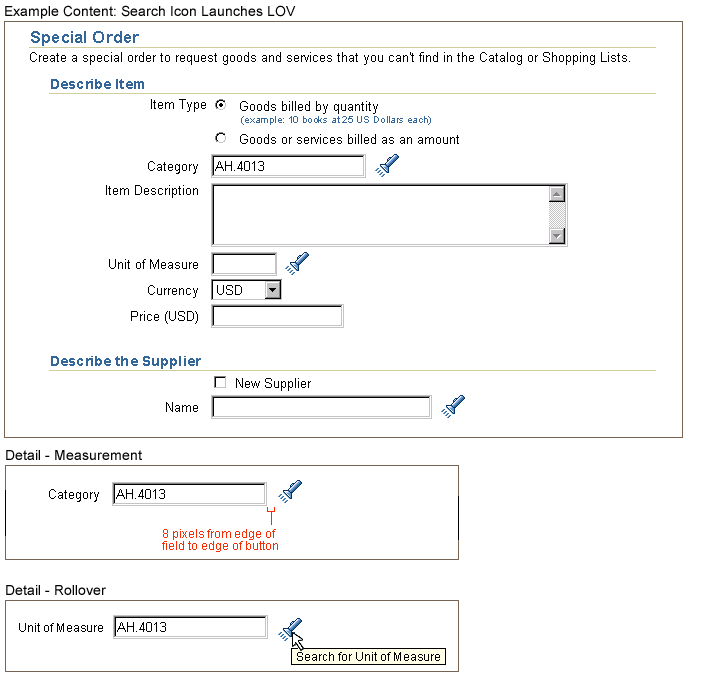
A LOV/Search Functional Icon is located next to a label and field combination where an LOV can be launched. When selected, the secondary window LOV template appears.
LOV/Search Icon Associated with Labels/Fields on a Page (Including Measurements)

LOV/Search Icon Associated with Fields in a cell of a Table
Example of the LOV Template: Defaulted with Initial Results Set

Example of the LOV Template: No Items Found

Open Issues
v3.0+ Additions:
- 18-Oct-2002: Adding the ability to toggle to a hierarchical view (hgrid) from WITHIN the LOV template if appropriate for task, and appropriate for user to be able to either search for a value or select the value from browsing a hierarchy. (Note: LOV field interaction will remain the same. HGrid will only be available once the user has opened the LOV template (and/or the pre-search capabilities open the LOV template based on string entered in field.
Closed Issues
20-Mar-2003: "Quick Select" icon in LOV documented in the guideline
21-Jan-2003: v3.0+ Addition: Added optional "Create" button next to LOV field based on process-in-process usability testing.
15-Aug-2002: LOV access from pulldown list has been added to the guideline
24-Aug-2000: Decided that the LOV template is to be drawn in secondary window:
- LOV template window must be modal
- LOV as a secondary window is an exception to the BLAF standards of no secondary windows.
 is selected, it will behave the same as if the user chose one row and the "Select" page level button.