Web applications feature several methods to provide help and communicate information to users. This specification describes methods for displaying brief Hints, tips, and Messages inline on the page, as well as rollover bubble-text ('Alt' text).
All the messaging methods in this specification address the need for display of brief in-context information. This information may be needed in context to explain application interface behavior, or to help the user decide on an action that best leads to meeting their goals in using the application.
Hints, Tips, Inline Information Messages, and Cautionary Warnings appear to the user on first page view. Bubble Text and the other Inline Messaging types (Warning, Error, Confirmation, and Processing) appear in response to user action. The choices made in which messages and message types to implement, and where and when to use them will have a significant impact on ease of use.
The following sections are intended to help make the best use of these messaging types in your application, and help develop strategies for dealing with the need for simultaneous display of these various messaging types. Note: Users may be allowed to turn off Tips, Hints, Key Notation, and Instruction Text in Preferences, accessed with the global Preferences button. Refer to the Global Templates BLAF guideline, Preferences Global Page section.
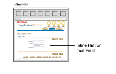
Hints for standard Web widgets (for fields, pulldowns, radio buttons, etc.) appear beneath the related element, and do not include a Tip icon. In general, Hints should not exceed a single line in U.S. English, to allow a maximum of one and a half lines in translation to other languages.
Hints Schematic
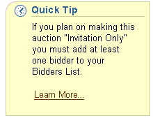
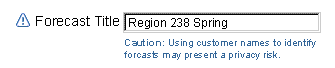
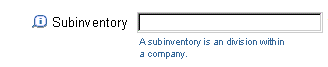
Tip text with Tip Icon is used inline in a page to call attention to useful domain or UI information that might not otherwise be obvious. This information may include reminders about organization policies, UI shortcuts or alternate ways to perform tasks, pointers to Preferences, or information on how the UI behaves, such as "Changes will be saved when you move to the next set of {objects}".
Tips appear in two forms:

Inline messaging is a combination of:
These standard BLAF application message types make use of Inline Messaging:
Inline messaging may appear in:
See the Help Methods guideline for a comparison of Tips and Information Messages.
Bubble text can provide a slightly longer description of a UI element than is possible in the element's label. This information can be very useful when labels are ambiguous. For instance, an action/navigation button may be labeled "Save Form," and the bubble text can read "Save 1999 Federal Tax Form."
Inline Messaging Schematic - Bubble Text

When a keyboard shortcut is assigned to a UI element, the Bubble text includes the shortcut, such as "Next: Access key = X". The Keyboard Shortcuts guideline specifies standard access keys.
See Icon Repository for BLAF for rollover text for common icons. Also, see Language in UI for writing style guidelines for rollover text.
Some limits should be placed on where, when, and how often Hints and Tips appear. Although hints can be automatically placed beneath common fields/web widgets, excessive use may be annoying to users who are either experienced in an application or familiar with the terminology common to a specific domain. However, new users may fail to complete a task if they are not provided with certain definitions.
While the user may turn off Hints and Tips in their application Preferences (accessible through the Global Preferences button), it remains wise to apply economy when populating a page. Refer to the Global Templates BLAF guideline, Preferences Global Page section for more on user messaging display options.
Hints & Tips UI Overload
Note that Bubble Text is not counted when calculating the population of Hints and Tips. Bubble Text is applied to buttons, links, and icons, and only appears if the user pauses the cursor over the active UI element. See Icon Repository for BLAF for standard rollover text on common icons. See Language in UI for details on the content and format of Hints for standard web widgets.
Hints for standard Web widgets (for fields, pulldowns, radio buttons, etc.) appear beneath the related element, and do not include a Tip icon. In general, Hints should not exceed a single line in U.S. English, to allow a maximum of one and a half lines in translation to other languages. To keep Hint text succinct:
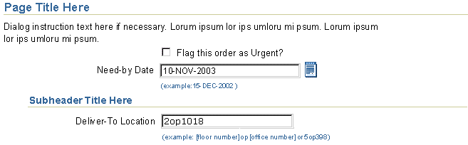

To reduce individual team coding efforts, Hints for specific common fields used throughout applications should be automatically generated, based on the field type. If the field is not a common field type, it still may be appropriate to specify Hint text. In that case, the Hint must be manually coded per application context.
Valid common field types for automatically generated hints:

To prevent excessive amount of Hints per page, including both automated and manual, the following heuristics should be used to determine when to show the automated Hint for the valid field type.
Heuristics:
Tips should be manually coded, per page. They are contextual to each task and application, and do not lend themselves to automatic generation.
Tip text is used inline in a page to call attention to useful domain or UI information that might not otherwise be obvious. This information may include reminders about organization policies, UI shortcuts or alternate ways to perform tasks, pointers to Preferences, or information on how the UI behaves, such as "Changes will be saved when you move to the next set of {objects}".
Tips appear in two forms:
See the Help Methods guideline for a comparison of
Tips and other Help methods.
Regular Tips consist of a Tip icon and dark blue text, and may be associated with a page, section of page, table, group or components, action/navigation button, or link. Regular Tips should not exceed one or two lines of text.
Tip Associated with a Section of Content

Tip Associated with an Action/Navigation Button

Tip Associated with a Link

Content Containers can be used to provide longer Tips. Content Container Tips may be associated with a section of the page, the entire page, or even a part of an application. The following illustration shows an example.
See the Content Containers guideline for
more details and examples.
Inline messaging is a combination of:
Out the common inline message types, these four make use of Inline Messaging:
Confirmation and Processing Messages are not directly shown through Inline Messaging. Confirmation Messages apply to pages and are not item specific. Processing generally is indicated only after process commencement. Use a Hint to indicate that a user action will initiate a process. Refer to the Messaging Templates guideline for details.
Inline Messaging can be in:
See the Help Methods guideline for a comparison of Tips and Information Messages.
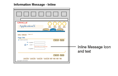
Note: Active icons are commonly used in Information Messages, but Error and Warning Messages usually have status icons.
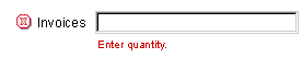
Inline messaging is associated with a message box at the top of the page, which indicates which fields or pulldown choice lists have an associated message (there are few exceptions to this rule). See the Message Box guideline for details. See Messaging Templates for implementation details templates.
Inline Message with Inline Active Icon, Field, and Optional Messaging Text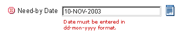
Multiple inline messaging icons can be associated with one field or pulldown. Below are the valid combinations:
It is not recommended to have an error and a warning message icon used together.
Example of Multiple Inline Messaging Icons with Status Icon

Example of Order of Multiple Inline Messaging Icons (with Status Icon as well)

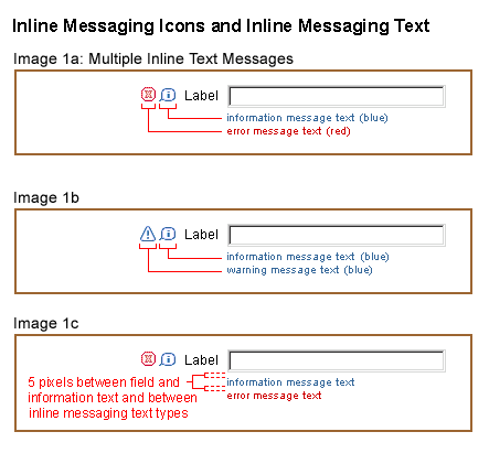
Multiple inline messaging icons and multiple instances of inline message text can be associated with one field or pulldown. They should be stacked and left-aligned, directly below the widget. Below are the valid combinations of inline message text:
It is not recommended to use Error and Warning Message text together.
Examples of Multiple Inline Message Text
See the Tables guideline for extensive examples and
guidelines for inline messaging in a table.
Bubble text, otherwise known as ALT text or rollover text, is used on several UI elements within a page:
Note: Bubble text must be used on all graphical elements. (BLAF buttons are graphics)
Bubble text can provide a slightly longer description of a UI element than is possible in the element's label. This information can be very useful when labels are ambiguous. For instance, an action/navigation button may be labeled "Save Form," and the bubble text can read "Save 1999 Federal Tax Form."
When a keyboard shortcut is assigned to a UI element, the Bubble text includes the shortcut, such as "Next: Alt + x". The Keyboard Shortcuts guideline specifies standard accelerator keys.
See Icon Repository for BLAF for rollover text for common icons. Also, see Language in UI for writing style guidelines for rollover text.
Rollover Bubble Help Text on Action/Navigation Buttons, Global Buttons, Icons, and Links as Buttons

It is possible to use some basic HTML formatting tags in Inline Messaging and Hints. These should be used sparingly and only when necessary, since inline messaging should be brief. These are the valid tags:
BRULLIOLA HREFMAILTOIMG