-
Examples of Global Icons
- Help Global Icon
- Preferences Global Icon
- Login Global Icon
- Logout Global Icon
- Email Global Icons
- Return to Portal Global Icon
Possible States of Global Icons - enabled
- active
- disabled
Color and Approximate Size of Global Icons - see Visual Specifications in the Global Button Guideline for details.
Example of Global icon in Global Button
Information Quantifier Icons - Information quantifier icons are used to visually describe a page's content, or a section of the page's content. There are two types of information quantifier icons: page title icons and subheader/content container icons. Page title icons are used in conjunction with a header component. They may also be used with other components that have headers such as the Message Box component. A subheader may also have an information quantifier icon, but since it is smaller in size than a header, the icon is slightly smaller. Content Containers in the page use the subheader component and may have an information quantifier icon as well. These serve the same purpose as a page title icon (visually describing an area of content) but are slightly smaller. These icons may be seen in a variety of different page templates, including Global Page Templates, or Messaging Page Templates.
- Examples
of Information Quantifier Icons - Page Title Icons
-
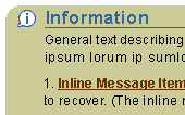
Example of Page Title Icon in a Message Box
- Confirmation Page Title Icon
- Error Page Title Icon
- Information Page Title Icon
- Warning Page Title Icon
- Login Page Title Icon
Possible States of Page Title Icons - display only Color and Approximate Size of Page Title Icons
- "Line" Color: dark blue; #336699 (see "Graphical Rendering of Icon Style" below for treatment details)
- "Fill" Color: transparent
- size = 18x18
- exception: error page title is the only exception and rendered with a "line" color of red;#cc0000
- Examples
of Information Quantifier Icons - Content Container and Subheader Icons
- Tutorial Icon
- Bullseye Icon (Salience or More Related Information)
- Quick Tip Icon
Possible States of Content Container Icons - display only
Color and Approximate Size of Content Container Icons - "Line" Color: medium blue; #6699cc (see "Graphical Rendering of Icon Style" below for treatment details)
- "Fill" Color: white
- size = 18x18
Example of Content Container Icons

Example of a Subheader Icon

Inline Icons - Inline icons are used throughout a page. They can be seen next to a label, a field, data, in a table, associated with text in a paragraph, etc. Inline icons may be active or just status icons. Selecting an active icon (by clicking on it) will reveal more information or functionality. Depending on an application's functionality, inline active icons can also have multiple states (enabled or disabled). Status icons denote a state only and can not be clicked on for further information.
- Inline
Messaging Icons
There are 3 fixed inline messaging icons. These icons are shown based on user action (error, warning, etc.) or provide information before an action is taken. See Inline Messaging and Tips and Messaging Template guidelines for full details.
Note: No new inline messaging icons can be requested in BLAF.-
Examples of Inline Messaging Icons
- Error Icon
- Error (status) Icon
- Information Icon
- Information (status) Icon
- Warning Icon
- Warning (status) Icon
Possible States of Inline Messaging Icons - display only (for both active and
status)
NOTE: Active icons have a thicker bottom edge outline to denote "clickability."
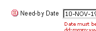
Example of Inline Messaging Icon with a Field
-
Color and Approximate Size of Inline
Messaging Icons
- "Line" Color: dark blue; #336699 (see "Graphical Rendering of Icon Style" below for treatment details)
- "Fill" Color: white
- size = 16x16
- exception: error page title is the only exception and rendered with a "line" color of red;#cc0000
- Inline Tip
Icons
There is only one inline tip icon. It is used with a "Tip" help method to call out a specific information to the user. See Inline Messaging and Tips and Help Methods guidelines for details.
Note: No new TIP icons may be requested.-
Examples of Inline
Tip Icons
- Tip (status) Icon [page level tip]
Possible States of Inline Tip Icons - display only
Color and Approximate Size of Inline Tip Icons - "Line" Color: dark blue; #336699 (see "Graphical Rendering of Icon Style" below for treatment details)
- "Fill" Color: white
- size = 16x16
- NOTE: The page level tip icon is always associated with the text "TIP"
Example of Inline Tip Icon Displaying a Page Level Tip

- Tip (status) Icon [page level tip]
- Inline Status ONLY Icons
Inline Status ONLY and Inline Status Indicator icons provide the user with status information about an object or item in the interface. It may also provide stateful meaning about an item such as "changed" item or "required" icon. Status ONLY Icons are non-clickable (status ONLY).-
Examples
of Inline Status ONLY Icons
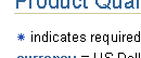
- Required Field (status) Icon
- Changed Item (status) Icon
Example of as Shown in Key/Legend Notation
-
Possible States of Inline Status
ONLY Icons
- display only
Color and Approximate Size of Inline Status ONLY Icons - "Line" Color: dark blue; #336699 (see "Graphical Rendering of Icon Style" below for treatment details)
- "Fill" Color: white
- size = 16x16
- Inline
Status Indicator Icons
Inline Status ONLY and Inline Status Indicator icons provide the user with status information about an object or item in the interface. Inline Status Indicator icons may be status only (non-clickable) or active (clickable). If the icon is in the active state and is selected, it should drill the user down to more details of the status of the item.-
Examples of Inline Status ONLY Icons
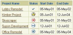
Hypothetical Example of Status Indicator Icons in a Table
-
Possible States of Inline Status
Indicator Icons
- active (clickable)
- status
Color and Size of Inline Status Indicator Icons - active (clickable)
- overall shape: active icons are within a circle shape
- Line color: dark blue #336699 (except for trend indicators like "good" (green), "marginal" (yellow) and "bad" (red)).
- Fill color: white (circle fill is white)
- Size: 16x16
- status
- overall shape: not in a shape
- Line color: dark blue #336699 (except for trend indicators like "good" (green), "marginal" (yellow) and "bad" (red)).
- Fill color: none
- Size: 16x16
Functional Icons
Functional icons are typically used in a cell of a table, where each cell in the column has a functional icon. When selected, either an action is performed or the user navigates to another page or pages to perform an action. Functional icons are also occasionally associated to a label/data pair (such as date picker or LOV icon). See the Table guideline for more details.
-
Examples of Functional Icons
- View Details Icon
- Notes Icon
- Update Icon
- Delete Icon
- Date Picker Icon
- LOV or Search Icon
Possible States of Functional Icons - enabled
- disabled
Color and Approximate Size of Functional Icons - Enabled Icon:
- "Line" Color: dark blue; #336699 (see "Graphical Rendering of Icon Style" below for treatment details)
- "Fill" Color: light blue; #99CCFF
- approximate size = 24x24
- Disabled Icon:
- "Line" Color: medium grey; #999999 (see "Graphical Rendering of Icon Style" below for treatment details)
- "Fill" Color: white
- size = 24x24
Example of Functional Icon; Field with Access to Date Picker Button
Example of enabled/disabled Functional Icons within a table
Component
Icons - There are multiple icons used in different components.
These icons are part of the component web beans, and can not be requested
for development. Some icons used in the web beans for components are
listed in the Icon Repository. Examples
of component icons are:
- Tree Icons
- Hide/Show Icons
- Locator Element: Previous/Next
- Quick Links
- etc.
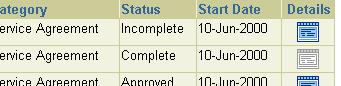
Object Type Quantifier Icons - Object Type Quantifier Icons are used in Trees, HGrids, cells of tables, and related links/shortcuts, and are associated with an object name. The icon quantifies what type of object the item is. For instance, an HGrid may contain all marketing campaigns with corresponding details, contacts, collateral, etc. For each of these objects in the HGrid, a respective Object Type Quantifier Icon is displayed next to the name so it is clear which is the campaign instead of the other objects. See HGrid, Tree, Related Links/Shortcuts, or Table guideline for details.
Example of an Object
Type Quantifier Icon within an HGrid
|
Example
of an Object Type Quantifier Icon in a Tree
Example of an Object Type Quantifier Icon with Related Links/Shortcuts 
|
-
Examples of Object Quantifier
Icons
- Document
- Folder
- Campaign
- Person
- etc.
Possible States of Object Quantifier Icons - view only (not clickable)
Color and Size of Object Quantifier Icons - Line color: dark blue #336699
- Fill color: white
- Size: 16x16
Diagram Icons - Diagram icons are used in graphical illustrations of processes, schemas, file systems, etc. These illustrations are used in conjunction with the diagram editor and may be functional depending on the mode in which the user is in. Examples of diagram illustration with diagram icons are a workflow process, a marketing campaign process, a database schema, a file directory, etc.
Examples
of Diagram Icons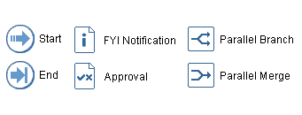
|
Example
of Diagram Icons used in a Diagram Editor
|
-
Possible States of Diagram Icons
- active (function depends on mode)
- overall shape: Depends on whether diagram represents a process (i.e.,
workflow process) or schema (i.e.,
file system)
- If diagram represents a process:
- Start and End icons are in a circle
- Branching Type steps are represented in a rectangle
- Process steps may be in a square or the shape that represents the type of process
- If diagram represents a schema:
- Schema nodes should represent the node object type, for instance a document should have a document shape, a folder should have a folder shape. The specific contents of the folder or document may be an iconic representation within that shape.
- Line color: dark blue #336699
- Fill color: fill in shape is white
- Size: 32x32
Color and Size of Inline Diagram Icons
Base Graphics - Base graphics are not specific icons (i.e., one of the BLAF icon types above) but are used to create a consistent iconographic library when creating a BLAF icon. For instance, many different types of icons may need "document" iconography. The "Document" base graphic should be used when creating this specific icon.
Some Examples of Base Graphic
Icons (24x24 shown)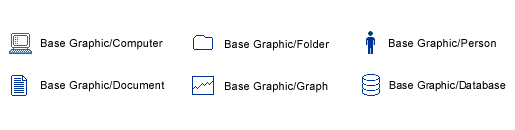
|
A BLAF icon created from
a Base Graphic
|