Art Direction Language
Last Updated 09.28.03
General Description
To maintain a family resemblance between all applications within the Oracle product line,
below an art direction statement has been made to help understand the rationale and
thinking behind the visual directions being determined for HTML applications.
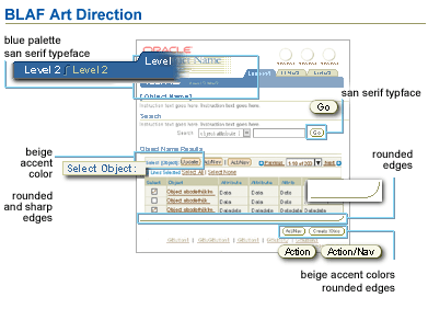
Collage of Various Elements in BLAF to Outline the Art Direction Language

Spec Attributes
Spec Version # - 3.1
Spec Contributors - Betsy Nute
UI Models - All models
Example Products - all products
Related Guidelines - all
Interaction and Usage Specifications
Not applicable.
Visual Specifications
Art Direction Rationale - The HTML application suite visual design direction is targeted to
match the latest business goals and objectives of Oracle. Oracle is an "internet" company. With slogans like,
"The Internet Changes Everything,"; "Oracle - #1 in eBusiness," it is important that the
applications we ship reflect the "internet" aspect of our products. To capitalize on this aspect,
a visual elements list was created to enumerate exactly what may be
perceived as web like. But to be more articulate, below is the detailed art direction for BLAF applications:
Predominately Blue and White Palette with Beige Accents
The color palette that is being used remains
relatively unchanged, with the main difference being that the predominerance
of grey has been replaced with white, and an accent color has been used
to add "warmth." Besides this, the blue palette remains unchanged. This
new palette, now offers a clean, professional, and business like look
that can convey messages such as: trust, security, cleanliness, precision,
conservative, technology, comfort, and warmth.*

Rounded and Square Shapes
To remain within the family of all Oracle products (including Java products) yet,
also convey a web like form, the predominate shapes within the self service art direction
have been reassessed. From the findings above in the elements list, it is clear that the web
has many more free form visual elements present, than, say, a typical GUI application. To capitalize
on this, the new art direction style perscribes the use of not only curves, but also sharp corners and rectangular shapes.
It has been researched that rounded shapes are quite effective in portraying psychological responses
like connection, community, and comfort. Whereas, a rectangular shape can evoke responses such as order,
logic, and security.* Along with these responses, the use of these two shapes together will add a dynamic
and original feel to the overall page layout since these two shapes are complimentary in nature.

Visual Hierarchy of Information through Size and Depth
To maintain a sense of visual hierarchy within self service applications,
the art direction recommends size and depth be used. Using different sized visual elements within the new UI will aid the user to
focus on the most important elements and information first and form a mental hierarchy of information. This technique can also prevent the
design from becoming cluttered, with too much information at relative weights, and importance, such that the user may perceive no clear notion of importance of information. Another technique used to create
visual hierarchy in this art direction is the use of depth, giving 3d attributes to
visual objects. This not only enforces the information hierarchy, but also can convey messages such as professionalism, richness,
and sophistication.

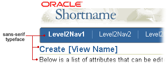
Sans-Serif Typeface
The font choice is to use a sans-serif font to convey cleanliness, and
modernity. The chosen fonts, specified in the Text
Standards and CSS Guideline is to be defaulted to Arial, and as an
alternative, Helvetica. Also, Arial font (or a sans-serif font face) is
preferred by low vision users, thus the usage of Arial enforces Oracle's
compliance to accessibility standards. Here is a comment from an article
regarding sans-serif fonts: "A less formal, more warm and friendly type
style, a sans-serif typeface typically makes an excellent screen font
as it is clear and easy to read."*

Minimize Rendered Icons, Emphasize Simplified, Stylistic Graphics in Content
The art direction can also be seen through the use of icons and other graphics within the content
of the web page. Since the presentation of the toolbar has been changed, one ramification is that the use of
highly rendered icons have been minimized. This minimization will also be beneficial, since the icon visual
style is seen more typically in application designs, but not necessarily in web pages. With the minimized use of icons, the new
art direction demands that more attention should be placed on graphics within the content. The styles
of these graphics should be less rendered, with a more stylized and simplistic look thus, not to be competitive
with the UI and task at hand. Also, rendering these graphics in the content with visuals from the
application domain can play another role of enforcing the unique and individual characteristics from
each application family (i.e., using HR specific imagery in HR applications, or Financial imagery for Financial applications.)

*Source of information: "Satisfying Customers with Color, Shape, and Type," by Molly E. Holzshlag; Web Techniques Magazine, November 1999.
Open/Closed Issues
all issues are closed.


