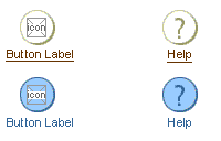
Buttons (Global)

Last Updated 03-Dec-2003

General Description

Global buttons are buttons that access sections of content that are global to the entire application. A global button is persistent and can be accessed from every area of the application.


Example of Enabled, Active and Disabled Global Button


Below is the contents of this guideline:

Spec Attributes

Spec Version # - 3.1
Spec Contributors - Betsy Beier, Lisa Serface, Ivy Leung
UI Models - all models
Example Products - all products
Related Guidelines - Tabs (global), Introduction to BLAF Page Templates, Help Methods, Icons, Branding, Global Button Flow: Preferences.

Interaction and Usage Specifications

General Principles - below are recommended principles about global buttons: Global Button Options - Global buttons may be shown as links only or with global icons depends on the choice of Branding type. A user preference setting may be exposed to allow user to choose from the available Branding Options. See Branding Options for details.

Order of Global Buttons - There is a set of common global buttons that are used in web based application, and a recommended order to display these buttons. Common Global Buttons - There is a set of common global buttons that are used throughout BLAF applications. See each guideline for details. Button States - There are 3 states to a global button; enabled, active and disabled.

Visual Specifications

Text Styles and Colors
  Enabled Selected (Active) Disabled
Text Color Brown (Text will be a link); #663300 Dark Blue; #336699 Very Dark Beige; #999966
Text Style Arial, 9pt (CSS), Regular Arial, 9pt (CSS), Regular Arial, 9pt (CSS), Regular
Button Fill Color white; #ffffff light blue; #99ccff light beige; #f7f7e7
Button Border Color dark beige; #cccc99 (highlight) - very dark beige; #999966 (shadow) dark blue; #336699 (highlight) - dark blue; #336699 (shadow) dark beige; #cccc99 (highlight) - very dark beige; #999966 (shadow)
Image of Rendered Button Fill and Border Colors
Approximate Icon Size and Shade 18x18(min)-21x21(max), very dark beige; #999966 18x18(min)-21x21(max), dark blue; #336699 18x18(min)-21x21(max), dark beige; #cccc99
Total Button Size 32x32 32x32 32x32


Buttons are Icons within a Circle, and the Button Label Text is HTML - Each global button is an icon within a filled circle, and needs to be rendered for all 3 states. The button label is HTML text and is centered below each individual global button. Button Text Label Wrapping - The global button text label should only wrap to 2 lines. The text is centered below the global button.

Maximum Width of Global Button "Bar" - To prevent the global buttons from horizontal scrolling in an 800 width environment, it is recommended to not exceed 450 pixel width for the combined set of global buttons and button text labeling. The maximum width can vary greatly depending on the text label length, thus it is important to follow stringent guidelines for keeping button label verbiage curt (see recommendations below under "Button Label Verbiage.")


Minimum Width Between Global Buttons and/or Button Labels in Global Button "Bar" - To prevent the global buttons from touching, a minimum value has been set between the global buttons and/or global button label depending on which is longer. This value is 10 pixels.


Button Label Verbiage - To prevent surpassing the suggested maximum width for the combined global button "bar," as well as prevent text from wrapping to two lines, it is recommended to keep global button label verbiage succinct, but still maintain understandable terminology for the user that describes the entire contents of the specific global area. The label should be consistent with the other common global button terminology and not be action oriented. See also Language in UI guidelines for more tips.

Global Button/Branding Options

Non-Contextual Branding - Large Layout

Non-Contextual Branding - Regular Layout

In-Context Branding - Regular Layout

Actual Icon Set for Global Buttons


See Icon Guideline and Icon List for set of common global button icons.

Open/Closed Issues