- Oracle Logo (Large Image)
- Product Branding (HTML Text)
- Extra Fill Image
- Global Links (Links Only)
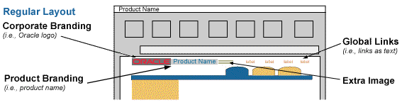
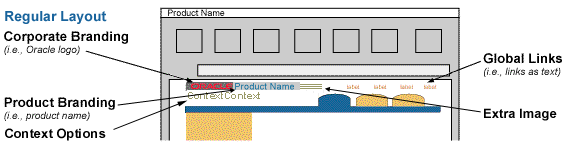
Corporate Branding/Product Branding with Extra Fill Image (Regular Layout)

The upper left corner of the UI for web based applications is reserved for corporate branding, product branding, co-branding, optional collage, and optional contextual information (depending on the application architecture.) Every Oracle web based application or module shipped will have a default branding configuration set, and ultimately the end user may be able to customize the size. The end Oracle customer may completely customize as necessary.
NOTE: Branding options are closely tied to Global Button options.
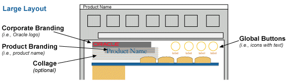
There are two (2) branding types and four (4) possible elements within them. The two branding types are:
The four elements that can be applied to the two types are:
Customers who decide to customize the branding area are able to completely replace the upper left hand corner of the UI with their own graphic. This graphic may have their corporate logo, their customized application or module name, and a graphic collage or any type of combination they desire.
Whether or not the branding is default or customized, for accessibility purposes, branding should have an "alt" tag for the branding graphic. The "alt" tag should describe the branding graphic; corporate name, product name, etc, according to what content is within the graphic.
For co-branding options, "Customers who are qualified Oracle Alliance[sm] application provider partners may want to share in the power of the Oracle brand by distinguishing their applications and software as products powered by Oracle's industry-leading server technology." In this case, the customer may become part of the "On Oracle" logo program and use this logo along with their customized branding. See On Oracle logo program brochure for details regarding this program and "On Oracle" logo usage.
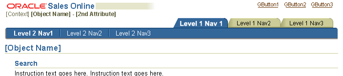
There are two overall types of branding, Basic (Non-Contextual) Branding and In-Context Branding. The usage of these two types of brands depends on the overall architecture of the application.
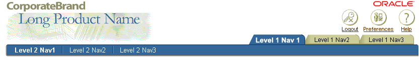
In general, the most common application architecture has persistent tabs, and maintains multiple object contexts. For instance, in an Expense application, there are multiple expense reports that can be viewed, updated, deleted, etc. This type of application uses the Basic (Non-Contextual) Branding, which identifies to the user what corporation the product was created by, and what the product/functionality is that exists within the applications.
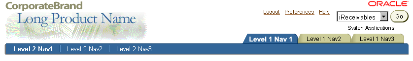
There are 2 layout size options for the Basic (Non-Contextual) Branding and the Global Button area at the top of the page, Regular and Large. The Regular Layout is set as the default in current implementation. Development teams can switch the shipped configuration to the Large Layout if they desire. The end user can also customize the setting as needed, in their Global Preference Settings. (See Global Page Templates: Preferences for more details regarding Preference.)
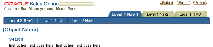
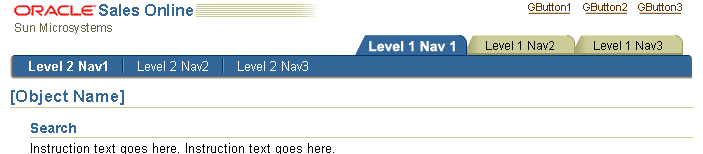
In certain situations, an application may be architected following a slightly different model than mentioned above. The core difference is that only ONE context exists across the persistent tabs. The user selects the context from a centralized aggregate home page of multiple contexts, then navigates into a tabbed application pertaining to that specific context.
For instance, in Projects, once a user has picked a specific project to view from the home page, all the tabs in that application are applicable ONLY to that specific project. This project name (the context) needs to be represented in the branding area, thus In-Context Branding should be used. For examples, see Contextual Information (In-Context Branding Only)
There is one layout size option for In-Context Branding and the Global Button area at the top of the page.
Below are several examples of In-Context Branding Options
In-Context Branding - Generic (Regular Layout)
In-Context Branding - Example with all Context Options (Regular Layout)
In-Context Branding - Example with no Context Options (Regular Layout)
The default corporate brand should be the Oracle logo. It should not be HTML text of the word "Oracle," but an image of the Oracle logo type and Oracle red color. (See Oracle Identity Guidelines for more details. This is an Oracle internal address.)
The Oracle logo for web based applications may be rendered in two sizes; one larger size image used in the Basic (Non-Contextual) Branding option, and a second smaller size for the partnership Co-Branding and In-Context Branding options.


Customers may customize the branding area with their own company logos, but they may also want to retain the Oracle logo for co-branding purposes. See Co-Branding, in this guideline, for more details.
Product Branding (or, Product Name) consists of the Application Name or Module Name (Name of All the Functionality within the Application). It is rendered in HTML text, and is not part of the collage image.
The product name text string is passed to the UIX branding component to render in HTML using CSS settings. The string is translatable. See "Visual Specifications" below for CSS details. Product name should also appear in the browser Title. See Language in UI: Browser Window Title for details.
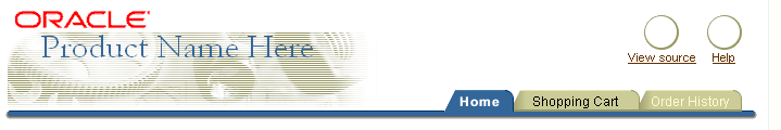
Product Brand - Internet Supplier Portal - Example

The Product Collage Image is used for the Non-Contextual Branding, large layout option. It may consist of domain or content specific collaged images, or be generic.
Using a product collage along with the product name can visually enforce the domain and content of a specific application as well as graphically enhance the application. There are several different default product collages to choose from, each designed to work well with a specific application domain:
NOTE: Basic Branding Regular layout and In-Context Branding do not use a collage. They may take an optional Extra Fill Image.
Below are the currently available domain/content-specific collages available for use in the Basic Branding Large Layout. Use of a collage is optional.
Business Intelligence product type collage
|
CRM product type collage
|
|
eCommerce product type collage
|
Financial product type collage
|
|
Health Care product type collage
|
Human Resources product type collage
|
|
Manufacturing type collage
|
Portal product collage
|
|
Server technologies product type collage
|
Tools product type collage
|
|
Generic line collage (Regular\)
|
For the Regular Size branding layout, Basic and Non-Contextual, the Extra Fill Image may be placed adjacent to the product name. This is used in place of the collage image Basic Branding Large Layout Option. The Extra Fill Image, when implemented, is automatically inserted to the right of the Product Name by UIX.
Extra Fill Image Example
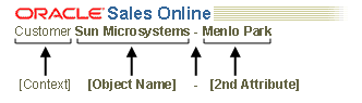
There are 2 pairs of contextual information that can be shown. The first is the context or object that is being displayed (object name and optional object type) such as "Customer Sun Corporation". The second is an optional secondary attribute. (The secondary attribute does not need a label, since it should be obvious based on the context. It is used only if absolutely necessary to distinguish different contexts.) The contextual information is represented as HTML text in the branding area.
The basic syntax for assembling context information is as follows:
Contextual Information Example & Syntax
A customer may customize the branding area to use their own company logo, while retaining the Oracle logo to signify cooperative co-branding.
It is possible for a customer to change the branding area to add co-branding information. A sample layout appears below. The customer's logo as the corporate brand of the application and a smaller Oracle logo signify a partnership or relationship standing with customer.
NOTE: These contacts may have specific partnership program logos available and/or provide other legal requirements (noted as of Feb-2000). For more information about Oracle partner programs contact: Trademarks and Partner Marketing.
Co-Branding Components

Corporate Branding/Product Branding/Cobranding with Collage (Large Layout)
Corporate Branding/Product Branding/Cobranding/Collage with Application Switcher (Large Layout)
It is common for applications across domains to integrate functionality and become sold as one product. (The module or product also may be sold separately as well.)
In the case where the products are integrated, it is important for usability that the product branding reflects the integration, since the end user is only aware of the product as one entity. In these cases, the product branding needs to be shipped with a meaningful name that reflects the combined functionality. If the customer chooses to buy as separate products, the branding would be only that single brand.
For instance, a financial module, Expense, and a human resources module, Time, may be sold separately or together. When the product is sold as one, the product branding would read "Time and Expenses," and would remain constant when the user is in the Time tab area or the Expense tab area. When the product is sold separately, the product branding would read, "Time" or "Expense" depending on which module is purchased.
If the application is an intranet solution, and the Oracle Applications Portal is installed, the product branding as mentioned above should match the application/module title which is seen in the Favorites or List of Application portlets.
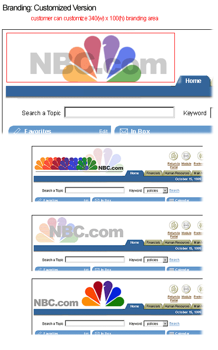
An Oracle customer who buys an Oracle web based application is free to customize the upper left corner of the screen. It is recommended that the graphic that is used is a maximum size of 340 pixels wide by 100 pixels high to be combined appropriately with the other application components that fit in the top portion of the page (i.e., global buttons and level 1 tabs).
Customers have the following branding area customization options.
As part of the Preferences Options, a setting should be provided to allow a user to choose from one of the branding and global button options (regular, large). See Global Page Templates: Preferences for more details regarding Preference.
Branding visual specifications are presented major subsections, preceded by General Notes, following the Basic and Contextual branding option structure.
See Corporate Branding - The Oracle Logo, in the Branding Elements section.
Below are the CSS specifications for the product name in the large layout. The use of Garamond is recommended because it is a core corporate font of Oracle, but Times New Roman may be used instead when automatically generated by the branding bean.
For examples, see Product Collage Image in the Branding Elements section of this guideline.
The product name may be short or long. Below illustrates how an extra long product name can wrap to two lines if necessary.
NOTE: Only applicable for Basic Branding Large Layout
Product Name Handling - Basic Branding Large Layout

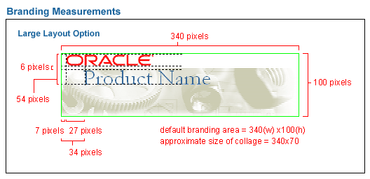
The diagram below shows layout and measurement positioning for each element, including logo, product name, and collage.
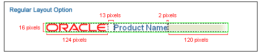
Measurements - Basic Branding Large Layout
See Corporate Branding - The Oracle Logo, in the Branding Elements section.
Below are the CSS specifications for the product name in the regular layout. San Serif fonts are used in this layout.
See Extra Fill Images, in the Branding Elements section.
The diagram below shows layout and measurement positioning for each element, including logo, product name, and Extra Fill Image.
Measurements - Basic Branding Regular Layout
See Corporate Branding - The Oracle Logo, in the Branding Elements section.
Below are the CSS specifications for the in-context branding product name. San Serif fonts are used in this layout.
See Extra Fill Images, in the Branding Elements section.
Below are the CSS specifications for the contextual information. Contexts should be translated.
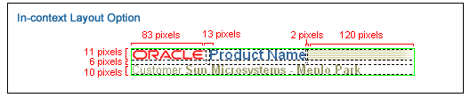
The diagram below shows layout and measurement positioning for each element, including logo, product name, and Extra Fill Image, and Context information.
Measurements - Contextual Branding Layout
Below are examples of customer customized branding areas. In these examples, the Oracle customer is NBC.
Branding Customer Customization Examples