Global Page Templates
Last Updated 07.31.03
General Description
Global Page Templates are used to construct application or suite areas that contain settings or other content that applies to the whole application or suite/portal. They are accessed from the Global Button component in the UI.
Contents of this BLAF Guideline document:
Guideline Attributes
Spec Version # - 3.1
Spec Contributors - Betsy Beier, Craig Louis
UI Models - all models
Example Products - all products
Related Guidelines -
Global Page Flow Guidelines: Contact Us,
Help System, Login/Logout,
Preferences, Return
to Portal.
Other Guidelines: Tabs, Page
Footer, Buttons (Global), Switchers:
Application and Context Switchers
- A Global Page is an area of information that is applicable to and accessible from the entire application, through selection of a Global Button.
- A Global Area may be a single Global Page or an assembly of pages - Selecting a Global Button may expose a single page with global content (a Global Page); that page may offer drilldown links to underlying global pages, and/or a persistent side navigation section - all of which together are defined as a single Global Area.
- Generally, Global Buttons and their subordinate areas should not be labeled with action names. Return to Portal and Login/Logout are exceptions.
- Global Buttons should not be used as the main navigation mechanism for the
application. The tab structure performs this function.
- An Application Switcher may be placed to the right of the Global Buttons.
It is not itself a Global Button and does not access a Global Page or Area.
See the Switchers: Application and Context Switchers
guideline for more.
When a Global Button is selected, it may be necessary to display a Warning
message to the user. If so, an error checking flow should be used. See the Save
Model and Messaging Templates
guidelines for details on Warning messages and saving work. The error checking
flow would be called for if:
- The task is not complete.
- Data has not been saved or submitted.
Global Page Templates are comprised of the following common components. This guideline illustrates where the different components are positioned in the UI for Global Page templates. All components may be configured with options offered by the individual separate BLAF Guideline documents for each, and the application-specific content. (Links in following list lead to related BLAF Guideline document.)
- Branding Area
- Global Buttons
One Global Button is active based on which Global Area is in view.
- Tabs/Navigation
- If tabs are used in the product, when in a Global Area, all tabs are enabled, but none are active. Horizontal navigation should not be used.
- The name of the Global Area is in the horizontal navigation area.
- Page Content Area
- Page Title or Headers depicting the Global Page Section name. (This is not necessarily the same as the Global Area name, especially when the Global Area contains many pages.)
- Instruction Text (as needed)
- Page Content
- Page Footer
The following sections describe the common Global Page templates assembled from the common components listed above.
The following describes Global Return to Portal Page interaction and usage.
- A "Return to Portal" button should be present on all intranet applications when a portal is present in the environment.
- A user may or may not have launched an application from the portal. Either way, a Return to Portal button can be present.
- When the Return to Portal button is selected, it may be necessary to display
a Warning message to the user. If so, the Return To Portal flow with error
checking should be used. See the Save Model and
Messaging Templates guidelines
for details on Warning messages and saving work. The error checking flow would
be called for if:
- The task is not complete.
- Data has not been saved or submitted.
- If the user has launched the application from he Forms environment, a Return
to Portal Global Button does not appear. See the Navigation
Between Forms and BLAF Applications section of the Interapplication
Navigation guideline for details.
See the Global Button Flow: Return
to Portal guideline for details of page flow.
Login and logout can take place from an internet portal for hosted applications,
or from the starting page of a hosted application on an intranet. See Login/Logout
Flow for details on Login/Logout Page flow.
The following describes interaction and usage for both starting points.
Global Page Template - Login
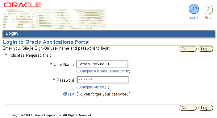
The Login Global Page should conform to the following interaction and content points:
- The Login Page must Contain Username and Password fields with inline Hints to aid the user
- If a "Forget Your Password?" flow exists, place a section level Tip with
link to that flow. For flow detail, see the Global
Button Flow: Login/Logout guideline.
- May include other fields, such as one specifying the specific database the user is logging into.
- The Login page should NOT offer language preferences. Changing languages is an infrequent task, and may also need to be accessed from within the application. Language preferences are set in the user Preferences global area. When the user first logs in, the language is based on the locale of the browser.
- The BLAF Page Title should be "Login to [Hosted Application or Portal Name]"
- The Login Page may contain a Login Page Title icon. See the Icon
Repository for BLAF guideline.
- On the Login Page, and Quick Login area, or login portlet, selecting the "Enter" key on the keyboard should act as selecting the "Login" action/navigation button in the UI.
The following graphic show schematic representations of page templates that
would appear if user input and submission on the Login page results in an error
condtion. For flow detail, see the Global
Button Flow: Login/Logout guideline.
Login Error & Ancillary Page Templates

- The Portal and Internet/Hosted applications have the notion of a "guest user" and a "registered user" or "valid user" (for portal). A "guest user" may be able to access certain generic or public information but not access the bulk of the application or portal functionality until he/she has registered (subscribed) to the service(s) provided. After the user has completed this registration process, every time the user comes to the hosted site in guest user mode, they must login to access their given functionality.
- The Login/Logout Global Button within hosted applications toggles depending on whether or not the user is logged in or not. (A user cannot access an intranet application unless they are logged in, thus a user would never have a login global button on an intranet application.)
- Once the user has logged in, more functionality within the application or portal may be exposed.
- It may be appropriate to show a Login ID once a user has logged in to the
application. See the Page Stamps guideline for
details on Login ID display.
- Intranet applications should follow a single sign on model, where once a user has signed on, he/she has access to all applications within the intranet environment.
- Intranet applications do not have the notion of a "guest user" mode. A user must login (from methods listed above) to perform functions within an intranet application.
Logout interaction is the same for the portal, intranet or internet/hosted applications.
Global Page Template - Logout
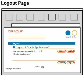
- To logout, the user selects the global Logout button. A warning message page is drawn, clearly asking the user if he/she would like to logout of all Oracle applications and associated applications. (Note: Single sign on will logout of all applications including external applications that the user has noted in their single sign on options.)
- If the user dismisses the warning message, he/she returns to the previous page and remains logged in.
- If the user accepts the warning message, he/she is returned to the page that was being viewed just prior to login.
- Logout will only log a user out of all applications, not individual applications.
- If a user is familiar with inherent browser functionality of Control-N (or menu selections) to open a new browser window, the logout scenario is as follows:
- It is possible for a user to select Control-N or browser menu functions to open a new browser window. If so, a second browser window will open. (The contents of this window follows standard browser behaviors for opening second windows through this command.)
- If two windows are open, and a user selects the global Logout button from the active window, the page will redraw with the Warning page asking the user if he/she wants to logout of all applications (see above for specifics.) If user accepts, the window will redraw to show the page that was being viewed just prior to logging in. The window behind will remain as is.
- After logging out, if the user closes the active browser window, the other application or portal window will come into view. (Note: the user is no longer logged in.) If the user selects any button, link, tab/navigation element on this page, the page will redraw with the global Login page, requiring the user to login again to perform other actions.
See Login/Logout Flow for details
of page flow.
The following figure shows a basic Generic Global Page template to be used for global areas that are modules specific to an application as well as the other common Global Button templates described in this guideline.
Generic Global Page Template

The basic Global Page template follows these guidelines:
- The tabs are all enabled, but none are active.
- The current module specific Global Button appears as active.
- The Global Area name is the same as the Global Button name. It does not change while the user is navigating through to Global Areas. (ie, Preferences, Contact Us, etc.)
- The page title is specific to the page within the Global Area. For instance, General Preferences or Application X Settings.
- Content within the Global Area should follow BLAF guidelines and principles.
See the Introduction to BLAF Page Templates
guideline for more.
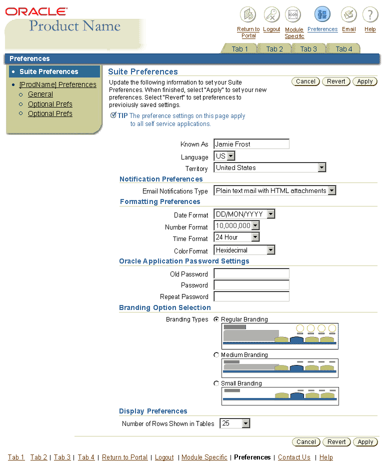
Preference settings, accessible from the global Preferences icon, allow users to adjust certain display and interaction options to their liking. Preferences fall into two main categories, Suite Preferences, and Application Specific Preferences.
- Suite Preferences: Allow the user to set preferences for all applications within a suite.
- Application Specific Preferences: Allow the user to set preferences for the application they are currently using.
See General Preference Settings for BLAF Applications, an ancillary document that lists many of the desired global settings, divided between suite-wide and application-specific global preference page content. Generally speaking, suite and application preference options are mutually exclusive; ie, a particular preference setting does not appear both in an application specific preferences page, and in the suite preferences page.
- A "Preferences" button should be present on all intranet applications.
- A product may or may not require application-specific preference settings, but in an intranet environment, at minimum an application suite preferences section should appear that allows the user to customize settings for all intranet applications, even if they would have no effect on the currently logged-into application.
- Other types of preferences that belong in this area are user options and/or configurable content settings that effect the entire application, not local to a specific section or page of the application.
- If a user has the responsibility to set up content or configurations for other users (a super-user or system administrator), these setup options are not located in Preferences, but are in the application content hierarchy, and are visible only to super-users.
- See the Global Button Flow: Preferences
guideline for details of page flow.
Preferences should be presented in groups defined by page content section headings, as shown in the graphic samples below. As appropriate, an inline Tip and/or Page Title should indicate whether the visible settings apply to the current application or to all applications hosted through the portal or suite.
Preference settings commonly fall into the following areas:
- Turn On/Off General Application Features: These include Instruction Text, Hints and Tips, and Personalization options. This allows for turning off of supplementary messages when users are using an application frequently or for long sessions.
- Display: Including table display options.
- Formatting: This includes language preferences, territory or time zone offsets, date and time format, currency, number formats, etc.
- Personal: Including user nicknames, AKA (Also Known As), passwords.
- Accessibility: Including redundant link removal, and secondary window information displayed in primary window.
- Notification: Including email delivery settings, such as HTML/plain text, plain text with HTML attachments.
The following figure shows a sample global Preferences Page template as used for Suite Preferences.
Global Page - Suite Preferences sample
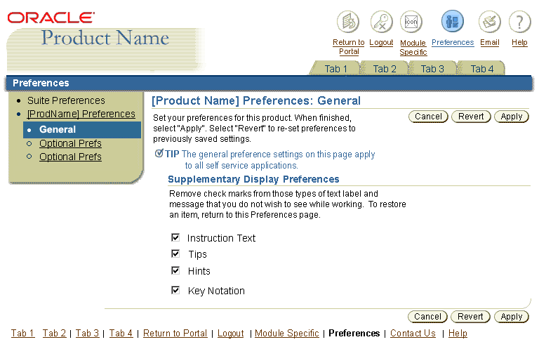
Global Page - Application General Preferences sample
The following is a generic example of a Contact Us page. It may contain other content as required by the application.
Global Page - Contact Us

The following describes Global Contact Us Page interaction and usage:
- A "Contact Us" Global Button is optional.
- The Contact Us Global Button launches a global Contact Us page template. The page contains links to specific email addresses the user can select from to get answers to his or her questions, depending on the nature of the question. There may also be phone numbers, fax numbers and other addresses on this page. This approach eliminates unnecessary email sent to the wrong parties, by targeting the content of the email to a specific email address; for instance technical questions would go to a Technical Support person, Help questions to Help Desk, etc.
- The Contact Us page should be designed using sections (subheaders) to organize the content on the page.
- See the Common Formats Guideline for detailed
layout of address, phone number, contact person information or other common
contact information.
See Global Button Flow: Contact Us
guideline for details of page flow.
The following figure shows sample Contents and Topic pages in the Global Help Page template.
Global Page - Example of Oracle Help for Web (OHW) Contents and Specific Topic Page
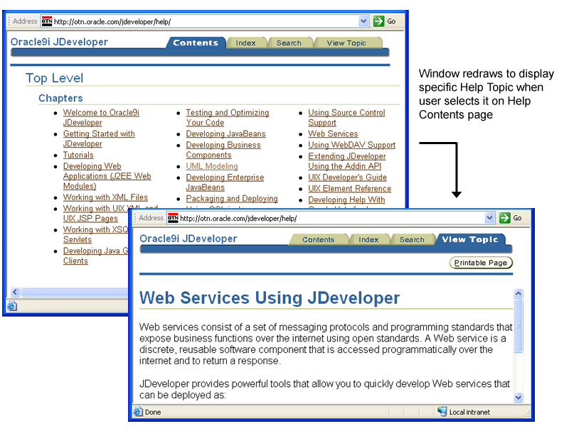
The following describes Global Help Page interaction and usage.
- A "Help" button is required.
- Once the Help button is selected, a smaller non-modal secondary window opens
, allowing the user to view Help information side-by-side with the application.
See Help Template guidelines for more information.
If the application is designed in compliance with BLAF guidelines, the Help system should not be focused primarily on specific UI how-to information. The Help system should contain business processes, policies, and extra contextual information to enhance the application and users domain knowledge.
For example, Help may contain:
- An overview of application functionality - not an explanation of the UI, but how to accomplish goals through use of the UI
- Explanation of technical support resources and link to Contact Us tab/page
- Business unit contact lists
- Technical explanations of business process parameters, such as duration limitations on transactions
- Narrative policy discussion with links to supporting documents.
BLAF provides many inline user guidance methods (Instruction Text, Messaging, Tips, Hints, etc.) that should be used in the context of the application page. The inline help should be the most reliable user guidance mechanism, not the Help system. However, if a topic is of necessity verbose, consider a contextual Help link.
If documentation sufficient for a full Help System is not available, a Simple Help Global Area in the primary window may be used.
A Simple Help Global Area should contain at maximum only a few BLAF compliant pages. See the Preferences Global Page Template section of this guideline for a similar template.
When inline messaging is not sufficient, links to specific topics in the Help system may be placed in context on the application page.
Direct links to topics in the Help system may be appropriate to expand on inline user guidance. "For more details, use the Help System." (Help System would be link text.) might be placed within:
- Instruction Text
- Tip Text
- Content Container Text
Contextual Help links are not recommended for:
- Information Messages - Generally, Information messages should not require added contextual links to the Help system. The information they provide should be sufficient.
- Bubble Help (ALT Text) - There should be NO link to the help system within Bubble Help.
See the Messaging Templates and
related guidelines and for complete details on inline user guidance. See the
Context Sensitive Help section of the
Help Methods guideline for a more complete discussion
of context sensitive Help.
For detailed Global Button layout and Enabled, Active, and Disabled state graphics,
see the Visual Specifications section of the Buttons
(Global) BLAF Guideline.
See the Global Level section of the
Tabs/Navigation guideline for an explanation of how
the Global Area Name is displayed. Also see Visual Specifications: Global Level
in the same guideline.
See the Tabs/Navigation guideline for details on display,
layout, and interaction of active, enabled (but not active), and disabled tabs.
Open Issues
none
Closed Issues
01-Aug-2002 - Added help Global Page templates.