Tabs/Navigation
Last Updated 09.04.03
General Description
Tabs and their associated navigation components allow the user to move through and preform work with BLAF applications. There are multiple tabs/navigation component combinations, and multiple options for each component. As a user navigates or drills down to more detailed content and functionality, each lower level is just a subset of the previous level. There are common tab/navigation configurations, each with specific recommendations for usage.
This document covers Tabs/Navigation components in the sections listed as follows:
Guideline Attributes
Spec Version # - 3.1
Spec Contributors - Betsy Beier, Raymond Wong, Lisa Serface, Craig Louis
UI Models - All Models
Example Products - All Products
Related Guidelines - Branding, Buttons
(Global), Page Footer Options, Browse
Menu, Intraapplication Navigation,
Instruction Text, Language
in UI: Tab/Navigation Section, All Page Templates,
All Page Flows
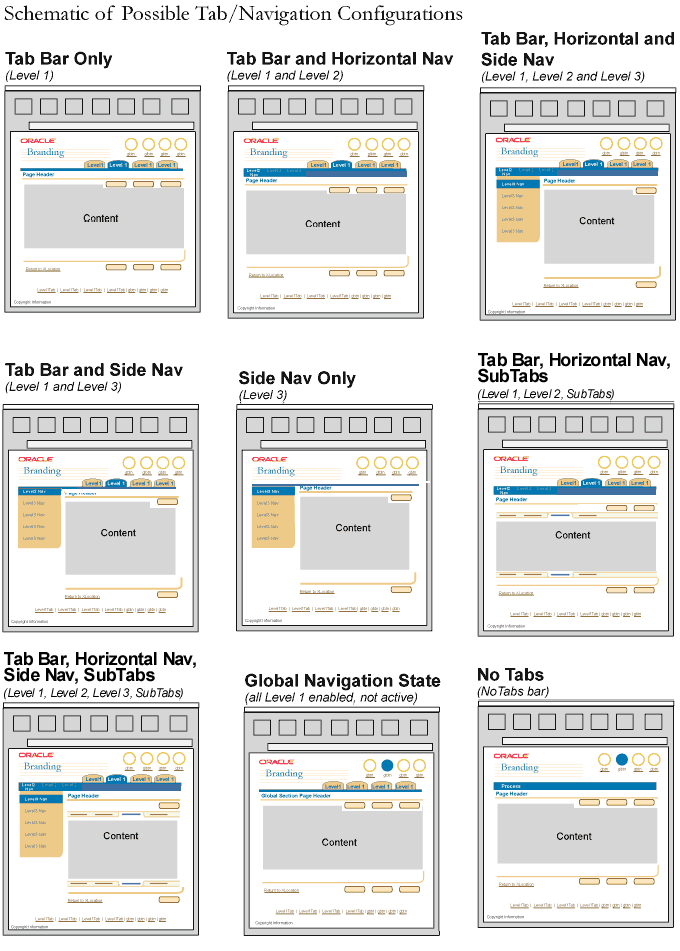
- Tab Bar (Level 1 only)
- Tabs and Horizontal Navigation (Level 1 + Level 2)
- Tabs and Side Navigation (Level 1 + Level 3)
- Tabs, Horizontal Navigation and Side Navigation (Level 1 + 2 + 3)
- Side Navigation Only (Level 3 acts as Level 1 [no level 2 possible])
- Tabs, Horizontal Navigation and SubTabs (Level 1 + Level 2 + Level 3)
- Tabs, Horizontal Navigation, Side Navigation and SubTabs (Level 1 + Level 2 + Level 3 + Level 4) (Rarely Implemented)
- Task/Property Menu and Tab/Navigation Configuration Options
- Tab Bar and Task Menu
- Tab Bar, Horizontal Navigation and Task Menu
- Global Level and Task Menu
- No Tabs and Task Menu
- Global Level
- No Tabs
Schematics of All Tab/Navigation Configurations
States: The Tabs, Horizontal Navigation, Side Navigation, and SubTab elements have 3 states:
- Enabled (Available for selection, but not active)
- Active
- Disabled
When navigating at the Global level, Tabs can only be in the Enabled or Disabled
state. The currently selected Global Button takes the Active state. See Buttons
(Global) guideline for more information.
Information Design: Application content should be distributed relatively equally among all levels of navigation. For instance, one section should not have 80% of the application content and functionality, while 3 other tabs share only 20%. It is recommended to assess all the content and functionality of an application before determining levels of navigation to prevent poor information design.
Language Used in Tab/Navigation Components: See the Language
in UI: Tab/Navigation Section guideline for verbage detail and writing style
hints.
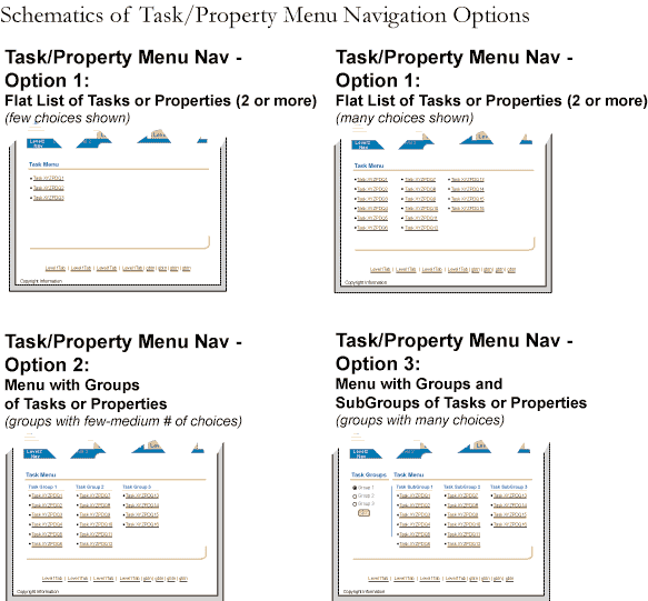
Schematics of All Task/Property Menu Configurations
States: The Task/Property Menu has only 2 states, Active (as a link) or Disabled (item is not a link.)
Information Design: The Task/Property Menu should only be used with all other tab/navigation structures and/or when a user has drilled down deep within an application. Information design using the Tab Bar, Horizontal Navigation and Side Navigation is a better solution for progressive disclosure of information.
Language Used in Task/Property Menu: The Task/Property Menu title, groupings,
and actual listing should be contextual to the application. (Do not use default
terms like "Property Menu", "Task Group" or "Task Menu." Also, see the Language
in UI: Tab/Navigation Section guideline for verbiage detail and writing
style hints.
The labeled Tabs protruding from the top of the Tab Bar are the highest navigation controls on the application level. These Tabs allow the user to navigate through the major content areas of the application. (Above them are only the Global Buttons/Links, which may link out of the application, or provide access to application/suite/portal meta tasks.)
Tab Bar Only

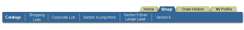
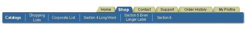
- Minimum/Maximum: There must be at least 2 tabs on the Tab Bar. The recommended maximum is 6-7 tabs; this is to prevent horizontal scrolling caused by too many tabs, and/or growth of text strings from translation (estimate 30% growth of all text strings after translation). Also, limiting the number of tabs contributes to ease of use. (See Minimum/Maximum Examples in the Visual Specifications section below.)
- Naming: Tab labels should represent content areas, not action items. And they should not a mixture of both content and action.
- Label/Bar Color: When a tab is selected, the style and color of the tab and text label changes to represent the Active state. For details, see Text Styles and Colors in Visual Specifications, below.
- Defaults: The left-most tab on the Tab Bar should be the default active tab. When the application is translated to a bi-directional language, the right-most section in the Horizontal Navigation element is the default.
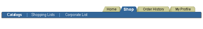
Horizontal Navigation sections, the subordinate embedded "tabs" inside the Tab Bar itself, act as a filter of the contents or actions of the selected level 1 tab . A level 1 tab may or may not have subordinate level 2 Horizontal Navigation sections; ie, the level 2 Horizontal Navigation selections appear only when the application content areas defined by level 1 tabs have subordinate content sections.
Tab Bar and Horizontal Navigation
- Defaults: If a level 1 tab which has subordinate level 2 content sections is selected, one of two default results may be employed. A specific level 2 tab can be set as the default, or no default is set and an overview of all the selected level 1 content appears. Either option is valid, but the approach should be consistent throughout the application:
- No Default Level 2 Selection: When no default level 2 section is specified, a page appears that represents the total content of the application area defined by the selected level 1 tab, and none of the level 2 selections in particular. None of the level 2 tabs are in the selected state.
-
For example, the level 1 tabs of a web based store may be "Clothing," "Books," "Shoes," and "Housewares." If the "Books" tab is selected, the page may redraw and show specific books that are on sale, plus the latest book releases - all in the content area of the resultant page. Level 2 navigation selections would be available, so that the user can easily filter the books section into categories like "fiction," "history," "fantasy," etc.
Level 2 Default Selection: In this model, when one of the level 1 tabs is selected, one of the level 2 tabs is selected by default, and the page displays the subset of level 1 content defined by that level 2 navigation section. The left-most Horizontal Navigation section should be the default. When the application is translated to a bi-directional language, the right-most section in the Horizontal Navigation element is the default.
- Using the web based store example above, if the "Books" level 1 tab is selected, it may be appropriate that one of the level 2 navigation sections, "Fiction," is automatically selected. The "Fiction" section may be the most popular section under "Books" tab, and user tests reveal this to be the expected default section.
Filtering Not Reorganizing: Horizontal Navigation tab sections should not be used as various ways to view level 1 tab information. Level 2 tab pages should be used as a filter of all level 1 tab information and/or filter of all the possible actions available for the selected level 1 tab.
Minimum/Maximum: Minimally, the Horizontal Navigation must have at least 2 sections. There should be a maximum of 6-7 sections to prevent horizontal scrolling caused by too many sections, and/or growth of text strings from translation (estimate 30% growth of all text strings after translation). Also, limiting the number of sections promotes ease of use. (See Minimum/Maximum Examples in the Visual Specifications section below.)
- If it is not possible to structure application content and functionality within this maximum number, then another tab/navigation component combination option should be used.
Naming: Horizontal navigation sections and their labels should represent content areas, not action items. And they should not be a mixture of both content and action.
Bar Color Constant: When a Horizontal Navigation section is selected, the color and style of the section text label changes to Active, but the background color does not change.
Level 3 Optional: A Horizontal Navigation section (level 2) may or may not have level 3 navigation available.
Level 3 Defaults Optional: A Horizontal Navigation section, once selected, may default to the entire contents of that section, or a subset of contents within that section (a Side Navigation section.)
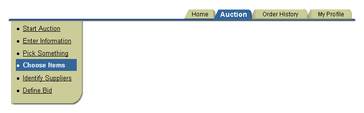
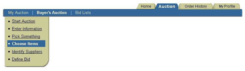
Side Navigation, the left-side vertical menu bar that hangs below the horizontal Tab Bar, contains either a flat list of content sections, or actions. Side Navigation may be used alone, with the Tab Bar (as a filter of the selected Tab section contents), or with the Tab Bar and Horizontal Navigation (a filter of the selected section in the Horizontal Navigation).
Tab Bar and Side Navigation
Side Navigation Only
NOTE: See additional Side Navigation options below.
- Filtering Not Reorganizing:
- Side Navigation sections used with the Tab Bar and without Horizontal Navigation should not be used as various ways to view the selected Tabs' information, but only as a filter of the Tab content and/or filter of all the possible actions available for that selected Tab.
- Side Navigation sections that have a Tab Bar and Horizontal Navigation present are a filter of the selected Horizontal Navigation section or a list of possible actions available for that selected horizontal section.
- May Appear on Drill Down Page: Side Navigation may appear as a drill down page from a page with Tabs and Horizontal navigation. For instance, if a Horizontal Navigation section is an object list, like Purchase Orders, on that page there may not be Side Navigation. But when a specific purchase order is selected from the object list, the user navigates to the specific purchase order. That page may have Side Navigation.
- Minimum/Maximum:
- Side Navigation allows for an unlimited number of sections.
(NOTE: Too many sections will create vertical scrolling, as well as complicate the user interface.)
- Side Navigation may have a total of 3 hierarchal section levels: primary sections, nested subsections, and nested sub-subsections. It is recommended only to use the primary and secondary levels. See Side Navigation Section Configuration Options, below, for illustrations.
- Naming: Side Navigation sections and their labels should be content areas or task pages, but not a mixture of both.
- Bar & Label Colors: When a Side Navigation section is selected, the background color, section text color and style of that section changes to Active.
- Defaults: The top-most section in the Side Navigation should be the active section by default.
- Persistence: When the Side Navigation component is used, it is persistent and shown when each section is active within that Side Navigation. When a user is on a page with Side Navigation, and they select an item that navigates to a drill down page, the drill down page does is not required to have Side Navigation.
- Side Navigation Only Configuration: Side navigation can be used without Tabs in the Tab Bar or Horizontal Navigation. This configuration is good for:
- Applications that have over 6-7 sections or content areas to the application.
- A "flat" information structure, where multi-level groupings of content or functions between higher and lower levels does not fit the users mental model of the application task.
- SideNav & Task Menu: The Task/Property Menu and Side Navigation have similar properties. See below under Task Menu: Task Menu vs. Side Navigation for detailed usage recommendations.
- Static Sections: Side Navigation sections are static in name and order,
and may not be deleted by the user. They may not be re-ordered, renamed, or
deleted by the user. The Tree component is the proper
component to use for dynamic content.
The Side Navigation element has multiple configuration options, as explained in the following sections:
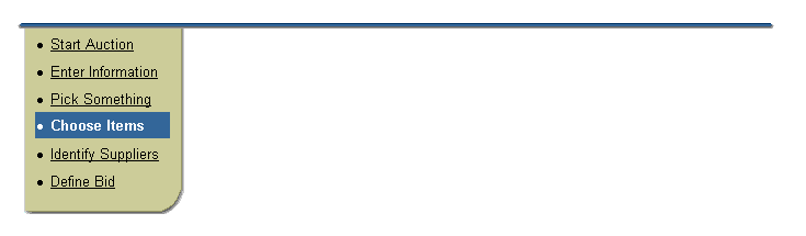
Side Navigation Option 1: No Numbers
- This option allows for an unknown number of tasks or options, in any order. It is the most flexible for unknown number of possible Level 3 sections.
- The list should be bulleted if section label text wraps.
- It is recommended that list item text be shortened to minimize vertical scrolling.
Side Navigation Option 2: Numbers
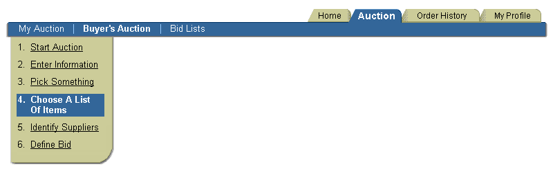
- This option is recommended for encouraging ordered task performance, when ordered performance is not actually required. This option allows a user to skip numbered sections if needed, as well as move back and forth between numbered sections as necessary; the numbers encourage a preferred order of task performance.
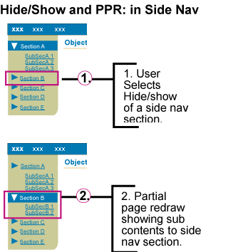
Side Navigation Option 3: Hide/Show Sub Navigation
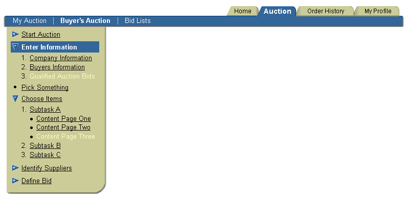
- This option is flexible for unknown numbers of sections. This allows for different section selections for different user roles, for example.
- This option allows for meaningful grouping of tasks and subtasks within Level 3.
- This option is not recommended when the user needs to see all options simultaneously.
- Hide/Show differs from a Tree within Side Navigation in that:
- It is predetermined with fixed sections.
- It is not user manipulated; i.e., the hierarchy of the sections, subsections and sub-subsections cannot be renamed, reordered, or deleted.
- It has a finite number of levels (3 total).
- Each Hide/Show section can accommodate up to two inner level sections: Subsection and sub-subsection.
- Subsections and sub-subsections within Hide/Show should be either content areas or task pages, but not a mixture of both.
- Bullets should be used whenever subsections/sub-subsections are not part of an ordered sequence. When Side/Navigation item text is long enough to wrap, bullets clearly delineate separate Side/Navigation items.
- When a Hide/Show section icon is selected, it expands or collapses the entire section including all subsections and/or sub-subsections. When the Hide/Show section text link is selected, the content page for that section is shown.
- Hide/Show navigation is only allowed on the first Side/Navigation section level.
- Hide/Show navigation may only be used for Side/Navigation sections that contain subordinate sections: subsections with or without sub-subsections.
- A mixture of Hide/Show and non-Hide/Show Side/Navigation sections is allowed, providing for sections that do not contain subsections.
- Hide/Show navigation does not have to be on all first level sections within Side Navigation, and is used only when needed.
- The Hide/Show element within Side Navigation should use Partial Page Rendering (PPR) technology.
- When the Hide/Show element is selected, only the new contents within that section are redrawn, not the full page.
- If PPR is not available (unsupported browser, or other reason), the behavior defaults back to a full page redraw.
- Side Navigation Option 3: Hide/Show Using PPR
Side Navigation Option 4: Long List with Sub Navigation as Indented List
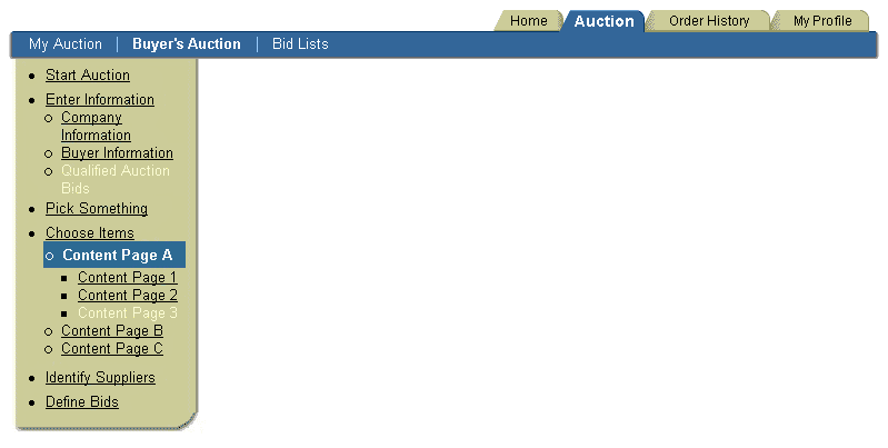
- This option allows the user to see all available sections simultaneously, at a glance.
- This option allows for meaningful grouping of tasks and subtask within Level 3.
- This option is best used when task at this level is conducted over a long period of time, and may require preparation work.
- Subsections and sub-subsections should be either content areas or task pages, but not a mixture of both.
- Bullets should be used whenever subsections/sub-subsections are not part of an ordered sequence. When Side/Navigation item text is long enough to wrap, bullets clearly delineate separate Side/Navigation items.
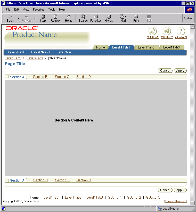
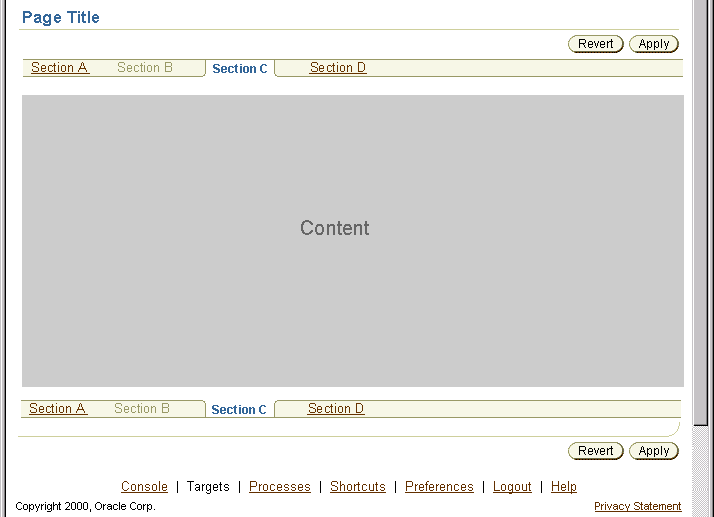
SubTab Navigation may be used with the Tab Bar and Horizontal Navigation (as a filter of the selected Horizontal Navigation section).
NOTE: See Object
Templates: Object Template with SubTab Navigation for more information on
using the SubTab component template.
First SubTab Selected - Example
Middle SubTab Selected - Example
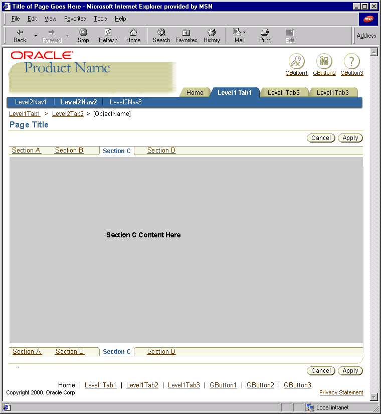
- SubTab Sections: Each SubTab content section name appears as a SubTab label on both upper and lower SubTab bars.
- Upper &Lower Subtab Bars: The upper and lower SubTab bars define SubTab component content area on the page. Selecting a SubTab section tab causes that section's content to appear in the SubTab content area.
- The lower SubTab Bar appears at the bottom of the page, directly above the Page Contents Bottom Line (the Ski). The lower SubTab Bar repeats the section selection of the upper SubTab Bar.
- Tabs With or Without Horizontal Navigation: MUST BE PRESENT when using the SubTab Bar. Side Navigation may also be used with the SubTab Bar, but that is not a recommended combination.
- Minimum/Maximum:
- The SubTab Bar must have at least 2 sections.
- There should be a maximum of 6-7 sections, to prevent horizontal scrolling caused by too many sections, and/or growth of text strings from translation (estimate 30% growth of all text strings after translation). Also, limiting the number of sections promotes ease of use. (See Minimum/Maximum Examples in the Visual Specifications section below.)
- If it is not possible to structure application content and functionality within this maximum, another Tabs/Navigation component combination should be used.
- Side Navigation has similar properties to SubTab Navigation, yet is more extensible. See Side Navigation for detailed usage recommendations.
- Naming: SubTab Navigation sections and their labels should be content areas.
- Bar & Label Colors: When a SubTab Navigation section is selected, the background color, section label text color and style of that section changes to Active.
- Defaults: The first section in the SubTab Bar should be the active section by default.
- Persistence: When the SubTab Navigation component is used it is persistent, and is shown when each SubTab section is Active (selected).
- Selecting a SubTab section should not cause the SubTab component to disappear.
- Selecting a higher level Tabs/Navigation component, such as a Horizontal Navigation section or a different level-1 Tab, may cause the SubTab to disappear.
- The SubTab component persists, regardless of which SubTab section is active, as long as a higher level Action/Navigation control is not selected by the user.
A Task/Property Menu is a list of links used to navigate the user to a task
or process. It is either a list of actions or a list of object properties displayed
in the content area. It can be used at almost all levels of navigation. This
type of menu allows for highly scalable number of tasks or properties to be
displayed at one time. (For an category/catalog centric menu, see the Browse
Menu guideline.)
NOTE: The Task/Property Menu can be built using Adjacent Headers and standard HTML bullet list.
Task/Property Menu - Option 1a
 |
Task/Property Menu - Option
1b
 |
Task/Property Menu - Option
2
 |
Task/Property Menu - Option
3

|
- The Task/Property Menu is either a list of tasks, or a list or properties
of an object but not a combination of tasks and properties.
- The Task/Property Menu should be used after all other tab/navigation solutions
have been evaluated, and should not be the main navigation method for an application.
- When the Task/Property Menu is displaying tasks: the menu is a filtered list
of actions, based on where the user is within the application or what level of
navigation the user is at.
- When the Task/Property Menu is displaying properties: the menu is a list or
properties relating to an object. The user selects one of the properties and drills
down to perform functions.
- Minimally, there must be at least 2 tasks or properties in the menu.
- If a large number of tasks or properties are displayed in the menu, categorization
of the tasks/properties should be applied to the list to make the list more usable
and manageable. See the options available under visual specifications.
- If the list in the menu is categories (like a catalog) and not object properties
or tasks, the Browse Menu should be used. See
guideline for details.
- If an action or property is not available for a specific user type, it should
not display in the menu. If an task or property can be accessed by a user some
of the time, but not all of the time (depending on context) the task or property
should be displayed in a disabled state.
- There is no "active state" of an action or property in the menu, since the
menu is not persistent throughout the subsequent pages or process.
- The Task/Property Menu is not persistent. Once an task or property is selected
from the menu, the page is redrawn to the task page, first step in the task,
or list of elements that belong within the objects property. Common templates
displayed after the Task/Property Menu page are: 1
Step/Transaction Page, 2 Step
Process Templates, Step by Step (3[+]
Steps) Templates, and Object List Templates.
It may be appropriate on the subsequent task or property page(s) to use a
"Return to [Task/Property Menu]" link for quick navigation back to the menu.
See Links guideline or the above appropriate template
guidelines for details.
- There is no default "active" action or property in the menu, since there is
no "active state" within the menu.
- The Task/Property Menu has multiple configuration options (see pictures above
for more details):
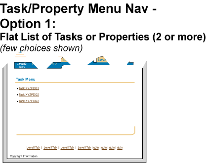
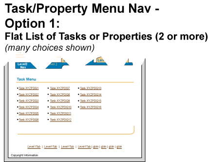
- Option 1: Flat List of Actions or Properties(2 or more)
- This option is most flexible for unknown number of actions or properties that
might be available at this level within the application.
- The actions or properties are displayed in columnar format (newspaper-style)
when the list is large.
- When the list is large, the actions or properties should be equally distributed
among columns.
- The tasks or properties should be put in some logical order, depending on
the context (i.e., alphabetical, by frequency of use)
- This option shows the user at first glance all the actions and or properties
that are available to perform or drill down on.
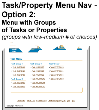
- Option 2: Task/Property Menu with Groups of Tasks or Properties
- The above "Option 1: Flat List of Actions or Properties (2 or more)" are applicable
for Option 2.
- This option allows for meaningful grouping of tasks or properties within the
menu.
- Option 3: Task/Property Menu with Groups and SubGroups of Tasks or Properties
- This option allows for meaningful grouping and subgrouping of tasks or properties
within the menu.
- This option is not recommended to use if the user needs to see all the options
at one glance.
- This option is the most scalable.
- Task/Property Menu vs. Side Navigation - since Side Navigation and a task/property
menu have many similar properties (each type of navigation have the ability to
display a large number or items) below are some distinctions on when to use when
versus the other.
- Side Navigation is persistent, and maintained throughout each section within
the side bar;
Task/Property Menu is not persistent; after a selection is made, the page is redrawn
without the menu.
- Side Navigation allows for easy/quick navigation from task to task since the
tasks/sections are persistent (e.g. reading different related Help topics);
A user must navigate back to the Task/Property Menu for all the options.
- Side Navigation may contain a numbered order of sections or tasks encourage
a linear order to completion;
Tasks or properties in the Task/Property Menu are not in numbered order.
Global Level is the state that the tab/navigation component renders when a
global button is accessed. (Also see Buttons (Global)
and Global Page Templates guidelines
for more information.)
Global Level Tab
- The global Level is available from any place in the application, and should
contain content or actions that are applicable to the entire application.
- When a global button is selected, the tabs in the Tab Bar become enabled,
and none remain active.
- The Global Level may also have Horizontal Navigation and/or Side Navigation
if there are many pages associated with that global section.
- The global Level may be sequence of pages that perform a linear task (see
Locator Elements: Train guideline)
- If the user selects a global button (i.e., global section) and the section
is multiple pages, Text MAY be placed in the blue bar as the *section* name (name
of entire global section). There still MUST be a page title on the page. This
page title changes per page, but the section name is constant.
- If the global section only contains one page; text does not have to appear
in the blue bar stating the global section name. The blue bar must still remain
on the page. There must also be a page title on the page, though.
- See Global Page Templates for details.
No Tabs option may be used if an application does not have tabs or navigation levels.
No Tabs or Levels
- The No Tab option can not be used with tabs, Horizontal Navigation
or Side Navigation (all options.)
- Some small applications that don't have tab/navigation structures
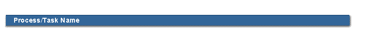
may use text in the blue bar to act as the "module name" or "process
name." The text is FIXED throughout the application. These pages MUST
also have a page title. The page title changes per page. This is a rare
case, since typically the module name goes in the product brand name,
and the blue bar just remains blank.
- The blue bar does not need to have text, and should still remain on
the page even if it is blank.
Visual Notes for Tab and Tab Bar
- The text label for Level 1 tabs is constrained to one line (no wrapping
allowed)
- There is no visible "a href" link on Level 1 text.
- The tabs in the Tab Bar are visually right aligned in the Tab Bar.
There is some extra space on the right edge of the Tab Bar. The first
tab, commonly the home or welcome tab is the left most tab in the tab
set.
When the tabs and Tab Bar are rendered in bi-directional languages,
the tabs and Tab Bar are left aligned. The first tab in the Tab Bar
is the right most tab of the set.
Visual Notes for Horizontal Navigation
- The text label for Horizontal Navigation can wrap to only 2 lines
- There is no visible "a href" link on Horizontal Navigation section
text.
Visual Notes for Side Navigation
Tab Bar, Horizontal Navigation and Side Navigation
Side Navigation Colors and Spacing Measurements

Tab Bar
with One Disabled Tab

Horizontal
Navigation with One Disabled Section

Side Navigation with
One Disabled Section

SubTab Navigation with One Disabled Section
Note: Tabs and Horizontal Navigation must be present
when using SubTab Navigation.
Visual Notes for Disabled Tabs, Horizontal Navigation Sections and Side
Navigation Sections
- It is not recommended to make heavy use of the disabled state for
a tab or other navigation element.
Minimum Width for Horizontal Navigation

Suggested Maximum Number of Horizontal Navigation Sections
Suggested Maximum Number of Tabs in Tab Bar and Horizontal
Navigation Sections
Minimum Number of SubTab Sections within the SubTab Bar
Note: Tabs and Horizontal Navigation must be present when
using SubTab Navigation.

Suggested Maximum Number of SubTab Sections within the
SubTab Bar
Note: Tabs and Horizontal Navigation must be present when
using SubTab Navigation.

Visual Notes for Min/Max of Navigation Levels
- These minimum/maximum examples illustrate the recommended numbers
of tabs and sections to use in the Tab Bar, Horizontal Navigation and
SubTab navigation.
- The Side Navigation element provides an unlimited number of sections.
- The minimum width of the blue area (Level 2 - Option 1) which the
text labels sit on is 220 pixels.
- Suggested Max width of Side Navigation (all Options) - the beige "bar"
is 155 pixels (shadows not included). After this point, the text should
wrap.
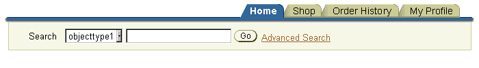
Quick Search with Navigation (NOTE: these are saved
with non-web safe colors)
Also, see Search and Query Templates for complete
details.
Tab Bar with Search
Tab Bar and Horizontal Navigation with Search

| |
Selected (Active) |
Enabled (Inactive) |
Disabled |
| Tab
Color |
Medium Blue; #336699 |
Dark Beige; #cccc99 |
Dark Beige; #cccc99 |
| Tab
Text Color |
White; #ffffff |
Black; #000000 |
Medium Beige; #ffffcc |
| Tab
Text Style |
Arial, 11pt (CSS),
Bold |
Arial, 10pt (CSS),
Regular |
Arial, 10pt (CSS),
Regular |
| Horizontal
Navigation Background Color |
Dark Blue; #336699 |
Dark Blue; #336699 |
Dark Blue; #336699 |
| Horizontal
Navigation Section Text Color |
White; #ffffff |
White; #ffffff |
Medium Blue; #6699cc |
| Horizontal
Navigation Section Text Style |
Arial, 10pt (CSS),
Bold |
Arial, 10pt (CSS),
Regular |
Arial, 10pt (CSS),
Regular |
| Side
Navigation Background Color |
Dark Blue; #336699 |
Dark Beige; #cccc99 |
Dark Beige; #cccc99 |
| Side
Navigation Section Text Color |
White; #ffffff |
Black;
#000000 |
Medium Beige; #ffffcc |
| Side
Navigation Section Text Style |
Arial, 10pt (CSS),
Bold |
Arial, 10pt (CSS),
Regular |
Arial, 10pt (CSS),
Regular |
| SubTab
Bar Background Color |
White; #ffffff |
Light Beige; #f7f7e7 |
Light Beige; #f7f7e7 |
| SubTab
Section Text Color |
Dark Blue; #336699 |
Link Brown; #663300 |
Very Dark Beige;
#999966 |
| SubTab
Section Text Style |
Arial, 10pt (CSS),
Bold |
Arial, 10pt (CSS),
Regular (a href/link) |
Arial, 10pt (CSS),
Regular |
| Global
Level Text Color (in blue bar) |
White; #ffffff |
n/a |
n/a |
| Global
Level Text Style (in blue bar) |
Arial, 11pt (CSS),
Bold |
n/a |
n/a |
- Task or Property Link
- Bulleted List
- Use native html bullet list.
- Task/Property Menu Title
- Use "header" style on white; see Header
guideline for details.
- Task/Property Menu groupings title
- Use "adjacent sub/subsubheaders"; see Header
guideline for details.
Open Issues
None
Closed Issues
2001-Dec - Side navigation and quick search should NOT be placed together.
2000-Oct-23 - can javascript rollover be used on sections in Side Navigation?
No. This is not ADA compliant, and not accessible without the use of a
mouse.
2000-Oct-23 - Side navigation can only be in a frame when the tree component
is used.
2000-Mar-13 - Use of Login ID: The login id that may optionally appear in the
UI after a user has logged in to an application will not be part of the
tab/navigation components. To see an example of login id placement, see Button
(Global) guidelines
