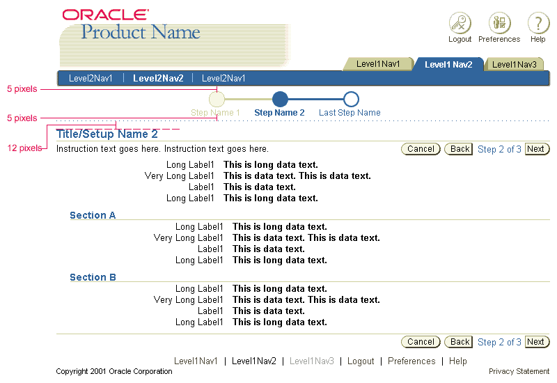
Space Above |
Space Below |
|
Breadcrumbs |
6 pixels | 1 pixel |
Quick Links |
6 pixels | None |
Train |
5 pixels | None |
Separator |
5 pixels | 5 pixels |
Page Title |
7 pixels | 2 pixels |
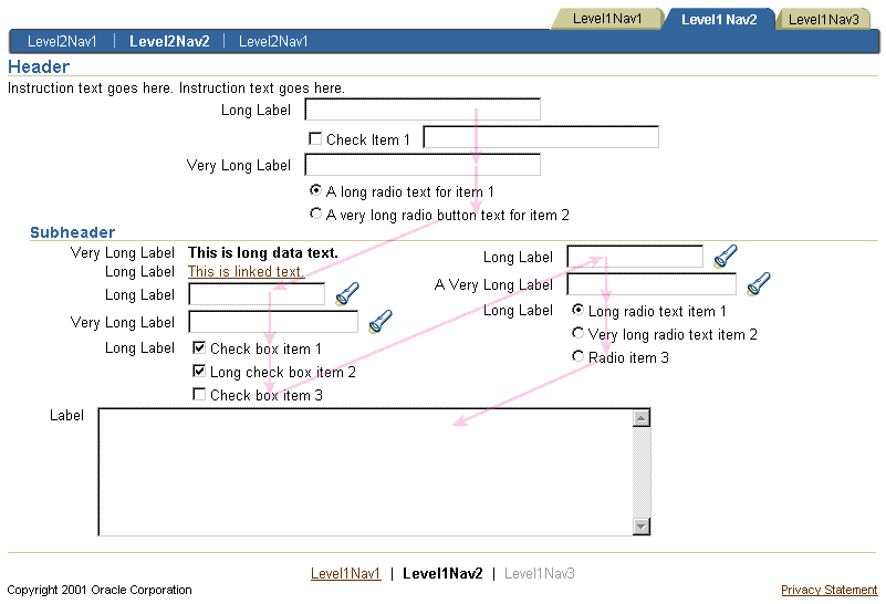
Subheaders |
10 pixels - 1st occurring Subheader on page 20 pixels - Subsequent Subheaders |
2 pixels |
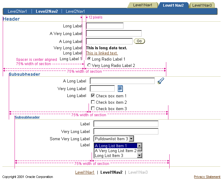
Subsubheaders |
10 pixels | 2 pixels |
Instruction Text |
3 pixels | None |
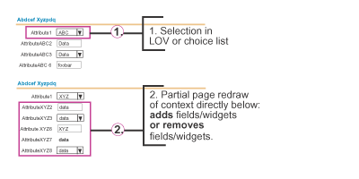
Message Box |
5 pixels | None |
Ski |
10 pixels | 2 pixels |