Standard Web Widgets
Last Updated
25-Nov-2003
The standard web widgets are native to HTML and allow
a user to either enter/update information (i.e., Text
Field and Text Area), or pick from between two or more
options (i.e., Radio Button, Check Box, Choice List
[Pulldown], List Box).
Web widgets 'look and feel' is
dependent on browser and operating system. As a result,
images in this document may vary based on the browser
and/or operating system in which they were originally
rendered.
Guideline Attributes
Spec Version # - 3.1
Spec Contributors - Betsy Beier, Lisa Serface,
Craig Louis, Lisa Rinderknecht
UI Models - all
Example Products - all
Related Guidelines - Content
Layout Templates, Shuttle,
Table Guideline, hGrid,
All Template Guidelines
The standard web widgets are native to HTML and allow
a user to either enter/update information (i.e., Text
Field and Text Area), or pick from between two or
more options (i.e., Radio Button, Check Box, Choice
List [Pulldown], List Box).
General Behaviors
- No instructions in widget, use hint text
- When read only, don't display widget; display
data as ready only
- Avoid hanging prompts (labels with no adjacent
widget or data)
- Disabled widgets and disabled text in widgets
are not recommended
- For truncation rules for certain Standard Web
Widgets, see Truncation
- In label data layouts, all standard web widgets
should have a corresponding label to be compliant
with accessibility standards. For more information,
see Content Layout
Templates
Types of Standard Web Widgets (fields, choicelist,
text area)
Native widgets used in BLAF applications and documented
in this Guideline include the following. Click on
the links to see the related section in this guideline:
- Text Field - A
single line area that lets users enter or update
data
- Text Area - A multi
line area that lets users enter or update data
- Choice List (a.k.a.
Pulldown List or Poplist) - A single line area that,
when selected, expands to allow users to pick a
single item from a list of items.
- List Box - A scrollable
list from which users can select either single or
multiple items.
- Radio Button -
A selectable circle element that must either be
selected (On) or unselected (Off). On is indicated
with a dot fill in the center of the circle. Users
can select only one Radio Button at a time.
- Check Box - A selectable
box that can either be checked On or Off. On is
indicated by a check mark or X inside the box. Users
can set any number of Check Boxes, including none.
- A Text Field is a single line entry for entering
or updating data.
Enabled Look of
Text Field

- A Text Field should not be disabled or non-editable.
If the data is not updatable, it should not be in
a Text Field, but displayed as view only.
Disabled
Text Field is NOT permitted

|
Read
Only Text Field (Becomes Label/Data)

|
- A Text Field should be sized according to the
data that the user is expected to enter.
- Every Text Field should have a corresponding label.
The label quantifies the data to be entered or updated,
and also is compliant with accessibility standards.
Text Field with
Label

- A default value in the Text Field is not necessary
if there is no current data for that item. If the
data previously exists, then the Text Field should
be populated with the most recent data as applicable.
Text Field with
Label and Data in Field

- So, for instance, if an address that a user
is changing appears in the UI, the Text Fields
in the form should be prepopulated with the current
address. If the user is about to enter a new address,
and there is no logical default (given the context)
the fields should be blank.
- Field Hints ("Type XYZ") should not be placed
inside a Text Field, Text Area, or Choice List.
If instructions are needed, place Hints, as explained
in Inline Messaging
Tips, Hints, and Bubble Text.
Text Field
with instructions is NOT permitted

|
Text
Field with hint

|
- Hint Text (inline tip text) may be used under
a Text Field to help the user fill out the field
using the proper data format. See Inline
Messaging Tips, Hints, and Bubble Text, Help
Methods, Language
in UI: Tip Text, and Messaging
Templates for details.
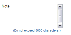
- A Text Area is a multi-line area for entering
or updating data.
Enabled

- A Text Area has the ability to vertically scroll.
- A Text Area has an enabled/active state and a
non-editable state. In most cases, a Text Area should
not be set to disabled, but just displayed as
view only data, if the data is not updatable. In
certain cases, though, it may be necessary to display
a non-editable Text Area. Below are some heuristics
for when to use a non-editable Text Area:
- A non-editable Text Area should be used in a
page with few to NO editable fields. Since an
uneditable Text Area appears the same as an editable
Text Area, it is recommended to not mix editable
and non-editable widgets on the same page, unless
it is clearly stated and obvious given the task
at hand.
- A non-editable Text Area is appropriate to use
if there is a very large block of text (i.e.,
a chapter from a book, a software license agreement,
or a large resume) that needs to be displayed,
as well as other elements like label/data pairs.
Since the non-editable text area has scrolling,
the entire page will not be forced to scroll as
much.
- Note: The text within a non-editable Text Area
can be selected, but not edited. Netscape 4.x
does not support this behavior, though.
- A Text Area should be sized according to the data
that the user is expected to enter or view.
- Every Text Area should have a corresponding label.
The label quantifies the data to be entered or updated,
and also is compliant with accessibility standards.
Text Area with
Label

- A default value in the Text Area is not necessary
for if there is no current data for that item. If
the data previously exists, then the Text Area should
be populated with the most recent data as applicable.
Text Area with
Label and Data in Field

- Field Hints ("Type XYZ") should not be placed
inside a Text Field, Text Area, or Choice List.
If instructions are needed, place Hints, as explained
in Inline Messaging
Tips, Hints, and Bubble Text.
Text Area
with instructions is NOT permitted

|
Text
Area with hint

|
- This widget is similar Radio Button since it allows
for only one choice at a time.
Enabled

- A Pulldown List is not disabled. If the data within
the list is not to be selected, the choice that
is selected should be view only.
Disabled
Pulldown List is NOT permitted
 |
Read
Only Pulldown List (becomes Label/Data)

|
- A Pulldown List is sized according to the longest
data string in the list. Items in the list should
not be truncated.
- The recommended number of items in a Pulldown
List is 20. There are exceptions to this, but in
general beyond 20 items in the list, the list may
become unmanageable. If a large number of items
exist, use an LOV
(see LOV
Guidelines.)
- Every Pulldown List should have a corresponding
label. The label quantifies the items to be picked
from in the list, and also is compliant with accessibility
standards.
Pulldown List
with Label

- There should be a default value for every Pulldown
List. Typically this is the first item in the Pulldown
List. Below are exceptions:
- Occasionally, given the task at hand, it may
be more appropriate to default a value other
than the first item in the list. For instance,
for an application configured for an audience
in France, it may be appropriate to default
a "Country" Pulldown List to "France." The default
items should be specifically chosen based on
the context of the Pulldown, and task at hand.
- In some contexts, a null value is a valid
choice. For these cases, defaulting the Choice
List to blank is recommended. This blank choice
represents a null data value. It is not the
same as specifying "None".
- If "None" and/or "All" is an appropriate choice,
these items may be put in a Choice List.
Pulldown List
with Label and Data in List

- Field Hints ("Type XYZ") should not be placed
inside a Text Field, Text Area, or Choice List.
If instructions are needed, place Hints, as explained
in Inline Messaging
Tips, Hints, and Bubble Text.
Pulldown
List with instructions is NOT permitted
 |
Pulldown
List with tip

|
- The selection of a item in a Pulldown List should
not initiate an action without first selecting an
action button.
- For instance, if a Pulldown List is associated
with filtering the contents of a table, first
the user must select the specific filter item
in the Pulldown List, then select a "Go" button
or some type of action button to instantiate the
action.
- There are only a few exceptions to this rule.
These exceptions are noted in the specific component
or template that the Pulldown is used.
- This widget is similar to a Radio Button group
and Check Box group in that it allows either single
selection or multi selection.
Enabled; Nothing
Selected

- A List Box may be set to only allow single
select behavior or allow single and multiple
select behavior.
- Multi-select behavior of a List Box should
be used only for more advanced users, since
multiple key strokes are required to activate
the selections. It is recommended to use Inline
Messaging: Hint Text under the List Box
if the functionality is active.
- A List Box is not disabled. If the data within
the list is not to be selected, the list should
be view only.
Disabled
List Box is NOT permitted
 |
Read
Only List Box (becomes Label/Data)

|
- A List Box is sized according to the longest data
string in the list. It is recommended not to have
a List Box scroll horizontally but it may occur
if an item in the list is very long.
- The recommended maximum line height of a List
Box prior to vertically scrolling is 20 lines. Beyond
20 lines, the List Box will vertically scroll. There
are exceptions to this, but in general beyond 20
lines, the list may become unmanageable.
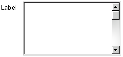
- Every List Box should have a corresponding label.
The label quantifies the items in the list, and
also is compliant with accessibility standards.
List Box with Label
 |
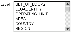
List Box with Label
and Data in Field
 |
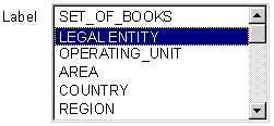
List Box with Label
and Data Selected in Field

|
- A List Box is commonly used in the Shuttle
component. See component for details.
- This widget allows for only one choice at a time.
Enabled; Not
Selected

Enabled; Selected

Disabled; Not Selected

Disabled; Selected

Read Only; Not Selected

Read Only; Selected

- 5-7 Radio Button choices is the maximum recommended
number of Radio Buttons that should be together
in a label/data format. Beyond 7 choices, a Pulldown
List may be a better selection option.
An exception to this is for Radio Buttons in a
"Select" column of a table. The number of Radio
Buttons that appear is determined by the number
of rows that are displayed in the table. See Table
Guideline for details.
- Every Radio Button should have a corresponding
label. The label quantifies the Radio Button to
be selected, and also is compliant with accessibility
standards.
- A set of Radio Buttons should have a group label.
Radio Button Group
- Vertically Aligned

- One of the Radio Buttons in a set should be defaulted
"on." HTML will automatically default one of them
as "on" but it is recommended that a specific Radio
Button is chosen as "on" based on the context of
the page.
Radio
Button Group - Multiple Columns

|
Radio
Button Group - Horizontally Aligned

|
- Radio Button groups can be vertically aligned,
horizontally aligned, or aligned in columns. Vertical
aligned Radio Button groups can be used when the
label text is lengthy, and when the page layout
is either single column or multi-column. Horizontally
aligned Radio Button groups can be used when label
text is very short. This layout is best when the
page is in a single column, since the horizontal
radio group may span 3/4 of the page width. Columnar
layout should only be used when the radio items
have very short labels, and the radio group is a
well known set of items. For instance, days of the
week may be placed in a columnar layout. This set
of items is very familiar, and can be easily read
as a group. (A radio group laid out in columns can
be very hard to read as a group if improperly used.
This may create usability problems such that users
do not know all the items within a group, or mistake
the columns as separate radio groups (mutually exclusive.)
- For nested radio group options, see Content
Layout Templates: Nested Label/Data Layouts.
- This widget allows for multiple choices at a time.
Enabled; Not
Selected

Enabled; Selected

Disabled; Not Selected

Disabled; Selected

Read Only; Not Selected

Read Only; Selected

- 5-7 Check Box choices is the maximum recommended
number of Check Boxes that should be together in
a label/data format. Beyond 7 choices, the shuttle
component may be a better solution for picking many
items.
- An exception to this is for Check Boxes in
a "Select" column of a table. The number of
Check Boxes that appear is determined by the
number of rows that are displayed in the table.
See Table Guideline
for details.
- Every Check Box button should have a corresponding
label. The label quantifies the item to be checked,
and also is compliant with accessibility standards.
- A set of Check Boxes should have a group label.
Check Box Group
- Vertically Aligned

- The default state for a group of Check Boxes is
to have all Check Boxes turned "off" (i.e., none
selected.) This default may be overridden, and one
or some Check Boxes turned "on" if the task at hand
and the context of the page is suited for this selection.
Check
Box Group - Multiple Columns

|
Check
Box Group - Horizontally Aligned

|
- Check box groups can be vertically aligned, horizontally
aligned, or aligned in columns. Vertical aligned
Check Box groups can be used when the label text
is lengthy, and when the page layout is either single
column or multi-column. Horizontally aligned Check
Box groups can be used when label text is very short.
This layout is best when the page is in a single
column, since the horizontal Check Box group may
span 3/4 of the page width. Columnular layout should
only be used when the Check Box items have very
short labels, and the Check Box group is a well
known set of items. For instance, days of the week
may be placed in a columnar layout. This set of
items is very familiar, and can be easily read as
a group. (A Check Box group laid out in columns
can be very hard to read as a group if improperly
used. This may create usability problems such that
users do not know all the items within a group,
or mistake the columns as separate radio groups
(mutually exclusive.)
- For nested checkbox group options, see Content
Layout Templates: Nested Label/Data Layouts
- Label (Used with All Standard Web Widgets)
- Every Text Field, Text Area, Pulldown List,
List Box, Radio Button Group, and Check Box
Group must have a label.
- Individual radio buttons and check boxes must
have corresponding text to the right of the
widget.
- A label quantifies the information that the
web widget contains, or information that is
to be entered.
- Group Label (Used with All Standard Web Widgets)
- Every radio group and Check Box group must
have a label.
Check
Box Group

|
Radio
Button Group

|
- A label quantifies the information that the
group of Radio Buttons or Check Box items contain,
or information that is to be entered.

- See Nested
Label/Data Layouts in the Content
Layout Templates guideline for information
on how to place multiple label/data groups.
- Data (View Only; Not in a Web Widget)
- A Text Field, Text Area, Pulldown List, or
List Box that is not updatable is view only
data. (Note: There are exception cases for a
Text Area. See above under "Text Area.")

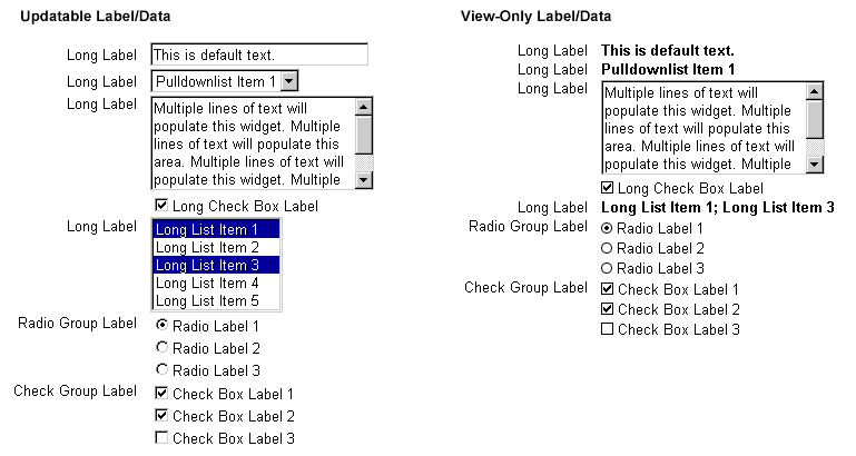
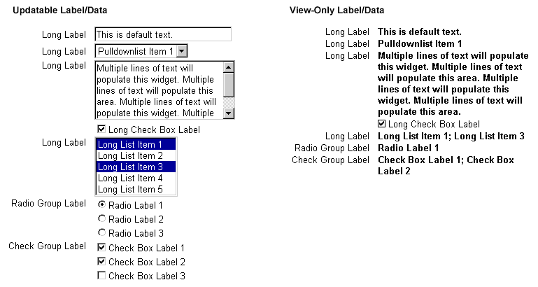
- Updatable and View-Only Label/Data
- Updatable Text Fields, text areas and droplists
have view-only options that are non-editable
text data.

- Updatable radio and Check Box groups have
view-only counterparts that show user selections
and are non-editable.


- Unsupported GUI Web Widgets
- The following web widgets are not supported
in HTML:
Below are examples of the look of standard HTML web widgets. For more layout
examples and exact measurements of widgets within a template, see Content
Layout Templates guideline.
- Text Style of Data inside Text Field
- Font Face = Arial, Helvetica, Sans Serif
- Font Style = Regular
- Font Size = 10pt CSS
- Font Color = Black; #000000
- Text Style of Data inside Text Area
- Font Face = Arial, Helvetica, Sans Serif
- Font Style = Regular
- Font Size = 10pt CSS
- Font Color = Black; #000000
- Text Style of Data inside List Box
- Font Face = Arial, Helvetica, Sans Serif
- Font Style = Regular
- Font Size = 10pt CSS
- Font Color = Black; #000000
- Text Style of Data inside Pulldown List
- Font Face = Arial, Helvetica, Sans Serif
- Font Style = Regular
- Font Size = 10pt CSS
- Font Color = Black; #000000
- Text Style of Radio Button Item
- Font Face = Arial, Helvetica, Sans Serif
- Font Style = Regular
- Font Size = 10pt CSS
- Font Color = Black; #000000
- Text Style of Check Box Item
- Font Face = Arial, Helvetica, Sans Serif
- Font Style = Regular
- Font Size = 10pt CSS
- Font Color = Black; #000000
- Layout Examples
- Label Text is used with all standard web widgets: a Text Field, Text Area, Pulldown List, List Box, Radio Button, and Check Box.
- Text Style for Labels and Group Labels
- Font Face = Arial, Helvetica, Sans Serif
- Font Style = Regular
- Font Size = 10pt CSS
- Font Color = Black; #000000
- Alignment
Labels are right aligned, and standard web widgets or view only data is left aligned.
- Text Style for View Only Data Not in a Web Widget
- Font Face = Arial, Helvetica, Sans Serif
- Font Style = Bold
- Font Size = 10pt CSS
- Font Color = Black; #000000
- Alignment
View only data is left aligned in the same manner as standard web widgets.
Labels are right aligned.
Open Issues
05-Jun-2003 - Automatic selection of default Radio
Button when a user places cursor in that selection's
label/data field is currently not supported in UIX
for functional/technical reasons.
Closed Issues
22-Aug-2000 - Pulldown List, Text Field, Text Area, List Box
do not have disabled state for version 2.0
22-Aug-2000 - Disabled text for Radio Button or Check Box?
unclear of use. Will explore for ver 2+


