Messaging Templates
Last Updated
15-Mar-2004
General Description
Standard Message Types
There are five BLAF application standard message types:
- Error - Alerts the user to errors due to data inaccuracies when submitting/saving a page.
Page requires immediate attention and/or correction before continuing.
- Warning - Alerts the user to a condition or a situation that requires a decision before continuing.
The user must provide some kind of input before continuing.
- Information - Provides contextual information about business practices and methods.
No interaction is required from the user, except when presented as a Message Page, in which case the user must acknowledge the message by clicking "OK", or a more specifically labeled button.
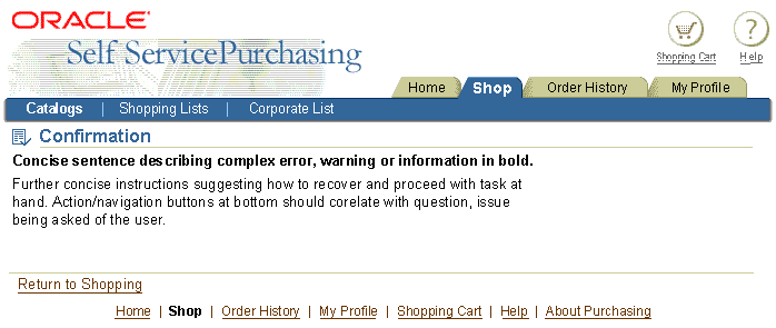
- Confirmation - Alerts the user to a confirmation that data has been submitted or changed.
No interaction is required from the user, except when presented as a Message Page, in which case the user must acknowledge the message by clicking "OK", or a more specifically labeled button.
- Processing - Informs the user that an action is currently being processed.
Where possible, provide an indication of the range of time required to complete the task.
Allowed Messaging Elements
- Inline Message - Message Box, Inline Message Icon and Text
- Message Page - Message Page Title, Message Text, Page Level Action/Navigation Buttons
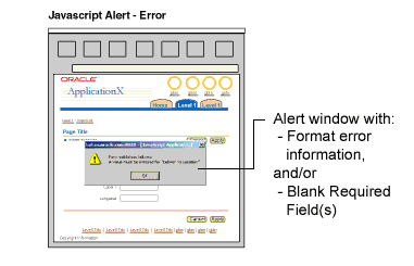
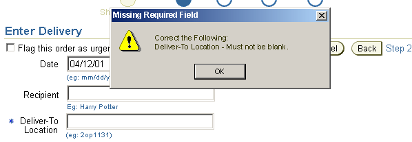
- JavaScript Alert - Alert window elicited by incorrect format/syntax input, or missing input in required fields. NOT RECOMMENDED and placed in this specification solely to document existing legacy UI implementations. Use of inline messaging is preferred over this technique.
NOTE: Inline messages and message pages are not displayed in secondary browser windows.
Guideline Attributes
Spec Version # - 3.1
Spec Contributors - Betsy Beier, Craig Louis
UI Models - all models
Example Products - all products
Related Guidelines - Icons, Language
in UI, Help Methods, Message
Box, Inline Messaging and Tips, Processing
Templates, and Messaging Flows
Interaction and Usage Specifications
General Principles
Message Layout Types:
Below is an outline of available message layout types. Click the links to jump to the rules and heuristic guidance for each type.
- Inline Message Box, Inline Message Icon and Text
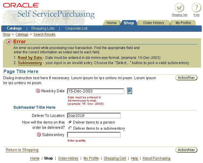
- A message "Box" at top of Page, icons inline with content denoting specific attention, and inline text with curt explanatory message.
- Inline Message Box Only
- A message "Box" at top of Page only.
- Inline Message Text with Icon - NO Message Box
- No Message "Box" at top, but has icons inline with content (denoting specific attention), and inline text with curt explanatory message.
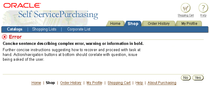
- Message Page
- A new page containing only the message information.
- This message type is best used when the user must make a decision regarding the message, and action/navigation buttons need to appear.
- Javascript Alert Window
- Elicited by missing required field input, and/or incorrect formatting/syntax in field input. Error checking may occur at page level when page is submitted, or field by field.
- This layout type not recommended. Use of inline messaging is preferred over this technique.
General Layout:
- Message Brevity:
Messages should be kept to a reasonable size.
- The message text should address the error, warning and/or information given to the user in a concise,
helpful manner.
- In case of an error, the message should not only inform the user of
an error, but also give a brief explanation of how to resolve the error.
- Standard page title icons denote message type.
- Icon size is 32 x 32.
- Used in Message Box and Message Page Header
- Icons inline with message may be interactive.
When inline icon is selected, the page redraws to a full Message Page layout.
- Buttons in a message page depend on context.
- The button labels should be appropriate to the question or statement presented to the user.
- Common buttons are "No" and "Yes". See Language
in UI and Button (Action/Navigation)
guidelines.
- For short message page, the repeated page level buttons may be turned off and only show the buttons at the bottom of the page.
- Multiple Message Types on Page
- Combined message types may appear on a single page, but implementations of this sort should be checked to make sure they are not confusing to the user.
- This layout type is not typical and should be avoided.
- See Multiple Message Types on Page for rules and heuristic guidance.
Message Template Types and Usage
Message templates are defined by their place in application flow and message
type. The following rules and heuristic guidelines relate to how the template
is used in application flow. Refer to the Messaging
Flows guideline for flow examples and specifications.
Inline Message Box, Inline Message Icon and Text
- Rules:
- Message Box appears at the top of the page. The Message Box contains a list of items in the page below it that have messages. Each list item is linked to the specific message on the page to which it refers.
- The message text appearing inline on the main page is repeated adjacent
to the linked Message Box list item. Inline message text may be
a shortened version of the full message text appearing in the Message
Box. See Message Box for details.
- At the specific message location in the main page area, an identifying
inline icon appears adjacent to the label or item with the inline
message. Inline text should always appear, unless such text is not
available. The inline message icon my be clickable to access a full
message page for details. This is typically used only for the Information
Message type. See Inline Messaging
and Tips for details.
- Basic Usage Heuristics: This method is appropriate to use when the surrounding page context is important to the user's understanding and, if required, reaction to the message. For example, in the case of user error the user may need an to evaluate the surrounding fields in order to appropriately revise the erroneous input.
- Typically Used Message Types: Error, Warning, Information
- Schematic Sample:
Inline Message Box, Inline Icon and Text - Error

Inline Message Box Only
- Rules:
- Message Box appears at the top of the page.
- There is no linked list of message items in the box, as the message refers to the entire page context.
- Basic Usage Heuristics: This method is appropriate to use for Confirmation messages when the user needs to view the confirmation message and read-only* content based on the transaction. This typically occurs when confirmation numbers and information, such as a purchase order number and invoice, needs to be displayed and made available for print-out or otherwise recorded. This method may also be placed at the top of the following page in the flow. For example, a user creates a new customer and returns from the page which launched the customer creation flow. If the newly created user is not on view on the return page, a message box should appear at the top confirming that the new customer was created.
(* Content may be updatable on page in some cases.)
- Typically Used Message Types: Confirmation
- Schematic Sample:
Inline Message Box Only - Confirmation

Inline Message Text with Icon - NO Message Box
- Rules:
- No message box appears at the top of the page.
- Only inline icons and their associated inline message text appear adjacent to items on the main page.
- Note: Hint text is similar to this method. See the Help
Methods guideline for details.
- Basic Usage Heuristics: This method is appropriate for Information messages when the user needs contextual information about a business practice and/or method. Typically, this type of message is not displayed based on a user action, but rather is shown when the user first enters the page.
- Typically Used Message Types: Information, Processing
- For Processing, inline messaging is recommended for background processing
only. Refer to the Processing
Templates guideline.
- Hint text may be shown with an item that, when selected, will incur time to process. An inline messaging icon is not necessary for this; Hint text should suffice.
- Schematic Sample:
Inline Text with Icon - NO Message Box - Information

Message Page
- Rules:
- Message appears in an independent page in the flow, including a page title and message details.
- Previous message page content does not appear, except as part of
label/data pairs or standard web widgets that may be required by the user to choose the appropriate recovery method or flow path.
- No message box appears at top of the page.
- No inline icons and associated inline message text link to item(s) elsewhere on the page.
- Basic Usage Heuristics: This method is appropriate to use when the process flow needs to stopped in order for the user to resolve the issue illustrated by the message (such cases might include server errors, full page warning or error situations, or confirmation messages not requiring full process flow page context). Page level action/navigation buttons should be labeled appropriately according to the message text on the page. The messaging text should contain concise text, in bold, that can quickly help the user recover from the error, warning, etc. Added text may appear to explain a complex situation. Label/data pairs or standard web widgets may appear on a message page, allowing the user to choose the appropriate recovery method or flow path.
- Typically Used Message Types: Error, Confirmation, Warning, Information, Processing
- Schematic Sample:
Message Page - Error

Javascript Alert Window
- Rules:
- Javascript Alert windows are used ONLY for field formatting errors or un-filled required fields. This method does not check for data validity against the DB.
- Alert window contains data entry format error messages and blank required field messages.
- The error messages must clearly identify the user data entry field in need of format revision or required input. If multiple fields are at fault, each must be identified. If one field is at fault, it must be identified.
- The other messaging methods explained in this specification are preferred over the Javascript Alert method for fixing formatting errors or missing required fields. Use the Javascript Alert method only if it is absolutely necessary. For example, if a user fills out a large updatable table, and has multiple formatting errors, once the Javascript Alert window and its list of all format issues is dismissed, the user has no indication in the UI as to which field(s) need revision. The user may end up having to deal with multiple alert window launches until they finally figure out which fields are at fault.
- This method does not check for valid data content; it only checks for data format errors or blank required fields. Examples include mixed alphanumeric data entered in numeric-only fields, numeric data entered in alphabetical-only fields, wrong date format entered based on user set preferences, etc.
- Alert Window Title & Message Syntax:
Alert Window Title Bar
|
| Error Type
|
Syntax
|
Examples
|
| Single Type
|
{Error Type}
|
Format Error
Missing Required Field
|
| Multiple Types
|
{Error Type} and {Error Type}
|
Format Error and Missing Required Field
|
Alert Window Body
|
| Error Type
|
Syntax
|
Examples
|
| Format Error
|
Correct the Following:
{Field Label}- "{invalid input string}" is not a valid format.
|
Correct the Following:
Need-By Date - "May 8" is not a valid format.
|
| Missing Required Field
|
Correct the Following:
{Field Label} - Must not be blank. |
Correct the Following:
Deliver-To Location - Must not be blank.
|
| Multiple Types/Errors
|
Correct the Following:
{Error Message}
{Error Message}
{Error Message}
{Continue listing until all errors listed.}
|
Correct the Following:
Need-By Date - "May 8" is not a valid format.
Deliver-To Location - Must not be blank.
Receiving Contact - Must not be blank.
|
|
Notes: {Error Message} variable in Multiple Types syntax, above, represents messages defined by the Syntax statements in Format Error and Missing Required Field rows. Multiple messages should be placed on separate rows, as shown above.
|
- Basic Usage Heuristics: This method is an exception, and is only appropriate to use if already implemented and in service. The Javascript Alert method works in two ways:
- On Field Exit: Window launches when user submits an error-checked field and user entry is found to be incorrectly formed/formatted. This implementation is not recommended, as it has a tendency to trap the user as they repeat attempts to enter properly formed data.
- On Page Level Submit: Window launches when user completes data entry on the page, and field formatting errors or blank required fields are found at page level submission time. This implementation is recommended in favor of the field-by-field method described above.
- Typically Used Message Types: Error
- Schematic Sample:
Javascript Alert Window - Error

Multiple Message Types on Page
This is not really a layout template type, but rather the combination of layout methods. Typically, the only layout types that handle multiple messages include Inline Message Box, Inline Icon and Text, and Message Page.
- Rules:
- Mixing message types on one page should be avoided, as the user may find it difficult to define references and relevance.
- The message box title and icon should match the most critical message. For example, if one of the messages is an Error, then the message box should be titled Error, and be placed to the right of the error icon. (All types of message should be listed in the message box or message page.)
- Appropriate inline message icons must appear adjacent to items on the page if inline messages are used.
- Basic Usage Heuristics: This method is appropriate to use when multiple issues force message display on the current page in the flow. Implementation examples:
- Error, Warning, and/or Information messages must appear simultaneously: Display the Error message icon in a message box; also include a list of all messages as links in the box, including other message types. Use appropriate inline message type icons next to elements on main page.
- Confirmation, but with Error or Warning: User is able to complete the transaction, but a Warning or Error must also appear: Display Confirmation message icon in a message box, and include the Error or Warning messages with links to the problem items in the main page area. Use appropriate inline message type icons next to elements on main page.
- If a separate message page is used, messages listed are not linked to previous pages in the flow.
- Typically Used Message Types: This method is not typical and should be avoided. Combinations of message types which might require use include Error/Warning with Information, Confirmation with Error/Warning.
- Schematic Sample:
Multiple Message Types on Page - Error, Warning

The following table may be used to decide when to use Confirmation Messages, and which message layout type to employ.
Answer the following question posed at the top of the table, Yes or No, and read across the appropriate answer rows to see available layout type options, and when to use them.
Is the change resulting from the user action clearly visible on the page?
|
|
|
Options:
|
Use If:
|
| If Yes:
|
No confirmation message needed. The changed status or data is easy to see and notice.
|
n/a
|
| If No:
|
Confirmation Message Box on page where update was made.
|
User wants to print in context of changed item. Item is typically in view-only mode.
Information on page is dense, and user wants to continue to update.
|
| Confirmation Message Box on page where user initially launched action/function.
|
User wants to continue with tasks on page where action was launched.
|
| Full Confirmation Message Page
|
Master page is very dense. Change in UI may be difficult to see.
After completing task user may want to branch somewhere else.
Very clear confirmation is needed, separated from context.
|
Visual Specifications
Error Messaging Options in Primary Window
Message "Box," Inline Icons, Inline Message Text - Error

Message Alone on New Page - Error

Warning Messaging Options in Primary Window
Message "Box," Inline Icons, Inline Message Text - Warning

Message Alone on New Page - Warning

Message Alone on New Page - Warning with Level 3/Side Navigation

Information Messaging Options in Primary Window
Message "Box," Inline Icons, Inline Message Text - Information
NOTE: Not Typical

Inline Icons and Inline Message Text - Information

Message Alone on New Page - Information

Confirmation Messaging Options in Primary Window
Message "Box" - Confirmation

Message Alone on New Page - Confirmation

NOTE: NOTE: Page level buttons may be used instead of Return to X" when a confirmation page allows the user to navigate to different pages.
Javascript Alert Messaging Options
NOTE: The Javascript Alert Window method is used ONLY for field formatting and blank required field errors.
Javascript Alert - Single Error - Format

Javascript Alert - Single Error - Missing Required Field

Javascript Alert - Multiple Errors - Format and Missing Required Fields

Open/Closed Issues
Open Issues
None
Closed Issues
02.01.00 - is the inline icon clickable? Yes, it is. The icon has been re-rendered to look more clickable. When selected the page will redraw with the specific "Message Alone on New Page" layout.
03.04.02 - action/navigation buttons updated to new look and repeated.


