Action/Navigation buttons in BLAF applications may be used to:
These buttons are referred to as Action/Navigation buttons and are placed throughout the page, according to context and function.
Refer also to the Buttons (as Links) and Buttons (Global) guidelines.
Technical Note: The order of action/navigation buttons is not included at this time in the UIX framework. The various verbiage in the 1/2 shaped button, and locator text can not be rendered as specified yet either.
Spec Version # - 3.1
Spec Contributors - Betsy Beier, Raymond Wong, Craig Louis, Lisa Rinderknecht
UI Models - all models
Example Products - all products
Related Guidelines -
Intra-Application Navigation,
Page Templates,
Buttons (Global),
Buttons (as Links),
Language in UI,
Tables,
Instruction Text,
Headers
Action/Navigation Buttons perform an action and navigate the user to another page. An Action Only Button performs an action, but remains on the same page (the action redraws the page with additional or updated information and/or confirmation message to reflect the action). A Navigation Button does not perform an action, but navigates the user to another page. These different button types are all referred to as Action/Navigation Buttons.
Examples of different Action/Navigation Buttons
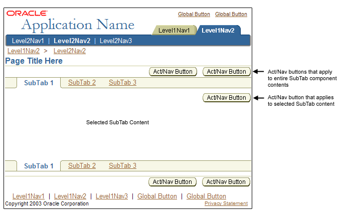
The placement of these buttons in the UI is determined by their relationship to widgets, components, content sections, or entire page contents. The valid locations of all types of action/navigation buttons are as listed below:
The links in the above list take you to the sections following for each button type. The numbers adjacent to each link indicate the button type's representation in the following image. Note that SubTab related buttons are not represented in the image.
Act/Nav Button Placement Examples

This type of button corresponds to one field, poplist or text area only. If it is an action/navigation button, once selected, the page may redraw with the respective functionality that allows the user to fill in the original field. If it is an action only button, once selected the page redraws appropriately related to the selection or input of that field/poplist.
Placement
This action/navigation button is placed justified center and right of the field.
Some Examples of Action/Navigation Buttons Related to a Single Field or Poplist
Template and Examples of Action/Navigation Button to Field
Template, Examples and Measurements of Action/Navigation Relating to a Specific Field (or Poplist)

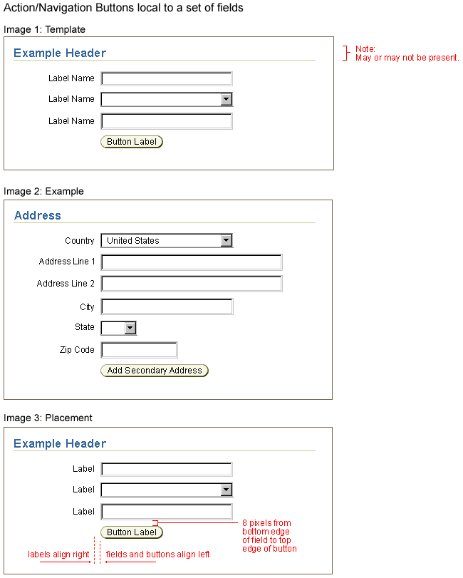
This type of button corresponds to a set of fields or component.
Placement
This button is placed below the last field of the set, and left aligned with the above standard web widgets. In a two column layout, the button is placed below the first column.
Some Examples of Action/Navigation Buttons Related to a Group of Fields and/or Poplists
Template and Examples of Action/Navigation Button to Group of Fields
Template, Examples and Measurements of Action/Navigation Relating to a Set of Fields
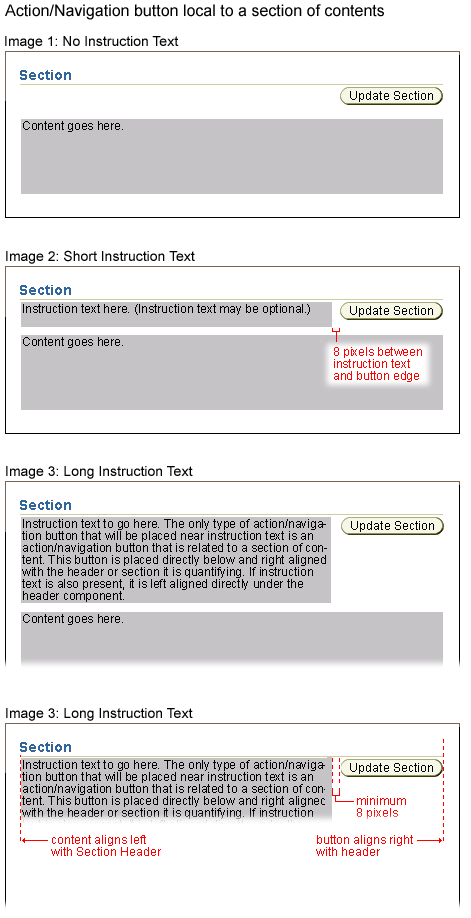
This type of action/navigation button is related to a page content section. The section may be a subheader section or a subsubheader section.
Placement
This action/navigation button is placed right justified, underneath the section subheader or subsubheader component. See the Header Component Guideline for details on headers. If instruction text is present, the instructions are left justified. See the Instruction Text Guideline for details regarding instruction text.
Some Example(s) of Action/Navigation Buttons Related to a Section of Contents
Template and Examples
Template, Examples and Measurements of Action/Navigation Button Relating to a Section of Contents
There are multiple valid usages of an action/navigation button in a table. See the Tables Guideline for extensive examples and usages.
Sample List of Valid Usages of Action/Navigation Buttons in Table:
NOTE: See the Tables Guideline for details.
Page level Action/Navigation buttons apply to the content of the entire page. Page Level Action/Navigation buttons can be either Action ONLY, Action/Navigation, or Navigation ONLY.
Some Example(s) of Page Level Action/Navigation Buttons Related to the Entire Page Contents
Placement
Page level action/navigation buttons are placed at the bottom right corner of page, below the Page Contents Bottom Line, and are repeated at the top of the page, right aligned directly under the primary page title, or first header on the page. There is a recommended order for page level buttons. See below for examples.
Template and ExampleExample of Page Level Action/Navigation Buttons - Button Relating to the Entire Page Contents (Repeated at Top and Bottom of the Page)
Placement of Action/Navigation buttons relating to SubTabs depends on whether they apply to the all the tabs in the SubTab component, or only apply to the currently selected tab.
SubTab Action/Navigation Button Placement
Usability test results have shown that action/navigation buttons repeated near top of page (i.e., below page title) greatly improves users performance to accessing the primary page level buttons. Below are examples of repeating action/navigation buttons and their interactions with various contents and widgets.
Several points are worth noting:
Page level action/navigation buttons may not need to be repeated on particular short pages. Page level buttons must be repeated top and bottom on all other pages. When the page level buttons are not repeated, the lower buttons are retained. Short pages where repetition of page level buttons may be omitted include:
When is a Message or Login Page "short"? If the rendered page can be expected to normally occupy less than 3/4ths of the vertical monitor size, omitting the upper page level Action/Navigation buttons should be considered.
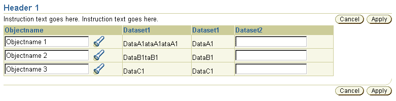
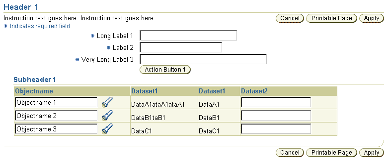
Action/Navigation Buttons (Cancel and Apply) and Instruction Text
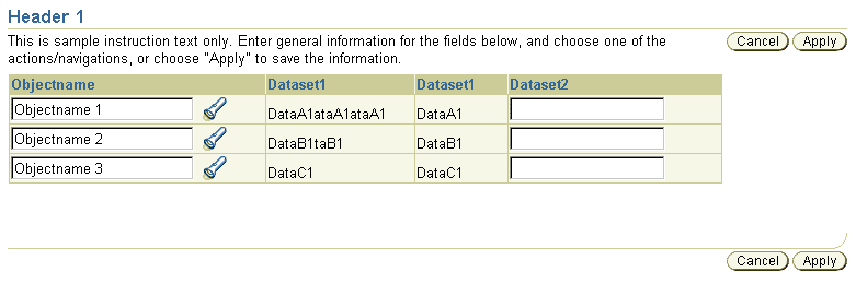
Action/Navigation Buttons (Cancel and Apply) and Long Instruction Text
Action/Navigation Buttons (Printable Page, Cancel, and Apply) and Two Key Notation Items (Required Field and Currency)
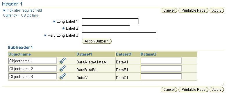
Action/Navigation buttons, Instruction Text and Key Notation
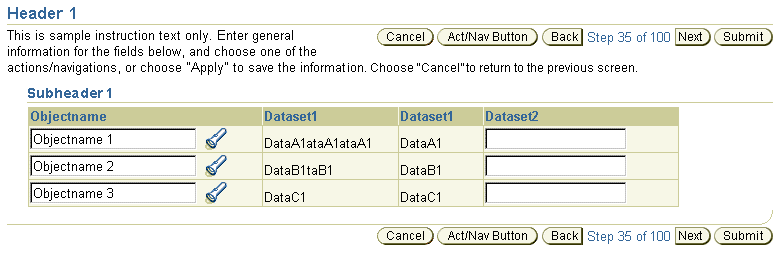
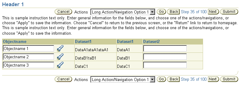
Action/Navigation Buttons (Next/Back/Cancel/Submit) and Wrapped Instruction Text
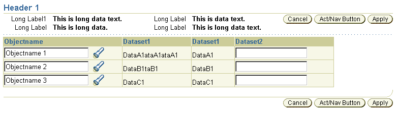
Action/Navigation Buttons and Contextual Information
Multiple Action/Navigation Buttons with Choice List and Wrapped Instruction Text
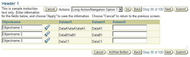
Multiple Action/Navigation Buttons with Choice List and Instruction Text Below (No Wrapping)
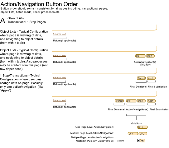
Page level Action/Navigation buttons are grouped into button categories or types, and follow a standard order (from left to right). The following are the categories of page level buttons as they appear in the UI from left to right (in bi-di applications, this order is reversed):
General Page such as: Object List, 1 Step Transactional, Messaging Page, etc.
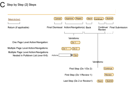
Step by Step (3[+] Steps)/Batch Detail Mode
![Step by Step (3[+] Steps)/Batch Detail Mode](buttons/actnavbuttons_order/actnavbtnorder_3stepbatch.gif)
2 Step Page Templates
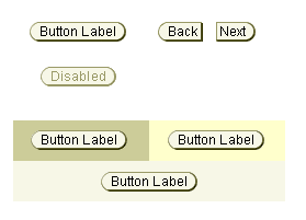
There are 2 states to action/navigation buttons, enabled and disabled.
Example of Disabled Button State
Example of Enabled Button State
For details regarding specific action/navigation button labels, as well as verbiage tips, see the Language in UI Guideline.
Action/Navigation buttons are dynamically generated in UIX using a Java based image generator. The outline edges (including the drop shadow) and the background fill are drawn by the tool. Then, the tool imports the appropriate text string to place inside the button. (This text string is translated as needed prior to generation of final image.) Finally, the tool renders and saves the composited image as a gif.
Since the buttons are actually images, they should also use an "Alt" tag to describe the function in "rollover/bubble text". The tag may be the button label, but can also provide further details regarding the function. See the Inline Messaging, Tips, Hints, and Bubble Text and Language in UI guidelines for bubble text recommendations.
NOTE: Generating the action/navigation buttons using the rendering tool is compliant with NLS [Internationalization and Translation] Requirements as well as Accessibility Requirements.
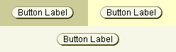
All Action/Navigation buttons are rounded on both sides.
Typical Action/Navigation Button Shape
Action/Navigation Buttons are a combination of rounded corners, and a text string. The text string or button label is centered in the button, and is constrained to one line only (i.e., the button text does not wrap.)
Note: Additional Action/Navigation layout measurements, including horizontal spacing between page level buttons, can be seen in Buttons (Global): Visual Specifications.
Measurement of Action/Navigation Button and Example of Text String in Button

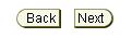
The only exception for a non-rounded edged action/navigation button are for navigation only buttons: "Next" "Back" and "Continue." These buttons have a rounded corner and a flat edge.
Exception Action/Navigation Button Shape: Used ONLY for Next/Back/Continue Buttons
Action/Navigation buttons can be on different colored background including:
Buttons on Different Colored Backgrounds
| Enabled | Disabled | |
| Text Color | Black; #000000 | Very Dark Beige; #999966 |
| Text Style | Arial, 10pt (CSS), Regular | Arial, 10pt (CSS), Regular |