Help Methods
Last Updated 09.28.03
General Description
Web-based applications include multiple methods to provide help to users. Each method satisfies user needs for different levels of information. This specification provides guidelines on choosing the methods which best match the needs of an application's users.
Guideline Attributes
Spec Version # - 3.1
Spec Contributors - Betsy Beier, Mervyn Dennehy, Lisa Serface
UI Models - all models
Example Products - all products
Related Guidelines - Icons, Messaging
Templates, Containers in Content, Action/Navigation
Buttons, Buttons as Links, Inline
Messaging and Tips, Language in UI
Global Page Templates: Help
Global Button Flow: Help System
Interaction and Usage Specifications
Web applications provide six major types of Help, which provide information ranging from a single-line hint on use of a component to detailed descriptions of applications concepts and procedures. The primary Help methods are:
- Instruction Text
- Hint and Tip Text
- Information Messages
- Rollover (ALT) Text
- Content Container Text
- Oracle Help for the Web
Users may be allowed to turn off Tips, Hints, Key Notation,
and Instruction Text in global Preferences, accessed with the global Preferences
button. In global Preferences, users may NOT be allowed to turn off Inline Messages
(Error, Warning, Cautionary Warning, Info. (inline w/widget), Bubble Txt, Content
Containers, and Oracle Help for The Web. Refer to the Global Templates BLAF
guideline, Preferences Global
Page section.
Instruction Text
When users cannot perform a task without directions, provide Instruction text. Instruction text
can be used both to explain domain- or industry-specific issues, and/or to explain how to use certain
user interface components. Instruction text may be applicable to:
- The entire page
- A section of content
- A group of components within a section
- A table
Example of Instruction Text Only (Shown with a Header Component)

Example of Instruction Text with Information Icon (Shown with a Header Component)
Here are some general guidelines on using Instruction text:
- Instruction text should only be used when the typical user may fail to perform a task unassisted.
To determine this, evaluate each page against its target user for:
- Complexity of UI elements: Some elements, such as tables containing LOVs, are challenging to most users, while others may only be difficult for inexperienced users.
- Complexity of task: Some tasks involve many interrelated objects, such as updating a BOM (Bill of Materials) with many lines, and which may include child BOMs.
- Familiarity with processes and terminology, such as creating and submitting a PO (Purchase Order) or an ECO (Engineering Change Order) for approval.
- If a page does not need text, do NOT add text to make it consistent with other pages.
- Users are more likely to read and understand text if it is concise, well-phrased, and used sparingly. Consequently, restrict instruction text to a maximum of 3 entries per page, with a combined total of 6 lines.
- Instruction text should only explain the primary way to complete a task. Use Tip Text to explain ways to increase productivity, shortcuts, and alternate methods.
Tip Text
Tip text is used to call attention to useful domain or UI information that might not otherwise be obvious. This information may include reminders about organization policies, UI shortcuts or alternate ways to perform tasks, pointers to Preferences, pointers to the Help System (contextual help), or information on how the UI behaves, such as "Changes will be saved when you move to the next set of <objects>"
Tips may be applicable to:
- The entire page
- A section of content
- A table, or a group of components within a section
- A single component, such as an action/navigation button, or link
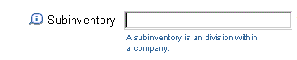
Hint Text
Hint text is used to call attention to useful domain or UI information that might not otherwise be obvious. Typically it either points out information on how the UI behaves, specific domain information, or syntax rules to help the user fill out a specific web widget.
Hints are applicable to:
- A standard Web widget, such as a field, or radio button. (These tips are known as "Hints.")
Tip Associated with a Section of Content

Hint Associated with Radio Buttons

All tips or hints are distinguished by dark blue text. Other Tip/hint attributes depend on the scope of the Tip:
- Tips for a page, section of page, table, or group of components include a Tip icon followed by the word "Tip" and one or two lines of text.
- Tips for action/nav. buttons or links include a Tip icon followed directly by one or two lines of text.
- Hints (Tips) for standard Web widgets consist of one short line of smaller text without a Tip icon.
- Content Container tips, which can be associated with a page or section of a page, may include an optional Tip or Quick tip icon followed by one or two paragraphs of text.
Note: See the Inline Messaging
and Tips guideline for visual details.
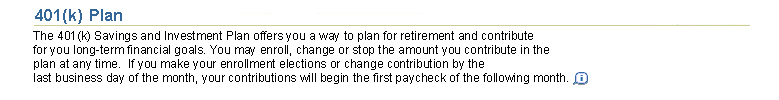
Information Messages
Information messages provide contextual information about business practices and methods, and may appear inline below a standard Web widget, in a message box, or in a message page. Web widget Information messages have the same font size and color as Web widget Tips, but are distinguished by their Information icon.
Information icons may be active, in which case they are linked to a message page with additional information, or passive, in which case they only serve to identify and draw attention to the associated message text. Passive icons are referred to as "Status" icons.
UI designers can use Information messages to explain domain terms; otherwise customers can use them to communicate their organization's policies and procedures. If users need directions on using a Web widget, provide them in page or section Instruction text, or in a Web widget Hint.
Information Message Explaining a Term
Note: See the Inline Messaging
and Tips guideline for visual details.
Bubble Help, specified with the HTML ALT tag, identifies a component (long name of element or curt
instructions) when the user
pauses the mouse over it, as shown in the following example. Bubble Help on an
Action/Navigation button includes its keyboard shortcut, if one has been assigned.
Rollover Bubble Text on Action/Navigation Buttons, Global Buttons, Icons, and Links as Buttons

See Inline Messaging and Tips Guideline for details.
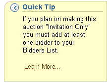
Content Containers
Content Containers can be used to provide step-by-step directions or more complex Tips
containing domain-specific information, such as a summary of the organization's policy
regarding the current object. A content container may also contain page level contextual help
if appropriate.
Content Container Displaying Process/Task Help

Content Container Displaying a Complex Tip
See Containers in Content Guideline for more
details and examples.
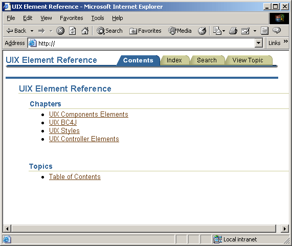
Oracle Help for the Web
Oracle Help for Web is a full-fledged Help and online documentation system, based on
Oracle Help for Java. Like WinHelp and other Help systems, Oracle Help for Web
is displayed in a separate window, allowing users to read directions while performing a task.
Help developers can use Oracle Help for Web to provide:
- Context-sensitive Help
- Table of Contents
- Index of keywords
- Full text search
- Online manuals
- Printable pages
- Quick Tours
This type of Help system is most effective at presenting large quantities
of information in sets of linked pages, and can provide conceptual,
task-oriented, and reference information for both the user interface
and for domain/business practices.
The Help system is accessed through the global "Help" button. This button is available on
all primary pages of an application. It may be appropriate to draw a the user's attention to
the Help system from within the content beyond just the Help global button. For instance, a link to the Help system
may be provided in Tip text on the page if necessary.
Context-sensitive Help - Help within the Page that Points to a Specific Topic within the Help System
Context-sensitive Help provides the user access to a specific Help Topic
within the Help System (i.e., not the main index of the Help System, but a specific page within Help). One
of the described methods in this document should be used to provide help content
within the application page before providing Context-sensitive Help, but if more help is needed given the context,
a link to the Context-sensitive Help topic may be provided.
For instance, if instruction text is used as a help method, the instruction text in the application
page should describe either domain- or industry-specific issues,
and/or describes how to use certain user interface components. If more information beyond what is
displayed is necessary, then a Context-sensitive Help link may be appropriate.
Below are the recommended methods of Context-sensitive Help or accessing the Help System from
within another help method on the page:
- Instruction Text - In addition to the text within the instruction text, a link directly to a
specific topic in the help system may also be provided. For instance; "For more details, use the Help System." (Help System would be link text.)
- Tip Text - In addition to the text within the Tip, a link may directly to a specific topic in the help system may be provided.
For instance; "For more details, use the Help System." (Help System would be link text.)
- Information Messages - Information messages provide contextual information about business
practices and methods, and may appear inline below a standard Web widget, in a message box, or in a message page. There
may be a contextual help link within the information message pointing the user to the topic in the help system.
- Bubble Help (ALT Text) - There should be NO link to the help system within Bubble Help.
- Content Container Text - In addition to the text within the content container, a link within
the Content Container to a specific topic in the help system may also be provided. For instance; "For more details, use the Help System." (Help System would be link text.)
Oracle Help for the Web - Contents Tab
Oracle Help for the Web - Specific Topic
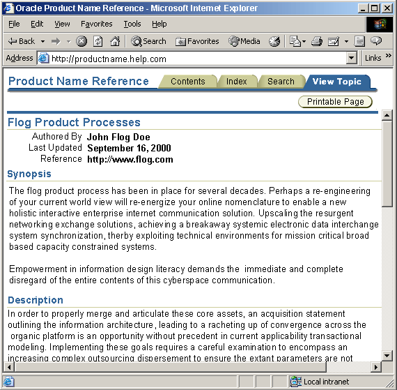
Note: As a default, Help material distributed by Oracle with an application should follow BLAF standards and styles. Use the templates provided by the Oracle Help for the Web team. Content of a specific topic may be supplied by customer or other third party documentation writers after the release of a product. The format of those page may vary from BLAF depending on how the content is developed.
Note: Oracle Help for the Web is intended for
public distribution in Summer 2001. Oracle internal developers can find more information
at the UIX Web Site.
Effective Help design depends on the same information as successful application design -- detailed knowledge
of the application's users.
Some applications are used by a single type of user who share common characteristics. However, most applications have different groups of users with differing software skills, responsibilities, and domain knowledge.
Often different groups of users will spend most of their time in different parts of an application, so Help
needs to be tailored to meet the audience needs for each part.
Develop User Profiles
Here are several questions that help develop user profiles. This information can be gathered in
the early design phase:
- Will users perform the same sets of tasks with this software?
- Do users have a common technology profile (software skills, domain knowledge, expectations of software behavior)?
- Based on the answers to these questions, how many major groups of users are there, and what are their characteristics?
Locate Problem Areas of the Application
Here are several questions that help determine which groups need help in which parts of the application.
This information is only available after prototypes and pre-release versions of the application have been developed.
- Do different groups of users typically use different tabs or groups of pages in the application?
- Which high-frequency tasks do each group of users find difficult to complete successfully?
- On which pages do users perform these tasks?
- How great is the difficulty? Can they figure out how to do it by themselves? If so, do they remember how the next time they perform the task?
Determine the Scope of the Problem
Web applications have multiple methods of providing Help, each with a different scope
(component, section, page, or group of pages). This information should be gathered before developing Help for the page.
- Is the problem caused by a single component, or by the interaction of a group of components?
- Is the problem caused by a UI glitch that cannot be fixed for some reason, or by a lack of domain knowledge (not understanding technical terms, or not knowing which choice to make)?
- Will a short line of directions suffice to address the issue?
- Is there standard component-level Tip text for any of the application's groups of users? (for example, novice users may require a Hint below a Date field)
The answers to the preceding questions help you determine the type and amount of information required.
The Help method(s) you select depends on the scope of the information required.
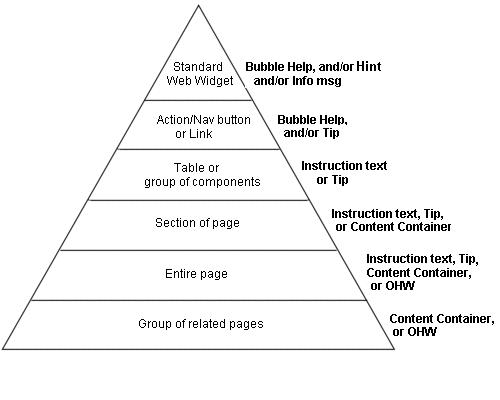
Web application Help methods may provide information on:
- Individual components, such as fields and table cells
- Sections of content, including groups of components or an entire table
- An entire page, or a group of related pages
The following diagram shows the applicable Help methods for different page elements.
Scope of Help Methods
Component-level Help Methods
Help for individual components consists of Bubble text and/or one or two lines
of terse Hint (Tip) or Information message text, and is defined in the Inline
Messaging and Tips guideline.
Bubble text simply identifies components. Component-level Hints may be used to supplement Instruction text. Information messages may contain domain-specific information, such as an explanation of a label, or related organization policies and procedures.
Section-level Help Methods
Help for sections of content can be provided in three ways:
- Instruction Text inserted directly below the section header.
- A Tip inserted within a given section, usually at the near to top or bottom of the section.
- A Content Container Tip.
Instruction text can be used on every page if there is reasonable doubt that users will understand what they need to do to accomplish their tasks. Because it is located directly below the section header, it is easy to locate, but also easy to ignore when no longer needed.
Tip icons draw attention to the associated Tip text, so must be used sparingly to avoid making the page busy and defeating the purpose of the icon. Tips should not be used instead of Instruction Text, but should be used either to make sure users are aware of an important piece of information, or draw their attention to a related issue that does not directly affect their ability to complete the current task.
Tips within Content Containers can be viewed as super Tips, because they take up more screen space, and strongly draw users' attention. Tips in Content Containers should be used when there is too much information to convey in a regular Tip, but should be used even more sparingly to avoid cluttering the page.
Page-level Help Methods
Help for an entire page or group of pages can be provided in the same three ways as section-level
Help. However, users have the additional option of opening the Oracle Help for Web system in a separate window.
The big advantage of displaying Help in a separate window is that users can be provided with more
information than is possible within an application page, and they can then refer to the information
while completing their tasks. However, Help systems have several potential drawbacks:
- Users must click the Help button (a Global button at the top of the page) to see this information.
- The information presented must be comprehensive enough to address a range of user concerns, or else users will not return to Help to find answers.
- Inaccurate information in one Help topic can jeopardize user trust in the entire Help system, so Help must merit adequate development resources, and must receive the same level of QA review as the application.
Matrix of Help Methods
The following table summarizes Help method usage:
| Help Method
|
Type of Content
|
Scope
|
Icon
|
Maximum Length
|
Maximum Number per Page
|
| Instruction Text
|
Primary directions for related area
|
Page, section, table, or group of components
|
Optional active Info icon displays more text
|
One brief paragraph
|
One per section
|
| Regular Tip
|
Additional information
|
Page, section, table, group of components, action/nav. button, or link
|
Tip icon
|
One or two lines
|
One per section; three per page
|
| Hint (Tip on Web widget)
|
Terse directions (often as an example)
|
Single web widget
|
None
|
One short line
|
Unlimited
|
| Information message
|
Brief domain or business info
|
Single component
|
Info icon (active icon displays more text)
|
One short line
|
Unlimited
|
| Bubble text
|
Identify element
|
Single component
|
N/A
|
One or two short lines
|
Unlimited - used on all button, links, icons, and graphics in content
|
| Content Container
|
Directions or Additional Info
|
Section, page, or group of pages
|
Optional Tip or Quick Tip icon
|
One or two paragraphs
|
Two per page
|
| Oracle Help for the Web
|
Overview, Directions, Tips
|
Page or group of pages
|
N/A
|
Unlimited (with links to related pages)
|
One Help context per page
|
General Rules of Thumb
Here are some general rules of thumb for providing effective Help:
- If users are presented with detailed information on each component and section of the page, the application will become unusable, so it is essential to prioritize based on user need.
- If users need directions to complete a task, use Instruction text.
- If a brief amount of additional information is required, provide a Tip, but do not use Tips in place of Instruction text.
- If the directions are complex and require more than one paragraph, add an active Info icon to the Instruction text, or, if necessary, provide step-by-step directions in a Content Container.
- If the information required is too complex to be presented adequately for most users within the page, insert a Tip recommending that they choose the Help button for detailed directions.
- If a page has little text and additional information will be useful to users, but not necessary to complete the task, provide this information in page, section, or Content Container Tips, not in Instruction Text.
- Do not place more than three Tip icons on a page, and avoid placing them close together.
- Do not place more than two Content Containers containing Help on any page.
- If components requiring help are grouped, use a single Tip for the group. If the components are not grouped, and section-level Instruction text is not adequate, provide Hints on standard Web widgets, and a Tip on action/nav. buttons or links, if required.
Note: Customers typically use the active Info icon on standard Web widgets to provide information about their organization.
Open/Closed Issues
Open Issues
Closed Issues
05.04.00 - separate component (inline messaging and tips) from page templates