Content Containers in Page
Last Updated 04.29.03
General Description
Content containers are used in page layouts to help distinguish specific types
of content or groups information. The content in the container is ancillary in
nature. It helps the user complete the task at hand, but is not required. The
content container is used throughout BLAF applications.
Another type of container, known as the portlet container, is only used in
portal interaction model (i.e., Oracle Application Portal).
Guideline Attributes
Spec Version # - 3.1
Spec Contributors - Betsy Nute
UI Models - eCommerce, CRM
Example Products - Oracle Exchange, ssPurchasing, Oracle Sales Online
Related Guidelines - Icons, Header
Component, Text Standards, Advertising
Guidelines, Help Templates, Dialog:
Messaging Guidelines, Home Page Template,
Related Links/Shortcuts.
Interaction and Usage Specifications
Content containers draw the user's attention to a section of information by
using a different colored background and content border other than the entire
page contents. There are different types of content containers; the general content
container, and the portlet content container (specifically used in the portal
interaction style.) Within each type, there are several stylistic options. Below
are usage recommendations for each type.
General Content Containers
- A content container should contain view-only
content.
- A content container must contain a container
header and a line.
- The container header may use an optional icon
to reinforce the container's information.
- Optional colors are available if needed to distinguish
content types (for instance, containers with "quick how to" type information may
all be yellow background, while containers with ancillary news pertinent to the
application may be on sand background.)
NOTE: The white background option is recommended for showing a "portal-like"
page when it is not possible to use portal technology (i.e., server technology
products).
- It is recommended only to use 1 background colored
container on one page, but 2 different colors may be used.
- All 4 background color container options should
not be used on one page.
- The specific content that is placed in a container
should be ancillary to the application task at hand. Important or crucial information
for completing a task should not be place in a container.
- There are a variety of UI methods for
displaying help or tips on screen to the user. Content Containers may
contain tips, but these tips should only supplemental and not be crucial
to completing a task. See Help Methods Guideline
and Messaging Templates
for other UI methods for displaying important inline messaging.
- General Layout principles for Content Containers
- A content container can form a standalone column
by itself or with other content containers stacked vertically (if different types of information is
needed in each container.) It can also exist with other contents within a section.
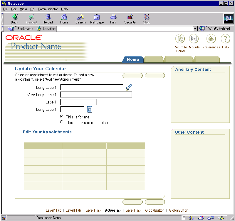
- All content containers should be aligned to
the right side of page and not placed on the left side of the page.
- A single content container may be placed in
the upper right side of the contents of the page, under the tab/navigation structure.
- A single content container should not span the
entire page, but only a portion of the right side of the page. The bottom portion
of the page contents may wrap below the container. If the container(s) spans the
entire right side of the page, no page contents may be below the container except
the page footer. See examples below for details.
- Content containers can include the following
types of information:
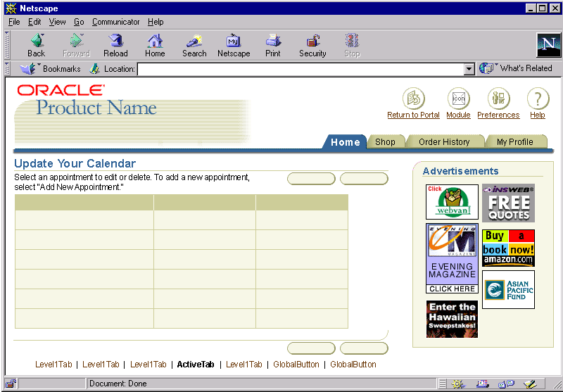
- Advertisements - Small advertisements, marketing
messages and other promotional infomration can be placed into container
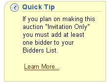
- Quick Tip - Hints or other useful domain or
UI information that might not otherwise be obvious to user
- Quick Tutorial - Steps or methods that may help
the user learn to perform certain tasks
- Process/Task Information - Descriptive list
of tasks to be performed by the user
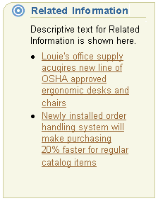
- Related Information - Navigation to information
resources related to the page's contents
- Related Applications - Navigation to other product
applications with related tasks or information to the given page
- Shortcuts - Navigation that takes the user to
a related task or object within the application - also known as "Related Links"
Portlet Content Containers (used in Portal Interaction
models ONLY)
Portlets provide at-a-glance, aggregate views of information, within a constrained
screen area. The portlet customization usually allows users to specify how much
information should be displayed. The portlet metaphor allows users to access commonly
used areas easily, with less navigation and number of clicks. The portlets contain
a consistent interaction mechanism, regardless of the name and the type of the
portlet provided.
Please refer to the General
Portal Guideline for further information. Note: Reference
URL is for internal Oracle use only.
Visual Specifications
General Content Containers
- Color Options (Fill and Border) for Content Containers Including Header Color
and Size
(Note: Border has a 1 pixel thickness.)
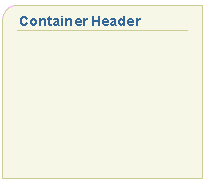
- Option 1:
- Fill: light beige (#f7f7e7)
- Border: dark beige (#cccc99)
- Header:
- face = helvetica, arial
- size = 11pt (CSS)
- style = bold
- color = dark blue (#336699)
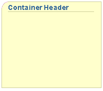
- Option 2:
- Fill: medium beige (#ffffcc)
- Border: dark beige (#cccc99)
- Header:
- face = helvetica, arial
- size = 11pt (CSS)
- style = bold
- color = dark blue (#336699)
- Option 3:
- Fill: medium blue (#6699cc)
- Border: very dark blue (#003366)
- Header:
- face = helvetica, arial
- size = 11pt (CSS)
- style = bold
- color = medium beige (#ffffcc)
- Option 4
- Fill: white (#ffffff)
- Border: dark blue (#336699)
- Header:
- face = helvetica, arial
- size = 11pt (CSS)
- style = bold
- color = dark blue (#336699)
- Size Options for Content Containers
- A content container should be approximately 1/4 to 1/3 of the size of the
width of the page and should dynamically resize according to the browser windows
total size.
- example 1: browser window size = 800 pixels wide; content container size =
between 200 and 266 pixels wide
- example 2: browser window size = 600 pixels wide; content container size =
between 150 and 200 pixels wide
- Suggested Minimum Width Size: It is recommended that the content container
should not be narrower than 100 pixels wide. At small width sizes, text can excessively
wrap, and become hard to read.
- Content Containers with Measurements
Measurements

- General Content Containers without Icons
Option 1:
Light Beige Background Color
|
Option 2:
Medium Beige Background Color
|
Option 3:
Medium Blue Background Color

|
Option 4:
White Background Color
 |
- General Content Containers with Icons
Option 1:
Light Beige Background Color

|
Option 2:
Medium Beige Background Color

|
Option 3:
Medium Blue Background Color

|
Option 4:
White Background Color
 |
- Example of General Content Container without Page Context(Self Service Purchasing)
Advertisements

|
Quick Tip

|
Process/Task Information

|
Related Information

|
Related Applications

|
Shortcuts

|
- Example of General Content Containers in Page Template
Example 1: Container Only Spanning Part of the Height of the
Page Contents

Example 2: Container Spanning Entire Height of the Page Contents

- Example of General Content Container with Advertisements

Portlet Content Containers (used in Portal Interaction models ONLY)
Portlet content containers are only used in the portal interaction model
(i.e., Oracle Application Portal.)
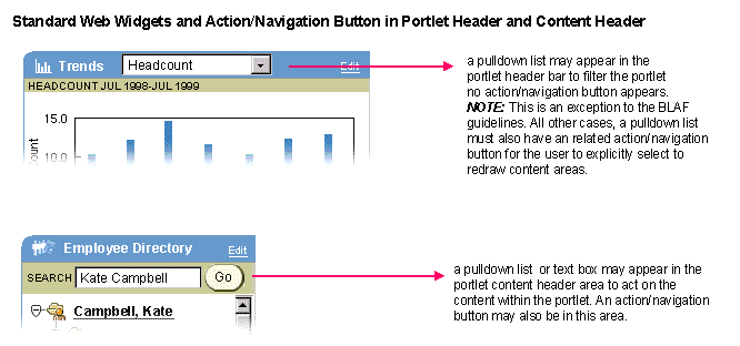
Portlet Definitions and Measurements

Portlet Headers with Pulldown and/or Portlet Content Headers
with Pulldown or Text Field

- For more information about the Oracle Application Portal See specific product
specification.
Open/Closed Issues
Open Issues
01.14.02 - Placement of content container at left side of page is being evaluated.
Further details will be decided in Guidelines Version 3.0.
Closed Issues
07.00 - portlet information added, currently portal product is rendered through
the portal technologies, not UIX.
07.00 - square off bottom right corner of content container to be consistent with
other components with same shape (portlet container, message box, shuttle...)
07.07.00 - measurements layout of content container

