Shuttle and Reorder
Last Updated
18-Sep-2003
General Description
Shuttle components are used to assemble a list of items, by moving or adding items from one list to another. Typically, users are moving objects from a list of "available" items to a list of "selected items". Shuttles may contain simple lists of items, tables, or hierarchies. This document is divided into the following sections:
Guideline Attributes
Spec Version # - 3.1
Spec Contributors - Betsy Beier, Dan Workman, Mervyn Dennehy
UI Models - all models
Example Products - all products
Related Guidelines - Content Containers,
Standard Web Widgets, HGrid
Flows, Headers, Instruction
Text
Interaction and Usage Specifications
- Shuttle components are used to assemble a list of items by copying or moving them from one list to another. One item can be moved at a time, some items may be moved, or all items can be moved at one time. This functionality is identical between both lists.
- There are three types of shuttle component, each with multiple options:
- Standard Shuttle: Used for selection from a simple list of objects.
- Tabular Shuttle: Used only for selection within a table containing many records.
- Hierarchical Shuttle: A variant of the tabular shuttle that is used only for selection within hierarchies (HGrids).
- Reorder functionality is optional for standard shuttles and tabular shuttles, but must be provided separately for HGrids.
- In the standard shuttle, items in the selection/destination list can be moved up one, moved to the top, moved down one, or moved down to the bottom of the list using optional Reorder controls. The Reorder container may be used by itself when only reorder functionality is required.
- The tabular shuttle can include optional Move Up and Move Down icons within a column of the table to move a record one row at a time.
- If Reorder functionality is required for an HGrid, a global table button should be provided on the resulting HGrid page to navigate to a separate Reorder page.
- All shuttle controls have associated "alt" tags. See Icon List for detailed "alt" tag text.
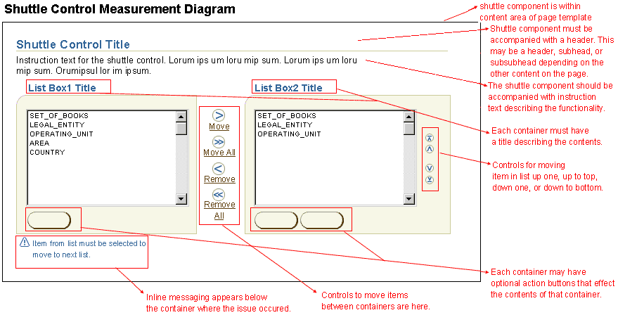
- Each container of the shuttle control must have a container title. Where possible the title should be specific to the shuttle list contents:
- Typical titles have the syntax "Available {ObjectType | Items}" and "Selected {ObjectType | Items}", where "Items" is the general term for a heterogenous list of objects.
- Note: For ease of communication, this guideline uses the general terms "Available Items" and "Selected Items" for the left-side and right-side containers.
- The entire shuttle control must contain a header. If the shuttle is within other content of the page, this header may be a subheader or subsubheader as applicable. See Header guideline for details regading the header.
- The entire shuttle control should contain instruction text describing the functionality of the shuttle. See Instruction Text guideline for details.
- Inline messaging may be exposed underneath the entire shuttle component on page redraw. For instance, if an error occurs in a shuttle on a page, a message box would appear inline at the top of the page stating the issue, and inline error message would show right underneath the shuttle component, briefly stating the issue. See Inline Messaging and Tips for detailed usage and options.
- Shuttles can be configured either to copy or move items between the Available Items and Selected Items lists. Users may copy or move from left to right and from right to left.
- If configured for copying items, the topmost action button is labeled "Add", and the copied items appear in both lists.
- If configured for moving items, the topmost action button is labeled "Move", and the copied items appear only in the target list, either in Available Items list or Selected Items list, but never in both lists.
BLAF provides multiple methods for assembling a list of items, such as multi-select tables, and shopping cart model selection. A shuttle is the preferred method when users are likely to both select and deselect multiple items. Shuttles facilitate this because selected items are clearly displayed in a list on the same page as available items, rather than only being indicated by check marks in the selection column, or across multiple pages. Also consider using a shuttle in the following cases:
- The number of available items is large, and users need to review their selections, requiring navigation through multiple pages.
- Users do not need to see many item attributes (more than three) or drill down on an item to determine whether or not to select it.
There are three types of shuttle component, each with multiple options:
- Standard Shuttle: Displays simple lists of items in a pair of list boxes, and allows users both to assemble a list of items in the selected/destination container and optionally to reorder that list.
- Tabular Shuttle: Displays items in a pair of tables with optional attribute columns, and optional columns of Move Up/Down functional icons. Used for selection within a table containing many records, and does not include the standard reorder controls, though reorder functionality can be provided separately.
- Hierarchical Shuttle: Displays hierarchical items in a pair of HGrids. Used for selection within hierarchies, and does not include Move Up/Down or reorder functionality.
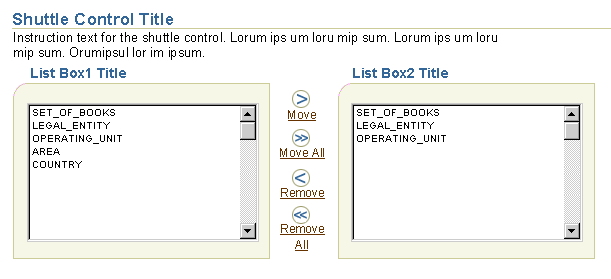
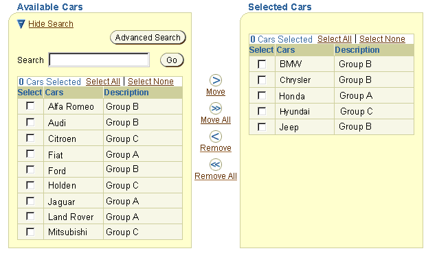
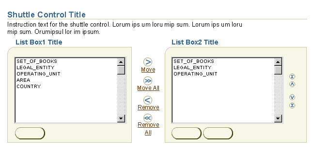
The standard shuttle consists of two side-by-side list boxes and iconic action buttons and links to control movement of items between the lists:
- The user selects one or more items in the Available Items list and then clicks an action button to add or move those items to the Selected Items list.
- The user can also reverse the process to remove items from the Selected Items list, and can repeat the select and move/remove process as many times as needed to populate the right-side list.
- List boxes may be configured to allow either single selection or multiple selection of items. If multi-select is enabled, the user can Shift-select multiple contiguous items (hold down the Shift key and select a range), or can Ctrl-select multiple non-contiguous items in any order. For more information on list boxes, see the Standard Web Widget guideline.
- Once the user completes the selection/removal process, the user can reorder the right-side list using the optional Reorder controls on the right of the shuttle.
- The basic shuttle may also feature several other options, including filters, search, a description field, and embedded action buttons. For details, see Shuttle Options below.
Standard Shuttle (Basic)

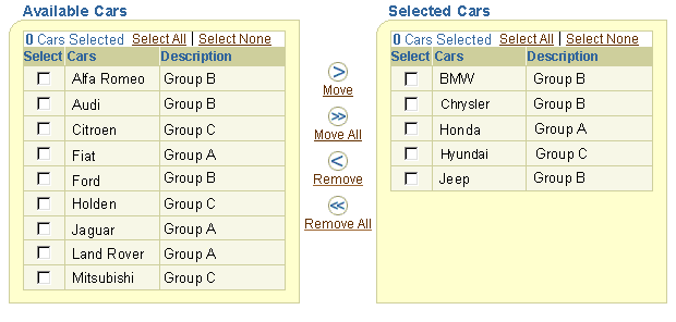
The tabular shuttle has the same general layout and functions as the standard shuttle. Aspects specific to the tabular shuttle are as follows:
- The shuttle has embedded tables in both the Available Items and Selected Items containers, instead of list boxes.
- Tabular shuttles are used exclusively for selection, and do not include a control bar for select and act functionality.
- Each table includes at minimum a multiple selection column, an object column, and one attribute column, along with "Select All" and "Select None" links, and a record counter.
- Users cannot drill down on any items, to avoid losing context with the shuttle selection process.
- A Selection counter is included above the Available and Selected Items lists to show the total number of selections. (The counter appears along with Select All and Select None controls whenever a table contains a multi-select column.) See Persistent Selection Among Record Sets in the Table guideline for details.
- When no items have been copied or moved, the following text appears in the first row of the Selected Items list: "No {items} selected. ". Text placement is identical to that used when a search yields no results. See Displaying an Empty Table (No Data in Table.) in the Tables guideline for an example.
- Each table includes record navigation if the number of rows to display exceeds the pre-set maximum (typically 25). See the Record and Page Navigation guideline for details.
- Record order may be modified by clicking the column header of a sortable column. See Sorting Column Data in the Tables guideline.
- The table may include an optional description column, or a separate description field, as well as other attribute columns. See Item Attributes below for details.
- When the shuttle is configured to copy items (instead of move them), all items in the Available Items container that have been added to the Selected Items container are flagged with "Selected Item" icons. The icons are placed immediately to the right of item names in the object column. The Selected Item icon should always be identified by Key Notation in the area above the shuttle. (this icon is also used in the Shopping Cart model -- see Selection From One Table to Add to Another Page)
- Tabular shuttles do not include the standard Reorder control. Instead, when reorder functionality is required, include Move Up and Move Down functional icons in action columns. In this case the table should contain no more than 2 optional attribute columns to avoid excessive horizontal scrolling.
The tabular shuttle may also feature filters and search. For details on all options, see Shuttle Options below.
Tabular Shuttle (Basic)
The hierarchical shuttle has the same general layout and functions as the standard and tabular shuttles. Aspects specific to the hierarchical shuttle are as follows:
- The shuttle has embedded HGrids in both the Available Items and Selected Items containers, instead of list boxes or tables.
- Hierarchical shuttles are used exclusively for selection, and do not include a control bar for select and act functionality.
- Each HGrid includes at minimum a multiple selection column and an object column, along with "Select All" and "Select None" links and a selection counter. For large hierarchies, the optional Focus column and HGrid breadcrumbs should also be included (HGrid breadcrumbs are displayed automatically when the Focus column is included).
- Users can expand and collapse nodes, but cannot drill down on any items to avoid losing context with the shuttle selection process.
- As in the tabular shuttle, a Selection counter is included in the Available and Selected Items containers to show the total number of selections. Note that this includes selected nodes that are not visible because their parent node is collapsed.
- HGrid columns cannot be sorted.
- Each HGrid includes HGrid record navigation if an expanded parent contains more than the pre-set maximum number of children (typically 10). See HGrid and Tree Record Navigation with Large Data Sets in the Record and Page Navigation guideline for details.
- HGrids may include an optional description column or a separate description field if necessary, as well as other attribute columns. Each HGrid should contain no more than 2 optional attribute columns to avoid excessive horizontal scrolling when large hierarchies are expanded. Unlike tabular shuttles, attribute columns may be omitted. See Item Attributes below for details.
- Optional search functionality displays results in a flat list. See Search a Hierarchy in the HGrid Flows guideline for general information.
- As in the tabular shuttle, when configured to copy items, the hierarchical shuttle also displays "Selected Item" icons to the right of item names in the Available Items container.
- There are both constraints and options specific to the HGrid that affect the display within the selected items container. See "Display of Hierarchies in the Selected Items Container" below for details.
- Hierarchical shuttles do not include reorder functionality. If users may need to change the position of nodes in the hierarchy consider providing either Move or Reorder functionality on the resulting HGrid page. For details, see Move Nodes and Reorder Nodes in the HGrid Flows guideline.
- Some applications, especially Business Intelligence, may have requirements for certain object types to be selected in tandem (if one is selected, the other is automatically selected as well).
- Applications may choose whether or not to select children automatically when parents are selected. However, this behavior should be implemented consistently across related applications.
The hierarchical shuttle may also feature filters and search. For details on all options, see Shuttle Options below.
Hierarchical Shuttle (Basic)
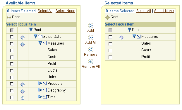
Several key principles govern display of hierarchies in an HGrid:
- HGrids are used to show hierarchical relationships among objects, so users must always be able to determine where each node is located in the overall hierarchy.
- Hierarchies are built from a single root, and consist of multiple levels of parent-child and peer/sibling relationships. Consequently every node other than the root must always appear beneath a parent.
- Applications may have different requirements of hierarchies:
- Users may need to see where certain nodes are located within a specific branch of the hierarchy, without the distraction of other branches or nodes at higher levels.
- Users may need to compare or manipulate widely-separated branches of the hierarchy, which may also occupy different levels. In this case, it is necessary to remove the intervening hierarchy to make it possible to view those branches on the same page.
- In large hierarchies, users may want to focus on a node within the hierarchy.
- Underlying data structures may require that certain object types are always selected together.
To address all of these requirements in the Selected Items container:
- The Focus control is optional. When the Focus control is omitted, HGrid breadcrumbs are also omitted automatically.
- If the user focuses further down the hierarchy:
- Breadcrumb links allow the user to navigate back up the hierarchy. However, when they exit the shuttle, the resulting HGrid will have the last focused root shown in the Selected Items container.
- And selects a node, but then focuses down below that node, a Warning page is displayed, with the message text: "If you focus on this node you will lose any selections outside the new focus. Do you want to continue? Yes/No"
- Development teams have two options to display a view of a hierarchy after a user selects/deselects nodes in the shuttle:
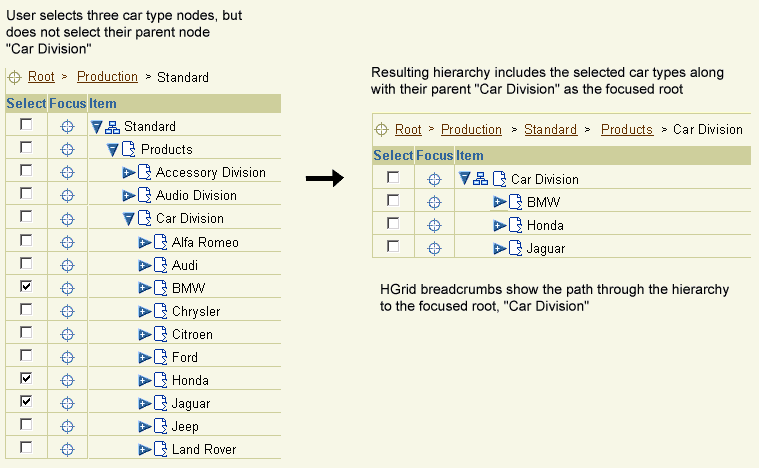
- Maintain all hierarchical relationships: With this option, the nearest common parent of all selected nodes becomes the root in the new hierarchy.
- "Selected Items" root: With this option, selected branches within the hierarchy are shown as peers under the a root named "Selected {ObjectType | Items}", even though they may be located far apart and at different levels of the full hierarchy. Use this option if users need to display separate branches together without the additional structure needed to maintain hierarchical relationships.
Nearest Common Parent as Focused Root
The following two example images show how the nearest common parent becomes the focused root:
Focused Root Based on Selection of Nodes at the Same Level in the Hierarchy

Focused Root Based on Selection of Nodes at Different Levels in the Hierarchy

"Selected Items" Root
The following two example images show how selected nodes are displayed beneath the "Selected Items" root:
Selected Items Root Based on Selection of Nodes at the Same Level in the Hierarchy

Selected Items Root Based on Selection of Nodes at Different Levels in the Hierarchy

Hierarchies of objects can only be displayed in a hierarchical shuttle. However, lists of objects may be displayed in either a standard or tabular shuttle. Consider the following principles when deciding which type of shuttle to use:
- Space Required: Standard shuttles require less horizontal and vertical space.
- Object Attributes: Tabular shuttles include at least one column of object attributes, whereas standard shuttles may only include optional concatenated attributes and/or an optional description field. As a result it is not only easier for users to read and compare object descriptions in a tabular shuttle, but it also removes the requirement to select an item before seeing its description.
- Sorting: Tabular shuttles allow users to sort a list of available or selected items by a particular attribute.
- Large Data Sets: Tabular shuttles include record navigation for large data sets, whereas the shuttle control only provides a scrolling list.
- Reorder Items: The standard shuttle includes a set of optional reorder controls (Move Up, Move Down, Move to Top, and Move to Bottom), whereas the tabular shuttle may only include optional Move Up and Move Down icons. If users need to reorder selected items manually, the standard shuttle is somewhat more efficient.
The three types of shuttles have a range of options, some of which are common, and some unique:
- Standard shuttles can include optional reorder controls in the selected items container.
- Tabular shuttles can include optional columns of Move Up/Down functional icons in the selected items container.
- All three types of shuttles may feature the following options:
- Filters: Narrow the contents of a list using pre-defined criteria
- Search: Narrow the contents of a list using user-defined criteria
- Item Descriptions: Help users determine which items to select
- Only the standard shuttle can include action buttons within shuttle containers.
The following sections describe implementation of these three options with each type of shuttle.
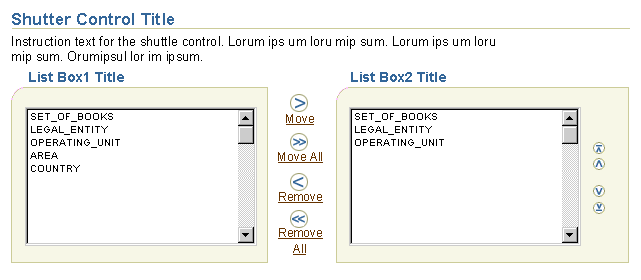
Users may need to reorder the items in the Selected Items container. The standard shuttle includes a set of optional reorder controls: Move Up, Move Down, Move to Top, and Move to Bottom. The tabular shuttle may include optional columns of Move Up and Move Down icons.
Standard Shuttle with Reorder Controls

Filters (to Narrow the Contents of a List)
When the list of available items is likely to be long (greater than 50 records), developers may provide a filter to enable users to narrow the contents of the list.
- Filters are optional for all three types of shuttle.
- Filters consist of an appropriate label, one or two choice lists, and a "Go" button placed above a list. For example, the available items container may be called "Available Books." The filter in the container may be labelled "Book Types" and the choice list contain, "All, Science Fiction, History, Fantasy, Romance...".
- In most applications, filters should only be provided for the available items container.
- If partial page rendering (PPR) technology is used, the "Go" button does not need to appear unless the filter is associated with search. Based on the selection in the choice list the contents of the list below will redraw automatically.
- The following instruction text should be placed above shuttles containing filters, "To filter a list of {items}, select a {category} [and click the Go button].", where {category} refers to the filter label, and {items} refers to the objects in the list box.
Standard Shuttle with Filter
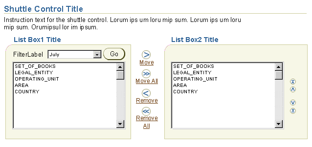
Search (to Narrow the Contents of a List)
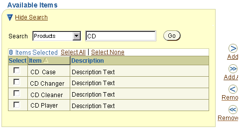
- Search functionality is optional for all three types of shuttle to narrow/populate the contents of a list.
- For both standard and tabular shuttles, search should only be provided for the available items container. In hierarchical shuttles, search may be added to both the available and selected items containers when working with very large hierarchies.
- Search is implemented directly in the shuttle container, and consists of an appropriate label, the search text field, and a "Go" button.
- To search, the user enters a text string in a text field and then clicks the "Go" button.
- Search may be combined with one or two attributes to limit the scope of the search.
- The list with the search functionality should be populated with default content so that the user is not forced to conduct a search.
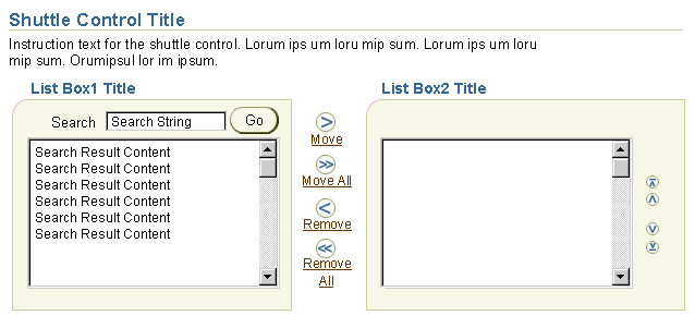
- The following instruction text should be placed above the shuttle with search functionality, "To search for {items}, specify your criteria, and click the Go button.", where {items} refers to the objects in the list box.
- If the search is conducted, and no items are found, populate the list with "(No results found.)". In the tabular shuttle, the first row of the table is displayed and the text is inserted in the object column.
- All three shuttles may include a Hide/Show Search control so users can hide the search section when it is not needed.
- Results tables for both tabular and hierarchical shuttles may include sortable columns.
- The Search section may include an optional Advanced Search button to perform advanced search on a separate page. Results are then shown within the shuttle container. This option has the same general flow as Multiple Sectioned Advanced Search as Own Page.
Standard Shuttle with Search Functionality in Available Items Container

Tabular Shuttle with Search Functionality in Available Items Container

Tabular Shuttle with Results in Available Items Container

Searching within a Hierarchical Shuttle
Unlike tables and lists, hierarchies must always show relationships between items in the hierarchy. When a search is conducted within a hierarchy, it may be impossible to show their relationships using the standard HGrid format. As a result, search is implemented in a hierarchical shuttle as follows:
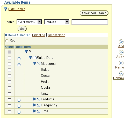
- The search section may include an optional filter to search "Full Hierarchy" or to restrict the search to "{Items} in Focus". If the user has not yet focused on a node, selecting either option has no effect on search results.
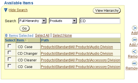
- Results are shown in a flat table, with an optional "Path" column indicating location in the hierarchy. If displaying path information causes excessive performance degradation, the Path column may contain Hide/Show controls within each cell, or the Path column may be omitted.
- A multi-select column allows users to select/deselect items to add/move to the selected items list. Selection boxes are unchecked by default. The table includes "Select All" and "Select None" links, and a record counter.
- A button labeled "View Hierarchy" appears above the results list, to enable the user to return to the hierarchy.
- The Search section may also include an optional Advanced Search button to perform advanced search on a separate page. Results are then shown within the shuttle container. This option has the same general flow as Multiple Sectioned Advanced Search as Own Page.
Hierarchical Shuttle Available Items Container with Filter and Search

Hierarchical Shuttle Available Items Container with Flat List of Results

All three types of shuttles may display object attributes, such as descriptions, to help users identify which items to select. Standard shuttles use a different method to display attributes than tabular and hierarchical shuttles.
- There are three options for displaying item attributes within a standard shuttle:
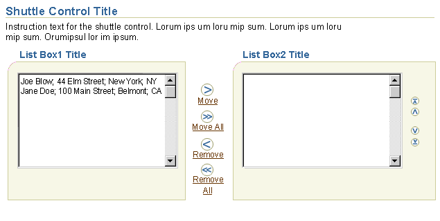
- Concatenating some attributes associated with each item in the list box (as semi-colon delimited attributes.)
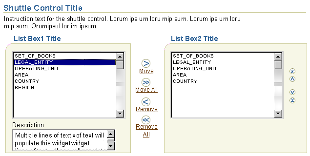
- Using a non-editable text area directly below the available list box. When an item is selected, the description for the item displays in the text area. The description may consist of concatenated object attributes.
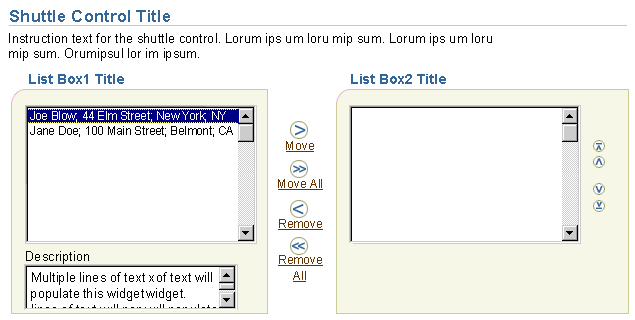
- A combination of the first and second options.
- The non-editable text area may be in the available or selected containers of the shuttle/reorder component.
- The description text should be shown automatically when a list box item is selected.
- When a description field is provided, include the following instruction text: "Select an {item} to see its description below.", where {item} refers to the objects in the list box.
- This solution should not be used if large performance issues will ensue.
- If multiple non-sequential items are selected, with the CTRL key selected, the description box displays the last selected item. If a sequential set of items are selected, with the SHIFT key, the description box shows the first selected item, but once the span is selected, no description shows.
Standard Shuttle with Description Text Area; Description Text Shown Based on Selection
The description area may be in the "available" list box or in both the "available" and " selected" list boxes of the shuttle/reorder component.

Standard Shuttle with Concatenated Attributes
Multiple attributes regarding the list box items may be shown as comma delimited values.

Standard Shuttle with Both Description Text Area and Concatenated Attributes

Tabular and hierarchical shuttles can display item attributes as columns within a table or HGrid.
- If a table includes optional Move Up and Move Down icons, it should contain no more than three optional attribute columns to avoid excessive horizontal scrolling. Note that a tabular shuttle must contain at least one attribute column -- otherwise use a standard shuttle.
- Each HGrid should contain no more than two optional attribute columns to avoid excessive horizontal scrolling when large hierarchies are expanded.
Tabular Shuttle with Attribute Columns and Record Navigation

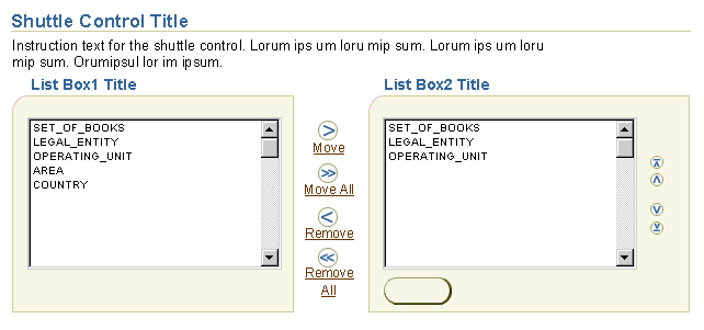
Within a container of the standard shuttle control, there may be action buttons associated with the list. An item is first selected from one of the lists, then the action button is selected.
Standard Shuttle with Action Button in One Container

Standard Shuttle with Action Buttons in Both Containers

If items on a page (not the standard shuttle page) need to be reordered, the standard shuttle container with the reorder controls may be displayed without the other shuttle elements.
- The originating page has an action/navigation button in the appropriate location depending on the page layout. The button is labeled, "Reorder [Items/objects]". The user selects the items, and the page redraws with the reorder portion of the shuttle only. The user reorders the items in the list, selects the page level "Apply" button, and return to the initial page.
- The reorder container may be on a page with other sections.
- The reorder container may optionally have action buttons (associated to a selected item) and/or a description text area (associated to a selected item.)
Standalone Reorder Container
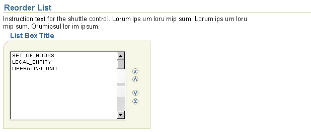
- Container Title
- Font Face = Arial, Helvetica, Sansserif
- Font Size = 11pt
- Font Style = bold
- Font Color = dark blue; #336699
- Container
- List Box within Container
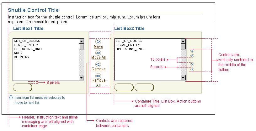
- The list boxes between the containers should be the identical size regardless of the data that is within them. For instance, if one list box has 10 items, and the other has none, both list boxes will be the sized according to the number of items in the list box with contents. If the item number in one of the list boxes exceeds the maximum line number, the list box will scroll. If the number of items between both list boxes is less than the minimum, each box will default to the minimum value.
- Maximum Line Height = 20 rows
- Beyond 20 rows, the list box will scroll.
- Minimum Line Height = 10 rows
- The list boxes will not be less than 10 rows.
- Labels for Controls Between Containers
- Font Face = Arial, Helvetica, Sansserif
- Font Size = 9pt
- Font Style = regular
- Font Color = link brown; #663300
- Shuttle Icons Between Containers
- Move or Add

- Move All or Add All

- Remove

- Remove All

- Icons within a Container
- Move to Top

- Move Up

- Move Down

- Move to Bottom

- Table Move Up/Move Down FunctionalIcons
- Move Up

- Move Down

Diagram of Elements of the Shuttle Component

Measurements of Elements within the Shuttle Component

Open Issues
24-Jul-2003: For a future revision of this guideline
- When hierarchy in selected items container (and in resulting page) displays nodes from different levels/locations of the hierarchy as peers, there is currently no way to indicate this other than through drill down on the node to display HGrid breadcrumbs.
Closed Issues
25-May-2001 - first round of shuttle enhancements in v2.1 doc.
