Table Flows
Last Updated
20-Mar-2004
The many common flows associated with Tables are described in this BLAF Guideline. In general, all Object Template guidelines apply to these flows. See the related guidelines listed in the General Principles section.
Guideline Contents
Spec Version # - 3.1
Spec Contributors - Betsy Beier, Craig Louis, Mervyn Dennehy, Ivy Leung
UI Models - all models
Example Products - all products
Related Guidelines -
Table,
Warning
(Messaging) Template,
Object Templates,
Object List Template(s),
1 Step Transaction Template,
2 Step Process,
3[+] Step by Step Templates,
HGrid Flows,
Icon Repository for BLAF
In general, all Object Template guidelines apply to these flows, see Object Templates for all options.
Other directly related guidelines include:
References to Global table buttons in this guideline refer to non-selection dependant Act/Nav controls in the table Control Bar. See Tables Guideline: Table Control Bar for more information on selection dependent and non-selection dependent table controls.
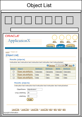
Add a Row allows a user to add a row to an Object List (or table). The different methods for accomplishing this as well as the heuristics for choosing the appropriate method are described in the following sections.
Section Contents
The Create template method should be used to add a row when:
- There are a large number of attributes needed to populate a new object row.
- Creating a new object row is time consuming.
This method is described in detail in the Create section later in this guideline.
The Add a Row button should be used within an object list when:
- The intent is to produce a spreadsheet-like interaction.
- There are a small number of attributes needed to populate a new object row.
- When the attributes needed to populate a new object row are based on those already available in the table.
Note: If 'Add Another Row' results in blank leftover rows when submitting the page, those blank rows will be removed the next time the server is hit.
Add a Row Flow

For full details on this method, see Tables Guideline: Add Row(s) to a Table.
When the intent is to add a row from an existing list of objects, use an LOV. For details, see the LOV (List of Values) Template Guideline.
Add a Row Inline should be used when:
- There are few objects in the Object List.
- There are few attributes needed to specify a new object.
- It is understood that the user is not creating a full object.
Add a Row Inline Flow

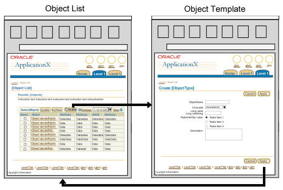
Create allows a user to create a new object and view the resulting changes within the Object List.
The Create template is the same as the Update Template except the fields/tables/etc on the page may be pre-populated based on default settings. Where defaults are not appropriate, there is no data in the widget.
There are multiple options for the create template. A create process may be one or multiple linear steps or it may be divided into multiple (non-linear) logical sections using the side navigation. (Images showing all the varied options will be added.)
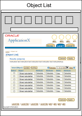
- Object List
- Click the "Create" global table button.
- Object Template
- The Object Template is displayed with blank fields (some fields
may contain default values).
- Fill out the template, then click the "Apply" button
- Object List
- The Object List is displayed with the created object.
Create Flow

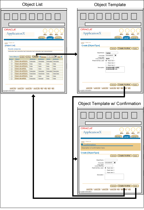
Create Another allows a user to create multiple new objects and view the resulting changes within the Object List.
- Object List
- Click the "Create" global table button.
- Object Template
- The Object Template is displayed with blank fields (some fields may contain default values). (Note: This page is sometimes just a subset of the full object, allowing the user to quickly define the base attributes without having to fill out all the object properties. Typically this approach is taken when creating a full object may take several hours or even days. The "base" attributes on the page should be the most frequently used fields, and/or all the required field necessary to define the object.)
- Fill out the template, then click the "Create Another" button.
- Object Template with Confirmation
- The Object Template is displayed with a confirmation message box indicating that a new object was created.
- For each additional object that must be created, fill out the template and click the "Create Another" button.
- When no more objects must be created, click the "Apply" button.
- Object List
- The Object List is displayed with the created objects.
Create Another Flow

Quick Create is a less frequently used method to create a new object while within another process, or in the midst of performing another transaction. Quick Create is only used to create objects that are subordinate to or related to the primary task/action.
For example if a user is entering a transaction, and needs to assign it to an account, but existing accounts are not a good match, the user could Quick Create an account to be able to complete the transaction.
- The Quick Create template is a reduced version of the Create/Update Template that includes a minimal number of fields. Quick Create pages do NOT allow users to complete all fields for the created objects.
- A Quick Create page must contain all required fields, and may contain additional fields depending on context.
- The fields may be pre-populated with default settings. Where defaults are not appropriate, there is no data in the widget.
- Quick Create always returns the user to the originating page, which is typically not the object list for the type of object created.
- There is a risk that users will assume that Quick Create is the only way to create this type of object, resulting in inefficient and potentially problematic work habits. Consequently, Quick Create should be used only in processes where deviating from the primary process to a "full" create page has a significant risk of jeopardizing the primary process.
- Page within a Process/Action
- Click the "Quick Create" action/navigation button.
- Quick Create Object Template
- The Quick Create Template is displayed with a subset of the object's fields that includes all required fields (some fields may contain default values):
- The Quick Create Template has the page title syntax of "Quick Create {ObjectType}"
- If only a single object needs to be created, display the fields in a form layout.
- The form may also contain an action/navigation button labeled "Display All Details" that toggles the page to show all of the object's fields.
- The full details page should have the same fields and elements as the Create Object page, except that it does not allow the user to navigate to the object list for the created object.
- The full details page has the page title syntax "Quick Create [ObjectType]: All Details". The object type should only be omitted if it is an overly long string.
- If multiple objects of the same type need to be created quickly, use the Create Another flow. In a step-by-step process (NOT when performing Quick Create from a single-step transactional page) the Quick Create template may also consist of an updateable table with a row for each object. The disadvantage of this approach is that users will not have access to additional object details fields until after they complete the step-by-step process.
- After filling out the Quick Create template fields, click the "Apply" button
- Originating Page within the Process/Action
- The originating page contains an inline confirmation message:
- If the Quick Create page can only create one object: "{ObjectType} {ObjectName} has been created." For example "Employee Jane Smith has been created."
- If the Quick Create page allows creation of multiple objects, provide a bulleted list of created objects in the message:
"The following {SecondaryObjectType} have been created with a minimum set of fields:
- {ObjectName1}
- [ObjectName2, etc.]
- Unless it is obvious to the application's users, or the user has already completed the additional fields as described above, consider adding the following informational text to the Confirmation message:
- "After you complete the {PrimaryProcessName} process, you can fill out the remaining {SecondaryObjectType} fields at any time in the [TabName] {PageTitle} page."
- Note that it may be necessary to include the tab name to help users navigate to the right page.
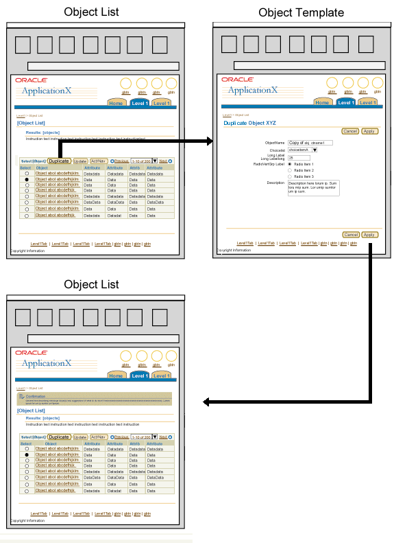
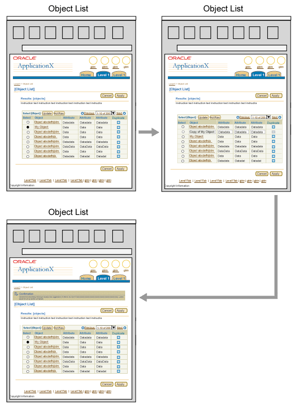
Duplicate allows a user to duplicate an existing object and view the resulting changes within the Object List. Duplication can be performed inline, or on a separate Duplicate Template page.
Section Contents
The Duplicate Template is the same as the Update Template except that fields/table/etc. on the page are pre-populated based on settings of the object that is being duplicated. The field that contains the name of object should be pre-populated with "Copy of [ObjectName]" so the original object is not overwritten. This is the preferred method of duplication when an object has many required or significant fields.
- Object List
- Select the row containing the object to be duplicated and click the "Duplicate" control bar button.
- Alternatively, click the "Duplicate" icon appearing in the row that contains the object to be duplicated.
- Object Template
- The Object Template is displayed showing all fields populated with contents of selected object. The object name field should read "Copy of X", where X is the name of the original object.
- Make any necessary edits to the template, then click the "Apply" button.
- Object List with confirmation message
- The Object List is displayed with the original and duplicate object, and a confirmation message.
Duplication using Duplicate Template Flow

When duplication is performed inline, a new row is inserted above the current or selected row. The new row contains updateable fields that are pre-populated with duplicate data. The primary field in the new row contains the text "Copy of {ObjectName}". Consider using inline duplication when:
- All of the object's required fields are displayed in the table, AND
- The table has room for a column of Update icons, or an Update button in the control bar (so the user can fill out the object's other fields later).
- Object List
- Select the row containing the object to be duplicated and click the "Duplicate" control bar button.
- Alternatively, click the "Duplicate" icon appearing in the row that contains the object to be duplicated.
- Object List
- A new row is inserted above the original row. The new row's fields are pre-populated with the data from the original row, except that the object name field reads "Copy of {ObjectName}".
- The row selector and any functional icons in the new row are disabled (until the user clicks the page-level Apply button).
- Rename the object and make any necessary edits to the other fields.
- Object List
- The Object List is displayed with the original and duplicate object (the duplicate object's row selector and functional icons remain disabled).
- Duplicate other objects as needed, then click the page level "Apply" button to confirm all changes to the object list.
- Object List
- The Object List is displayed with the original and duplicate object(s), and an inline confirmation message.
- The row selector and functional icons for the duplicated object(s) are now enabled.
Note: When duplicating an object inline, users can only update object attributes that appear in the object list. After they click the page level Apply button to save the duplicated object, they can use an Update button or Update icon to navigate to an object page containing all of the object's attributes.
Inline Duplication Flow

Delete allows a user to delete an object and view the resulting changes within the Object List. When dependencies or certain other conditions are present, Warning Message Page display should be considered.
Section Contents
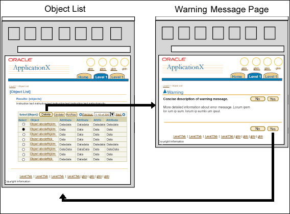
- Object List
- Select the row containing the object to be deleted and click the "Delete" control bar button.
- Alternatively, click the "Delete" icon appearing in the row that contains the object to be deleted.
- Warning Message Page may be displayed depending on context. See Use of Warning Messages below for details.
- Object List
- The Object List is displayed with the deleted object omitted.
Delete from Object List - Flow

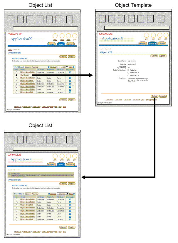
- Object List
- Select the object and click Update to go to the updateable object template.
- Select the object name hyperlink to go to the read-only object template.
- Object Template
- Click the page level Delete button.
- Object List
- The Object List appears without the deleted object, and the page includes a confirmation message.
Delete from Object Template - Flow

Depending on context, Warning message pages may need to be displayed when a user attempts to delete one or more objects. However, Warning messages can be annoying to professional users, by increasing the number of steps required to perform an operation, so designers must carefully evaluate the requirements below to determine whether or not to use a Warning message.
A Warning message should be provided if any of the following conditions are present:
- Dependencies exist in the data being deleted. In this case the dependencies should be listed, so the user can make an informed decision whether to proceed with deletion or not.
- The data would be time consuming to recreate.
- When it may not be obvious that one or more objects WILL be deleted, such as a selection across multiple record sets.
- If the UI shows no indication that one or more objects HAVE been deleted.
If ALL of the following conditions are present, do not use a Warning message:
- The deleted object(s) has no data dependencies.
- The UI clearly indicates which object(s) WILL be deleted.
- The UI clearly indicates that the object(s) HAS been deleted (such as removal of a row from an object list).
- The object(s) is not time consuming to re-create.
Note: Warning message pages should list all objects being deleted, as well as any data dependencies.
Update allows a user to update an object and view the resulting changes within the Object List.
Section Contents
The content on the template should be divided into logical sections, with each section named appropriate to the content it quantifies. The template may have many sections, when there are more than 4 sections, Quick Links should be considered. If the page is very long, or there are dependencies within the data that makes up the object, it may be broken into multiple pages. Possible other designs may be: use of side navigation, subtabs, one of the step by step flows. See Object Templates for more options.
The page may have label/data information and/or an updateable table depending on the object that is being updated.
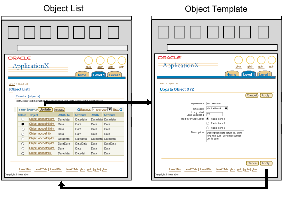
- Object List
- Select the row containing the object to update and click the "Update" control bar button.
- Alternatively, click the "Update" icon appearing in the row that contains the object to be updated.
- Object Template:
- The fields of the Object Template are populated with the contents of the object.
- Make any changes to the template, then click the "Apply" button.
- Object List
- The Object List is displayed with the updated object.
Update Flow

Update Object Inline on Object List allows a user to update an object and view the resulting changes from the same page.
- Object List
- The Object List is displayed with updateable fields.
- Make any changes and click the "Apply" button.
- The Object List is displayed with the updated object.
Update Object Inline on Object List Flow

Users can simultaneously update a property for multiple objects inline. They can set all rows within of an Object List to a specific column value (an inline property), and view the resulting changes within the Object List.
- Object List
- The Object List is displayed with:
- At least one column with updateable fields.
- A drop down choice list in the control bar labeled "Set X," where X is the header of the updateable column.
- A "Go" button in the control bar.
- Select the desired value from the choice list and click the "Go" button.
- The Object List is displayed with the updated object.
For example images and details on this flow, see the Batch
Detail and Batch Processing guideline.
Tables can provide different options to sort their contents, as described in the following sections.
Section Contents
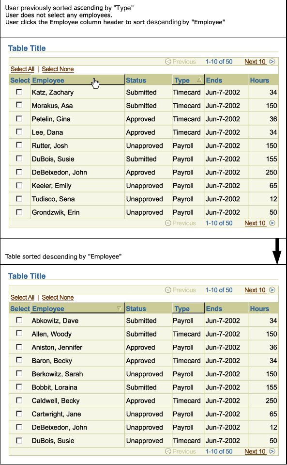
Sort Without Selection allows a user to sort all objects within an Object List according to their values in a specified column.
- Object List
- The headings of sortable columns appear raised within the Object
List.
- Click a sortable column heading.
- The Object List appears sorted ascending by the selected heading.
- An upward triangle appears right justified within the selected heading.
- Re-select a sortable column heading to toggle the sort between ascending and descending order, which is depicted respectively by the upward and downward direction of the triangle.
Sort Without Selection Flow

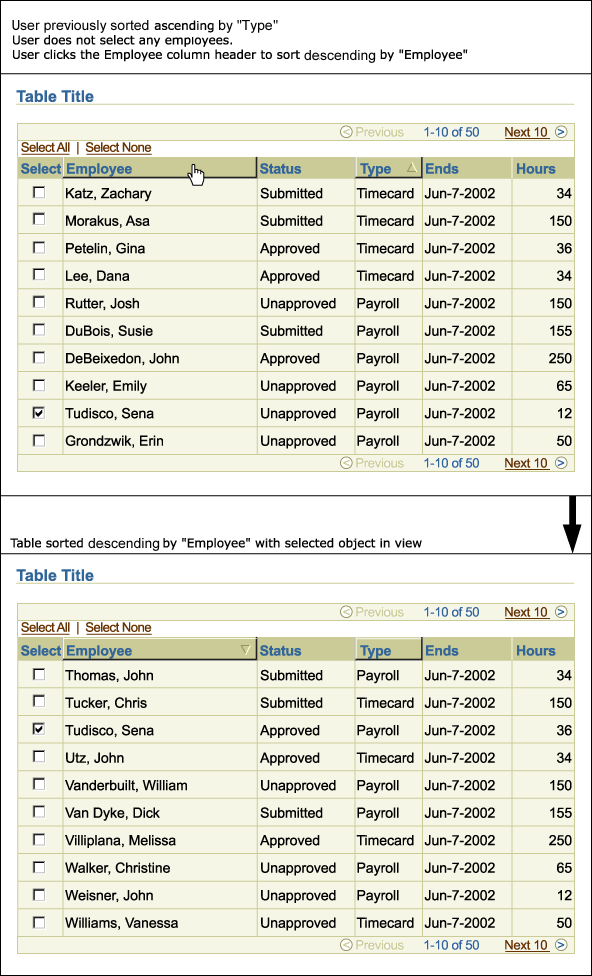
Sort With Single Selection allows a user to view a selected object in the context of its position within a sorted Object List.
- Object List
- The headings of sortable columns appear raised within the Object List.
- Select a single object of interest.
- Click a sortable column heading.
- The Object List appears sorted ascending by the selected heading.
- An upward triangle appears right justified within the selected heading.
- The selected object row remains in view. (Data is sorted, and selected object is within the displayed record set.)
- Re-select a sortable column heading to toggle the sort between ascending and descending order, which is depicted respectively by the upward and downward direction of the triangle. The selected object row remains in view regardless of the chosen order.
Sort With Single Selection Flow

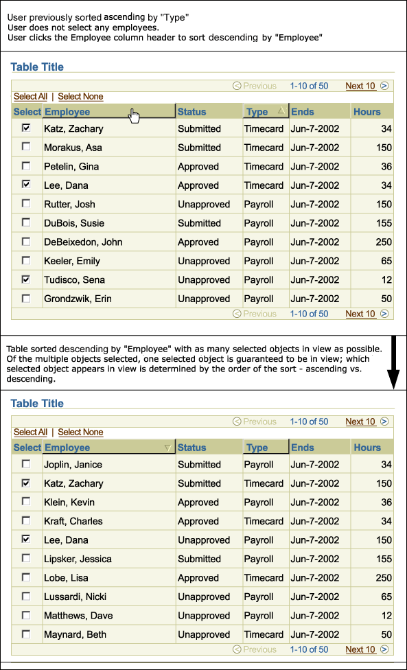
Sort With Multiple Selection allows a user to view several selected objects in the context of their positions within a sorted Object List.
- Object List
- The headings of sortable columns appear raised within the Object List.
- Select the check boxes in the Selection Column for multiple objects of interest.
- Click a sortable column heading.
- The Object List appears sorted ascending by the selected heading.
- An upward triangle appears right justified within the selected heading.
- The first selected object row to occur within the sorted order always appears in view in the record set. Other selected object rows may appear in view provided they are visible within the constrains of the sorted order.
- Re-select a sortable column heading to toggle the sort between ascending and descending order, which is depicted respectively by the upward and downward direction of the triangle. Regardless of the chosen order, the first selected object row to occur in the sorted order always appears in view.
Sort With Multiple Selection Flow

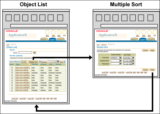
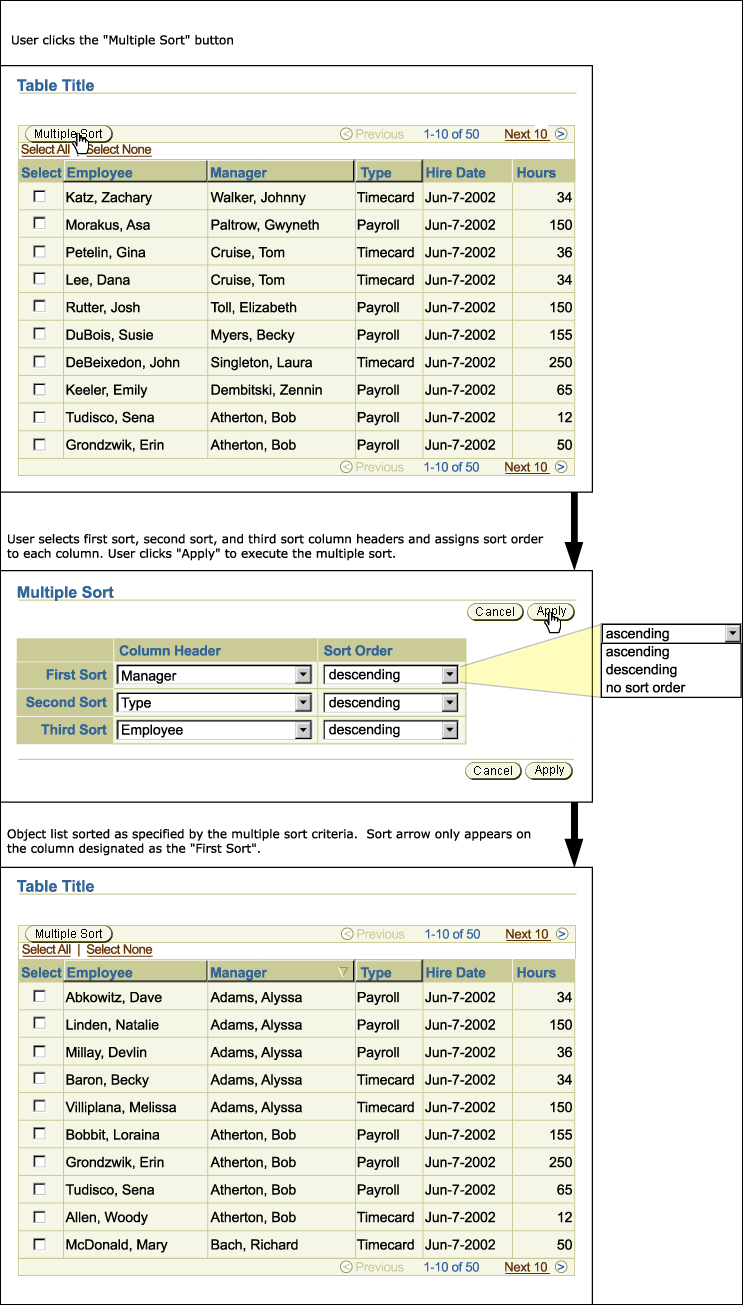
Sort by Multiple Columns allows a user to sort an Object List by multiple column values and view the resulting changes within the Object List.
- Object List
- Click the "Multiple Sort" global table button.
- Multiple Sort
- The Multiple Sort page is displayed.
- Select the order of which columns to be sorted (either by first, second, or third sort) and then sort order (ascending, descending, no sort order) for each column heading, then click the "Apply" button.
- Object List
- The Object List is displayed with objects sorted by the specified criteria.
- A triangle Column Sort icon appears right justified within the column heading designated as "First Sort." The triangle points upward or downward depending on whether the specified sort order was ascending or descending, respectively.
- No other sorted column heading is displayed with a triangle.
For more on the Column Sort icon, see Tables Guideline: Functional Icons in Column Header that Affect a Data Column
Sort by Multiple Columns Flow

Sort by Multiple Columns Flow (Close-Up)

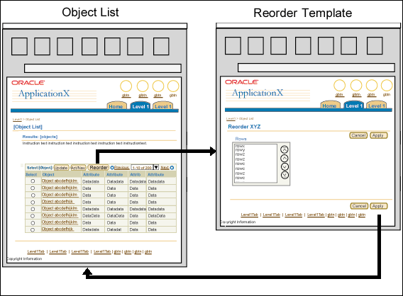
Reorder allows a user to change the displayed order of rows within an Object List. Using this method, the flow takes the user to the Reorder Template, where they can rapidly rearrange row order without waiting for page reload of the whole object list. The entire object list appears in the new order only after the user submits it in the Reorder Template.
Consider using the Reorder Template when the position of individual objects within a list is significant to the user, and Sort functionality does not provide a fine enough level of control.
- Object List
- Click the "Reorder" non-selection dependent table button.
- Reorder Template
- Use the Reorder component to select an object row and move it up or down within the Object List and click the "Apply" button.
- Object List
- The Object List is displayed with the order of the object rows specified in the Reorder Template.
Reorder Flow

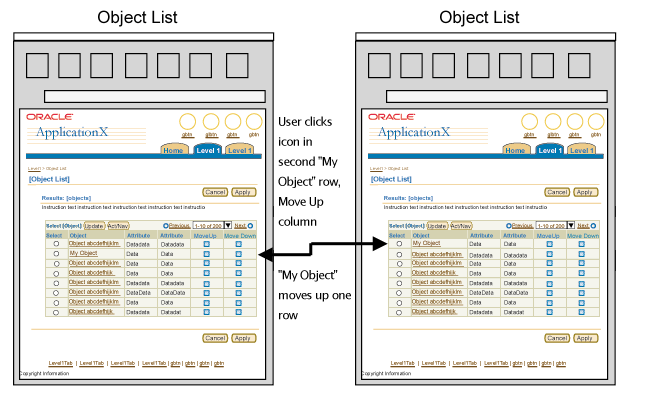
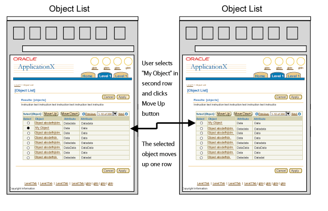
Move Row allows a user to move a single row up or down, one row at a time in an object list. Unlike the previous Reorder Rows method, this method allows users to perform the rearrangement without leaving the object list page.
Consider using Move Row when the position of individual objects within a list is significant to the user, and Sort functionality does not provide a fine enough level of control.
Move Row can be implemented using either a pair of functional icon columns (Move Up, Move Down), or with selection dependent action buttons in the table control bar, as discussed in the following sections:
Section Contents
- The columns are labeled "Move Up" and "Move Down".
- The Move Up and Move Down column pair may occupy any column position to the right of the Primary Object Column. The Move Up column should be placed to the immediate left of the Move Down column.
- Each row contains both a Move Up icon and a Move Down icon.
- The Move Up icon in the first row and the Move Down icon in the last row are shown in a disabled state.
- Action buttons are labeled "Move Up" and "Move Down".
- User selects row in selection column, and then selects action button.
- Control bar action buttons should be used if ALL three of the following conditions are present:
- There is not enough space for an additional column, or the table will be too cluttered
- There are not more than two existing control bar buttons
- The table has a single-select Selection Column (with radio buttons), not multi-select (with selection boxes).
- First And Last Rows:
- Attempting to move up the first row, or move down the last row should evoke no result.
- Selecting the first row in the object list and clicking "Move Up", should result in no action.
- Selecting the last row in the object list and clicking "Move Down", should result in no action.
- Object List
- Click a Move Up or Move Down row icon, OR
- Select a row, and click the "Move Up" or "Move Down" control bar button.
- Object List
- The Row moves up or down one position.
Move Row Using Functional Icons - Flow

Move Row Using Selection-Dependent Table Buttons - Flow

Users can resize column widths in a table to adjust data display. Column resize can be provided as a standalone feature, or as part of the table personalization process. In both cases, column resize can be performed in one of two ways, depending on browser capabilities and accessibility requirements:
- Using drag and drop within the table
- Navigating to a separate properties page (for both column width and column order)
For details on column resize behavior and constraints, see Resizing Columns in the Tables guideline. For details on table personalization, see Personalization of Views (Tables and HGrids).
Users can reorder columns in a table to adjust data display. Column reorder can be provided as a standalone feature, or as part of the extensive HGrid personalization process. In both cases, column reorder can be performed in one of two ways, depending on browser capabilities and accessibility requirements:
- Using drag and drop within the table
- Navigating to a separate properties page (for both column order and column width)
Note: Users cannot change the position of a table's Selection Column or its Primary Object Column. In most languages, primary objects always appear either in the left-most column position, or immediately to the right of the selection column. In BiDi languages the primary object column and selection column appear on the right.
For details on column reorder behavior and constraints, see Reordering Columns in the Tables guideline. For details on table personalization, see Personalization of Views (Tables and HGrids).
The Hide/Show component can be used to hide/show additional details in a single cell or in an entire row. When Hide/Show is implemented for rows, a Hide All Details/Show All Details control may also be provided. For details on these functions, see Hide/Show in the Tables guideline.
Tables provide different options for navigating between record sets. For details see Record Set Navigation in the Tables guideline.
Section Contents
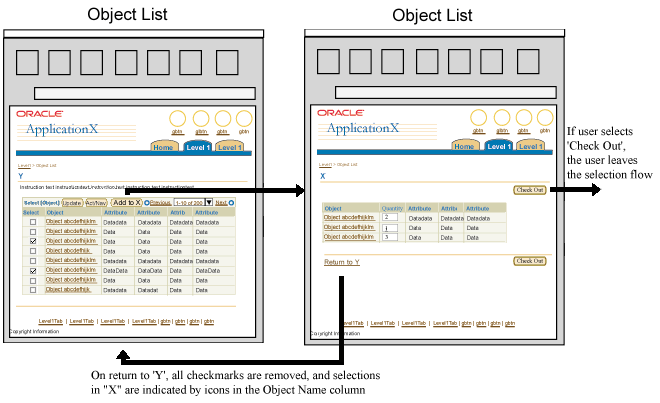
A Shopping Cart model allows a user to add objects in one Object List to another Object List residing on another page (select from one table to add to another page).
- (original) Object List
- Select one or more objects from the Object List and click the "Add to X" button, where "X" is the name of the destination Object List.
- (destination) Object List
- The (destination) Object List will be populated with the selected objects
- The destination object list may allow users to change certain object attributes, such as quantity.
Note: Actions should be kept to the minimum needed on the destination page.
- Click the "Return to Y" link, where "Y" is the name of the original Object List, or click a page level button such as "Check Out" to leave the selection flow.
- (original) Object List
- All check marks are removed from the Selection Column.
- A 'Previously Selected' icon (currently being developed) indicates which objects were added to the destination object list. The Previously Selected icon is placed to the right of each applicable object name within the object name column.
- Optionally, a content container may be placed on the page to provide a running total of the number of objects placed in the shopping cart.
Shopping Cart Flow

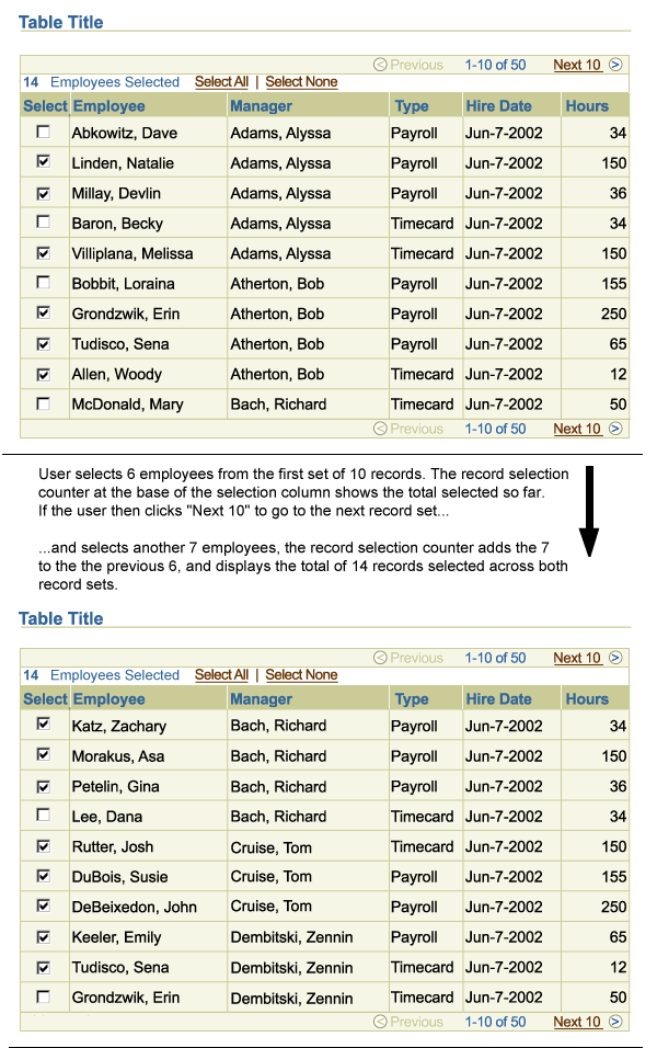
When a multi-select table has more than one record set, users can select objects from different record sets and have the system remember the selection. This allows the user to perform a task on several selected objects at one time, even though they are not displayed on the same page.
A Persistent Record Selection Counter is displayed in a table Selection Bar to inform the user how many rows have been selected. The selection counter is persistent and dynamic, and so is updated as each record is selected or deselected.
For component details, see Persistent Selection Among Record Sets in the Selection Bar section of the Tables Guideline.
Persistent Selection Flow

See template guidelines for details about the individual page templates used in this flow. From that guideline, see the individual components for detailed visual specifications.
Open/Closed Issues
Open Issues
none
Closed Issues
none


