Key Notation
Last Updated 09.28.03
General Description
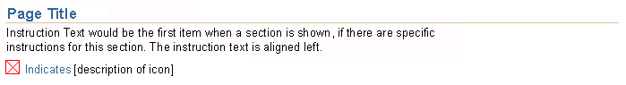
Key Notation is a type of legend used to define icons, elements, or terms that are used within the content of a page or a section of page content. Common uses for Key Notation include definitions of the Required Field icon, currency, and abbreviations of standard terms or phrases. The notation can be applicable to the entire page, a section of content, or a table. The content of this guideline is as follows:
Note: Key Notation should not be confused with a graph legend -- a page may contain no more than one Key Notation area, but may contain a separate legend for each graph.
Guideline Attributes
Spec Version # - 3.1
Spec Contributors - Betsy Beier, Mervyn Dennehy, Lisa Serface, Craig Louis
UI Models - all models
Example Products - all products
Related Guidelines - Common Formats, Abbreviations,
Accessibility , Icons, Language
in UI, Page Stamps, Component
Order, Tables, Hide/ShowInteraction and Usage Specifications
Key Notation should be used when a page contains status icons, symbols, or terms that may not be self-explanatory to users of an application.
- Key Notation may be contextual to an entire page, or a section of content, or a table.
- A page may contain only one Key Notation area.
- Key Notation can be displayed in four ways, depending on the number and type of keys, and other elements on the page:
- Underneath a header component -- the page title, a subheader, or a subsubheader -- along with other optional components, including Instruction Text, the Hide/Show component, and Page Stamps.
- Underneath a SubTab when the information is specific to that SubTab.
- In a message page that is displayed when a user clicks an Information Icon. Information Icons for Key Notation can be placed in Tips or in table column headers.
- In a right-aligned content container placed below the page title, a subheader, or a subsubheader. This approach cannot be used in all contexts.
- You may design to allow users to turn off Key Notation in Preferences, accessed
with the global Preferences button. Refer to the Global Templates BLAF guideline,
Preferences Global Page
section.
- Key Notation pushes page content lower on the page, so avoid placing more than four keys beneath a header, or more than seven keys in a content container.
- Key Notation associated with a header component, including that in a content
container, can also be associated with a Hide/Show
More Information component, so users do not have to see unnecessary information
each time they go to a page.
- If the key contains an icon or other image (such as a graphical symbol), the image should have rollover text (ALT tag) to provide more information. The key description text should be derived from the icon rollover text.
- See Language in UI for capitalization rules
regarding key description text.
- Due to Internationalization and accessibility requirements, avoid abbreviations and acronyms unless all three of the following conditions are met:
- Abbreviation is unavoidable due to space constraints
- The abbreviated term is an Oracle standard abbreviation or standard acronym.
See the Abbreviations guideline for details.
- The full term or phrase is defined in one of the ways specified above.
- Due to Internationalization requirements, each Key Notation entry may only contain one definition. For example, the phrase "Amounts in {thousands} of {US Dollars}" contains two definitions, which makes it impossible to translate. If this information is needed, provide two separate Key Notation entries -- one for currency and one for scale.
- Depending on the application, some types of Key Notation may be essential, such as those which define scales of numeric values, whereas others, such as standard abbreviations, may only be of use to new users, and will lose their importance as the user becomes more familiar with the application.
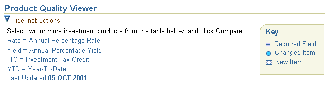
Example of Key Notation for Entire Page with Sample Page Content
There are three types of Key Notation syntax, depending on the type of element being defined:
- Icons and other images
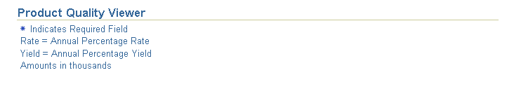
- Syntax: {Icon} Indicates {definition}
- Example:
 Indicates required field
- Terms and character-based symbols
- Syntax: {Term} = {Definition}
- Example: Yield = Annual Percentage Yield
- Example: Currency = US Dollars
- Scales of values
- Syntax: A phrase including both the defined element and its definition
- Example: Amounts in thousands
Note that scaling can also be defined with the {Term} = {Definition} syntax. The following table lists common types of Key Notation that use these three syntaxes.
| Type of Key |
Element Defined |
Examples |
Related Guidelines |
| Icons and other images |
Icon |
Indicates required field
 Indicates changed items Indicates changed items |
Icons |
| Map symbols |
 Indicates major road Indicates major road |
n/a |
| Terms and character-based symbols |
Monetary Units (with a single currency on page) |
Currency = German Marks |
Common Formats |
| Monetary Units (with multiple currencies on page) |
USD = United States Dollars
DM = German Marks |
| Time setting |
Time Zone = Pacific Standard Time |
| Measures |
Weight = Metric Tonnes
Distance = Miles
|
| Standard abbreviations |
Res = Resource |
Abbreviations |
| Standard acronyms |
RMA = Return Material Authorization |
| Contracted phrase |
Rate = Annual Percentage Rate
Yield = Annual Percentage Yield |
| Context-specific term or phrase |
On Hold = Item already requested by another user |
n/a |
| Scales of values (in scale format) |
Numeric values |
Amounts in thousands
|
Common Formats |
| Population in Millions
|
| Amounts in millions, except per share data
|
Key Notation can be displayed in four ways:
- Under a header component (page title, a subheader, or a subsubheader)
- Under a SubTab
- In a message page
- In a right-aligned content container placed below a header component.
The method chosen depends on the number and type of keys, and other elements on the page.
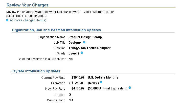
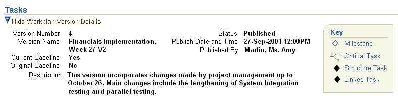
This is the standard method of displaying Key Notation. In this approach, up to 4 keys of any type can be displayed beneath the page title, a subheader, or a subsubheader. Definitions are presented above the first occurrence of the icon or term, but content is pushed further down the page. When associated with a Hide/Show More Information component, users can hide the Key Notation when it is no longer useful.
Example of Multiple Keys Under a Header
Caution: Key Notation of numeric scales, such as "Amount in
thousands" should not be associated with a Hide/Show component, as hidden scales could lead to serious user error.
Example of Key Notation with Hide/Show

In this approach, place a link to a message page in a Tip, or place an Information Icon in the column header of a table. When the user clicks the link or Information Icon, Key Notation is displayed in the message page. This method is useful when more than 4 keys require definition. However, if any of those keys provide definitions of numeric scales, they should be displayed prominently under a header component, while the remaining keys are defined on a message page.
Note: If your application allows users to turn off
Key Notation in their Global Preferences, any Tips that link to Key Notation
in message pages remain, allowing users to still access the Key Notation on
message pages. In this case to completely eliminate Key Notation, Tips must
also be turned off. Refer to the Preferences
Global Page section of the Global Templates BLAF guideline for more on Preferences.
Example of a Key Notation Info Link in a Tip
Note: If icons appear in more than one column of a table, use a Tip to display the message page, rather than placing info icons in each column header.
Example of a Message Page with Key Notation
In this alternate approach, up to seven keys can be placed in a content container, right-aligned below a header component. This method allows space to the left for other informational page elements such as contextual information, Tips, Page Stamps, and Instruction Text.
Example of a Key Notation in a Content Container
Consider the following principles when placing Key Notation in content containers:
- To avoid excessive white space, the number of keys that can be placed in the content container depends on the number and size of the informational page elements on the left. Designers must also consider that pushing active page elements further down the page can make the page less usable.
- When associated with a Hide/Show More Information component, users can hide the content container and the adjacent informational page elements when they are no longer useful.
- Avoid placing Key Notation for numeric scales in a content container that is associated with a Hide/Show component.
- Active page elements such as text fields can be placed adjacent to a content container, but, in general, they should not be associated with a Hide/Show More Information component.
- When all keys within a Content Container define icons or symbols, it is recommended to omit the word "Indicates" from the definitions to avoid repetition. If the keys consist of a mix of Key Notation types, all types should conform to the standard syntaxes defined above.
- The Content Container method cannot be employed with any components that require the full width of the page, such as table or hgrid components. Unlike the standard left-aligned method, the content container method also depends on other components to fill the space to its left.
Key Notation can be placed underneath a SubTab when the information is specific to that SubTab. Each SubTab can have its own separate Key Notation where needed.
Example of Key Notation Under a SubTab

When using more than one method of Key Notation to define elements on a page:
- Place higher priority keys, such as currency definitions, below a header -- either left-aligned below a header or in a Content Container -- and use a Tip or Information Icon to display lower priority keys, such as standard abbreviations, in a message page.
- Where possible, group keys by type. For example, place Key Notation for scaling and term definitions below a header and use a Tip with an Information Icon to display a message page with Key Notation for icons.
- If necessary, the Content Container method can be used in conjunction with the standard left-aligned method to display up to 11 keys (up to four on the left, and up to seven in the Content Container). However, it is recommended to use this combined method only in conjunction with a Hide/Show More Information control, so it is not appropriate for Key Notation of numeric scales.
Example of Combined Methods of Key Notation
Excessive use of Key Notation can be annoying to users who are either experienced in an application or familiar with the terminology common to a specific domain. However, new users may fail to complete a task if they are not provided with certain definitions. There are four ways to address these conflicting requirements:
- Provide a Hide/Show More Information control, so users can hide all Key Notation when they no longer need it (this option cannot be used with numeric scales).
- Use message pages to display Key Notation, so users only see it on demand.
- Display only the highest priority keys on the current page:
- Numeric scales must always be displayed directly in the current page, either as Key Notation, or in a chart legend.
- Abbreviations must be defined either on the current page or in a message page.
- If misunderstanding the icon/symbol/term cause users to fail to complete a task, then a key must be provided on the current page or in a message page.
- If it is likely that the user has already seen the definition on a prior page, then the key may be omitted.
- If users are expected to know certain terms before commencing work in a specific domain, such as Purchasing, or Accounts Payable, then those terms may be omitted.
- You may allow users to turn off Key Notation in Preferences, accessed with
the global Preferences button. Refer to the Global Templates BLAF guideline,
Preferences Global Page
section.
Contents of Key Notation
- 16 x 16 pixels icon (if icon is being defined)
- Icon is generally between 10x10-12x12 pixels within a 16x16 pixels total size
- Icon is separated from definition text by the equivalent of two non-breaking spaces.
- See Icon Guideline and Icon
List (full BLAF icon repository) for details.
- Term and definition text
- Font size = 10pt css
- Font style = regular
- font color = dark blue; #336699
- Term is separated from definition text by the equals sign with single spaces on either side.
- Keys are separated from each other with a single line break
Placement of Key/Legend Notation
Key Notation (only one per page) is associated with the header component. If Key Notation exists it is either underneath a header (or page title), a subheader, or a subsubheader. There are also other components that are positioned in this area, including Instruction Text, the Hide/Show component, and Page Stamps.
For the specific vertical layout order and placement of the Key/Legend compare
to other components, see Component Order.
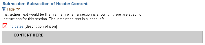
Key/Legend Placement with Instruction Text
Example of Key Notation for Entire Page with Instruction Text
Example of Key Notation for Section of a Page with Instruction Text

Key/Legend Placement with Hide/Show Component
NOTE: It is not recommended to place a required field within a hidden section of content
Example of Key Notation for Section of Page with Section Hidden

Example of Key Notation for Section of Page with Section Shown
Open/Closed Issues
Open Issues
None
Closed Issues
03-Jul-2003 - Added refs to global Preferences, user control over Key Notation display.
22-Apr-2003 - Added subtab method of displaying Key Notation; removed notation with combined currency and scaling; defined two ways of specifying currency.
10-Jun-2002 - Removed example of "Amount in thousands of US dollars" to meet I18N requirements.
11-Oct-.2001 - listed common key items, and added heuristics for number and frequency
07-Nov-2001 - added measurement graphic
13-Nov-2001 - changed definition font to blue to match Page Stamps
14-Nov-2001 - created draft v21 version of Abbreviations guideline to match updated Key Notation guideline.
26-Nov-2001 - Added Hide/Show option, and Content Container method.