Hide/Show
Last Updated
03-Dec-2003
General Description
The hide/show element allows a portion of the page contents to toggle between hidden or
shown. There are multiple valid locations where hide/show can be used:
- Hide/Show a Section or a Part of a Section on a Page
- Hide/Show Full Section
- Hide/Show with Link Text Directly Under Subheader or Subsubheader
- Hide/Show on Subheader or Subsubheader (no link text with this option)
- Hide/Show Part of a Section
example
- Hide/Show More Information
- Hide/Show More Search Criteria
- Hide/Show in a Table
- Hide/Show Details in a Cell of a Table
- Hide/Show Details of a Row of a Table
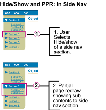
- Hide/Show in Side Navigation Element
Below is the contents of this guideline:
Guideline Attributes
Spec Version # - 3.1
Spec Contributors - Betsy Beier, Ivy Leung
UI Models - all models
Example Products - SSPurchasing, Resource Management, Enterprise Manager
Related Guidelines - Tables, HGrid,
Tabs (level 3 + sub options), Header
Component
Interaction and Usage Specifications
- The Show/Hide element is a toggle.
- The Show icon has a plus symbol in the arrow to indicate more information is available.
- The Hide icon has a minus symbol in the arrow to indicate information can be hidden if needed.
- Hide/Show usage should be consistent throughout an application.
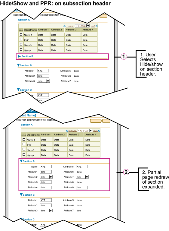
- The hide/show element for all options (basic, table row, table cell, subheader section and side navigation)
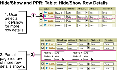
should use Partial Page Rendering (PPR) technology. When the hide/show element is
selected, only the portion of contents affected by the hide show should be redrawn, not the full page. If PPR is not available (unsupported browser, or other reason), the
behavior will default back to a full page redraw. See images below for details.
- Content that a user must see to complete a task, or content that is required should not have the ability to be hidden.
- There are 2 types of updateable fields/widgets that may be in hide/show, object attribute fields or criteria fields.
- Object Attribute Fields - fields/widgets that are part of updating an object.
- These fields should not be in a hide/show if they are frequently used or are crucial to completing the task (like updating the object)
- If the user changes the value(s), then hides the section contexts, the newly updated information should be cached. It should be saved when the user selects the page level "Apply" button.
- Criteria Fields - fields/widgets that are part of a search for an object
- Criteria fields, like used in a search with more options, may be within a hide show region.
- When the criteria is hidden, the fields/widgets within that hidden region are not used as part of the search.
- See Search/Query templates for details.
- A page that uses the hide/show element should have a default value of either content hidden or content shown depending on the task at hand.
- If the hide/show area is extra functionality or information that is not necessary to completing the task, the page should default with the functionality/content hidden.
- If the hide/show area is extra functionality or information that is often used, the UI designer and development team may choose to set the default state of the hide/show area to be shown.
- If the functionality or content is required or always used given the task at hand, it should not be placed in a hide/show area.
- The state of the hidden or shown area of a page should be remebered by the system. If a user has shown a section of content on a page, then leaves the page, when the user returns, the section of content shown should still be visible. The page should not redraw with the default hide/show value.
- Elements that require the hide/show link text are:
- Hide/Show a section of contents (when the hide/show is NOT in the subheader or subsubheader.)
- Hide/Show a portion of a a section of contents
- Hide/Show in a Cell of a Table
- Hide/Show in a Row of a Table
- Elements that do not require the hide/show link text are:
- The verbiage after the word "Show" and "Hide" should be specific to what information will be shown, and what information will be hidden.
- Hide/Show a Full Section (Subheader Section or Subsubheader Section)
- The primary Header (or Page Title) can not be a section that can have hide/show functionality. This functionality would make the entire page contents hidden, which is not useful to the user.
- Option 1: The hide/show icon and text can be placed directly below the subheader and/or subheader line to hide or show a section of contents. The hide/show toggle icon and the link text ("Show 'X'" or "Hide 'X'") are both selectable
and perform the same action. The arrow and "Show 'X'" or "Hide 'X'" label are always immediately below a subheader/line, subsubheader/line, or separator line, which quantifies the content of the section.
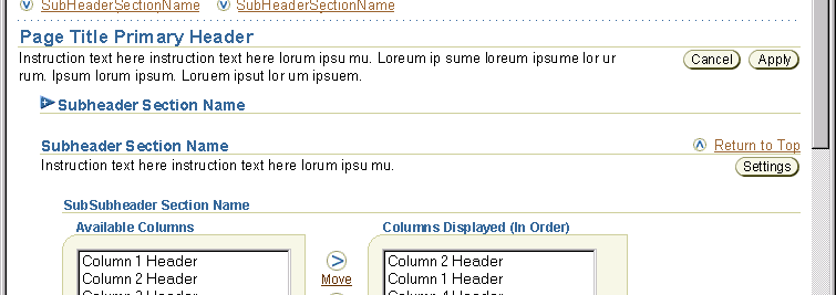
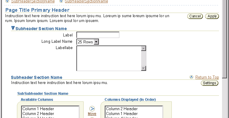
- Option 2: The hide/show icon may be used with a subheader or subsubheader,
see Hide/Show
Capability on Subheaders and SubSubHeaders. (Note: For this
option, only the hide/show icon is selectable. The subheader and/or
subsubheader text is not selectable.)
- Hide/Show a Portion of a Section
- The Hide/Show icon and link text are directly inline with the content. When the portion of the section is shown
the information follows directly beneath the hide/show icon and link text.
- See Table Guideline: Hide/Show
in Table for all interaction notes regarding hide/show usage in
tables.
- For hide/show in a table row, the first column of the table is labeled
"Details." Each cell in the column has an open/closed arrow icon followed
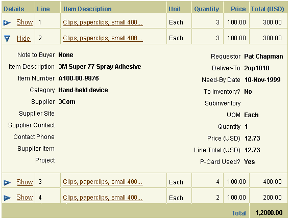
by a link that reads "Show" or "Hide." When the hide/show icon is selected, the table row expands to show additional details about that table row. Selecting the hide/show icon on a row that does not contain extra
details that can be shown or hidden would display an blank row. Hide/Show Row information should be used to
show more details regarding a specific row (or object.) It should not
be used to show secondary objects or children objects. See HGrid
or Master Details Template for alternative presentations of these types of information.
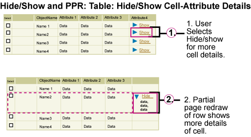
- For hide/show in a table cell, the hide/show icon and "Show [XXX]" or "Hide [XXX]" link text is the first
line in the cell. When the hide/show icon is selected, the table cell expands to show detail information regarding that cell, or collapses hiding
the detailed information.
Visual Specifications
Visual Definitions of Hide/Show
- text verbiage: "Show 'X'" and "Hide 'X'"
- text style: regular
- text font: Arial
- text size: 10pt CSS
- text color: link brown, #663300
- "Show" arrow icon

- "Hide" arrow icon

Hide/Show -Basic (Portion of section of content within a Page)
The basic hide/show element can be used in a section of contents of a page.
Basic Hide/Show with PPR

Hide/Show in Full Section of Page (Subheader or Subsubheader Section ONLY)
The hide/show is directly below a subheader or subsubheader, and if content
is shown, instruction text immediately follows the hide/show. See Component
Order guideline for complete list of the vertical order of the components.
Section Hidden on a Page with Hide/Show Icon and Link Text
This is an example of a subsection hidden.

Content Shown on a Page with Hide/Show Icon and Link Text
This is an example of a subsection shown.

Hide/Show in Subheader or Sub/Subheader: Content Hidden on a Page
To see all examples of hide/show on a subheader or subsubheader, see Header
guideline, Hide/Show
with Sub/Subsubheaders.
This is an example of a subsection hidden.

Hide/Show in Subheader or Sub/Subheader: Content Shown on a Page
This is an example of a subsection shown.

Hide/Show on a Subheader (or subsubheader) with PPR

Hide/Show in a Table
See Table Guideline: Hide/Show in
Table for all interaction and visual notes.
Table Row Content Hidden
This is an image of what a table would look like when details of a row's contents is hidden.

Table Row Content Shown
This is an image of what a table would look like when a details of a row's contents is shown.

Hide/Show of Table Row Details with PPR

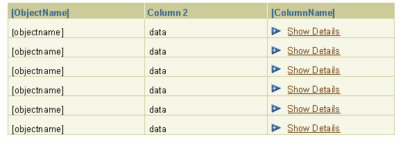
Table Cell Content Hidden
This is an image of what a table would look like when details of a cell's contents is hidden.

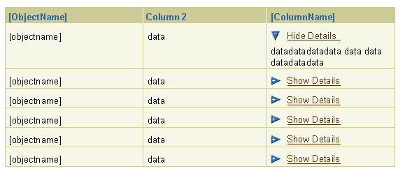
Table Cell Content Shown
This is an image of what a table would look like when a details of a cell's contents is shown.

Hide/Show of Table Cell Details with PPR

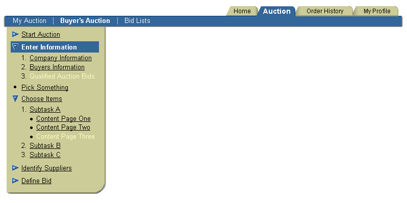
Hide/Show in Side Navigation
See Tab: Side Navigation for all interaction and
visual notes.
Hide/Show in Side Navigation

Hide/Show in Side Navigation with PPR
