HGrid (Hierarchy Grid or Tree Table)
Last Updated 02-Jun-2004
General Description
The HGrid shares many properties of a Table, most notably that it is a display of information in tabular format. The main difference between the two is that a Table displays a flat list of objects, whereas an HGrid displays objects in a hierarchy. The HGrid has similar behaviors to other hierarchical components, such as a Tree control and a Crosstab Table. The contents of this guideline are as follows:
Guideline Attributes
Spec Version # - 3.1
Spec Contributors - Betsy Beier, Carmen D'Arlach, Mervyn Dennehy, Craig Louis, Ivy Leung, Lisa Rinderknecht, Raymond Wong
UI Models - all models
Example Products - all products
Related Guidelines - Tables, Tree,
HGrid Flows, Hide/Show
Component, Personalization of Tables and HGrids
Interaction and Usage Specifications
An HGrid displays a hierarchy of objects in tabular format. In a Table, all objects are at the same level of hierarchy, whereas in an HGrid, objects are displayed in a hierarchy which may have successive levels of container and/or child objects. (A container may or may not have associated object information.)
- A Table provides a tabular format to view rows of objects with attributes. An HGrid provides the same view of objects and attributes, but also shows the hierarchical relationship between objects.
- An HGrid, like a Table may contain view-only data or updatable data.
- For detailed flows using an HGrid, see HGrid Flows guideline.
- Users can personalize views of HGrids. For details, see the Personalization of Tables and HGrids guideline.
HGrid - Overview Image of All Possible Elements
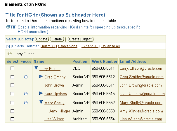
Tables and HGrids share many components.
- Table/HGrid Title - Header/subheader/or subsubheader component describing the Table or HGrid contents.
- Table/HGrid Global Actions Independent of Row Selection - (i.e., Create Object)
- Table/HGrid Instruction Text - Describes what the user needs to do regarding the Table or HGrid.
- Table/HGrid Tips - Section level tip may be appropriate to use with a Table/HGrid if there are special processes that occur when a Table interaction is initiated (for instance, a certain action may take a long time to process.)
- Control Bar - Area for selection instructions and selection dependent and global action/navigation buttons of a Table. (Note: selection column must be present with control bar.)
- Selection Bar - Area directly under Control Bar that appears in either of the following conditions:
- When a Selection Column is present in the Table/HGrid, the Selection Bar includes Select All|None controls. If multi-selection is offered, it also includes a Persistant Selection Counter.
- When HGrid Expand All|Collapse All functionality is desired.
- Selection Column - First column of Table reserved for selection column to provide user with the ability to select one or many rows to act on. (Note: control bar and selection controls are typically present when a selection column is shown. Select All/None behavior is somewhat different in an HGrid, read below for details.)
- Table/HGrid of Data - For HGrid, the Object column is a displayed as a hierarchy.
- Repeated Controls - Control Bar controls repeat at the bottom of the Table after a certain number of rows are displayed. This helps users gain easy access to information in Tables with many records.
- Record Navigation - Standard Table record navigation is not applicable to a hierarchy of containers and objects. Nevertheless, the "Focus" feature allows a user to isolate a node of the hierarchy, and support is provided for navigating through large record sets within a container. See Display of Large Record Sets in an HGrid below.
- Refresh Action Area of a Table - for controls that refresh the data or state of Table, but do not take the user to another page.
Totalling - There is no totalling in an HGrid for this version.
- Sorting by Clicking Column Headers - this is not supported in the HGrid column headers. To sort the contents of an HGrid, a global action/navigation Table button, called "Sort [HGrid]" should be used. See Sort Nodes in the HGrid Flows guideline for details.
Tables and HGrids share many aspects of information design. Note that most of the links below point to the related sections of the Table guideline:
Hide/Show in an HGrid operates on parent nodes and subordinate container nodes. Hide/Show in a Table operates on selected rows or selected cells only, and does not propagate hierarchically.
- Hide/Show
- Hide/Show of a Table Row
- Hide/Show of a Table Cell
HGrids and Tables share the following interaction features:
- Create a new object or line entry
- Delete a row
- Update object information
- Resize and reorder columns (using drag and drop, or a properties page)
For details on most actions, see Table Flows guideline and see the HGrid Flows guideline. For details on drag and drop functionality, see Resizing Columns and Reordering Columns in the Tables guideline.
- Sorting - HGrid column headers are not sortable. If sorting is needed, see Sort Nodes and Sort All Nodes in the HGrid Flows guideline.
- Searching with an HGrid - When searching for an object on a page with an HGrid, the results are returned in a flat Table. See Search a Hierarchy in the HGrid Flows guideline for details.
- Totalling - Totalling in an HGrid is not supported at this time.
In addition to applicable Table subcomponents and elements (listed above), the hierarchy of objects consists of:
- Object names and container names.
- A Hide/Show toggle icon that is used to expand and collapse a parent node or container.
- A Focus control (column labeled "Focus" with icons per cell) that allows a user to denote the container or parent as the root parent of the HGrid.
- HGrid Breadcrumbs to provide users with a hierarchical path of the objects in view, starting at the top root of the hierarchy.
- Optional Expand All | Collapse All Controls to quickly open or close all parent or container nodes under the current root.
- A single hierarchy of data or multiple hierarchies of data. If an HGrid contains multiple hierarchies, all the hierarchies should be placed under one root name. This name should be the umbrella term for the contents of all the hierarchies. For instance, an HGrid may display many budgets, each budget being an independent hierarchy. To display all of these hierarchies in the HGrid component, the HGrid root should be named "All Budgets."
Note: An HGrid must have a single root node to enable navigation up and down the hierarchy once the Focus control is used. Without a single root, if users focused on branch A, they would not be able to use HGrid breadcrumbs to redisplay branch B. Consequently, when combining multiple hierarchies in a single HGrid, it is necessary to create a single root using a suitable umbrella term, such as "All Products" or "All Items".
HGrid - Diagram of Elements
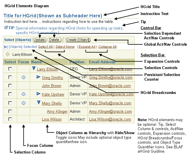
- Parent Object - a parent object is a container that also has object details. It may contain other parent objects, child objects, or just containers only. It is represented as link text and has an associated Hide/Show toggle icon.
- Container Only - a container (only) does not have object details. It may contain parent objects, child objects, or other containers (only). It is represented as just text, and has an associated Hide/Show toggle icon.
- Child Object - a child object is not a container, but has object details. It may not contain anything. It is represented as link text, but does not have an associated Hide/Show toggle icon.
- Every object may have a link to drill down to object details. A container may or may not have a link depending on whether the container contains property and/or object information.
- Each item (container and/or object) may also have an optional icon defining the container or object type. See Icon Repository: Object Type Quantifier/Tree Icons for current list of these types of icons.
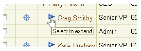
Rollover of Hide/Show Control
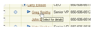
Rollover of ObjectName Link
- The Hide/Show toggle icon has two states, either open or closed.
- The icon signifies that the parent object or container contains other parent objects, containers, and/or child objects.
- The user can expand and collapse nodes, except when focusing in on a node that has not been previously opened.
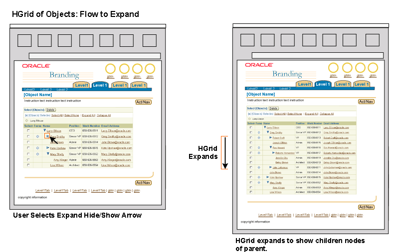
- Expanded and Collapsed node states are maintained as other nodes are opened and closed.
Expand Container/Parent in HGrid
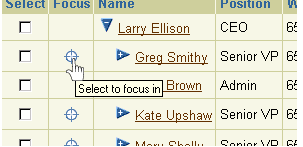
- The Focus control allows the user to select a parent object or container and make this the "root" parent/container of the HGrid.
- When a parent or container object is focused, the item becomes the parent/container root of the HGrid, and is displayed expanded to one level (unless otherwise configured as expanded). HGrid Breadcrumbs are also displayed, showing the hierarchical path from the top root of the hierarchy to the parent/container selected as the "root".
- A child object cannot be focused. Nevertheless, under certain circumstances it may be displayed alone within an HGrid. See HGrid Breadcrumbs, below, for details.
- The HGrid breadcrumbs are used to "focus" out, or move back higher in the hierarchy.
- The Focus control (and HGrid Breadcrumbs) are optional. If the overall size and depth of the hierarchy is relatively small, it may be appropriate to omit these controls to reduce clutter. The default behavior of the component, however, is to display these functions.
Rollover of Focus
Focus on Container/Parent - New "Root"
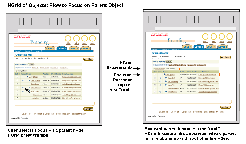
- HGrid Breadcrumbs are always present with the Focus control in an HGrid Table. When an HGrid is displayed from the root of the hierarchy, the HGrid Breadcrumbs only show the root.
- HGrid Breadcrumbs are similar in appearance to standard breadcrumbs (used to indicate application hierarchy) but are in a different location, and represent the object hierarchy.
- When the HGrid is viewed from the top root, the HGrid Breadcrumbs show the text of the top root. The root becomes a link once another container/parent has been selected as a root.
- As a user focuses in on a parent or container node, the relevant path is appended to the HGrid breadcrumbs. The selected root is the last element in the breadcrumb, and is not a link, just text.
- As stated above under "Focus Controls", the HGrid Breadcrumbs (and the Focus control) are optional. See notes above for heuristics.
- Even though a child object cannot be focused by user control (i.e., a user can not focus on a child, and have the HGrid redraw with just the single child object in the HGrid), it may be appropriate in specific situations for the application page to only display an HGrid with a child object, and HGrid Breadcrumbs of the path of that object from the root.
- For instance, if the user searches an HGrid, the HGrid is redrawn to a flat list/Table of objects (based on the search). Within that Table, there may be a "View Hierarchy" column with an associated functional icon per row. When selected, the Table is redrawn as an HGrid to display the chosen object within the hierarchy. The object should then be in focus, regardless of whether it is a container or a child object. From this point, the user can utilize the HGrid Breadcrumbs to navigate higher in the hierarchy.
HGrid Breadcrumbs

HGrid Breadcrumb - "Start" Icon

- Expand All and Collapse All controls are based on the currently selected root of the hierarchy. The currently selected root may or may not be the top root of the hierarchy.
- The Expand All | Collapse All functionality is optional. It should not be exposed if the hierarchy is extremely large, or if expanding the entire hierarchy will result in significant performance degradation.
Select All and Select None apply only to the items in focus. If a user needs to select all items in a hierarchy, or deselect all, the user must place the focus at the root of the hierarchy.
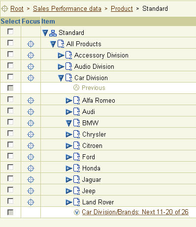
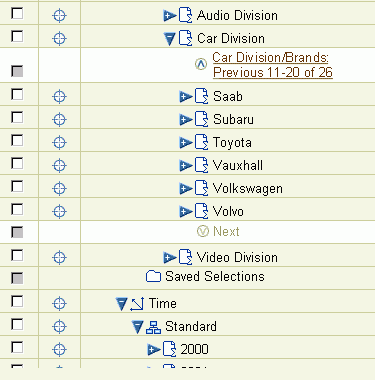
When a node contains many children at the same level, it is not practical to simultaneously display the entire list within the HGrid. In this case the BLAF standard is to display record sets and to provide record navigation controls within the hierarchy column, to move forward and back through the record sets. The same approach is used for Tree controls.
For usage principles and syntax details, see HGrid and Tree Record Navigation with Large Data Sets in the Locator Element: Record and Page Navigation guideline.
Navigation Within an HGrid Record Set

HGrid Showing Last Record Set
(Heterogeneous HGrid Where Total Number Of Records Is Known)

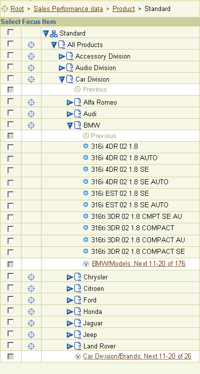
HGrid with Two Levels of Record Navigation
(Heterogeneous HGrid with record navigation at both parent and child levels)

HGrids share features of both Tables and Tree controls. The following usage principles help determine which control to use in different contexts:
- Like the Tree control, HGrids are only recommended for use with hierarchical data consisting of three or more levels, where it is important for users to:
- Browse through a hierarchy
- See an object's location in the hierarchy, and its relationship with other containers and objects.
- If the data contains only two levels, display the parent objects in a Table and provide drill down links or View icons to display the child objects on a separate page.
- Consider using the Tree control instead of an HGrid if the purpose of displaying the hierarchy is either of the following:
- Selection of an object from a hierarchy, and then moving on with a task that does not require display of the hierarchy
- Display of hierarchical Master/Detail content, where selection in the hierarchy provides object details on the same page (on the right)
- Use the HGrid instead of the Tree when users need to either:
- Manipulate the objects in the hierarchy (add, delete, move, reorder, etc.). Note that in certain cases it may be necessary for users to navigate from a Tree to an HGrid to perform these actions. See Editing and Updating the Tree Hierarchy in the Tree guideline for more information.
- See more object details than can be displayed in a Tree, AND the amount of required detail per object does not warrant use of a Tree with a Master/Detail view.
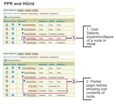
PPR can be used to refresh the HGrid when users manipulate HGrid display or perform actions that do not require navigation to another page.
- Manipulate the HGrid Display:
- Expand a container or parent object
- Collapse a container or parent object
- Focus on a node
- Perform Actions on HGrid Data:
- Duplicate child object (not parent object, which requires a Message Page)
- Delete child node, if no warning is required for application's users (typically professional users)
Principles for use of PPR with HGrids are as follows:
- PPR is intended only for partial rendering of pages that do not require extensive back-end or middle-tier processing. Do not use PPR when the HGrid fills most of a page's content, and the entire HGrid needs to be redrawn.
- PPR is only used to redraw the content of the current page. It is never used when navigating to page with a different title.
- Do not use PPR when displaying large record sets that will have a slow response time.
- PPR is disabled on older browsers.
- If PPR is not used in an HGrid, the functions/actions described above will cause a full page refresh.
- For more information on PPR, see the Partial Page Redraw (PPR) guideline.
PPR Used to Expand an HGrid Node

Visual Specifications
With the exceptions noted above, HGrids conform to the specifications in the Tables guideline. Examples of various HGrid layouts are included below.
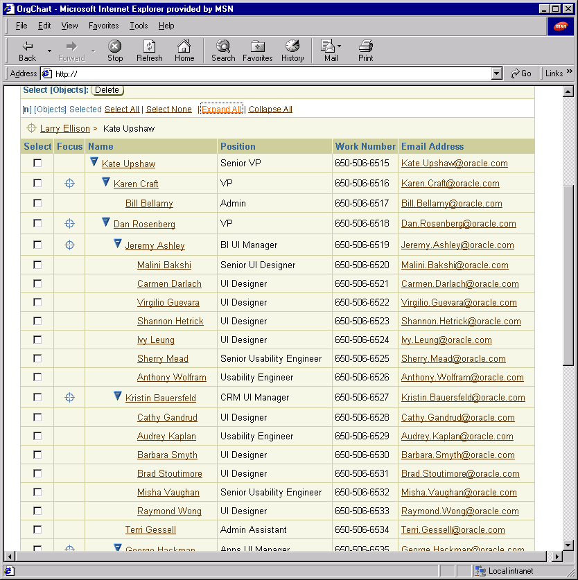
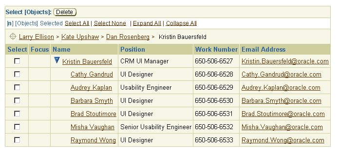
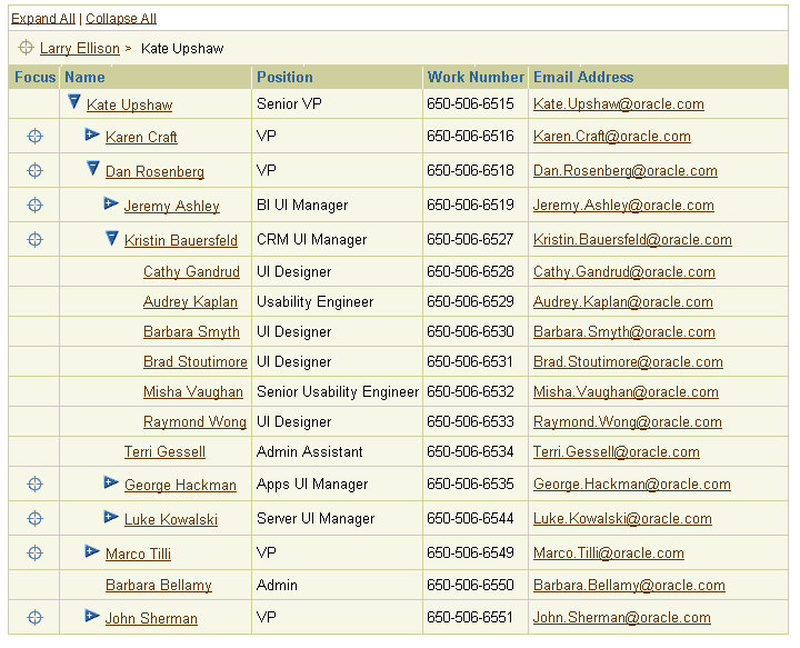
HGrid - Expand All Used; All Nodes Open (from selected root); Long page

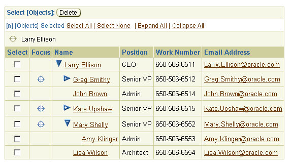
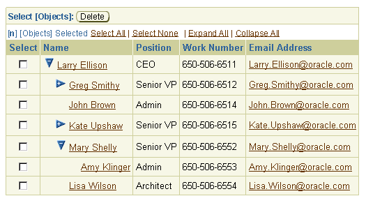
HGrid - At Root of Hierarchy, Some Nodes Open/Some Closed

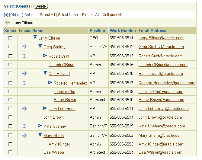
HGrid - At Root of Hierarchy, More Nodes Open/Some Closed

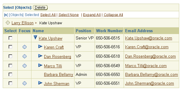
HGrid - Focus on New Root, HGrid Breadcrumbs Appended

HGrid - Focus to Last Parent/Container in Hierarchy, HGrid Breadcrumbs Appended

HGrid - No Control Bar

HGrid - No Focus Control and HGrid Breadcrumbs

HGrid - Empty with Sample Text String

Open/Closed Issues
Open Issues
05-Feb-2003: Use of drag and drop for column resize and reorder is currently being investigated by the UIX team.
03-Oct-2002: - v3.0+ additions/investigation:
- Use of shuttle control for selection within large hierarchies
- Reevaluation of "Select All" and "Select None" terminology to "Select All in Focus" and "Deselect All in Focus".
- Some of the additions/investigation mentioned above must be evaluated to see if they impact the Table guideline as well.
Closed Issues
03-Oct-2002: Added PPR, record navigation for large hierarchies, usage principles, and restructured document.
09-Apr-2002: Edited and reformatted document.
28-Mar-2002: HGrid Flows extracted from this document and placed in full
flows document (flow such as "Move", "Create Node", etc.) See HGrid
Flows guideline.


![]()
