Ancillary Graphic Style
Last Updated 05.17.02
General Description
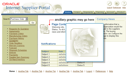
Ancillary graphics can be used throughout an application to add and enhance a more friendly web-like feel. They are only enhancements to the look of the application, and not necessary or required for the user to understand or complete the task at hand.
Examples of ancillary graphics are:
- marketing-communication type graphics
- graphics that visually enforce the task at hand; but aren't absolutely necessary
- graphics that are used to convey ancillary information not necessary applicable to a given application task (i.e., advertisement graphics, associated graphics to ancillary news items, etc.)
Example of an Ancillary Graphic on a Home Page

NOTE: For complete repository of ancillary graphics, see
Ancillary Graphic List.
Guideline Attributes
Spec Version # - 3.1
Spec Contributors - Betsy Nute, Aylin Uysal
UI Models - all models
Example Products - all products
Related Guidelines - Color Palette,
Icons, Buttons (Global),
Art Direction Language, Header
Component, Content Containers
Interaction and Usage Specifications
General Principles
- An ancillay graphic can be a visual representation of the task, content, and/or domain of the application.
- The use of these graphics can enforce the unique and individual characteristics of
each application family, as well as uniquely identify each page within a task flow, or content section.
- An ancillary graphic can only be used in the content area of an application. Example places within the content area are:
- within a content container
- near a header
- near a body or paragraph of text
- The colors within the graphic should be close if not exact to the color
palette (see Color Palette guideline
for more information.) This will keep the graphics from becoming competitive
with the UI and the task at hand.
- Do not clutter the UI with excessive amounts of unnecessary graphics. Fewer graphics become more meaningful and again, less competitive with the UI.
- Be consistent with style and usage across an application. For instance, if each of your pages uses a header component with an icon representing the section, use this element throughout the application.
- For accessibility purposes, ancillary graphics should have an "alt" tag for each individual ancillary graphic. The "alt" tag should describe the
contents of the graphic.
Visual Specifications
Line Art or Illustrative Ancillary Graphics
Ancillary line art graphics are like pictogram symbols. They are objects that have been outlined with
important objects filled to communicate the visual representation of the graphic (i.e., the computer
screen is filled to emphasize the computer and to create a contrast with the figure.)
Example of Illustrative Graphic Style (similar style to icon style)

Example of Illustrative Ancillary Graphics

- color="#336699"
- size = approximately 32x32 (possible bigger if light content throughout application)
Photographic Ancillary Graphics
Photographic images are collaged together and converted into duotone colors
(or monotone) using the beige accent color palette. (See Color
Palette guideline for details.) Additional horizontal white lines
are then add for stylistic treatment to the photograph.
Example of Photographic Collage with Horizontal Lines

To bound the photographic collage, and give consistent look across applications, a border should
be added to surround the image. The top left of the border is rounded, the bottom right is square. The border is
a one pixel line thickness.
Border to Surround Photographic Collage

Example of Photographic Collages (with Lines and Border)

Ancillary Graphic Repository
A repository of ancillary graphics has been created that lists all possible ancillary graphics, and suggested usage. This list will be added to through time.
Open/Closed Issues
Open Issues
none
Closed Issues
none
