Table Navigation/Action Methods
Last Updated
10-Dec-2003
General Description
This guideline describes the models for drill down navigation and actions on objects within tables, and consists of the following sections:
Guideline Attributes
Spec Version # - 3.1
Spec Contributors - Betsy Beier, Mervyn Dennehy, Craig Louis, Ivy Leung
UI Models - all models
Example Products - all products
Related Guidelines -
Tables,
Table Flows,
Object List Templates,
Object Templates,
1 Page Object Template,
2 Step Process/2 Page Object Template,
3+ Steps Page Template (Wizard),
Messaging Page Templates
Interaction and Usage Specifications
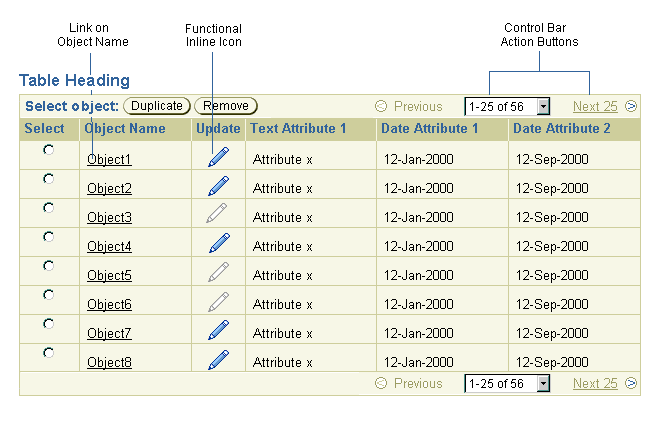
Tables allow navigation and/or action on objects through one or more of the following methods:
- Links on object names
- Control Bar action buttons and Selection Column (either single or multi-select)
- Functional Inline Icons (with identifying column headers)
Also, Previous/Next Record Navigation links further facilitate gross navigation through sets of records. See the Table Record Navigation section of the Tables Guideline for details.
Table Action/Navigation Methods - Sample
The choice of the method used depends on whether:
- The object is a primary object (the focus of the table) or a related object (the focus of another table).
- Object names are "unique" (can be distinguished by their names).
- Users need to perform actions on multiple rows at a time.
- More than one action can be performed in the table.
- An action can be performed on some or all of the rows.
- Actions can be enabled or disabled as a group - ie, when one action is not valid on a particular row, other actions are also not valid.
- User privileges - Depending on the users security profile, they may or may not be able to perform some actions on an object.
Here are some general guidelines that affect your choices:
- Links navigate to view-only pages, not to transactional forms.
- Control Bars in single-select tables should have more than one action button or other control. If necessary, Control Bars in multi-select tables may have only one control. If you don't have more than one required action, use a column of functional icons, unless space is needed for many data columns.
- Avoid redundancy between the Control Bar and Functional Inline Icons in table cells. For example, if a table has an Update button in the Control Bar, it must not have Update icons within table cells.
- Do not use Javascript to enable or disable Control Bar buttons based on row selection. This script is error-prone in a single selection table, and unworkable in a multi-select table, without violating the previous guideline on redundant actions.
- Row selectors (radio buttons for single select or check boxes for multi select) may only be disabled if all Control Bar actions are not valid. For example, if a table contains Update and Delete buttons in a Control Bar, a row selector may only be disabled if the user is prohibited from both updating and deleting that row.
- Multi-select tables easily lead to failed actions and warning messages. Only allow multi-select in a table if there is conclusive evidence that users need to perform actions on multiple rows at a time.
The following matrix summarizes the criteria for each table navigation/action method.
| Action/Navigation |
Implemented as Link in table cell |
Implemented in Control Bar with single-select |
Implemented in Control Bar with multi-select |
Implemented as Inline Functional Icon |
| View only | If object has unique name |
For primary object without unique name, AND
If the selection column is never disabled.
|
If application allows batch view of objects
AND
If the selection column is never disabled.
| If object does not have unique name, and there is not a View button in a Control bar
OR
In an updateable table, to "View More Details"
|
| Update | No | Together with at least one other action button,
AND
All actions for each row can be disabled together without restricting access to valid actions.
| If application allows batch update or batch processing of objects
AND
All actions for each row can be disabled together without restricting access to valid actions.
| In table without selection column,
OR
If the Control Bar requirements are not met,
OR
In an updateable table, to "Update More Details"
|
| Delete | No | Together with at least one other action button,
AND
All actions for each row can be disabled together without restricting access to valid actions.
| All actions for each row can be disabled together without restricting access to valid actions.
| In table without selection column,
OR
If the Control Bar requirements are not met
|
| Remove | No | Together with at least one other action button,
AND
All actions for each row can be disabled together without restricting access to valid actions.
| All actions for each row can be disabled together without restricting access to valid actions.
| In table without selection column,
OR
If the Control Bar requirements are not met
|
| Duplicate | No | Together with at least one other action button,
AND
All actions for each row can be disabled together without restricting access to valid actions.
| No | In any table
UNLESS
single-select table Control Bar requirements are met
|
| Add Attachment | No | Together with at least one other action button,
AND
All actions for each row can be disabled together without restricting access to valid actions.
| No | In any table
UNLESS
single-select table Control Bar requirements are met
|
See the Table Flows Guideline for
additional interaction details.
When drilling down to a view-only page for an object, refer to the following guidelines to determine which method to use:
- Use links on both primary and related object names if the names are generally unique***.
- Use a View button in a Control Bar to view primary
objects if the selection column is never disabled, and either:
- The object does not have a link on its name,
- OR, the table allows multiple-selection and batch viewing of objects (this model is currently being tested).
- Use a column of Inline View Icons to view objects that do not meet the preceding criteria. See Functional Inline Icons below for more details.
*** A "unique" name clearly distinguishes one object from another and leads to a unique page. For example, a P.O. number is a unique name. In a column of related objects, an object name may be repeated in multiple rows. For example, a table of Purchase Orders may include a Customer column with links to Customer pages - in this case a customer may have more than one open P.O., and so its name would appear in more than one row.
The following illustration shows a table from an Order Management application containing both links on object names and inline View icons to navigate to View-only pages:
Table View-Only Drill Down Methods - Sample
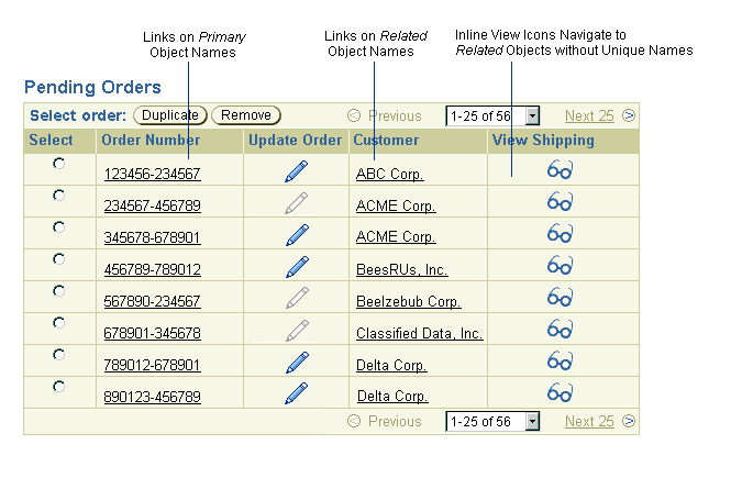
In this illustration:
- "Order Number" links display order details in a view-only page. These are the primary objects in the table.
- "Customer" links display customer information in a view-only page. These related objects would typically be found on another tab in the application.
- "View Shipping" icons display shipping information in a view-only page. These related objects would typically be found on another tab in the application.
Note: Do not use a View-only drill-down method to navigate directly to a transactional form. If possible, use one of the methods listed below. Otherwise, place an Action/Navigation button on the objects View-only page.
In this model, the table has a Control Bar, and a Selection Column containing radio buttons. Radio buttons can be disabled when the page is loaded to restrict actions on any row. The table may also contain links in table cells.
Use this simple approach if:
- The table has two or more actions that are valid for most rows.
- All actions for each row can be disabled together without restricting access to valid actions.
Table Basic Single-Select Control Bar - Sample
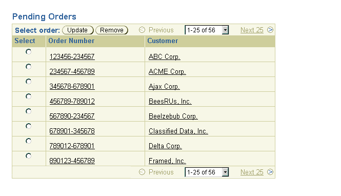
For example, if a user has update and remove privileges on some rows but not others, then both these privileges can be enabled or disabled as a group by disabling or enabling a row's radio button selector. If this model restricts users from valid actions, consider adding columns of functional inline icons.
In this model, the table has the same features as the Basic Single-Select approach, but adds columns of icons to enable other actions selectively.
Use this more complex approach if:
- The table has two or more actions that are valid for most rows.
- These action buttons can be disabled together without restricting access to valid actions.
- The table also has one or more other actions that must be enabled and disabled individually. Use functional inline icons for these actions.
For example, Duplicate and Remove may be allowed on one row, but Update may not be allowed - in this case, Update would be implemented as an icon rather than as an action button in the Control Bar.
Single-Select Control Bar with Functional Inline Icons - Sample
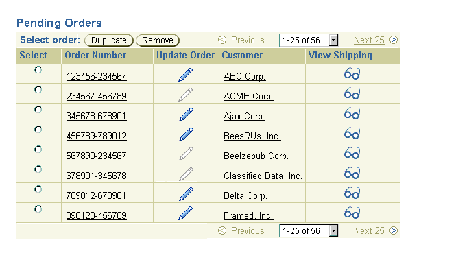
See Functional Inline Icons below for more details.
Like the Basic Single-Select approach, this model features a control bar and selection column, but, instead of radio buttons, it uses check boxes to enable selection of multiple rows. Check boxes can be disabled when the page is loaded to restrict actions on any row.
Use this model if:
- Users need to perform actions on multiple rows concurrently.
- All action buttons can be disabled together without restricting access to valid actions.
- All action buttons are valid for more than one row at a time (such as Delete, but not Duplicate).
Multi-Select Control Bar - Sample
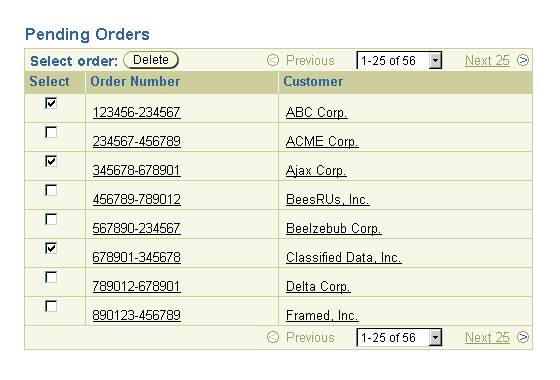
For example, if a user has update and delete privileges on some rows but not others, then both these privileges can be disabled as a group by disabling a row's check box selector.
If an action is invalid while other actions are valid, consider the following options:
- Split the table into two or more single-select or multi-select tables in which actions can be allowed or disallowed as a group.
- Consider using functional inline icons for actions that are more frequently invalid. Users will then have to perform those actions one row at a time (see the next section).
- Move one or more actions to a detail page for the object. Users will then have to perform those actions one page at a time.
- Otherwise, the table should include a Tip to give the users advance notice that all actions may not be available on all rows. When an action is initiated, display a processing page to notify the user whether actions are performed successfully or not on each of the selected rows.
If an action is invalid for more than one row at a time (such as Duplicate), consider the following approach.
In this model, the table has the same features as the Basic Multi-Select approach, but adds columns of icons to enable other actions selectively. Use this more complex approach if:
- Users need to perform actions on multiple rows concurrently.
- The table has one or more actions that can be disabled together without restricting access to valid actions.
- These actions are valid for more than one row at a time.
- The table has one or more other actions that do not meet the two previous criteria (such as Duplicate, which is not valid for more than one row at a time). Use functional inline icons for these individually-enabled actions.
Multi-Select Control Bar with Functional Inline Icons - Sample
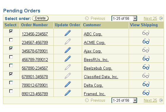
If users need to perform an action on multiple rows, but the action is invalid while other actions are valid, consider the following options:
- Split the table into two or more single-select or multi-select tables in which actions can be allowed or disallowed as a group.
- Otherwise, the table should include a Tip to give the users advance notice that all actions may not be available on all rows. When an action is initiated, display a processing page to notify the user whether actions are performed successfully or not on each of the selected rows.
See the following section, Functional Inline Icons, for more details.
Use functional inline icons in tables as follows:
- To view objects that do not have "unique" names.
- To "View More Details" or "Update More Details" in an updateable table
- For any other action in tables that do not contain a selection column.
Functional Inline Icons - Sample
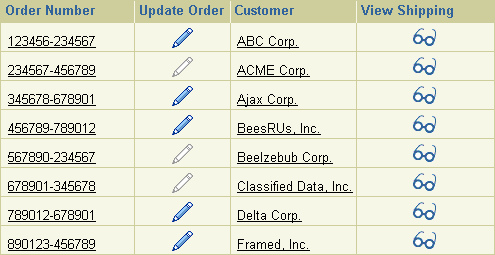
Use the following guidelines when implementing Functional Inline Icons:
- Column headers must specify object types to distinguish the navigation points, such as "View Order" or "Update Account".
- Where necessary, tables may contain up to three columns of View icons to navigate to related objects. In this case, insert one or more columns with other contents between the columns of View icons.
- If a table also includes one or more columns of View icons, the column header in an Update column must specify an object type, such as "Update Order".
- Other functional inline icons act on the primary object in each row, so, unlike View icons, cannot appear in more than one column.
- To update related objects, use View icons to navigate to a view-only page containing an Update button.
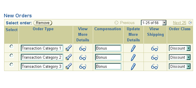
- View and Update icons have an additional usage in updateable tables. See the following section, View and Update in Updateable Tables.
When designing updateable tables, it is not always practical to display all of a primary object's attributes in a single row (See the Object Templates Guideline for all valid type of object detail pages). In this case, users can navigate to a page containing ALL details for that object:
- A column labeled "View More Details" contains View icons that link to a view-only page with all the primary object's details.
- A column labeled "Update More Details" contains Update icons that link to an updateable page with all the primary object's details.
When used, the View More Details column should be placed by default to the immediate right of the primary object column, as shown in the illustration below.
Like view-only tables, updateable tables may include a single column of Update icons, and up to three columns of View icons. As a result, if one column of View icons is reserved for "Update More Details", then the table may only have up to two other columns with View icons that navigate to related objects. For example, in the following illustration View icons link to Shipping details, which would be located on the Shipping tab.
View and Update in Updateable Table - Sample

As in view-only tables, View icons navigate to pages that are built with the Details template, and Update icons navigate to pages that are built with one of the Update templates.
The following table details how user privileges affect the use of "View More Details" and "Update More Details" columns:
| User has Update privileges on:
|
"Update More Details" column?
|
"View More Details" column?
|
| All objects
|
Yes
|
No
|
| Some (not all) objects
|
Yes
|
Yes
|
| No objects
|
No
|
Yes
|
Ask the following questions to determine whether to use links, Control bars, and icons in a table. In most cases, you will not need to proceed past Stage Two.
Stage One: View-Only Evaluation
In the first stage, determine how to provide navigation to view-only
pages for objects in the table.
- Does the table contain navigation points to either primary or related objects?
- If no, go to Stage Two to evaluate other table actions.
- If yes, go to next step.
- Is this an updateable table that cannot display all of its details in a single row?
- If no, go to the next step
- If yes, use View icons in a column labeled "View More Details", and go to the next stage to evaluate other table actions.
- Does the application allow the user to view batches of primary objects (currently being tested)?
- If no, go to next step.
- If yes, use Control Bar with View button, and go to next step.
- Do objects have distinguishing names?
- If no, use View icons with distinguishing column header, and go to next step.
- If yes, use links on object names, and go to next step.
Stage Two: Single-Select Evaluation
In the second stage, determine which model of table actions is appropriate:
- Is there clear evidence that users need to perform actions on multiple rows at once?
- If no, go to next step.
- If yes, go to Stage Three to plan implementation of a multi-select table.
- Does the table have multiple actions that are valid for most rows?
- If no, use Inline Functional Icons for any actions.
- If yes, go to the next step.
- Will access to some valid actions be restricted if a row selector is disabled?
- If no, use a single-select control bar with action buttons.
- If yes, go to next step.
- Can any actions be enabled or disabled together without restricting access to some valid actions?
- If no, do not use a Control Bar or a selection column - use inline
functional icons for all actions.
- If yes, use a Control Bar containing action buttons that can be disabled together, and one of the following solutions for the other actions:
- Use inline functional icons.
- Place action in a detail page.
- Split up the table into several tables that allow enabling/disabling as a group.
Stage Three: Multi-Select Evaluation
In the third stage, plan how to implement a multi-select table:
- Will access to some valid actions be restricted if a row selector is disabled?
- If no, use a multi-select control bar with action buttons.
- If yes, go to next step.
- Do users truly need to perform these specific actions on multiple rows?
- If no, use inline functional icons for these single-row actions, and a Control Bar with action buttons for multi-row actions.
- If yes, consider the following options:
- If possible, split up the table into several tables that allow enabling/disabling as a group.
- Otherwise, use a Tip to notify users that all actions may not be available on all rows, and display a processing page to notify the user whether actions are performed successfully or not.
Visual Specifications
See the Tables specification.
Open/Closed Issues
Open Issues
None
Closed Issues
None


![]()

![]()
![]()
