Flexfields (Custom Fields)
Last Updated 10.17.03
General Description
A flexfield is a placeholder set of fields that can be configured by customers for use by their organizations. Once configured, the customer-defined fields (label/widget pairs) may appear in either form or tabular layouts. There are two main types of flexfields: Descriptive flexfields, which are configured as a set of fields that are indistinguishable from core (default) application fields, and key flexfields, which consist of multiple segments for entry of codes, such as a product serial numbers or bank account numbers.
Guideline Attributes
Spec Version # - 3.1
Spec Contributors - Betsy Beier, Lisa Serface, Mervyn Dennehy
UI Models - all
Example Products - all
Related Guidelines - Content Layout
Templates, Tables, Table
Flows, Standard Web Widgets, LOV
Template
Interaction and Usage Specifications
- A flexfield is a placeholder for a set of fields. Developers add a flexfield to an Oracle applications so customer sites can configure it to display one or more fields for use by their organization. Each configured field is referred to as a flexfield "segment".
- Flexfields consist of label/widget pairs or table fields (just like core fields), but do not appear in Oracle applications unless specified by a customer.
- Users should not be aware of any difference between core fields and flexfields specific to their company or organization. Labels and column headers should be specific to the context, and NEVER include the term "flexfield".
- There are two main types of flexfields:
- Descriptive Flexfield: A customer-defined set of fields within a page or group of pages. There are three types of descriptive flexfield segments:
- Global: One or more segment fields that always appear on the page (without any dependencies on a 'controlling' field)
- Context: A controlling choice list or LOV field that causes the page to display different context sensitive fields, depending on selection.
- Context Sensitive: One or more segment fields that only appear when an appropriate selection is made in a controlling context field.
- Key Flexfields: A customer-defined field consisting of multiple segments, such as a product serial number or bank account number. Unlike descriptive flexfields, key flexfields can never be dependent on a controlling field. Key flexfields can be implemented in two ways:
- As a single label/text field pair containing delimiters where users can enter or view all segments of a code.
- With separate label/text field pairs for each code segment.
- The two types of flexfields (Descriptive and Key) can be used in both form and tabular layouts.
- Form Layout: A typical label/prompt and either read only data or widget (text field, choice list, text area, etc.) that allows a user to enter a value(s).
- Tabular Layout: A column of information in a table, where the label of the flexfield segment is the column header, and the values are within each cell of the column.
- Flexfields can be mixed with core fields in both form and tabular layouts, but all segments of a single flexfield must be grouped together.
- Flexfields may also be presented in a separate section/subsection of the page, alone in a table, or on their own page.
For more information on form layout, see the Content
Layout Templates guideline.
For more information on tabular layout, see the Tables
guideline.
Descriptive flexfields provide a flexible way for Oracle Applications to provide customizable "spaces" within a page or pages of an application. Descriptive flexfield segments are only added to a page when configured by the customer. They are then treated like any other type of label/data or tabular data, except that they are grouped in a single content area.
For example, the XYZ Widget Company might require a customized HR application including descriptive flexfield segments for additional employee data not generally required by other Oracle customers. These segment fields would appear along with core fields, and be indistinguishable to XYZ Widget users.
There are three types of descriptive flexfield segments:
- Global Segment: always appears on the customer's application page, regardless of the context.
- Context Segment: a controlling choice list or LOV field that always appears on the customer's application page, regardless of context.
- Context Sensitive Segment: only appears when an appropriate selection is made in the context segment (the controlling field) See below for more details.
Global and context-sensitive segments may consist of the following widgets:
- view-only label/data pair
- text box
- date picker
- choice list
- LOV field
Descriptive flexfield segments may also have associated information/comments inserted by development teams. In this case, development teams can either append an Information (i) icon to each field with information/comments, or insert instruction text for the section. When users press the icon, the related information is displayed in a message page. The section instruction text can display information common to all flexfields in the section.
Technical Note: All segment fields from a single descriptive flexfield must be grouped in a single location on a page. If a page contains segment fields from two or more descriptive flexfields (unusual), the groups may be placed in separate locations.
Note: The images in this section show examples of descriptive flexfield segments on pages that also include core fields. Each type of field is distinguished by appending one of the following labels in parentheses to the placeholder field labels: (CoreField); (DFF Global Segment); (DFF Context Segment); and (DFF Context Sensitive Segment). These placeholder labels should be replaced with application-specific labels.
The following images show examples of global segment fields in both form and tabular layouts. Note that the segments of a single descriptive flexfield are always grouped together in a single region of the page.
Form Layout with Both Corefields and DFF Global Segments

Form Layout with DFF Global Segments in Separate Section/Subsection

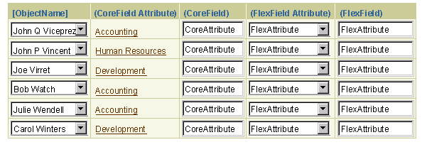
View-Only Table with Both Corefields and DFF Global Segments

Updateable Table with Both Corefields and DFF Global Segments

Context-sensitive segments only appear on a page when a specific value is selected in a single controlling context field. The context field may be either a choice list or an LOV field, and like global segments, is always displayed on the customer's application page. The context selected in the controlling field may also determine the type of data displayed in the context sensitive (i.e. dependent) segment(s).
Context sensitive segments can only be displayed in form layouts, though context segment data may be displayed in a table.
Contextual Descriptive Flexfields in Form Layouts
In form layouts, both the context segment and context sensitive segments may be displayed on the same page, along with global segments and core fields. All segments from a single descriptive flexfield must be grouped together, and controlling context fields must precede dependent context sensitive fields.
For example, XYZ Widget Company's customized ERP application might feature a choice list of XYZ products. When the user selects product "widget54", the page would redraw with context sensitive segments that are relevant to widget54.
Context sensitive segments benefit from use of Partial Page Rendering (PPR)
technology: When a user selects an entry in a controlling context field,
dependent context sensitive fields can be displayed without reloading
the page. For more information on controlling fields and their use with
PPR, see Content Layout and PPR
in the Content Layout Templates guideline.
Form Layout with Context Segment and Context Sensitive Segments

Form Layout with Combination of Context and Other Field Types
(Core Fields, Global Segments, Context Segment, and Context Sensitive Segments)

Technical Notes:
- Context segments and context sensitive segments should not be implemented in two-column formats, because potential page personalization could result in a controlling field being placed in one column and dependent fields placed in the other column. In this case, users may not realize the relationship between the controlling and dependent fields.
- In certain cases a context sensitive segment may also be (or become) a required field, with a Required icon appended. At this point, only a single icon can be appended to any field, so if the segment also has associated information/comments, the Information icon cannot be displayed as well. In this case, it is recommended to provide section-level instruction text instead, and display all information/comments for the set of context sensitive segments.
Context Segments and Tables
Context sensitive segments cannot be implemented directly in tables. However, users can access context sensitive data from a table as follows:
- When users drill down on the object name link, the resulting object page displays the controlling context segment and context sensitive segments in a view-only form layout, as described above.
- When users choose the Update icon, the resulting Update page displays the controlling context segment and context sensitive segments in an updateable form layout, as described above.
- The current selection from the controlling context field can only be appended as view-only data in a column of the table. The context segment can never be editable within the table.
- Both the drill-down and Update pages may contain a combination of core fields and descriptive flexfields, as long as flexfields are grouped together.
- Developers should not use "Add Another Row" functionality in tables that contain context data.
View-Only Table with Global Segment and Context Data

Updateable Table with Global Segment and Context Data

Key flexfields provide a flexible way for Oracle Applications to represent code objects that contain multiple segments. The segments can be thought of as structured attributes of the object displayed in the key flexfield.
For example, a key flexfield may display a bank account number. Bank account numbers are codes consisting of distinct segments that identify the institution, the branch, and the individual account. The structure of those segments is always consistent, and the key flexfield must contain all of those segments. Another common use of flexfields is for serial numbers, where segments may indicate the time period (year and quarter or month), the production batch, and the individual product.
- Key flexfields are seeded by professional applications where users are expected to be familiar with many of the codes used in their environment.
- The structure of key flexfield segments can be configured by each customer organization, and may vary in both the number and length of segments.
- Key flexfields may be used in different types of both form and tabular layouts, as shown in the examples below.
- In form layouts, key flexfields typically consist of a label/text field pair with an active key flexfield icon, and followed by one or two description fields.
- In tables, key flexfields typically consist of a column header (equivalent to the field label), cells that contain both a text field and the key flexfield icon, and one or two columns of description fields. Options for tabular layouts vary depending on whether all key flexfields have the same structure, and depending on the need to display other attributes in the table.
- If a standard key flexfield is too challenging for a particular user population, a key flexfield may be divided into multiple fields, with a separate field and LOV icon for each segment. All segments must be grouped together. This approach can be used in either form or table layouts.
- Key flexfields include hints to help users fill out the field(s). Once the field is validated, description attributes for individual segments are usually displayed in a separate concatenated field. Optional combination description attributes for the field as a whole may also be displayed in another field. These attributes appear as view-only fields in both form and tabular layouts. See "Key Flexfield Hints and Description Attributes" below for details.
- Key flexfield segments are separated by delimiters, such as periods (. . .) or dashes (- - -). Customer sites can specify which character to use as a delimiter. All examples in this guideline show the period delimiter.
- When a user opens a page containing a key flexfield, the flexfield is displayed without delimiters. Users need to rely on structure hints to determine the number and type of segments and which delimiter to enter.
- Users may enter the exact value or a partial value to be validated on exit of the flexfield. Pre-search is provided for partial values. See "Key Flexfield Population Methods and Field Level Validation" below for details.
- The Key flexfield icon displays a search page with several options. See "Key Flexfields and Search" below for details.
- Key flexfields do not directly accept aliases (a term matching one or more codes that is easier to remember than the code), though the key flexfield search does.
- Key flexfields have many similarities to LOV fields, both in field
population and search methods -- see the LOV
guideline for details.
- Parallel usability testing of LOV fields indicates that most users of key flexfields will also rely on the field's pre-search capabilities rather than directly selecting the key flexfield icon.
Form Layout with Core Fields, Empty Key Flexfield, and Global Descriptive Flexfield
(Key flexfield contains structure delimiters only)

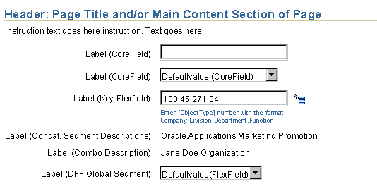
Form Layout with Mix of Field Types, Validated Key Flexfield, and Concatenated Segment Description Field
(After validation of key flexfield, its segment description field is inserted below)

Tabular Layout with Mix of Field Types, Including Validated Key Flexfields with Shared Structure
(After validation of key flexfields, their concatenated segment descriptions appear in the column on the right)

The structure of key flexfield segments depends on organization requirements, and may vary in both the number and length of segments. The structure may vary from one organizational area to another or even between peer objects, such as products. Thus, depending on environment, all key flexfields may have identical structures, or a single page may contain multiple key flexfields, each with a different structure.
Key flexfields feature a structure Hint that indicates the type of data to enter for each segment. Once users complete a key flexfield, concatenated description attributes for the data in each individual segment are typically displayed in a separate field. An optional combination (Combo) description for the entire key flexfield may also be displayed in another field. There are multiple methods for displaying hint and description attributes as follows:
Structure Hints
- In form layouts, the structure hint appears directly below the key flexfield on two lines, with a line break after the colon, as shown in the form layout image above.
- In tabular layouts, a table-level tip provides directions on filling out the key flexfields:
- If all flexfields in the table have the same structure, the entire structure hint is included in the table-level tip, and structure hints should not appear within the body of the table. The tabular image above shows an example of this format.
- If any flexfields in the table have a different structure, the table-level tip provides general directions, and the segment portion of the structure hint is displayed directly below each key flexfield, in the same way as form layouts. See below for an example.
- Field-level Hint Syntax and Examples:
- Syntax: "Enter {ObjectType} [CodeDesignator] with the format:
{Segment 1}.{Segment 2}.{Segment n}"
- Example:
"Enter account number with the format:
Company.Cost Center.Organization"
- Table-level Tip Syntax and Examples if all key flexfields have the same structure:
- Tip Syntax: "Tip: To complete fields in the {KeyFlexfieldLabel} column, use the following format: {Segment 1}.{Segment 2}.{Segment n}"
- Example:
"Tip: To complete fields in the Product column, use the following format: Product Line.Product Type.Configuration"
- Table-level Tip Syntax and Examples if one or more key flexfields have different structures:
- Tip Syntax: "Tip: To complete fields in the {KeyFlexfieldLabel} [and KeyFlexfieldLabel] column[s], use the format specified below each field."
- Tip Example (one column of key flexfields):
"Tip: To complete fields in the Account column, use the format specified below each field."
- Tip Example (two columns of key flexfields):
"Tip: To complete fields in the Product and Serial Number columns, use the format specified below each field."
- Syntax Notes:
- The ObjectType is a required variable, such as "part" or "account".
- The CodeDesignator is typically the term "number" or "code", but may be substituted with another company-specific term.
- In an environment where the ObjectType name includes the term "code" or "number", such as "serial number", then the CodeDesignator should generally be omitted.
- Customers can specify different delimiters.
- In tabular layouts, if additional global KFF tip info (info common to all KFFs in table) is needed then developers can either combine it with the existing tip or provide an info icon. If users need information about other elements in the table (NOT KFFs), then provide it in section-level instruction text if possible; if not, stack another tip above or below the KFF tip. If tips are stacked, have them follow the same sequence as the columns to which they refer. e.g. if info is needed for columns 2 and 4, then put the Tip for column 2 on top.
- Structure hints are omitted if:
- A key flexfield is disabled, and not updateable.
- A key flexfield is divided into multiple segment fields. In this case, the segment field label then identifies the content of the field. If necessary, additional hints may also be provided for one or more of the segments.
Tabular Layout with Mix of Field Types, Including Validated Key Flexfields with Different Structures

Concatenated Segment Descriptions
- Concatenated segment description fields consist of view-only data with an associated label or column header. Segment description data and delimiters only appear when a key flexfield has a valid value (i.e. do not appear when a key flexfield is empty)
- Segment description data consists of text with the same number of segments and type of delimiter as the structure hint.
- Segment descriptions contain specific data for each segment indicated by the structure hint, and help users verify that they have selected the correct code or entered the correct alias. Examples include:
- Notebook Computer.Omega.Professional
- Oracle.2845.Usability Test
- In form layouts containing one or more key flexfields, segment descriptions are shown in a single view-only field directly below the key flexfield and its structure hint, as shown in the form layout images above.
- In tabular layouts containing key flexfields, segment descriptions may be shown in one of two ways:
- In a separate column directly to the right of the key flexfield column, as shown in the tabular layout images above.
- In a rowspan below each key flexfield, if it is necessary to display other attributes in the table's columns. In this approach the key flexfield label and segment description label are concatenated with a slash separator, as shown in the rowspan example below.
- The label or column header for segment descriptions is "{CodeDesignator} Description", such as "Number Description", or "Code Description". The ObjectType should not be specified to avoid confusion with the keyflexfield label and the optional Combo label.
- Concatenated segment descriptions only appear after an entry has been validated in the associated key flexfield. Before validation, segment description fields do not appear.
- Applications may be configured to omit segment descriptions if a code segment consists of text, and the description is identical.
- If a key flexfield is divided into separate fields for each segment, each segment field has a context-specific label, and has an associated view-only description field which does not require either a label or any delimiters:
- In form layouts, the description of each validated segment is appended as a read-only field to the right of the segment field, as shown in the form example below.
- The maximum number of characters per segment description field is 50. However, to avoid the risk of horizontal scrolling, it is recommended to use a lower character length limit for segment descriptions, such as 30 characters.
- Note that this is a single column layout that is reserved exclusively for key flexfield segment descriptions, and should not be used for other field types.
- This layout is also shown in the Key Flexfield Search page, shown below in the "Key Flexfields and Search" section of this guideline.
- In tabular layouts, each segment field appears in a separate column, in the same order as the key flexfield, and the descriptions for each validated segment are grouped with the associated segment field. Note that segment fields can only be displayed separately in a table when all key flexfields in the table have the same structure. Methods for grouping segment descriptions with segment fields include:
- Using a rowspan with either a Select column, as shown below, or horizontal table banding to group the segment field and description pairs.
- Using a columnspan for each segment field and description pair.
- Using vertical table banding to group the segment field and description pairs.
Tabular Layout with Rowspan for Segment Descriptions

Form Layout with Separate Fields for Each Segment and Description

Tabular Layout with Separate Columns and Rowspans for Each Segment Field and Description
(Only possible if all key flexfield codes have the same structure)

Technical Note: Cell span will not be supported until the UIX group rebuilds the table bean for UIX v3.0.
Combination (Combo) Descriptions
- Consist of optional view-only text that describes the overall code validated in a key flexfield. Examples include:
- "Omega Professional Notebook Computer"
- "Oracle Usability Test Department"
- Combo descriptions should only be included if they provide additional information to the user, or help users to readily distinguish one entry from another.
- In form layouts, Combo descriptions are shown in a single view-only field immediately below the segment description field. See below for an example.
- In tabular layouts, Combo descriptions are shown in a separate column. See below for an example.
- The label or column header for Combo descriptions depends on context. Examples include: "Account Description", "Product Description". The terms "Combo" and "Combination" should never appear as labels in the UI.
- Combo descriptions only appear after an entry has been validated in the associated key flexfield. Before validation, Combo description fields do not appear.
Form Layout with Both Segment and Combo Descriptions

Tabular Layout with Both Segment and Combo Descriptions

- Key flexfields accept both full codes and any segment(s) of those codes. Partial codes lead to the Search by Code page where users can complete the remaining segment(s). For example, if a code consists of four segments separated by three periods, the user can type segment one in front of the first period, type segment two in front of the second period, and then complete the remaining two segments on the Search by Code page.
- Key flexfields do not accept aliases, but the key flexfield search page does.
- Validation occurs on exit of the key flexfield (on the primary page), and any subsequent action is ignored until the validation is finished. Users may exit the field by:
- Tabbing out of the field (to the key flexfield icon).
- Using the mouse to click another UI element in the page.
- Using the mouse to click "dead space" or "white space"
in the UI.
- Validation on field exit allows robust pre-search capabilities: The value is checked against the database list of values, and based on the findings, the appropriate functions occur (for example, if exact match, dependent fields may also be populated, or on exit of field with a partial string the Search page may appear, allowing the user to select one of the partial string matches.)
Users may not always know the full code required by the key flexfield. In this case, they can enter a partial string or click the key flexfield icon to display the key flexfield search page.
- The key flexfield search page follows the LOV Template layout, but is not displayed in a secondary window.
- Unless there are partial matches to values entered in the key flexfield, the key flexfield search page does not display results until the user explicitly conducts a search by clicking the Search button.
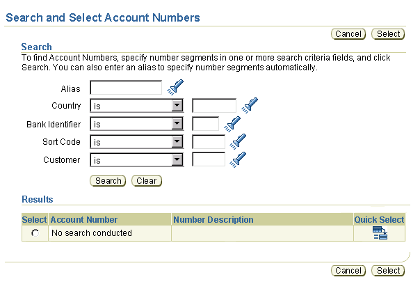
- The standard Search By Code page displays each segment of the flexfield in a separate LOV field together with a search parameter choice list. Search and Clear buttons and an empty Results section appear below the fields.
- The Search By Code page supports only SQL-based search with the following
parameters: IS, STARTS WITH, and IS NOT. That is, it supports an appended
wildcard search paradigm only for partial strings. See Search
Templates for more information.
- When the user selects any parameter other than IS (STARTS WITH, or IS NOT), the LOV field is replaced through PPR with a text field, requiring the user to enter a code or partial code from memory or another look-up method. This field switch is necessary because an LOV field must be able to provide an exact match, and this is not possible except when using the IS search parameter.
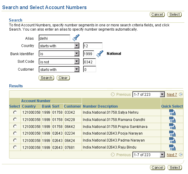
- If the user has already entered an exact match in one or more segments of the key flexfield with the IS parameter, the Search By Code page populates those segment fields and displays their view-only segment descriptions to the right of the LOV icons.
- Segment field LOVs on the key flexfield search page do not follow standard BLAF LOV behavior. When a user enters a partial value into the field, the LOV window does not appear. Instead the user must explicitly click the LOV icon, or click Search to see matching results below.
- The key flexfield search page may also accept aliases and partial aliases, to avoid requiring users to remember alphanumeric codes. When the user enters or selects a valid alias the related segment fields are populated with matching values, but no results are displayed until the user clicks Search.
- When results are displayed, the user can select an object from the results list, or further refine the search by entering or selecting data for one or more flexfield segment fields.
- The Results list is empty in the following conditions:
- If the user exits the key flexfield on the originating page without entering any data, the Results table displays the message: "No search conducted"
- If the user exits the key flexfield on the originating page after entering data that has no match, the Results table displays the message: "No results found"
- If the user enters criteria in the key flexfield search page, but the criteria have no matches, the Results table displays the message: "No results found"
- Results may be displayed in one of two ways, depending on application configuration:
- With each key flexfield segment in a separate column. In this case the table is redrawn with a column span for segment labels, as shown below.
- With the full key flexfield in a single column, as shown in the tabular examples in previous sections of this guideline.
- The page title for the key flexfield search page has the syntax "Search and Select {ObjectType}", such as "Search and Select Items" or "Search and Select Accounts".
- The key flexfield Search page should include the following instruction text in the Search section:
- Instruction Syntax: "To find {ObjectType} {CodeDesignator}s, specify {CodeDesignator} segments in one or more search criteria fields, and click Search. [You can also enter an alias to specify {CodeDesignator} segments automatically.]
- Instruction Example: "To find Account Numbers, specify number segments in one or more search criteria fields, and click Search. You can also enter an alias to specify number segments automatically."
Technical Note: When a segment field in the Search by Code page consists of a choice list, the field does not hit the server. When a segment field consists of an LOV, it must hit the server to display the segment description.
Use of Aliases in Key Flexfield Search
- Aliases may be shared by more than one key flexfield code or be associated with a single code. Searching on a shared alias or partial alias displays a list of matching results.
- If the user enters a valid alias or selects one from the LOV page, the page is refreshed and related segment fields are populated with matching values. Note that an alias may be associated with more than one code, so in this case entry of a validated alias would not cause all segment fields to be populated.
- After entering or selecting an alias, the Results section is not refreshed until the users clicks Search.
- The segment description fields provide information to help users avoid incorrect matching of an alias.
Note: The term "Nickname" should not be used in place
of "Alias". See the Common Formats guideline
for standard usage of these terms.
Key Flexfield Search Page, with Blank Alias and Segment Fields and No Results

Note: In the following example, the user has selected both STARTS WITH and IS NOT search parameters for certain segment fields. As a result, LOV fields associated with those segment fields are replaced with text fields.
Technical Note: Display of concatenated descriptions in search results may result in slower performance, but it is necessary to enable users to distinguish one key flexfield code from another.
Key Flexfield Search Page, with Completed Alias and Segment Fields and Matching Results

Each key flexfield code is a separate object, consisting of specific segment codes. Even though each segment code already exists, a key flexfield code must also be created as an individual object. Administrators can configure an application for users to create a new key flexfield code, using the DINSERT (Dynamic Insertion) parameter. Otherwise, administrators must create each new code themselves. When DINSERT is turned ON:
- On Originating Page:
- A new key flexfield code is automatically created when a user specifies a valid set of segment codes in a key flexfield.
- No message is displayed to users, so they are unaware that a new code has been created.
- The new code is created without a combo description. If combo descriptions are used in the application, administrators then need to enter them.
- On Key Flexfield Search Page:
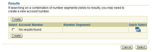
- The Results list on the Key Flexfield Search page includes a Create button so users can explicitly create a new key flexfield code.
- The Create button takes the user to the Create Code page, described below.
- The following table-level tip should also be included in the Results section along with the Create button:
- Tip Syntax: "If searching on a combination of {CodeDesignator} segments yields no results, you may need to create a new {ObjectType} {CodeDesignator}."
- Tip Example: "If searching on a combination of number segments yields no results, you may need to create a new account number."
Note: When DINSERT is turned OFF, only application administrators can create key flexfield codes.
Results Section of Key Flexfield Search Page, with Create Button and Table Tip
(Only appear when DINSERT is turned on)

Technical Note: Display of concatenated descriptions in search results may result in slower performance, but it is necessary to enable users to distinguish one key flexfield code from another.
Key Flexfield Create Code Page
- The Create Code page includes segment fields, Cancel, and Apply buttons, as shown in the image below.
- The Create Code page does not include a field for users to enter combination descriptions. This function is provided on separate administrator maintenance pages.
- Segment fields are pre-populated with values from the segment fields in the Key Flexfield Search page.
- When the user completes the segment fields and clicks Apply, a Confirmation page appears with the following text and buttons to return users to the Key Flexfield Search page, or to return to the originating page with the key flexfield:
- Syntax: "{ObjectType} {CodeDesignator} {KeyFlexCode} has been created. To perform another search, click Search Again. To return to the {OriginatingPage Title} page, click Apply.
- Example: "Account Number 1000234564 has been created. To perform another search, click Search Again. To return to the Current Accounts page, click Apply.
- Page-level buttons are "Search Again" and "Apply".
- For flow details, see Create
in the Table Flows guideline.
Note: Even when DINSERT is turned on, users do not have the ability to delete or update key flexfield codes, and also cannot specify Combo descriptions. These functions are reserved for application administrators.
Key Flexfield Create Code Page

- The user enters a code or partial code, or clicks the key flexfield icon.
- The content of the key flexfield is validated on exiting the field:
- Exact Match: If a code has an exact match, then it is validated.
- A full code is left unchanged in the field.
- A partial code is replaced by the full code.
- If the validated key flexfield has dependent fields, these may change and/or be populated with values.
- No Match: If a full or partial code has no match, then the key flexfield search page is displayed, with all segment fields left blank, and no results shown.
- Multiple Matches: If the user enters a partial code (the first segment, or first and second segments, etc.) which typically has multiple matches, the key flexfield search page is displayed with those segment fields populated, and with matching results listed.
- The user populates segment fields as needed in the search page and clicks the Search button. If aliases are allowed, the user can also enter or select an alias to populate segment fields.
- Matching results are displayed. The user selects one of the results, and returns to the page containing the selected key flexfield. If no results are found and DINSERT is turned ON, user may create a new code by clicking the Create button (shown in the flow images below).
Basic Key Flexfield Search Flow

Visual Specifications
Flexfields do not have unique visual specifications. For more information
about form layout, see the Content Layout
Templates guideline. For more information about table or tabular layout,
see the Tables Guideline.
Open/Closed Issues
Open Issues
30-Jun-2003:
- In tabular layout, can key flexfield segment descriptions wrap after the separators, rather than in the middle of a segment?
- This guideline needs to be sent to I18N for input on tokenization. Input should be placed in the OAF code standards.
Future Enhancements:
- Add more criteria on KFF Search page using 'Add Another Criteria' function.
- Key flexfield auto-skip mode (cursor jumps over delimiters) with separate Alias field.
- DFF context sensitive fields in editable Hide/Show in table
- Dynamically controlled context
- Editable attributes
Closed Issues
30-Jun-2003:
- Should we display separators in empty concatenated segment description fields? No: In table layout they would be contained by the cell, but in form layout they would appear to be floating on the page next to the label.
18-Jun-2003: Changes based on input from tech team
- Key flexfields cannot have context, so contextual flexfields are redefined as a sub-type of Descriptive flexfield.
- Redesign of Descriptive flexfield form layout images to group flexfields in a single location on the page.
- Contextual Flexfields cannot be displayed in tables, but the data from a controlling field can.
- Key flexfields cannot directly accept aliases, but the key flexfield search page can.
- Key flexfield search now combines search by code and search by alias in a single page.
- Key flexfield search now includes a Create button to create new codes.
- Added many implementation details in all sections.


