Last Updated 22-Mar-2004
The Date Picker allows a user to select a date from a graphical calendar to populate a date field on a page.
Guideline Contents
Spec Version # - 3.1
Spec Contributors - Betsy Beier, Ivy Leung, Lisa Rinderknecht, Craig Louis
UI Models - all models
Example Products - all products
Related Guidelines -
Tables,
Buttons (Action/Navigation),
Inline Messaging Tips, Hints, and Bubble Text,
Locator Element: Record and Page Navigation.
The primary Date Picker function is to provide an alternate graphical method that users may use to populate a date field. A secondary benefit of using a Date Picker is that is allows for the visible restriction of available dates for selection to those valid in the application context. Whether the Date Picker appears inline or in a secondary window, the date field is the primary interaction method. The Date Picker exists to populate the date field, and users may instead choose to manually populate the date field.
- Single Field Only - A date field should be a single text field, and not separate fields (or pulldown lists) for months, days, and years. This allows for internationalization and translation into multiple date formats.
- Hint Text - Inline Hint text should appear on the first date field of a page, indicating the format required to correctly populate the field. See Inline Messaging and Tips Guideline for more information.
- Format Errors - If the user enters incorrectly formatted data in the date field, field format validation should be handled through a simple JavaScript message window. For instance, if an incorrectly formatted date is entered into the date field, a JavaScript alert will prompt the user to correct the input (as well as reiterate the correct formatting.)
- The text for this field formatting validation should read: "You have entered the date in an incorrect format. The format for the date is: [date format here]. Please retype the date using this format."
- See the Messaging Templates Guideline for more on JavaScript alert messaging.
- Accessibility - Both the secondary window and inline date picker do not conflict with Accessibility guidelines, since the Date Picker is just an alternative method for entering a date. The date field is always present and allows direct manual input, so the user does not have to access the date picker. In Accessibility Mode, the inline date picker is not available, since a calendar view is not necessary for non-sighted users. Date pickers per field are still available.
- Keyboard traversal - Each item in both the inline and secondary window date picker is keyboard traversable. The user can use the Tab key to move through the date picker, right to left and top to bottom, and Shift-Tab to move backwards. Selection is made with the Enter key.
Note: This feature is still under consideration, as tab traversal of each day of the calendar may be considered laborious.
- Turning Off PPR - The inline date picker uses PPR, so if the user turns off PPR the inline date picker should not appear. The secondary date picker remains available through the date picker icon. And the user can still manually type data into the date field.
- Hold Validation - Selecting a new month/year (either by the next/previous icons or through the month/year choice controls) should not cause the form fields (such as dateFields) to be validated.
- The user should always have access to the inline date picker, even if certain fields in the page happen to be in an invalid state. Changing a date field should not force other fields on the page to be validated.
- If page validation occurs on each date change, remaining required fields on the page could cause error messages to be thrown.
The Date Picker can be displayed either in a primary window inline with the page contents, or in a modal secondary window.
Note: The secondary window must be modal to ensure that the window retains focus and does not get hidden behind the primary window.
- To access the secondary window Date Picker, a date field must be present with a Date Picker Icon.
- The Date Picker Icon appears next to each date field, even if a Date Picker itself appears inline. This clearly identifies the field as a date field. It also allows the user a choice of either using the inline date picker, or the date picker icon to open the date picker in the secondary window.
- The Date Picker Calendar comes in two sizes; one size when used in line with content in a primary window and another size when shown in a secondary window.
The inline and secondary window methods offer the following advantages:
- Date Picker in Primary Window - A Date Picker inline with the page contents in the primary window is good for applications where picking a date is a crucial element to completing a task. Also, it is good to use for tasks where having a calendar in view at all times as reference is helpful. For instance, in an application that handles appointments and scheduling, date picking is a crucial process in this task flow. Another example may be an online travel site, where a user is booking a vacation and having a calendar inline in the page expedites the date picking process. The Date Picker inline in the page is not recommended to use when picking a date is not an essential element of the task flow, and/or there is a lot of information on the page.
- Date Picker in Secondary Window - The Date Picker in a secondary window is recommended to be used when a calendar view is not crucial to picking a date, and/or core to the task at hand. It is also good to use when there is a lot of information on the screen, and an inline calendar will add too much clutter to the page.
Note: The usage of a secondary window in this scenario is compliant with Accessibility guidelines, since the Date Picker is just an alternative method for selecting a date. The date field is always present, so the user does not have to access the secondary window unless it is desired.
Whether the Date Picker appears inline on the page, or in a modal secondary window, the Date Field is the primary item of user focus - the Date Picker exists to help them populate the Date Field.
The Hint text below the date field helps the user to enter in the correct value for the date in case they choose to do so manually. See Inline Messaging and Tips Guideline for more information regarding Hints.
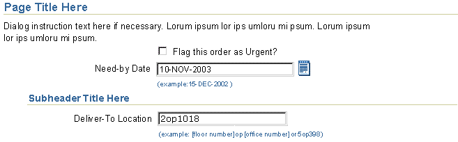
The following image shows a date field with a Date Picker Icon (calendar icon) located to the right of the field. When the calendar icon is selected, the Date Picker widget is invoked.
Date Field in Page Contents to Access Date Picker in Secondary Window
This method is best used when maintaining continuous view of the calendar helps the user complete their task.
- When multiple date fields appear on the page, you may place one date picker per date field, or place multiple date fields per inline date picker.
- Date field and Date Picker focus interaction differ somewhat, depending on whether one or many date pickers are placed on the page. Refer to One-to-One / One-to-Many, below.
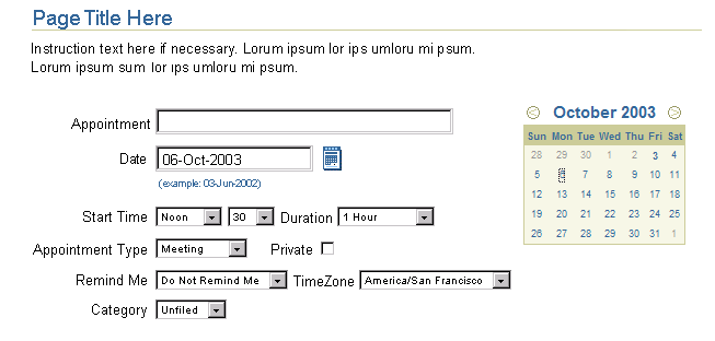
The following is an image of the a single date field among other components with the Date Picker Calendar inline in the page contents.
Date Field in Page Contents with Date Picker Inline in Primary Window
- One-to-One - One inline date picker per date field on the page.
- Use one date picker per date field when date fields are spread across the page, in multiple sections, or are separated by multiple non-date-field.
- This also works if the page is sparsely populated, and multiple date pickers will not be distracting.
- One-to-Many - One inline date picker for many date fields on the page.
- You can use one date picker for multiple date fields when the fields are immediately next to each other, or in close vicinity. The inline date picker should be placed next to the set.
- This approach is good for when the page is highly dense, and there is not enough room for multiple inline date pickers.
When one Date Picker appears for each date field on the page:
- If there is no current focus, the date field nearest to the inline Date Picker used for date selection will be filled when the user selects a date. Focus moves to that date field after the user makes the date picker selection.
- If a date field is in focus, and the user selects a date in the adjacent inline date picker, that date field will be updated. Focus returns to that date field after the user makes a date picker selection.
- If another component is in focus on the page, the date field nearest to the inline Date Picker used for date selection will be filled when the user selects a date. Focus moves to that date field after the user makes the date picker selection.
When only one Date Picker appears for multiple date fields, which date field gets changed when the user selects a date in the inline date picker?
- If there is no current focus, the first date field on the page will be filled when the user selects a date in the inline date picker. Focus moves to the first date field after the user makes the date picker selection.
- If a date field is in focus, and the user selects a date in the inline date picker, that focused date field will be updated. Focus returns to that date field after the user makes a date picker selection.
- If another component is in focus on the page, the LAST date field in focus will be updated if the user selects a date in the inline date picker. Focus moves to the last date field after the user makes the date picker selection.
For example, for the following arrangement of text and date fields:
| | Field Order | Type |
| | 1 | Field |
| | 2 | Date Field |
| | 3 | Field |
| | 4 | Date Field |
| | 5 | Field |
- If the user arrives at the page, and then selects the inline date picker, #2 will be updated and be in focus.
- If the user fills out #1, then fills out #2, then fills in 3#, and then selects the inline date picker, field #2 will update and be in focus.
- If the user fills out #1, #2, #3, moves focus to #4 and doesn't fill it out, then goes to #5, and THEN selects a date in the date picker, #4 will be updated and be in focus.
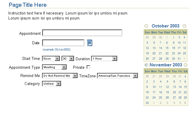
Multiple months can be stacked if a multiple month view is necessary for the user to pick an appropriate date and complete a task.
Stacking Multiple Date Picker Calendars Inline in Primary Window
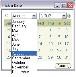
The Date Picker in the secondary window either displays the month and year as read only text, or the month and year in individual pulldown lists, [Month] in first pulldown list, [Year] in next pulldown list.
| |
Date Picker in Secondary Window
(Read-Only Month/Year)

|
|
Date Picker in Secondary Window
(Pulldown Month/Year)

|
To determine which option is appropriate, evaluate the task at hand, and assess the date range the user must be able to select from to fill in the field appropriately. If the range spans many years, the pulldown option is a better solution, if the range is within a year or two, the read only option is fine. The chosen option need not be consistent throughout a product family nor even within the product itself, but consistency within a product is preferable. More important, though, is that the option selected is best suited for the task at hand.
- Read-Only Month and Year - Some tasks require a user to select a date that is within a tight date range. For instance, setting up an appointment in a personal calendar, a user tends to select a date within a range of a couple of days to several months away. It is the rare case that a user selects a date that is 3 years away to make an appointment. Thus, a display only of the month and year is an appropriate design solution.
- Month and Year in Individual Pulldown Lists - Some tasks may require a user to select from a wide date range, possibly spanning years. For instance, if one were to select their birth date, given the corporate nature of Oracle applications, most users would be at least over 15 years old, and some users may be 60 years old. To satisfy this vast differences in date, the pulldown list option would be an appropriate design solution.
The Date Picker facilitates limitation of selectable dates to those which are valid. Invalid months and years can be set to not appear in the pulldown menu. Invalid days can be set to appear as inactive in the calendar.
If minimum and/or maximum values are set, hint text should be shown under the date field on the primary page indicating the restriction.
Here are examples of limiting the available day selections. In the left image, 15 September 2000 is the earliest valid date. In the right image, 14 October 2000 is the latest valid date. Other days appear, but are not selectable.
| |
Earliest Valid Day: 15 Sep 2000
|
|
Latest Valid Day: 14 Oct 2000
|
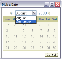
Here are examples of limiting the available month selections. In the left image, all twelve months are valid, and selectable. In the right image, September and August 2000 are the only valid months.
| |
All Months Valid
|
|
September and August Valid
|
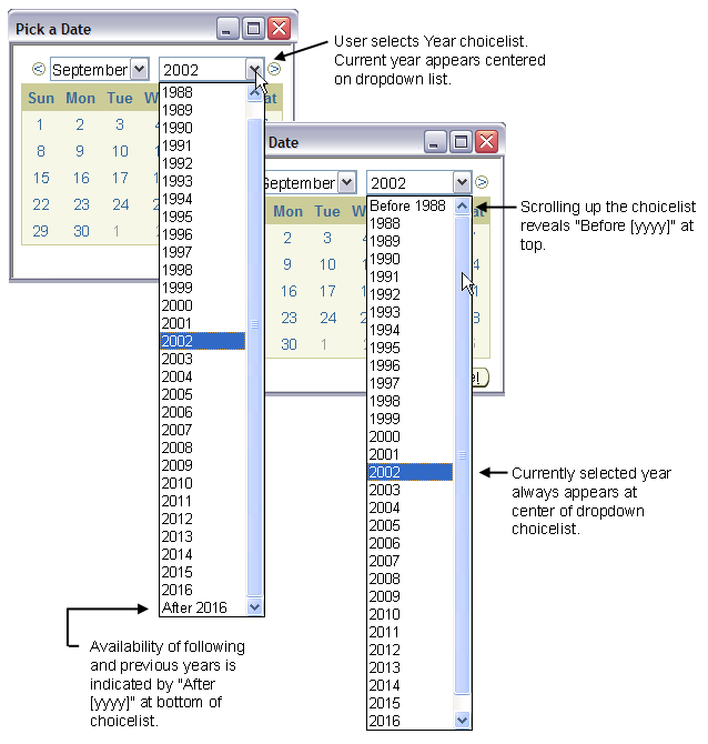
The Date Picker Month and Year pulldown menus handle large date spans by limiting the maximum menu population visible at one time to 30 items. The items are comprised of 28 years or months, with two additional places devoted to "Before [Year/Month]" and "After [Year/Month]". That makes a total of 30 items maximum shown in each batch of displayed years or months. Similar interactions can be found in the
Table Record Navigation with Large Data Sets section of the Locator Element: Record and Page Navigation Guideline.
Here's an example of a large selection of available years is handled:
Date Picker in Secondary Window - Large Date Spans
The following image describes the flow and positioning of the Date Picker launched in a secondary browser window.
Date Picker in Secondary Window Flow
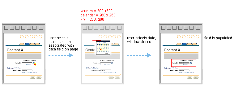
- The secondary window location should be positioned at x,y = 270,200 and the window size should be 260x260.
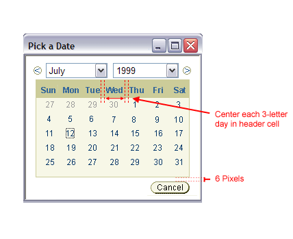
- The days of the week on the calendar of the Date Picker (inline or secondary window) can be abbreviated. (i.e., in English, the abbreviations is: Mon, Tue, Wed, etc.) These abbreviations are translatable because they are provided by the built-in JDK localization engine.
Measurements of Date Picker in Secondary Window
Open Issues
01-Mar-2004 - Keyboard traversal of the days in the date picker calendar is under examination.
- It is feared that traversing the calendar days may be laborious.
- It is under investigation whether we will SKIP the calendar portion of the inline date picker from keyboard traversal all together (i.e., the tab will see the previous/next and month year pulldowns of the inline date picker, but skip all the days of the month.) (this may be thought of as a bug by some users, while others may like this...)
19-Sep-2002 - Version 3.0+ Enhancements
- Inline Date Picker options are being explored, including ways to display multiple months simultaneously, with controls for toggling between them.
- Time and Time Zone options are being added as Date Picker options. This will change the picker interaction model.
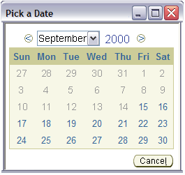
Closed Issues
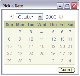
26-Jan-2000 - Here is an image of the calendar in the old look, for reference.