Color Picker
Last Updated 06.05.03
General Description
The
color picker component allows a user to pick a color for an object or component
in the page.
For example, the color picker could be used to pick the color of a bar in
a graph.
Guideline Attributes
Spec Version# - 3.1
Spec Contributors - Nina Gilmore, Dan Workman
UI Models - All Models
Example Products - All Products
Related Guidelines - Date
Picker, , Inline Messaging and Tips Guideline,
Button (Action/Navigation) Guideline
, Content Layout Guideline
Table of Contents
Interaction and Usage Specifications
General Principles
- The color picker's
primary function is to provide a means for users to customize
the color of an object or element (i.e. the color of gridlines
in a graph, or the background color in a table cell) in the page.
- The color
picker component consists of a label, a text field, a color swatch,
and a color palette. The color palette can be displayed inline
(with the page contents), or in a modal secondary window (accessed
by clicking on the color swatch in the primary page.) See images
below for visual description.
The inline color picker
(in the primary page contents) works well when customizing color information is
a crucial part of the task at hand, and space exists in the primary page to place
the color palettes inline. Each customizable object field must use a separate
color palette.
Color Picker - Inline (single color picker)
.gif) The color picker in a secondary window is useful when color customization
is not a user's primary task, and/or when objects have default
colors that are not often customized. It is also useful in instances
where the primary page is dense with information, and adding inline
palettes would add too much clutter to the screen.
The color picker in a secondary window is useful when color customization
is not a user's primary task, and/or when objects have default
colors that are not often customized. It is also useful in instances
where the primary page is dense with information, and adding inline
palettes would add too much clutter to the screen.
Color Picker - Inline Text Field and Swatch
.gif)
Color Palette - In Secondary Window
.gif)
(Note:
the secondary window must be modal to ensure that the window retains
focus and does not get hidden behind the primary window.)
Color Picker - Inline (multiple color pickers)
.gif)
General
- Users can pick
a color in two ways: click on a color in the color palette or
type a color into the text field either on the primary page or
in the secondary window.
- The text input
field accepts Hexadecimal color values (i.e. #FFFFFF) or RGB color
values (i.e. 255, 255, 255). The application chooses the default
color format, and can give users the ability to change the default
in user preference options.
- Only one
color value is valid per field.
- The color swatch
adjacent to the text field displays the currently selected color.
- The graphical
color palette allows a user to choose a color by simply placing
the mouse over the selected color and clicking. The selected color
will be reflected in both the text field and adjacent color swatch
currently in focus (selection updated when the user tabs out of
the field.)
- The color swatch is either status-only or clickable. The clickable swatch launches the color palette in a secondary window.
- The clickable color swatch is identified by using a palette icon, in addition to the color square. The status-only color swatch uses a non-clickable square.
- Rollover text
for the clickable color swatch: "Click to change <object>
color. Current color: <Hex or RGB value>."
- Rollover text
for the status-only color swatch: "Current <object>
color: <Hex or RGB value>."
- In cases where
the current object color is transparent or not specified, the
text field should read "Transparent" or "None", respectively.
- Users can pick
any (valid) Hex or RGB color, or click the "Transparent"
color swatch in the palette.
- When a user
picks the "Transparent" ("X")
swatch in the palette, the corresponding text field
updates to show "Transparent" and the color swatch updates
to show the Transparent Swatch.
- The text input
field provides inline hint text to indicate the proper color format
for hexadecimal or RGB color value entry. The text should read:
(Hex example: #FFFFFF).
- Tip text should be used when appropriate (e.g. multiple color
pickers located inside a table, or in a section of contents
on the page). Tip text for the inline color picker: "Click
in the palette to select a color or enter color information
as [#FFFFFF]", and for the secondary window color picker:
"Click on the color swatch to select a color or enter
color information as [#FFFFFF]". See the Inline
Messaging and Tips Guideline for more information.
- Users can create
a custom color by typing a color value into the text field. Custom
colors are located in the custom color row, beneath the palette.
- If a user selects
the color picker associated with an object that contains colors
which are outside of the color picker palette, those colors will
appear in the custom color row.
- The
color picker text field must have a valid selection before the
user can exit the field.
- For required fields, a valid color must be selected before
a user can move focus out of the field. Formatting error messaging
will prompt a javascript alert on empty or improper color
formats in required fields (read more...)
- An application must specify which fields require a color
selection. Non-required fields may be left empty (with no
color selected.)
Colorpicker Inline
- When a user
places the cursor over the color swatch, roll-over text appears
that gives color information in the default color format ("Current
<object> color: <Hex or RGB value>")
- The color swatch
reflects the currently selected color; it is not clickable.
- Each object
allowing color customization must use its own palette. Do not
use one palette for multiple objects.
- Use the inline color palette when color customization is a key
task for users. If several inline colorpickers appear on
the page, consider using 2-column layout to optimize space
and minimize the need for scrolling. Check the Content
Layout Guideline for more information.
Colorpicker in Secondary Window
- When a user
places the cursor over the color swatch, roll-over text appears
("Click to change <object> color. Current color: <Hex
or RGB value>") and the cursor changes from a pointer
to a hand to indicate that the swatch is clickable.
- The color swatch reflects the currently selected color, and it is clickable.
- The color swatch icon should be used (swatch with palette graphic) to indicate that the swatch is clickable.
- Clicking on
the color swatch opens the color-palette in a secondary window.
The user must click on it to open the color picker. It is located
immediately to the right of the inline text field. The color swatch
should only be clickable when the palette is in a secondary
window.
- The color picker secondary window changes size depending on the
size of the color palette image. In most cases, the 49-color palette
provides a satisfactory selection of colors to optimize color
picking. To determine the appropriate palette, the application
should evaluate the users' expected tasks to determine their required
color needs. Always use the smallest palette that will meet users'
needs.
- When the secondary window is opened, it reflects the currently
selected color for the field in focus in the primary page.
- Clicking "Apply" in the secondary window updates the
appropriate field/colorswatch (in the primary page) with the selected
color and closes the secondary window. Clicking "Cancel"
closes the secondary window without updating the primary page.
A user can edit color information in the text field. This will create a custom
color.
General Heuristics for Custom Colors
- Custom colors are created by typing
a specific color value into the text field. If that color does
not exist in the current palette, it is a custom color.
- The custom color row fills from left to right with custom colors. When the
row is full, the newest custom color replaces the oldest custom
color.
- The custom color row has the same number of swatches and is the same width
as the color palette. It is separated from the color palette by
5 pixels.
- Custom colors are saved on a "per browser session" basis.
- Custom color information is lost when ALL browser windows
are closed and/or a user logs out of the application/application
suite.
- If an object contains colors that do not exist in the color picker
palette, those colors appear in the custom color row.
Colorpicker Inline
Typing a color value into the text field in the primary page creates
a custom color.
When a user types a color value into the text field, the color swatch
following the text field updates to display the custom color when
focus leaves the field.
The custom color row in the inline palette also updates (when focus leaves the
field) to show the custom color in the first available space. Custom colors are
filled left to right in the custom color row.
Custom Colors Inline
.gif)
Secondary window
Typing a color value into the text field in the secondary window creates
a custom color.
When a user types a color value into the text field, the color swatch
following the text field updates to display the custom color (when
the field loses focus.) When the user clicks "Apply", the
secondary window closes and the custom color is applied to the field
in focus on the primary page.
In the secondary window, the custom color row updates with the custom
color in the first available space and the next time that the secondary
window color picker is opened, the custom color is visible. Custom
colors are filled left to right in the custom color row.
(When a user types a custom color into a text field on the primary
page without launching the color picker window, the custom color is
still created. The next time the color picker is launched, the custom
color appears.)
Custom Colors in Secondary Window
.gif) Error messages make it possible for the user to know when they�ve
typed an invalid color format into the colorpicker field.
Error messages make it possible for the user to know when they�ve
typed an invalid color format into the colorpicker field.
Inline
If a user types an invalid color format
into the primary page text field and attempts to tab or click
out of the field, a javascript alert warns the user that the format
is invalid. Error text must indicate the proper color format (based
on the application) in hexadecimal or RGB value: �Color must
be entered in the following format: [#FFFFFF]." When
the user clicks "OK" in the alert window, the field
on the primary page is reset to its previous value and focus returns
to the field.
When the user enters a color in the appropriate format into the text field on
the primary page, the color swatch will update upon exiting the field.
Secondary
Window
If a user types an invalid color format into the secondary page
text field and attempts to tab or click out of the field, a javascript
alert will warn the user that they have typed an invalid format.
Error text must indicate the proper color format appropriate to
the application in hexadecimal or RGB value: �Color must be
entered in the proper format. (Example #FFFFFF)".
When the user clicks "OK", the field is reset to the
previous value in the field, and focus is returned to the field.
The user can choose to edit the field again or click "Cancel"
to dismiss the secondary window without making any changes to
the primary page.
Choosing a color
palette should be based on the task and the needs of the users,
helping them accomplish their tasks without confusing or distracting
them. In most instances this means using the palette with the fewest
colors. Use the heuristics below to determine which palette to choose.
- Good information
design and page layout design relies on using a limited number
of colors in the interface. Small palettes make it easier for
a user to reliably pick the same color when editing page elements
and help users create well-designed pages.
- As a rule,
business applications are not graphics-intense and do not need
large palettes to effectively customize page elements. Large palettes
may provide too many options for users and make it difficult for
them to repeatedly find the color they are looking for.
- Examples of
interfaces where small palettes (=<49 colors) are acceptable:
email applications, document customization, CSS editing.
- Consider whether
your users are familiar with a specific palette. If so, using
the same palette will preserve a consistent user experience and
may enhance usability (will prevent users from having to relearn
where the colors they need are located.)
- Do not use different color palettes within an application. This can be distracting
and confusing for users, who rely on consistent and predictable results when
choosing colors.
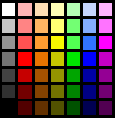
- For most users
in most circumstances, the default 49-color palette provides a
good range of colors and organizes them to help users perceive
incremental color differences. This palette is recommended as
the default palette for the color picker.
49-color (Default)
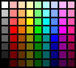
72-color palette
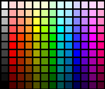
143-color palette
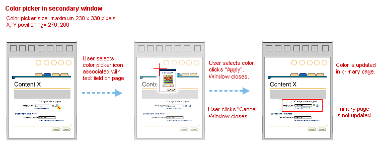
Secondary Window Flow
The color picker secondary window page flow is
described visually below.
When the color swatch icon is selected, the color picker will
open in a secondary window at X, Y position 270, 200. The smallest
effective palette should be used.
Color Picker in Secondary Window
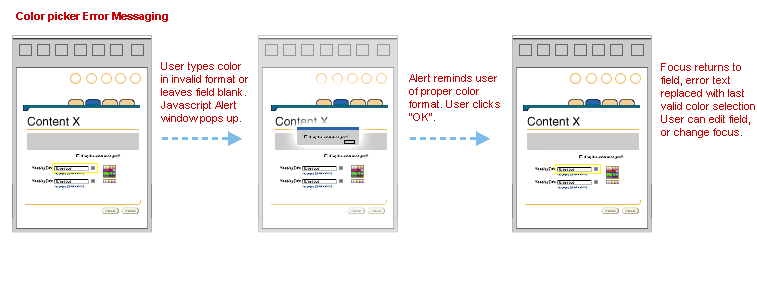
Error Messaging
(consistent for both inline and secondary window)
The color picker formatting error messaging flow is described
visually below.
If a user types an invalid entry into the color picker text field,
a JavaScript alert will tell the user of the proper format and
return focus to the field when the user clicks "OK".
Color picker error messaging
- The color swatch
should be separated from the text field by 5 pixels.
- The inline
palette should be no more than 25 pixels from the right edge of
the color swatch and aligned to the top of the textfield.
- The inline
palette should always be located adjacent to the text field and
color swatch. Do not place the color palette elsewhere in the
page.
- If several objects in the primary page enable color customization, optimize
your page layout using the following heuristics:
- use 2-column layout to reduce vertical scrolling.
- use the color picker in a secondary window if color customization
is not a primary task.
- always use the smallest palette that meets the needs of
your users. Smaller palettes take up less space and reduce
scrolling.
- The secondary window location should be positioned at X,Y = 270, 200.
- The color picker secondary window should be no larger than 285 x 310, using the maximum size recommended palette.
- The custom color row is separated from the color palette by 5 pixels.
- If an object supports transparency, the palette should contain a transparent
pick (a black "X") in the top, left swatch of the color
palette.
.gif)
.gif)
.gif)
Open/Closed Issues
Open Issues
- 3-20-02: Saving custom
colors beyond a browser session.
- 3-20-02: Defining
custom colors as colors which fall outside of the current color
picker palette.
- 3-20-02: Allowing
an application to limit color picker palette (including custom
colors) to certain color values.