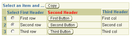
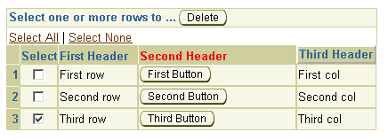
ADF UIX provides two row selection components: singleSelection and multipleSelection. Either row selection component can be used in a table or hGrid component. The row selection components enable users to select one or more rows and then perform an action on the selected row or rows.
Both singleSelection and multipleSelection render a selection column and a control bar. The singleSelection component renders a radio button selection column, while the multipleSelection component renders a checkbox selection column.
The control bar displays above the column header. The text in the control bar is set by the text attribute on the row selection component. The control bar can contain any indexed children, which is usually an action button that acts on the selected row or rows.
To disable row selection, either set the disabled attribute on the row selection component to true or bind the disabled property to return true for those DataObject rows that should be disabled.
For singleSelection, you can use the primaryClientAction attribute to fire a client action when a radio button is selected. To set the initial selection state of the component, use the zero-based selectedIndex attribute. Note, however, a binding on the selected attribute takes precedence over the setting of the selectedIndex attribute.
Use the selection named child to specify the DataObjectList
that represents the original selection status of each row. The
selected attribute specifies the initial selection status of a
row. Typically the selected attribute is databound to the
current DataObjectList so that the selection state of a row can be
retrieved from the selection DataObjectList.
About Table and its Named
Children
About HGrid and its Named
Children
Using SingleSelection or
MultipleSelection (TableSelection)
Working with Table Components
Copyright © 1997, 2004, Oracle. All rights reserved.