The hGrid component is a combination of two other ADF UIX components: It extends the tree component while imitating the format of the table component.
Use the hGrid component to display tree-structured data in a table-like format. Each row corresponds to a tree node. While a tree component support multiple roots, hGrid supports only a single root that is a DataObject (and not a DataObjectList as in a tree). You can use hGrid with very large data trees because the hGrid component also supports zooming in and out of subtrees (i.e., focus in and out).
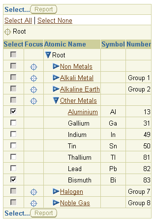
The hGrid component creates an object hierarchy column that contains the tree nodes, and a focus column that contains the zoom in or focus icons. The root of the tree displays just below the column headers.
In the object hierarchy column, the user can expand (view) or collapse (hide) the children of a tree node. In the focus column, a focus icon displays in each tree node that contains one or more subtrees. The focus column is used to select a new root for the tree. This allows users to zoom into subtrees of a massive tree.
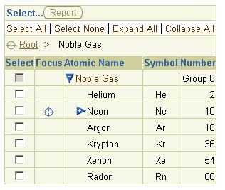
When the user clicks a focus icon, the hGrid component renders a breadcrumbs area above the column headers, which show all the parent nodes above the current focus root. This allows the user to focus out (or zoom out) of the current subtree. At the same time, the hGrid also renders text links to allow the user to quickly expand or collapse all the nodes under the current focus root.
As in a tree component, a nodeStamp may be used to render the contents of the object hierarchy column. The default column header for this object hierarchy column is 'Name'. You can, however, change the default by defining a column component as the nodeStamp and by setting a columnHeader named child on that column.
The rest of the appearance of hGrid is controlled in a manner that is similar to the table component. Use the columnHeaderData attribute and the columnHeaderStamp named child to specify the column headers. The column values are set as indexed children (or contents) of hGrid. Various format options may be set using the tableFormat, columnFormats and columnHeaderFormats attributes.
Tip: It may be undesirable to allow the user to expand all nodes in cases where the number of elements in a subtree is huge. To disable the expand-all feature for a tree node, set the expandAll attribute to false on the nodes element. Alternatively, set the value of the key ClientStateHGridDataProxy.EXPAND_ALL_KEY to Boolean.FALSE.
The attributes you can set for hGrid are:
alternateText - Specifies the text to display inside an
empty hGrid.
formSubmitted - Specifies a boolean value that determines
whether form submission will be used in the links generated by the
hGrid proxy.
summary - Specifies a summary of the purpose and
structure of the table for non-visual user clients.
childBlockSize - Specifies the maximum number of child
node records that can be displayed at one time under any given node.
If a node has more children than the childBlockSize number, a special
navigation row with scroll links are rendered below and above the
node. See About ChildBlockSize
for more details.
columnFormats - Specifies the data source to bind to for
the formatting information of each column. This complex attribute may
be databound using an EL syntax expression.
columnHeaderData - Specifies the data source to be used
when stamping out the columnHeaderStamp child. This complex attribute
may be databound using an EL syntax expression.
columnHeaderFormats - Specifies the data source to bind
to for the formatting information of each column header. This complex
attribute may be databound using an EL syntax expression.
destination - Specifies the base destination for all
links generated by the hGrid.
inlineStyle - Specifies the inline CSS style to use.
partialRenderMode - Specifies the type of partial page
rendering (PPR) behavior for the hGrid. Available values are none,
self, multiple. By default all hGrid interactions result in full page
renders (i.e., partialRenderMode is set to "none"). When
partialRenderMode is set to "self" or "multiple", the expand,
collapse, and focus events are sent as partial page events, which
allow the specified partial targets to be updated without redrawing
the entire page. For PPR to work properly, the hGrid component id
attribute must be set, and the hGrid must be contained within a UIX
body element. When these requirements are met, and partialRenderMode
is set to "self" or "multiple", the hGrid component will use the PPR
architecture to send events to the application. If any of these
requirements are not met, or if the browser is not capable of
supporting PPR, full page rendering will be performed. If set to
"multiple", then you must also set the partialTargets attribute.
partialTargets - Specifies the list of partial target
nodes to render when partialRenderMode is set to multiple. The ID of
the hGrid component is automatically included in the partialTargets
list.
proxied - Specifies a boolean value that determines
whether hGrid operations can be performed using JavaScript on the
client-side. If set to true, JavaScript proxy code is included when
rendering on the client.
proxy - Specifies the proxy that sits between the tree
nodes and the expanded state, selection state, focus state, and the
children of those nodes. An hGrid without a proxy is not interactive.
The proxy keeps track of the expand/collapse/focus state of the hGrid
by setting up the expand, collapse, and focus destinations. The proxy
must be of type oracle.cabo.ui.data.tree.HGridDataProxy. See
oracle.cabo.ui.data.tree.ClientStateHGridDataProxy for an instance of such
a proxy.
summary - Specifies a summary of the purpose and
structure of the table for non-visual user clients. If this attribute
is not provided, the value of the text attribute will be used.tableFormat - Specifies the formatting data for the
entire table. This complex attribute may be databound using an EL
syntax expression. The table formats allowed are:
bandingInterval - Specifies the number of rows or
columns in each banding group.
tableBanding - Specifies the banding strategy used
for the table. The values supported are:
noBanding - Default. No banding is used in the
table.
columnBanding - The columns are alternately
banded.
rowBanding - The rows are alternately banded.
treeData - Specifies the data tree to be displayed by the
hGrid.
unvalidated - Specifies a boolean value that determines
whether or not to validate before any form submits generated by the
hGrid proxy. The default is to perform no validation. This attribute
is only applicable when the hGrid is used in formSubmitted mode.
width - Specifies the width of the hGrid.
model - Specifies an EL syntax expression that resolves
to an ADF Data Control. When this attribute is set, various attributes
from the data control are set automatically on the hGrid. These
attributes are identified in the Property Inspector as [Set by model]
in the right column. When you use the Data Control palette to create
your hGrid, the id and model attributes are
automatically set, for example, <hGrid
model="${bindings.ColorsView1}" id="ColorsView11">
.
id - Specifies the page-wide hGrid identity in
client-to-client or client-to-server events. This attribute is
automatically set when you use the Data Control palette to create your
hGrid.
For more details about ADF bindings and the Data Control Palette, see:
The hGrid component supports the following named children:
columnHeaderStamp - Use the columnHeaderStamp named child
to specify the node that renders a label for each column.
nodeStamp - Use the nodeStamp named child to specify the
header for the object hierarchy column. By specifying a node that
renders at each tree node, this named child can also be used as a
stamp to customize the data in the object hierarchy column.
tableActions - Use this child to insert a component for
performing actions on the hGrid that are independent of row selection.
The inserted child component displays above the column header. The
preferred component you can insert are button, messageChoice,
pageButtonbar, or submitButton.
tableSelection - Use this child to insert a selection
column in the table for selecting one or more rows. Either radio
buttons (single selection) or checkboxes (multiple selection) may be
used.
Note: Row formatting options, table navigation, and
detail-disclosure are not supported on hGrid.
About HGridDataProxy
About Tree
About BrowseMenu
Creating an HGrid
Working with Table Components
Copyright © 1997, 2004, Oracle. All rights reserved.