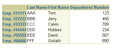
Note: For layouts requiring a table-like appearance,
consider using tableLayout instead.
The main table components used to display tabular data are
table and column. A
data table is created by a series of column elements as
indexed children of table. By themselves, table
and column do not display anything visible until data is
configured or "stamped" in the table.

The attributes you can set for table are:
alternateText - Specifies the text to display inside an
empty table.
allDetailsEnabled - Specifies a boolean value that
determines whether to provide Show All Details and Hide All Details
links above the table rows. These links allow the user to show/hide
all detail areas.
blockSize - Specifies the number of rows to display in
the table at each time.
columnFormats - Specifies the data source to bind to for
the formatting information of each column in the table. This complex
attribute may be databound using EL expression. This complex attribute
has no effect if the columnFormat attribute of a column component is
specified.
columnHeaderData - Specifies the data source to bind to
for the column headers. This complex attribute may be databound using
an EL syntax expression. This complex attribute has no effect if the
columnHeaderData attribute of a column component is specified.
columnHeaderFormats - Specifies the data source to bind
to for the formatting information of each column header in the table.
This complex attribute may be databound using an EL syntax expression.
This complex attribute has no effect if the columnHeaderFormat
attribute of a column component is specified.
destination - Specifies the base destination for all
links generated by the table.
detailDisclosure - Specifies the disclosed state of each
cell in the "Details" column. This complex attribute defines the data
source to bind to for the list of detail rows currently disclosed.
This complex attribute may be databound using an EL syntax expression.
formSubmitted - Specifies a boolean value that determines
whether form submission will be used in the links generated by the
table navigation bar.
inlineStyle - Specifies the inline CSS style to use.
maxValue - Specifies the last possible row in the data
set displayed.
minValue - Specifies the first possible row in the data
set displayed.
nameTransformed - Specifies a boolean value that
determines whether name transformation should be turned on or off when
rendering form controls in editable table cells..
partialRenderMode - Specifies the type of partial page
rendering (PPR) behavior. Available values are none, self, multiple.
By default PPR support is disabled (i.e., partialRenderMode is set to
none). If partialRenderMode is set to 'self' or 'multiple', then PPR
is used to optimize actions such as table navigation, column sorting,
and detail-disclosure. If set to 'multiple', then you must also set
the partialTargets attribute. For PPR to work properly, the table
component ID must be set. If the client does not support PPR, then
full page rendering will be used.
partialTargets - Specifies the list of partial target
nodes to render when partialRenderMode is set to multiple. The ID of
the table component is automatically included in the partialTargets
list.
proxied - Specifies a boolean value that determines
whether table operations can be performed using JavaScript on the
client-side. If set to true, JavaScript proxy code (TableProxy
JavaScript object) is included in the table when rendering on the
client.
rowFormats - Specifies the data source to bind to for the
formatting information of each row in the table. This complex
attribute may be databound using an EL syntax expression.
rowHeaderData - Specifies the data source to bind to for
the labels of each data row. This complex attribute may be databound
using an EL syntax expression.
rowHeaderFormats - Specifies the data source to bind to
for the formatting information of each data row header. This complex
attribute may be databound using an EL syntax expression.
showAll - Specifies a value that determines whether a
"Show All" option is to be displayed in the record navigation bar.
This is only used if maxValue is set. If the number of row blocks is
too large, this is automatically disabled. Supported values are yes
and no only.
summary - Specifies a summary of the purpose and
structure of the table for non-visual user clients.
tableData - Specifies the data source to bind to for this
table. This complex attribute may be databound using an EL syntax
expression, for example, ${uix.data.demoTableData.demoRowData}. This
complex attribute is not available if the model attribute
is specified.
tableFormat - Specifies the formatting data for the
entire table. This complex attribute may be databound using an EL
syntax expression. The table formats allowed are:
bandingInterval - Specifies the number of rows or
columns in each banding group.
tableBanding - Specifies the banding strategy used
for the table. The values supported are:
noBanding - Default. No banding is used in the
table.
columnBanding - The columns are alternately
banded.
rowBanding - The rows are alternately banded.
unvalidated - Specifies a boolean value that determines
whether to validate before any form submits generated by the table.
Used only when formSubmitted is true.
value - Specifies the first currently visible row in the
data set that is displayed. This attribute is required if the table
has navigation bars.
width - Specifies the width of the table. Set the table
width attribute in pixels or as a percentage of the parent element. If
the value is not large enough to accommodate the table content, ADF
UIX overrides the width attribute at display time and uses the minimum
amount of space to display all the content.
model - Specifies an EL syntax expression that resolves
to an ADF Data Control. When this attribute is set, various attributes
from the data control are set automatically on the table. These
attributes are identified in the Property Inspector as [Set by model]
in the right column. When you use the Data Control palette to create
your table, the id and model attributes are
automatically set, for example, <table
model="${bindings.EmpView2}" id="EmpView20">
.
id - Specifies the table identity in client-to-client or
client-to-server events. Use in place of the name attribute, which has
been deprecated. This attribute is automatically set when you use the
Data Control palette to create your table.
For more details about ADF bindings and the Data Control Palette, see:
The table component supports the following named children:
columnHeaderStamp - Use the columnHeaderStamp named child
to specify the node that renders a label for each column. The data for
the header is set using the columnHeaderData property of a
DataObjectList.
detail - Use the detail named child to specify the node
to stamp below each row that is disclosed. When the detail named child
is specified, ADF UIX automatically renders an additional column with
the heading "Details" and a hideShow component in each cell of that
column.
footer - Use the footer named child to present a summary
of the data at the bottom of the table. You can insert any component
in the footer, but the preferred components to insert are addTableRow
and totalRow. Note: ColumnFooter has been deprecated.
rowHeaderStamp - Use the rowHeaderStamp to specify the
node that renders a label for each data row. The data for the row
header is set using the rowHeaderData property of a DataObjectList.
tableActions - Use this child to insert a component for
performing actions on the table that are independent of row selection.
The inserted child component displays above the column header. The
preferred component you can insert are button, messageChoice,
pageButtonbar, or submitButton.
tableSelection - Use this child to insert a selection
column in the table for selecting one or more rows. Either radio
buttons (single selection) or checkboxes (multiple selection) may be
used.
Tip: Use the column component to
encapsulate all the information that describes a table column into one
entity instead of using a number of column attributes set globally on
the table. When column indexed children are specified, they
override any values for column formats and stamps specified on
table.
About Table Structure and Stamps
About Column and its Named Children
About Data Binding in Tables
About Name Transformation and Editable Table Cells
About TableLayout
Creating a Table
Working with Table Components
Copyright © 1997, 2004, Oracle. All rights reserved.