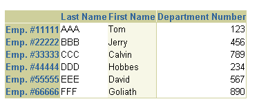
The main table components used to display tabular data are
table and column. A
data table is created by a series of column elements as
indexed children of table. By themselves, table
and column do not display anything visible until data is
configured or "stamped" in the cells of the table.
Use column to encapsulate all the information that
describes a table column into one entity instead of using a variety of
table column attributes (e.g., column formats, column header data,
column header formats) set globally on the table. When column
attributes are specified, they override any values for column formats and
stamps specified on table.
You can use column for any, all, or none of the columns in
a table component. The attributes you can set for column
are:
columnFormat - Specifies the formatting information for
the entire column. This complex attribute can be databound using an EL
syntax expression. The column formats allowed are:
columnHeaderData - Specifies the data for the header of
this column.
columnHeaderFormat - Specifies the formatting for the
header of this column, whether cellNoWrapFormat is turned on or off.
inlineStyle - Specifies the inline CSS style to use.
nameTransformed - Specifies a boolean value that
determines whether this column should turn on or off name
transformation when rendering data controls. By default name
transformation is on, unless nameTransformed on the table
has been set to false.
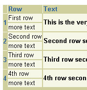
useSeparateRows - Specifies a boolean value that
determines whether the indexed children of this column should be
rendered on separate rows.
The column component supports the following named children:
columnHeader - Use the columnHeader named child to
provide a label for the header of this column. The preferred child to
insert is styledText. For sortable column headers, insert the
sortableHeader element.
footer - Use the footer named child to present a summary
of the data at the bottom of this column. Any child component can be
inserted into the footer.
Each column stamp gets its visible contents to stamp (or render) from
the indexed children of column. The indexed children can be
text, buttons, or any other components. Set the useSeparateRows
attribute to true if you wish to display the indexed children on
separate rows in each column cell.
About Table and its Named
Children
About Name
Transformation and Editable Table Cells
Creating a Column
Working with Table Components
Copyright © 1997, 2004, Oracle. All rights reserved.