To change the appearance of a table and its contents created by table and column components, use the following attributes:
tableFormat - Set the tableFormat complex attribute on
the table component to specify the formatting for the entire table.
This complex attribute can be databound. Currently the table
formatting you can control is banding.
columnFormat - Set the columnFormat complex attribute on
the column component to specify the formatting for that column. This
complex attribute may be databound. Or, you can use the following
attributes:
rowFormats - Set the rowFormats complex attribute on the
table component to specify the formatting for each table data row.
Currently the row formatting you can control is the appearance of
horizontal grid lines above the rows. This complex attribute must be
databound.
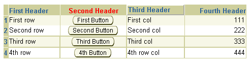
The following sampe UIX XML code produces the table shown above:
...
<provider>
  <!-- all the data used by our table demo -->
  <data name="demoTableData">
    <inline>
      <!-- DataObjectList to provide information to the data rows -->
      <demoRowData firstColumnText="First row"
                   secondColumnText="First Button"
                   thirdColumnText="First col"
                   fourthColumnText="111"/>
      <demoRowData firstColumnText="Second row"
                   secondColumnText="Second Button"
                   thirdColumnText="Second col"
                   fourthColumnText="222"/>
      <demoRowData firstColumnText="Third row"
                   secondColumnText="Third Button"
                   thirdColumnText="Third col"
                   fourthColumnText="333"/>
      <demoRowData firstColumnText="4th row"
                   secondColumnText="4th Button"
                   thirdColumnText="4th row col"
                   fourthColumnText="444"/>
      <!-- DataObjectList to provide information to the row header stamps -->
      <demoRowHeaderData headerText="1"/>
      <demoRowHeaderData headerText="2"/>
      <demoRowHeaderData headerText="3"/>
      <demoRowHeaderData headerText="4"/>
      <!-- DataObjectList to provide formmating information to the rows -->
      <demoRowFormats/>
      <demoRowFormats displayGrid="false"/>
      <demoRowFormats/>
      <demoRowFormats/>
    </inline>
  </data>
</provider>
...
<table tableData="${uix.data.demoTableData.demoRowData}"
       rowHeaderData="${uix.data.demoTableData.demoRowHeaderData}"
       rowFormats="${demoTableData.demoRowFormats}"
       width="55%">
  <contents>
    <column>
      <columnHeader>
        <styledText text="First Header"/>
      </columnHeader>
      <contents>
        <!-- first column stamp -->
        <text text="${uix.current.firstColumnText}"/>
      </contents>
    </column>
    <column>
      <columnHeader>
        <styledText text="Second Header">
          <inlineStyle>
            <property name="color">red</property>
          </inlineStyle>
        </styledText>
      </columnHeader>
      <contents>
        <!-- second column stamp -->
        <button text="${uix.current.secondColumnText}"/>
      </contents>
      <columnFormat columnDataFormat="iconButtonFormat"/>
    </column>
    <column>
      <columnHeader>
        <styledText text="Third Header"/>
      </columnHeader>
      <contents>
        <!-- third column stamp -->
        <text text="${uix.current.thirdColumnText}"/>
      </contents>
    </column>
    <column>
      <columnHeader>
        <styledText text="Header 4"/>
      </columnHeader>
      <contents>
        <!-- fourth column stamp -->
        <text text="${uix.current.fourthColumnText}"/>
      </contents>
      <columnFormat columnDataFormat="numberFormat"/>
    </column>
  </contents>
  <!-- row header stamp node -->
  <rowHeaderStamp>
    <text text="${uix.current.headerText}"/>
  </rowHeaderStamp>
  <tableFormat bandingInterval="1" tableBanding="rowBanding"/>
</table>
...
About Table and its Named
Children
About Column
and its Named Children
Using TableFormat, ColumnFormat, and
RowFormats
Working with Table
Components
Copyright © 1997, 2004, Oracle. All rights reserved.