Note: The messageLayout component replaces inlineMessage, which has been deprecated.
Message form components are all the Form components in ADF UIX that have names starting with the prefix 'message', e.g., messageCheckBox, messageChoice, and messageDateField.
In UIX, the messageLayout component is used to lay out inline messages (e.g., tip, error, or prompt). Message form components are special components that combine inline messaging with input components such as checkBox and choice. For example, the messageCheckBox component is a combination of the checkBox component and messageLayout component, and the messageChoice component combines messageLayout with the choice component. Message form components enable you to display inline messages easily with the input components that caused problems during event handling.

Tips:
All message form components have the end named child. Use the end named child to add any component after a message form component.
Message form components have the following message attributes:
anchor - Specifies the name of an anchor tag that
uniquely identifies the message form component across a single page.
The messageBox component uses anchor tags to link to message form
components on the same page.
longDescURL - Specifies the URL to a page with more
information about the message.
message - Specifies the error, warning, or informational
text.
messageType - Specifies the type of the message, e.g.,
error or warning.
targetFrame - Specifies the target frame for the
component, if any.
tip - Specifies the tip text associated with the input
component.
The general attributes you can set for a message form component are:
accessKey - Specifies the character to use for quick
access to the associated input component. The character must exist in
the text or prompt attribute of the component, otherwise no visible
indication of the access key will be presented in the UI.
contentStyleClass - Specifies the CSS style of the
content area of the message form component. This area includes the
direct contents as well as the end child.
disabled - Specifies whether to render the component as
disabled.
inlineStyle - Specifies the inline CSS style for the
component.
name - Specifies a unique name for the component.
prompt - Specifies the prompt text that displays before
the input component.
promptAndAccessKey - Specifies both the prompt text and
the access key from a single value using the ampersand ('&') notation.
For example, setting this attribute to "P&rompt" will set the prompt
to "Prompt" and the access key to 'r'.readOnly - Specifies whether to render the component as
read only.
required - Specifies whether the associated component
requires user input. This attribute does not affect client or server
validation, which must be done independently. Depending on the
component, these values are supported:
yes - User input is required. Any attached validater
must also succeed. Visual indication is displayed (asterisk).
no - Default. User input is not required or any
attached validater must succeed.
uiOnly - The user interface indicates that user input
is required (asterisk), but the constraint is not enforced.
validaterOnly - Validation success is dependent on
the validater and not whether any input has been entered. Any
attached validater must succeed.
vAlign - Specifies the vertical alignment of the prompt
and other contents.
Note: When you create or edit a message form component, the Property Inspector shows a complete list of the supported attributes. A message form component may also support other attributes that determine the behavior of that component. These attributes are described in the procedural topic for the component, e.g., the procedural topic "Inserting a MessageCheckBox" describes the special checked attribute for a messageCheckBox component.
Most message form components support the primaryClientAction attribute. See About Client Actions for details about the client actions you can use.
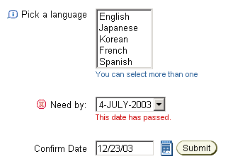
Message form components can be inserted inside a messageComponentLayout or a labeledFieldLayout. When placed inside a messageComponentLayout or labeledFieldLayout, all the prompts are right aligned, as shown in the following illustration:

Inserting an End Named Child for a
Message Form Component
Setting the Message Attributes for a Message Form Component
Setting the General Attributes for a Message Form Component
Working with Form Components
Working with Layout Components
Copyright © 1997, 2004, Oracle. All rights reserved.