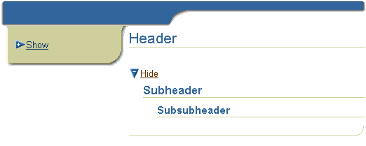
The hideShow component is used to toggle a group of indexed children between being shown (disclosed) or hidden (undisclosed). For example, use hideShow to hide or show details of a table row or a section or part of a section of information on a page.

The arrow icon and text of a hideShow component, and the tooltip text for the arrow icon are automatically generated. The default text that displays next to the arrow icon is "Show" or "Hide".
The disclosed attribute specifies whether the indexed children of a
hideShow component are shown or hidden. When the disclosed attribute is
false (default), the indexed children are hidden, the arrow icon points
sideways, and the default text is "Show". When the disclosed attribute
is set to true, the indexed children are displayed, the arrow icon
points down, and the default text is "Hide". To change the default text,
use the attribute undisclosedText (to override "Show") or disclosedText
(to override "Hide").
The hideShow link is a generated URL based on the destination and id attributes. If no destination is specified, the default URL for the page is used. When the user clicks the arrow icon or text, an event is sent to the server. The parameters of the generated URL are the "show" or "hide" event ID, and the hideShow ID as the source parameter. You must set a "show" and "hide" event handler for the hideShow link to function properly when a user clicks the arrow icon or text.
The hideShow component can also generate links that trigger form submission using Javascript. When the formSubmitted attribute is set to true, form submission is enabled whereby the event and source fields will be set to "show" or "hide", and the hideShow ID.
The hideShow component has one named child, prompt, which is used to insert a text link next to the arrow icon (in the same position as the default text). The prompt child destination is the same as the destination of the arrow icon. By setting the text and destination attributes of the link component in the prompt child, you can override the default text that displays next to the arrow icon and specify a different destination.
The hideShow component can use partial page rendering to send events to the application. To enable partial page rendering, the following requirements must be met:
<accessibility-mode>inaccessible</accessibility-mode>
in the UIX configuration file (
uix-config.xml).
If any of the requirements are not met or if the browser does not support partial page rendering, full page rendering will be used.
About HideShowHeader
About Partial Page Rendering
Inserting a HideShow Component
Inserting a HideShowHeader Component
Working with Layout Components
Copyright © 1997, 2004, Oracle. All rights reserved.