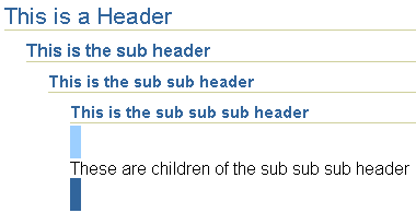
The header component places a label (title) and an optional icon at the top of a page section. Use the header component to divide your page into sections. You can insert any number of headers in a page. If you insert a header within a header, the subheader is smaller and indented relative to the parent header.

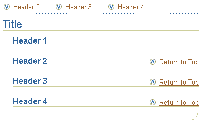
When a header component is used, a 'Return to Top' text link is automatically generated at the bottom of the section. Also, when you have more than one header and the quickLinksShown attribute of pageLayout is set to true, text links to all the headers (except the top header) are automatically generated and displayed as quick links above the page title.

The quick links text is generated from the header text attribute. If the header text is long and you want a shorter name to appear in the quick link, specify an abbreviated version of the header text by setting the shortText attribute on the header component. When the page is viewed in a browser, the full header text appears as a rollover on the quick link text.
You can also use the header component to display a message header with an icon at the top of the page for important messaging information such as Warning, Confirmation, Information, and Error.
![]()
You can override the default message header title by setting the text attribute on the header. You cannot, however, replace the default icon used in the message header.
About Quick Links
About HideShowHeader
Inserting a Header
Working with Layout Components
Copyright © 1997, 2004, Oracle. All rights reserved.