Date: Tue, 21 Jul 2009 21:54:36 +0200
Hello GlassFish team,
First of all I would to thank you for GlassFish, as a beginning Java EE
developer it feels like a very solid application server, and I especially
like v3 because it is so lightweight.
One thing I noticed with the new GlassFish v3 Preview is that the praised
Admin GUI has changed quite a bit, and in my opinion it's not an
improvement.
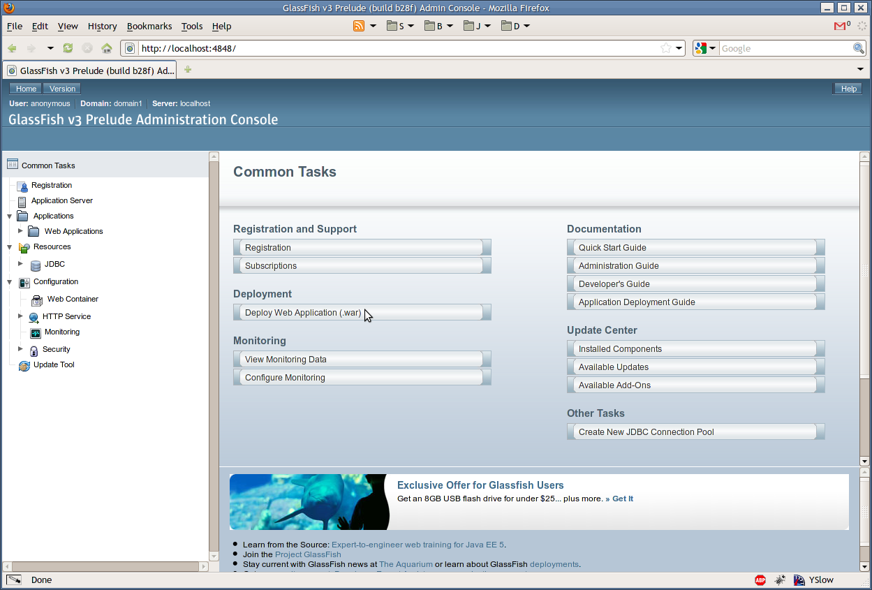
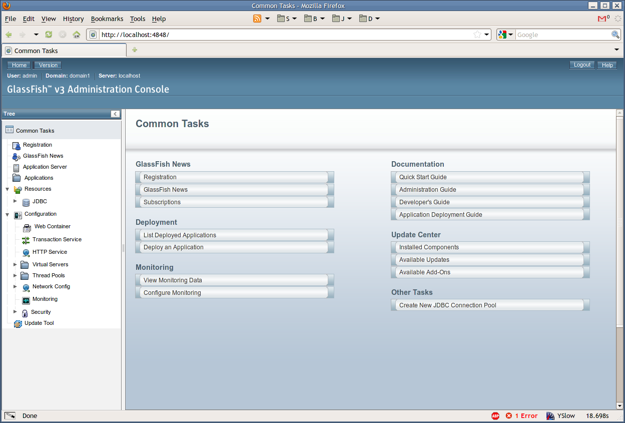
I attached the screenshots, you can clearly see that the Preview has way
more padding around the main GUI elements (header, sidebar, body) and the
fonts are bigger, so there is less information on the screen.
To illustrate what I am talking about, i attached three images,
gfv3-prelude.png - the interface we all came to love ;)
gfv3-preview.png - the interface with too much padding (imho),
gfv3-preview-fixed.png - the last interface, fixed with a few minor CSS
tweaks.
I think that the last option is the way to go, please consider fixing the V3
Preview GUI, if you where not already planning on doing so.
The reason I'm emailing you is because I posted my displeasure on this blog
[1] , there I got the advice of emailing you :)
I'm looking forward to your reaction,
Best wishes,
Bram Borggreve
ps. These screenshots are made on a Linux system with Firefox 3.5, but the
problem is reproducable on more machines (including XP with IE8).
[1]
http://blogs.sun.com/theaquarium/entry/restart_glassfish_from_admin_console

(image/png attachment: gfv3-prelude.png)

(image/png attachment: gfv3-preview.png)

(image/png attachment: gfv3-preview-fixed.png)