
 Read more...
The page template you define holds some generic layout components including facet definitions, attributes, decorative box, panel group layout, an image and a facet. that you want to be applied for every single page of your application. Then you create a new page based on the page template, add new layout components to this new page and finally
see how to substitute a value to the attribute template.
| Purpose | Duration | Application |
|---|---|---|
This practice shows you how to develop a page template with layout components that you want to be applied for every single page of your application. Then you see how to create a page using the page template. The file contains two zip files (tutorial.zip and tutorialsolution.zip), one with the starter application, the other the completed solution. |
30 minutes |  |
In this section you open the starter application and create a page template to be used for additional pages you will create: To create the page template perform the following steps:
Page templates let you define entire page layouts, including values for certain attributes of the page. Read more...
When pages are created using a template, they all inherit the defined layout. When you make layout modifications to the template, all pages that consume the template will automatically reflect the layout changes. You can either create the layout of your template yourself, or you can use one of the many quick layout designs. These predefined layouts automatically insert and configure the correct components required to implement the layout look and behavior you want. For example, you may want one column's width to be locked, while another column stretches to fill available browser space.
To use page templates in an application, you first create a page template definition. Page template definitions must be JSF documents written in XML syntax (with the file extension of .jspx) because page templates embed XML content. In contrast to regular JSF pages where all components on the page must be enclosed within the f:view tag, page template definitions cannot contain an f:view tag and must have pageTemplateDef as the root tag. The page that uses the template must contain the document tag, (by default, JDeveloper adds the document tag to the consuming page).
A page template can have fixed content areas and dynamic content areas. For example, if a Help button should always be located at the top right-hand corner of pages, you could define such a button in the template layout, and when page authors use the template to build their pages, they do not have to add and configure a Help button. Dynamic content areas, on the other hand, are areas of the template where page authors can add contents within defined facets of the template or set property values that are specific to the type of pages they are building.
The entire description of a page template is defined within the pageTemplateDef tag, which has two sections.
One section is within the xmlContent tag, which contains all the page template component metadata that describes the template's supported content areas (defined by facets), and available properties (defined as attributes). The second section (anything outside of the xmlContent tag) is where all the components that make up the actual page layout of the template are defined. The components in the layout section provide a JSF component subtree that is used to render the contents of the page template.
-
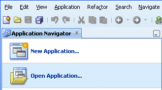
In the Applications Navigator, click Open Application .
-
In the Open Application(s) dialog, locate the folder where you unzipped the application and select Tutorial.jws.
Click Open. If prompted with a migration warning message, continue and finish the migration operation.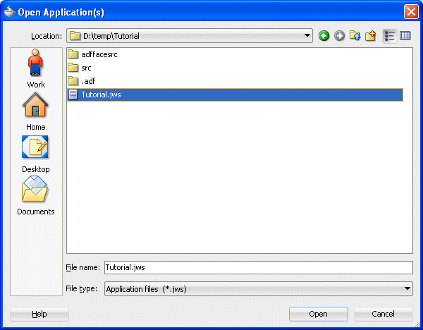
-
The application is loaded up in the Application Navigator, showing the adffacesrc project.

-
In the Application Navigator, right-click the adffacesrc project and select New from context menu.

-
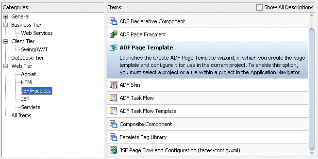
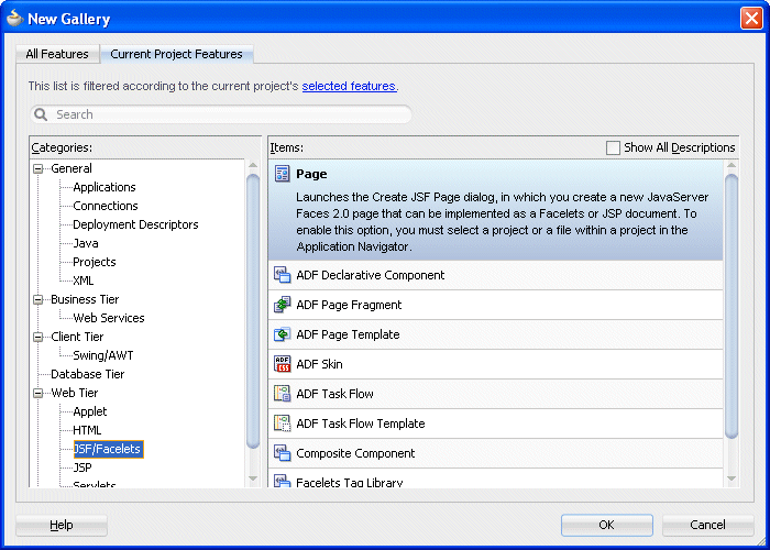
In the New Gallery, in the Categories pane, select Web Tier | JSF/Facelets, then select the ADF Page Template item.
Then click OK.
-
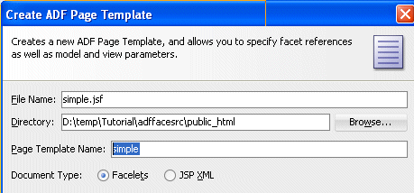
In the Create ADF Page Template, type simple for the Page Template Name.
-
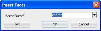
In the Facet Definitions tab, click the Add
 button and type center as the Name.
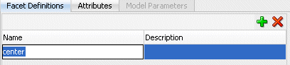
-
Click the Attributes tab, click the Add
button , then type title as the Name and Default Title as the Default Value.
Then click OK.
-
The simple.jspx template page opens up in the design editor.

-
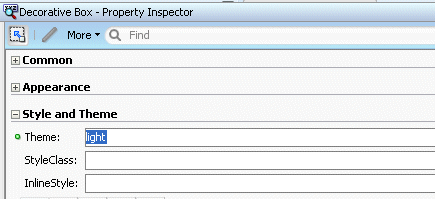
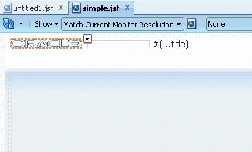
From the Component Palette, expand the ADF Faces - Layout nodes and drag a Decorative Box onto the empty page.

Using the Property Inspector, in the Style and Theme tab, set the Theme property to light from the list .
-
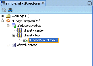
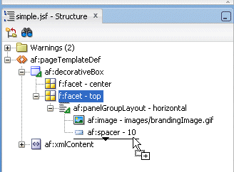
In the Structure Pane, drag and drop a Panel Group Layout into the top facet.
-
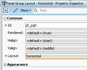
With the panelGroupLayout selected, set the Layout property, in the Property Inspector, to horizontal.
-
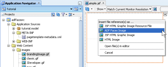
In the Application Navigator, expand the Web Content | images nodes and drag and drop the brandingImage.gif node onto the Panel Group Layout. In the context menu select ADF Faces Image .
-
From the ADF Faces - Layout, drop a Spacer next to the image.
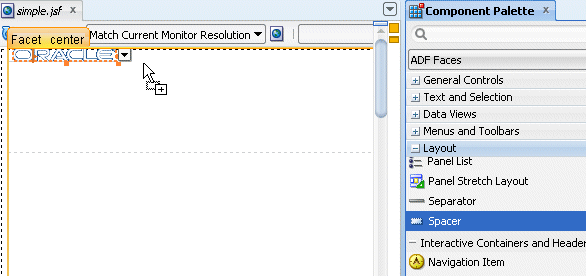
Then set the Width property to 100.
-
From the ADF Faces | Common Components, drop an Output Text under the spacer component.
In the Value field, select Expression Builder from the drop-down list .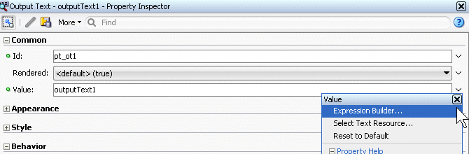
-
In the Expression Builder, clear out the existing expression and set the value to #{attrs.title}.
Then click OK.

-
In the Component Palette, under the ADF Faces drop-down, expand the Layout node and scroll down to the Core Structure section. Drag and drop a Facet onto the center facet.
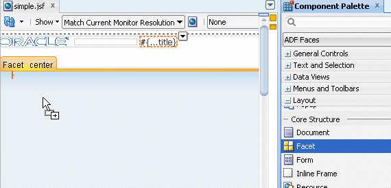
In the Insert Facet Ref dialog, select center as the facet name, then click OK.
-
Click the Save All
 icon in the JDeveloper menu bar, or select File - Save All from the menu to save the page.
Now that the template has been created you can create a new page, and use the template as the default structure for the page. To do this, perform the following steps:
Read more... If you modify the layout section of a page template later, all pages or page fragments that use the template are automatically updated with the layout changes.
Typically, you create JSF pages in the same project where page template definitions are created and stored. If the page templates are not in the same project as where you are going to create template-based pages, first deploy the page templates project to an ADF Library JAR. and the page that consumes a template, you can add content before and after the pageTemplate tag. In general, you would use only one pageTemplate tag in a page, but there are no restrictions for using more than one.
JDeveloper simplifies the creation of JSF pages based on page templates by providing a template selection option in the Create JSF Page or Create JSF Page Fragment wizard
-
Right-click the adffaces project and select New from the context menu.

-
In the New Gallery, expand the Web Tier node and select JSF/Facelets. Then select the Page item and click OK.
-
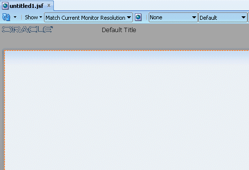
In the Create JSF Page dialog, leave the file name to the untitled1.jspx default value and ensure the Document Type is set to Facelets. Then select simple from the drop-down list for the Page Layout section.
Then click OK.
-
The untitled1.jspx appears as a new node in the Application Navigator and it opens up in the Design editor using the simple.jspx template.
-
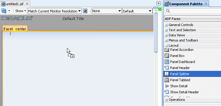
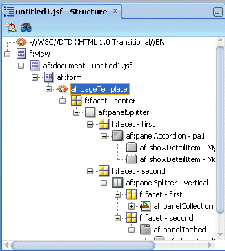
From the component palette, using the ADF Faces | Layout library, drag and drop a Panel Splitter component onto the center facet.
In addition to the Panel Splitter, ADF Faces provides a number of other layout components that can be used to arrange other components on a page.Read more...
Usually, you begin building your page with these components. You then add components that provide other functionality (for example rendering data or rendering buttons) either inside facets or as child components to these layout components. In addition to layout components that simply act as containers, ADF Faces also provides interactive layout components that can display or hide their content, or that provide sections, lists, or empty space. Some layout components also provide geometry management functionality, such as stretching their contents to fit the browser windows as the window is resized, or the capability to be stretched when placed inside a component that stretches. Some layout type and components are listed below.
Page Layout Containers
- panelStretchLayout: Contains top, bottom, start, center, and end facets where you can place other components.
- panelSplitter: Divides a region into two parts (first facet and second facet) with a repositionable divider between the two. You can place other components within the facets.
- panelDashboard: Provides a columnar display of child components (usually panelBox components).
- panelBorderLayout: Can have child components, which are placed in its center, and also contains 12 facets along the border where additional components can be placed. These will surround the center.
- panelFormLayout: Positions input form controls, such as inputText components so that their labels and fields line up vertically. It supports multiple columns, and contains a footer facet.
Components with Show/Hide Capabilities
- showDetailHeader: Can hide or display contents below the header. Often used as a child to the panelHeader component.
- showDetailItem: Used to hold the content for the different panes of the panelAccordion or different tabs of the panelTabbed component.
- panelBox: Titled box that can contain child components. Has a toolbar facet.
- panelAccordion: Used in conjunction with showDetailItem components to display as a panel that can be expanded or collapsed.
- panelTabbed: Used in conjunction with showDetailItem components to display as a set of tabbed panels.
-
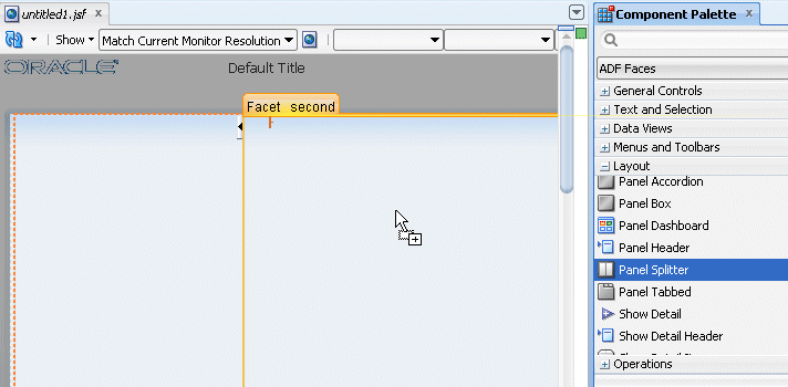
Drag and drop another Panel Splitter component onto the 'second' facet of the panel splitter.
-
In the Structure pane, expand the first panelSplitter component and select the second one. Using the property inspector, set the Orientation to vertical.

-
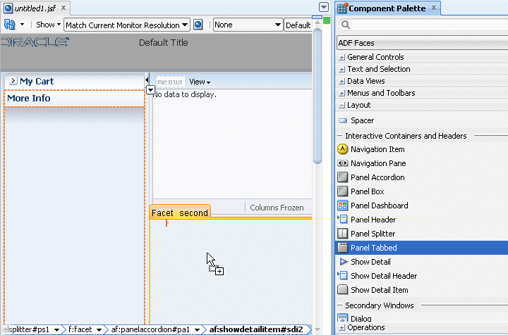
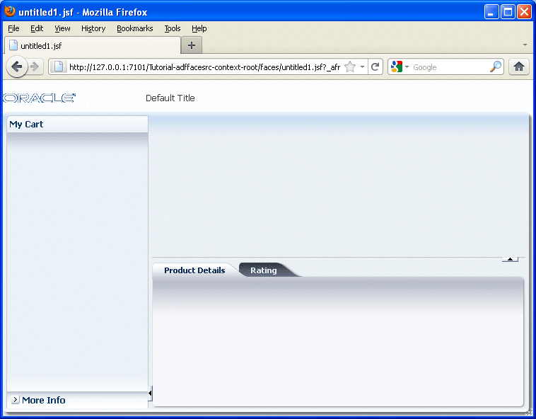
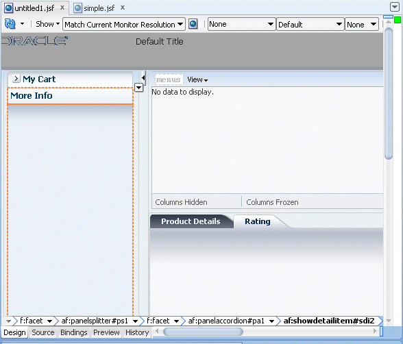
Drag and drop a Panel Accordion component onto the 'first' facet on the left hand side of the panel splitter.
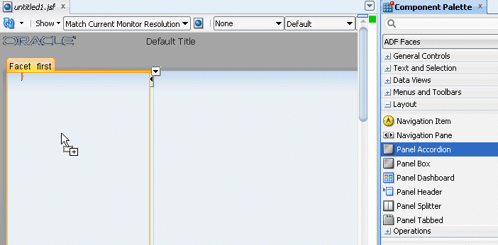
In the Property Inspector, set the Text to My Cart.

-
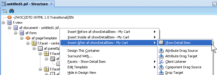
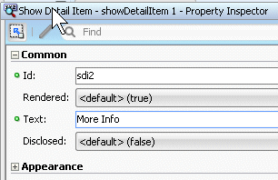
Click within the accordion you just created, then right-click on the showDetailItem and from the context menu select Insert after Show Detail Item - Show Item Detail.
For the show detail item that you just added, using the Common tab of the Property Inspector, change the Text field to More Info.
-
Drag and drop a Panel Collection component onto the right hand side 'first' facet.

-
Drag and drop a Panel Tabbed component onto the right hand side 'second' facet. The component can be found in the Interactive Containers and Headers grouping.
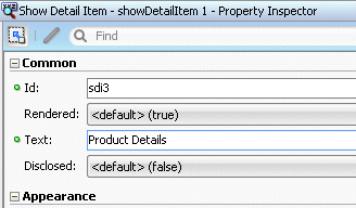
In the Structure pane, select the af:showDetailItem component you just created and In the Property Inspector, enter Product Details in the Text field.
-
Right click the Product Details tab and select Insert After Show Detail Item - Show Detail Item from context.
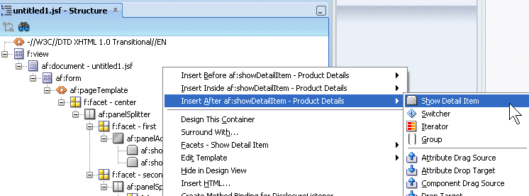
In the Structure pane, select the af:showDetailItem component you just created and in the Property Inspector, enter Rating in the Text field.

The page should look like the following image.

-
Save all your work. Then right-click in the page and from the context menu, select Run.

-
The page will load in your browser. Experiment with selecting the tabs and expanding the More Info panel. Once you're finished, keep the browser open and return to JDeveloper
-
In the next steps, you customize the page title and see how it is consumed in the existing page. To start the process, open the simple.jsf template page you created earlier.
-
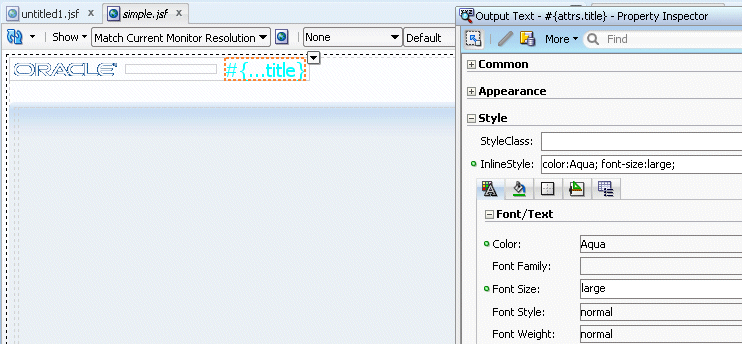
In the page designer, select the title component.
In the Property Inspector, expand the Style node, and using the Font/Text node, in the Color field click the Color drop-down list and select the color of your choice (Aqua in our example).

In the Font Size property, and select large from the drop-down list.
-
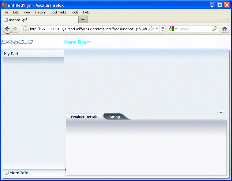
Save all your work. Then go back to the browser and reload the page to see the new characteristics.
Note that after saving your JDeveloper application, refreshing your browser window reflects the new changes made to your application as long as you haven't updated any binding component. In that case you will need to reRun the page from JDeveloper in order to have the changes reflected in your browser.
-
Open the untitled page in the design editor.
-
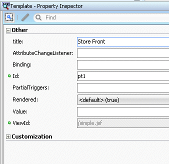
In the Structure pane, select the pageTemplate tag and in the Property Inspector, set the Title property to Store Front.
-
Save all your work. Then go back to the browser and reload the page to see the new characteristics.
- Create a Page Template
- Design a Page using the Page Template
 Expand all |
Hide all
Expand all |
Hide all