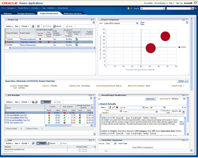

The Project Comparison graphs enable you to view financial performance across multiple projects. The graph contents are based on your projects in your project list. You can view a high-level summary of where your projects need most attention.
The size of the bubble on the graph is proportional to the ITD budget cost and the color reflects the overall health of the project. Since the project is critical, the bubble is red.