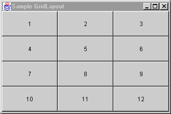
GridLayout places components in a grid of cells that are in
rows and columns. GridLayout expands each component to fill
the available space within its cell. Each cell is exactly the same size
and the grid is uniform. When you resize a GridLayout
container, GridLayout changes the cell size so the cells
are as large as possible, given the space available to the container.
Use GridLayout if you are designing a container where you
want the components to be of equal size, for example, a number pad or a
toolbar.
You can specify the number of columns and rows in the grid, but only one
of the rows or columns can be zero. You must have a value in at least
one so the GridLayout manager can calculate the other.
For example, if you specify four columns and zero rows for a grid that
has 15 components, GridLayout creates four columns of four
rows, with the last row containing three components. Or, if you specify
three rows and zero columns, GridLayout creates three rows
with five full columns.
In addition to number of rows and columns, you can specify the number of
pixels between the cells by modifying the horizontal gap (hgap
) and vertical gap (vgap) properties. The default horizontal and
vertical gap is zero.
To change the property values for a GridLayout container,
select the GridLayout object in the Structure window, then
edit the values for the rows, cols
, hgap, or vgap properties
in the Property Inspector.
Copyright © 1997, 2004, Oracle. All rights reserved.