Note: A column component is used as an index child of the table component.
The columnHeader element is a named child of the column and columnGroup components. Use columnHeader to specify the text for a column header. The preferred child to insert into columnHeader is styledText. The text attribute of styledText defines the column header text. You can specify an inlineStyle for the styledText element.
...
<provider>
<!-- all the data used by our table demo -->
<data name="demoTableData">
<inline>
<!-- DataObjectList to provide information to the data rows -->
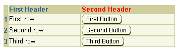
<demoRowData firstColumnText="First row"
secondColumnText="First Button"/>
<demoRowData firstColumnText="Second row"
secondColumnText="Second Button"/>
<demoRowData firstColumnText="Third row"
secondColumnText="Third Button"/>
<!-- DataObjectList to provide information to the row header stamps -->
<demoRowHeaderData headerText="1"/>
<demoRowHeaderData headerText="2"/>
<demoRowHeaderData headerText="3"/>
</inline>
</data>
</provider>
...
...
<table tableData="${uix.data.demoTableData.demoRowData}"
rowHeaderData="${uix.data.demoTableData.demoRowHeaderData}"
width="48%">
<contents>
<column>
<columnHeader>
<styledText text="Header 1"/>
</columnHeader>
<contents>
<!-- first column stamp -->
<text text="${uix.current.firstColumnText}"/>
</contents>
</column>
<column>
<columnHeader>
<styledText text="Second Header">
<inlineStyle>
<property name="color">red</property>
</inlineStyle>
</styledText>
</columnHeader>
<contents>
<!-- second column stamp -->
<button text="${uix.current.secondColumnText}"/>
</contents>
</column>
</contents>
<rowHeaderStamp>
<text text="${uix.current.headerText}"/>
</rowHeaderStamp>
</table>
... To use data binding in the column headers, set the columnHeaderData attribute on the table component to the data source, and then data bind the child of columnHeader to the key for the column header data.
...
<provider>
  <!-- all the data used by our table demo -->
  <data name="demoTableData">
    <inline>
      <!-- DataObjectList to provide information to the data rows -->
	  <demoRowData firstColumnText="First row"
		           secondColumnText="First Button"/>
	  <demoRowData firstColumnText="Second row"
	               secondColumnText="Second Button"/>
	  <demoRowData firstColumnText="Third row"
	               secondColumnText="Third Button"/>
      <!-- DataObjectList to provide information to the row header stamps -->
	  <demoRowHeaderData headerText="1"/>
	  <demoRowHeaderData headerText="2"/>
	  <demoRowHeaderData headerText="3"/>
      <!-- DataObjectList to provide information for the column headers -->
	  <demoColHeaderData textKey="H1"/>
	  <demoColHeaderData textKey="H2"/>
    </inline>
  </data>
</provider>
...
...
<table tableData="${uix.data.demoTableData.demoRowData}"
       rowHeaderData="${uix.data.demoTableData.demoRowHeaderData}"
       columnHeaderData="${uix.data.demoTableData.demoColHeaderData}"
       width="48%">
  <contents>
    <column>
      <columnHeader>
        <text text="${uix.current.textKey}"/>
      </columnHeader>
      <contents>
        <!-- first column stamp -->
        <text text="${uix.current.firstColumnText}"/>
      </contents>
    </column>
    <column>
      <columnHeader>
        <text text="${uix.current.textKey}"/>
      </columnHeader>
      <contents>
        <!-- second column stamp -->
        <button text="${uix.current.secondColumnText}"/>
      </contents>
    </column>
  </contents>
  <rowHeaderStamp>
      <text text="${uix.current.headerText}"/>
  </rowHeaderStamp>
</table>
...
For sortable column headers, insert the sortableHeader element into columnHeader. See About SortableHeader for details.
Inserting a ColumnHeader
Working with Table Components
Copyright © 1997, 2004, Oracle. All rights reserved.