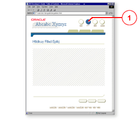
The globalButton component is used to insert a global button. Global buttons on a page are created by using a series of globalButton components as indexed children of the globalButtonBar component.

Unlike tabBar, globalHeader, and sideBar components (which allow users to maneuver from one specific part of an application to another), global buttons (which are available from every part of an application) allow users to navigate to information that is common or "global" to the application.
You should provide at least a Help global button for each application. Other global buttons that you could include are: Return to Home Page, Login or Logout, Contact Us, and Preferences.
A globalButton component displays a link label as well as an icon. By default, the text attribute value of a globalButton is repeated as a text link at the bottom of a page. Thus each page has the same easy navigation links at the top and in the footer section.
Creating a GlobalButton
Creating an ApplicationSwitcher
Working with Navigation Components
Copyright © 1997, 2004, Oracle. All rights reserved.