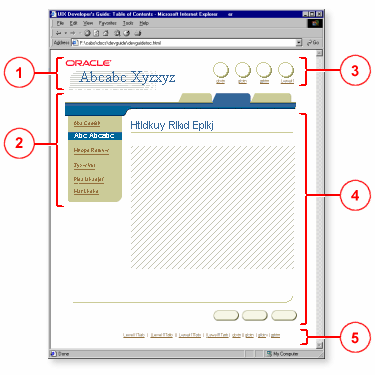
The pageLayout component and its named children organize content on an ADF UIX page. The main areas in a page are: (1) branding, (2) navigation, (3) global buttons, (4) page content, and (5) footer, as shown in the following illustration.

Note: The footer is automatically created by pageLayout. Additional information can be inserted in the footer using about, copyright, and privacy.
The attributes you can set for pageLayout are:
title - Displays a title for the UIX page.
chromeType - Specifies where productBranding will be
shown in relation to corporateBranding. Supported values are: compact
or expanded. If set to compact (default), productBranding will be
shown alongside corporateBranding. If set to expanded, productBranding
will be shown below corporateBranding. You cannot have
inContextBranding in the expanded mode. If you include
inContextBranding, then productBranding automatically renders next to
the corporateBranding.
inlineStyle - Specifies the inline CSS style to use.
messageType - Specifies if a page is a messaging dialog.
Optional values are: error, info, warning, confirmation, processing,
and none (default). The appropriate icon and header will display at
the top of the page.
quickLinksShown - Specifies if text links to each header
in a page (except the top header) should be displayed. These text
links are called quick links, which display horizontally above the
page title. Default is false.
The named children of pageLayout that support the building of a page layout and its contents are:
about - Creates
an area below the copyright region in the page footer.
Use to add a link to more information about the application.
cobranding -
Creates a cobranding region in the page header. Use to add a small
image of the associated company's logo.
contextSwitcher
- Context switcher of a page. Not supported on the following agent types:
pda, phone, voice. A context switcher lets the user change the
contents of the page based on the context. For example, when a user is
viewing assets for the accounting department, the user can use the
context switcher to switch from viewing the accounting department
assets to the marketing department assets. All the pages will then
change to the marketing context.
copyright -
Creates an area at one end of the page footer for a link to the
company's copyright statement. See also privacy.
corporateBranding
- Creates a corporate branding region in the page header. Use to add a medium
size image of the logo of the company that owns the page.end - Create the
end column region, which usually contains the contentContainer
component that is used to place ancillary information on a page with a
different background color.
footnote -
Creates an area at the bottom of the page (above the footer) for
page-level status information that is ancillary to the user's task.
See also pageStatus.globalButtons
- Creates an area for the global button bar, which organizes a set of global
buttons and an optional application switcher.
inContextBranding
- Creates an area below corporateBranding. When inContextBranding is on the
page with productBranding in expanded mode, then the productBranding
area moves up to the side of the corporateBranding area. See attribute
chromeType. See also the
productBranding component.
largeAdvertisement
- One of five branding and advertising regions. Creates a large advertisement
region in the page header. Use to add a large advertisement image with
a link to more information. See also mediumAdvertisement, cobranding,
corporateBranding, and productBranding.
location -
Creates an area above the page title for a train or breadCrumbs
component.
mediumAdvertisement
- One of five branding and advertising regions. Creates a medium
advertisement region in the page header. Use to add a medium
advertisement image with a link to more information. See also
largeAdvertisement, cobranding, corporateBranding, and productBranding.
messages -
Creates an area below the page title for messages. Use to add the
messageBox component to display a shaded boxed area for error,
warning, confirmation, or informational messages.
pageButtons
- Creates a page navigation region below the page title (and repeated above
the page footer), where a pageButtonBar (for page action buttons) or
navigationBar (for step-by-step or record navigator) is used, or both.
pageHeader
- Creates a region below the page tabs, where a globalHeader is
placed.
pageStatus -
Creates a page-level status region immediately below the page title,
where page-level instruction text that is important to the user's task
is placed. This region can also contain a key notation, which is a
legend used to define icons, elements, or terms used within the page
content, including the blue asterisk to indicate required fields.
privacy - Creates
an area at one end of the page footer for a link to the company's
privacy statement. See also copyright.
productBranding
- Creates a product branding region in the page header. In expanded mode,
usually use to add an image of the company's product logo below
corporateBranding. In compact mode, usually use to add formatted text.
See the productBranding
component.
quickSearch -
Creates a quick search region above the page title. Use to add a
search text input field and submit button.
returnNavigation
- Creates a "Return to [X]" link at the bottom of the page.
start -
Creates a start column region, which usually contains the sideBar
component.tabs -
Creates a region for tabs. Contains the tabBar component.
userInfo -
Creates a user information region above the page title, where user
login and connection information are placed.
Note: contentFooter is deprecated. Use
pageButtons and returnNavigation instead.
About ContentContainer
About MessageBox
About TabBar,
GlobalHeader, SideBar, and SubTabBar
About GlobalButton
About
Page Button Bars
About Navigation Bars
About Breadcrumbs
About Trains
Working with PageLayout and its Named Children
Copyright © 1997, 2004, Oracle. All rights reserved.