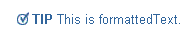
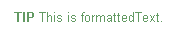
Use the tip component to provide page or section level hints to the user. Depending on the look and feel, the tip component renders a 'TIP' icon with or without a 'checkmark' icon.
The preferred indexed children components to insert into tip are: formattedText, link, and text. Typically, the only indexed child is formattedText, but as many children as necessary can be added.
On mobile devices the tip component renders nothing itself, but does renders its indexed children.
Inserting a Tip
Working with Simple and Miscellaneous Components
Copyright © 1997, 2004, Oracle. All rights reserved.