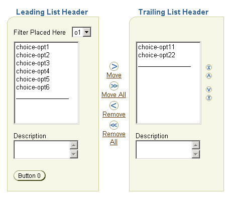
The shuttle component provides a mechanism for moving items between two lists and reordering one of these lists. This component is not supported on the following agent types: pda, phone, voice.

The most common usage of a shuttle is to allow the user to choose items by:
The leading list is also referred to as the "from" list, and the trailing list as the "to" list. You can also move items in the trailing list back to the leading list.
When choosing items you can select one more items in either list. Then by choosing the appropriate icon or link between the lists (Move or Remove), you "shuttle" the items from one list to the other. Use the Move icon or link to move selected items from the leading list to the trailing list. Use the Remove icon or link to move selected items in the trailing list back to the leading list. To move all or remove all items at once, use the Move All or Remove All icon.
By default the shuttle allows the reordering of items within the trailing list. By using the reorder icons on the side of the trailing list, you can move the selected items up to the top of the list, up one slot in the list, down to the bottom of the list, or down one slot in the list.
Upon form submission, the contents of each list (i.e., all the items, not just the selected items), which are stored as values of hidden elements in the shuttle, are passed to the application through:
where
The attributes you can set for the shuttle component are:
leadingHeader - Specifies a header text above the leading
container.
leadingDescShown - Specifies an area in the container
immediately below the leading list for displaying item descriptions.
trailingHeader - Specifies a header text above the
trailing container.
trailingDescShown - Specifies an area in the container
immediately below the trailing list for displaying item descriptions.
reorderable - Specifies whether the items within the
trailing list can be reordered. If set to false, the reorder icons
next to the trailing list will not display.
size - Specifies the height of both list boxes in terms
of number of items. If a list contains more items than the size
specified, then scroll bars are enabled in that list. The minimum
value is 10 and the maximum value is 20. If the size attribute is not
set, then the height is determined by the lengths of both lists, and
the minimum and maximum values. For example, if one list has more than
20 items and the other list has less than 10 items, then the maximun
height is 20 and scroll bars are enabled in the longer list. Another
example: If the leading list has 18 items and the trailing list has 12
items, and the shuttle size is set to 15, then the height should be
equal to 15.
Note: On the UI of the shuttle, there is a horizontal line below the items of each list. ADF UIX provides this additional item to maintain correct sizing of the lists; the line cannot be acted upon like the other items in the lists.
The named children supported by shuttle are:
leading - (Required) Creates the leading container, which
contains the "from" list. The leading list of items are created by
using a list component with the list contents (items) defined by a
series of option components as indexed children of list.
filter - Creates a filter area above the leading list.
The filter area is usually used to insert a choice control, whose
options are used to perform operations on the shuttle using a
ShuttleProxy.
leadingFooter - Creates an area below the leading list
(below the description area, if any) that can be used to place buttons
or images (icons). See note below.
trailing - Creates the trailing container, which contains
the "to" list. The trailing list of items are created by using a list
component with the list contents (items) defined by a series of option
components as indexed children of list.
trailingFooter - Creates an area below the trailing list
(below the description area, if any) that can be used to place buttons
or images (icons). See note below.
Note: Use a flowLayout to contain the buttons or icons in the footer areas. The buttons or icons, which can have a maximum height of 26 pixels, are placed in only one row in either footer area. The buttons or icons can be used to perform operations on the shuttle using a ShuttleProxy.
UIX provides a set of JavaScript utility methods, which are automatically loaded when you use the shuttle. You can use these methods on the filter options or the footer buttons or icons to manipulate the contents of the lists. See the shuttle element in the UIX Element Reference for details on how to create a ShuttleProxy instance and use its functions.
Inserting a Shuttle
Working with Form Components
Copyright © 1997, 2004, Oracle. All rights reserved.