Date: Mon, 13 Apr 2009 05:21:16 +0530 (IST)
I forgot to write the browser I used for the below mentioned message: Its Mozilla Firefox.
But same is the case with IE7.
Thanks,
Ayan
--- On Sun, 12/4/09, Ayan Shah <ayanshah999_at_yahoo.co.in> wrote:
From: Ayan Shah <ayanshah999_at_yahoo.co.in>
Subject: Bug in GUI of glassfish
To: "Quality" <quality_at_glassfish.dev.java.net>
Date: Sunday, 12 April, 2009, 4:46 PM
Hi Judy,
I am doing Glassfish testing in CMPE-287 class at SJSU. I am working on build 44. While testing the Admin GUI, I found that there is a bug with the CSS of GUI of glassfish.
Steps:Go to
1) Admin GUI -> Resources -> JDBC -> JDBC Resources.
2) Click on any available JDBC resource.
3) In the EDIT JDBC resource page, click on Save button.
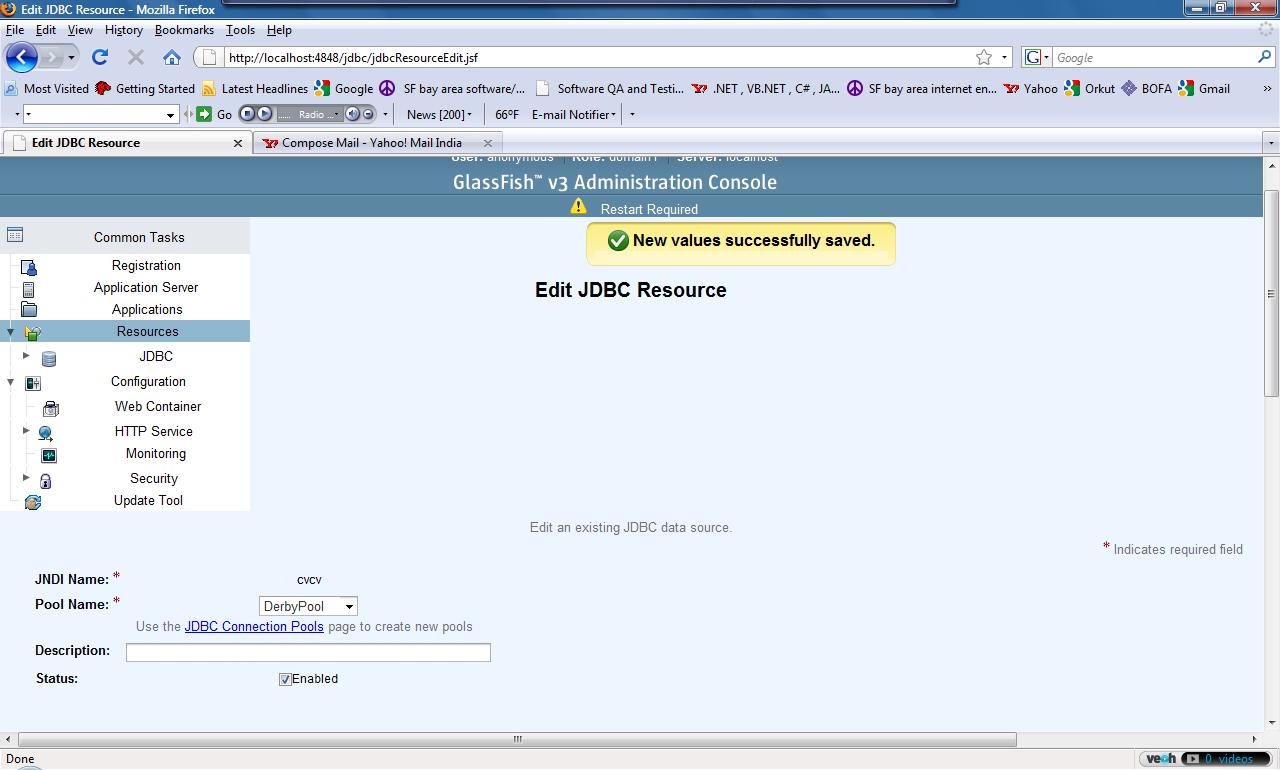
When you do this, all the controls on the page are displaced from their position. The "Glassfish V3 Administration console" heading comes at the center of page. The save button goes to the extreme right of the page and all other fields go below the left hand side tree menu. There comes a big blank space between "New values saved successfully" message and other controls on the page. I have attached a screenshot for this. Same is the case for many of the other "Save" buttons in the Admin GUI module. So I think this is a bug with the GUI of glassfish.
Regards,
Ayan

(image/jpeg attachment: Untitled.jpg)