Tables
Last Updated 09-Mar-2004
Tables are the principal method for displaying and interacting with data in BLAF applications. Tables are used not only to display tabular view-only data, but can also provide a wide range of highly interactive functions to modify and manipulate data. The visual and interaction principles of a table are covered in this Guideline as follows:
- Table Flows - Shows common flows for table actions (such as Create, Delete, Duplicate), and for manipulation of table display (such as sorting and reordering columns).
- Table Action/Navigation Methods - Provides heuristics and details for valid action/navigation methods within a table.
- Personalization of Views (Tables and HGrids) - Provides methods for individual users to create and modify views of tables/HGrids, including:
- Reorder Column Display
- Add or Delete Different Columns to Display
- Multiple Column Sort and Sort Order
- Rename Columns
- Configure Total Column Shown
- Configure Number of Rows Shown
- Create and Save Custom Query to Filter Data
- HGrid (Hierarchy Grid or Tree Table)
- Cross Tab Table - to come...
- Related Templates and Flows to Table
Note: To improve performance using Netscape 4.x, some tables will render slightly differently than with Netscape 7.x, IE 4.x and above, and other browsers, which did not experience the same performance issues.
Guideline Attributes
Spec Version # - 3.1
Spec Contributors - Betsy Beier, Mervyn Dennehy, Lisa Serface, Lisa Rinderknecht, Ivy Leung, Craig Louis
UI Models - all models
Example Products - all products
Related Component Guidelines -
Button (Action/Navigation),
Help Methods,
Hide/Show,
Locator Element: Record and Page Navigation,
Inline Messaging and Tips,
Save Model
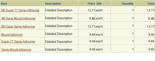
Tables can be used to display and modify a wide range of view-only and updateable data. General table principles are provided in the following sections.
Section Contents
Tables are broadly grouped into two types, each with different characteristics:
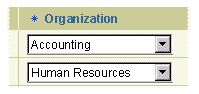
- View/display-only tables: Containing view-only data, such as search results.
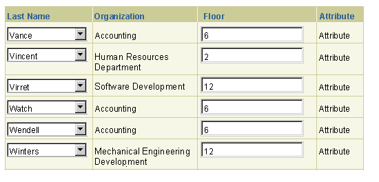
- Updateable tables: Containing standard web widgets where users can modify data.
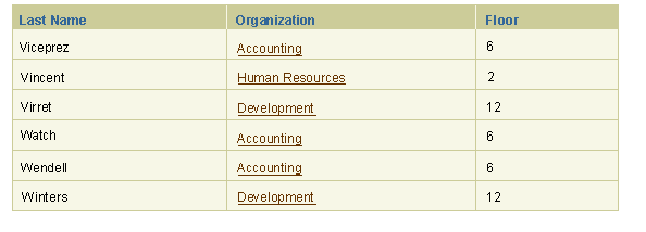
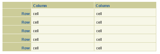
A view/display only table contains data that cannot be modified (edited/updated, deleted, etc.) directly within the table. A view only table may allow users to alter the view of the table contents (i.e., by sort or filter capabilities), drill down to details, or perform actions on drill down pages, but the table data remains view only. View only tables have no standard web widgets within cells (i.e., no text fields, choice lists, etc.) A view only table may provide the ability to alter the view of the table contents (i.e., by sorting or filter capabilities), as well as other interactive functionality, such as adding a row, or links on data in cells.
Example of Display-Only table
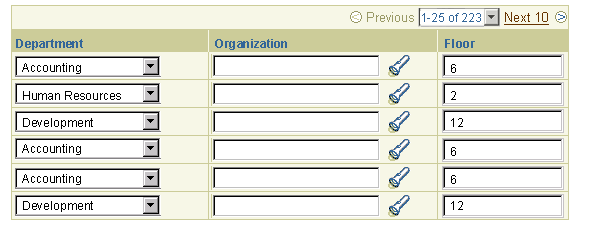
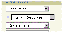
An updateable table is a table with any type of standard web widget in a cell (some cells or all cells). Updateable tables provide multiple types of interactive possibilities including: editing/updating, adding (inserting), deleting, creating new data, and totaling. An updateable table may also include the ability to alter the view of the table contents (i.e., by sorting or filter capabilities), while the table data remains updateable.
Example of Updateable table
Individual table cells may contain any of the following types of data:
- Display-only or updateable data
- Text or numeric data
- Links and icons that provide access to more data (i.e., drill down to view-only or updateable details pages)
- Customer-defined flexfield data (key or descriptive)
- Horizontal scrolling of tables should be avoided wherever possible. Usability studies prove that users have difficulty completing tasks when the information scrolls horizontally off the page. If, however, there are cases which require many table columns, or if table columns exceed the width of the browser window, then horizontal scrolling may become necessary to reveal the table data beyond the window. In such cases, the table column data will extend beyond the browser window, while the table's control bar and record navigation will remain in the window's view. For additional details about horizontal scrolling for tables, see the Content Layout Templates Guideline.
- The most important column information within the table (importance of data to a user can be determined by usability studies) should be on the left side of the table, or on the right if translated to BiDi languages.
- Banding and gridding options should be used to improve the information design of tables.
- Updateable tables can contain web widgets (e.g., text field, choice list), icons, and links, as well as view-only data.
- Display-only tables can contain icons, and links in table cells.
- All tables should have a table title that qualifies the information displayed in the table. The table title is a Header/Subheader/Subsubheader component; the level of header depends on where the table is within the content of the page. If a control bar surrounds a table, the table title may be associated with the control bar unit.
(Note: Requiring a table title satisfies the accessibility requirement specified in the W3C guidelines.)
- Many elements of the table should use Partial Page Rendering (PPR) technology. PPR enables the full table or table data to be redrawn when a function is performed, without redrawing the entire page. Elements in the table that use PPR are: record navigation; Hide/Show row details and cell details; action only global table, control bar buttons or cell icons; column sort functionality; refresh area actions that repaint only the table (such as add a row). If PPR is not available (unsupported browser, or other reason), the behavior should default back to a full page redraw. See the specific sections within this document about the identified elements for more details.
Grids and bands are visual elements that emphasize different aspects of the information in a table. A grid is made from thin horizontal and vertical rules between rows and/or columns in a table. Bands are formed when the background colors of rows or columns alternate between white and Sand.
Grids are often sufficient for simple tables. Bands provide stronger emphasis for complex tables, including wide tables. Grids are also often used to provide another level of structure to a banded table.
Section Contents
Below are examples and recommendations for when to use different combinations of grids and bands. These distinctions are somewhat subjective, based on these characteristics:
- Should the table emphasize the horizontal relationships in the information, the vertical relationships, or both?
- What is the relative density of the information? For example, tables containing single names and numbers have light information density; while tables with extensive text, complex graphics, or complex controls have medium-to-heavy density.
- What are the levels of interactivity available to the user? For example, tables containing minimal, simple controls-such as a check box in each row-provide light interactivity; while tables with multiple complex controls in every row provide heavy interactivity.
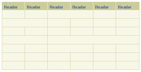
Example of Grids and Banding in a Table
- Suggested Usage - To emphasize horizontal relationships, that is, the information in the rows
- Information Density - Medium
- Interactivity - Medium-to-heavy
Horizontal Grid Only
- Suggested Usage - To emphasize equally the information relationship between horizontal (rows) and vertical (columns)
- Information Density - Medium-to-dense (With grids, the table can be designed to clip data within a cell if necessary, and grid lines would show clipping)
- Interactivity - Light-to-medium
Vertical/Horizontal Grid
- Suggested Usage - Headers emphasize both rows and columns: Vertical and horizontal information relationships are of equal importance.
- Information Density - Medium-to-dense
- Interactivity - Light-to-medium
Vertical Grid with Column and Row Headers
- Suggested Usage - To emphasize horizontal relationships in all rows and vertical relationships in some columns.
- Information Density - Medium
- Interactivity - Light-to-medium
Horizontal Grid with Partial Vertical Grid

- Suggested Usage - To emphasize horizontal relationships in wide tables.
- Information Density - Medium
- Interactivity - Medium-to-heavy
Horizontal Bands with Horizontal Grid

- Suggested Usage - To emphasize horizontal relationships in wide tables. The vertical grid is used here mainly for data clipping and not necessarily to emphasize vertical relationships.
- Information Density - Medium
- Interactivity - Minimal-to-medium
Horizontal Bands with Vertical and Horizontal Grid

- Suggested Usage - To heavily emphasize vertical relationships. The horizontal grid is used here mainly to separate rows visually and not necessarily to emphasize horizontal relationships.
- Information Density - Medium
- Interactivity - Minimal-to-medium
Vertical Bands with Horizontal Grid

- Suggested Usage - To heavily emphasize vertical relationships. The vertical grid is also used to emphasize the vertical relationships in the information. The horizontal grid is used here mainly to separate rows visually and not necessarily to emphasize horizontal relationships.
- Information Density - Medium
- Interactivity - Minimal-to-medium
Vertical Bands with Vertical/Horizontal Grid

- Suggested Usage - Since headers are used for both columns and rows, there is relatively equal emphasis on vertical and horizontal relationships, yet the vertical bands suggest columns are slightly more important. Also can be used effectively with a table having only a few columns but many rows.
- Information Density - Medium-to-heavy
- Interactivity - Medium
Vertical Bands, Vertical/Horizontal Grid, with Column/Row Headers

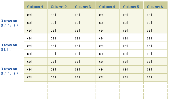
It may be appropriate to band columns or rows by groups of more than one; for instance 2 rows at a time, or 3 rows at a time. This will visually group associated rows. (Note: Only rows or columns may be banded, it is not possible to band both columns and rows.) The following subsections provide recommendations for group banding of rows and of columns.
- Rows may be banded by groups of 1, 2, 3, or 4. Groupings of more than 5 rows are not recommended. The visual effectiveness of the grouping may be lost since the table may be long (vertically).
- Banding patterns must be applied consistently and through all rows: Banding may not be applied selectively with custom odd patterns.
Examples of Group Banding of Rows

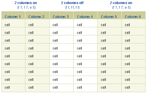
- Columns may be banded by groups of 1, 2, or 3. It is not recommended to exceed groupings of 4 columns. The visual effectiveness of the grouping may be lost since the table may be too wide (horizontally). It is also not recommended to allow tables with excessive numbers of columns
- Columns may be selectively banded, such that only Total columns, for example, are the banded columns.
Examples of Group Banding of Columns with a Pattern
Examples of Group Banding of Columns without a Pattern
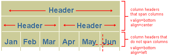
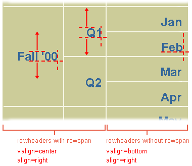
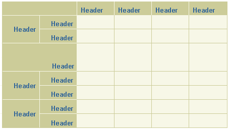
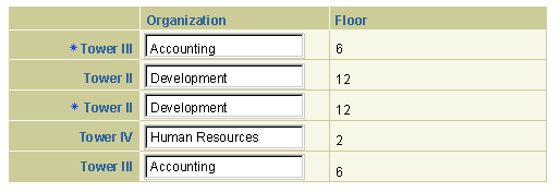
Column span and row span are used when a column or a row has "children" columns or rows. An example is a column labeled Spring. This column may be broken up to subcolumns, such as March, April and May. In this case, column spanning is used. A typical example of a column span or row span in a cell would be for a calendaring application in which a meeting spans several hours, or a television programming schedule, where a show lasts for several hours.
Colspan and rowspan are valid in:
- Column Headers
- Row Headers
- Cells
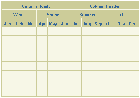
Example of Column Span
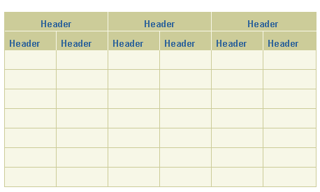
Example of Column Span - Details
Example of Column Span - 3 Columns Deep
Example of Column Span - Some Columns Span, Some No Span
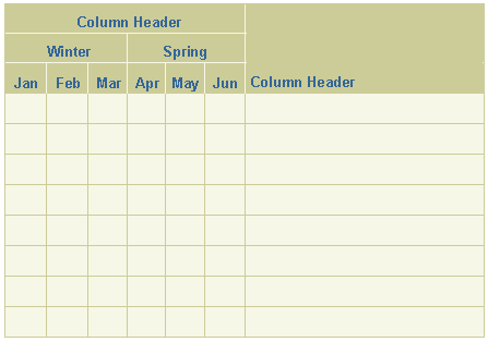
Example of Column Span - Select Column No Span, Some Columns Span
Example of Row Span - with Details
Example of Row Span - Some Rows Span, Some No Span
Example of Row Span - In Cells
Example of Column Span - In Cells
Section Contents
Numeric view only data and column headers default to align left within a column, but may be set to align right if numeric data is used for totaling or for comparisons across cells in the column. Using right-alignment maintains numeric data number place horizontal alignment across rows in the columns. Icons are centered in table cells (Note: alignment settings are bidi compliant based on the xss code implementation.)
Example of View Only Data in Cells
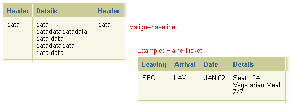
Below is an example of text wrapping in a table cell. The valign is set for "baseline." Note that valign="baseline" may yield unpredictable effects on cells containing a text field or choice list with a height ≥ 1 line. See the User Configurable Views of Table Data section for more information on and examples of wrapping.
Example of Text Wrapping in Table Cell
Below is an example of multiple data sources in one cell.
Example of Multiple Data Sources in One Cell
The Hide/Show component can be used when it is important to have the data in view with the entire table, but the user may or may not want to view the data at all times.
- The Hide/Show component may appear in a cell or as part of a row.
- It is not recommended to put updateable widgets within a table cell or row containing a Hide/Show component. A user may not ever see this information.
- For the same reason, never put required information within a Hide/Show cell or row.
- The Hide/Show component for a cell or a row should follow all the principles of the Hide/Show component. See Hide/Show Guideline.
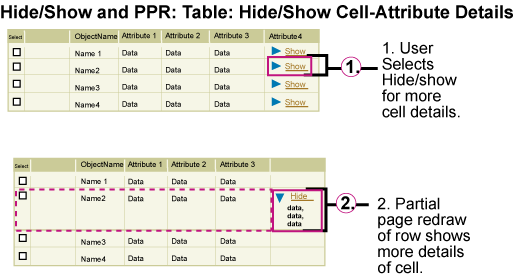
- When in a table cell, the Hide/Show component allows the user to expand and collapse a cell to show/hide additional information related to the entire row.
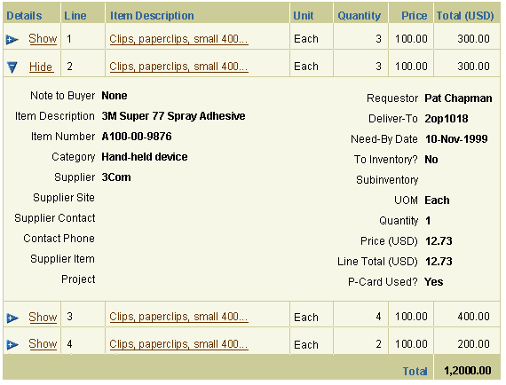
- Hide/Show in a cell is typically used for homogeneous information, such as long details. If the long details were all shown, the table would become very large vertically. The Hide/Show allows the user to view the verbose details at their own discretion.
- For Hide/Show in a cell, the Hide/Show icon and "Show [XXX]" or "Hide [XXX]" link text is the first line in the cell. When the Hide/Show icon is selected, the table cell expands to show detail information in that cell, or collapses hiding the details.
Example of Hide/Show in a Table Cell - All Cells Hidden
Example of Hide/Show in a Table Cell - One Cell Shown
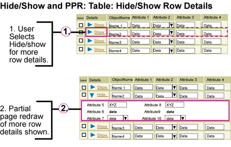
- When in a row, Hide/Show allows the user to expand and collapse a large amount of information related to the entire row.
- Hide/Show Row information should be used to show specific row (or object) details. It should not be used to show secondary objects or child objects. See HGrid for hierarchy information in a table.
- Details of a row that is shown may be homogeneous or not.
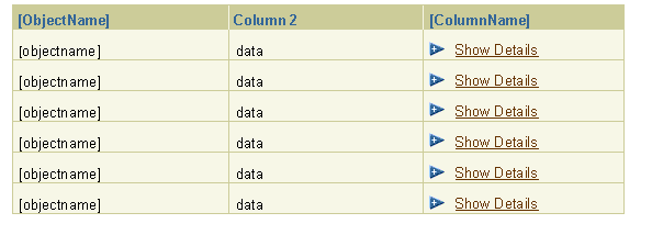
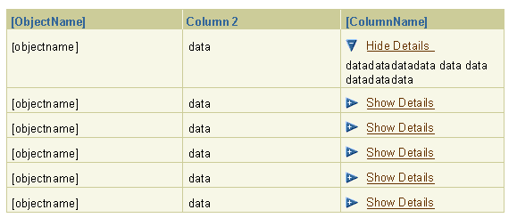
- For Hide/Show in a table row, the first column of the table is labeled "Details." Each cell in the column has an open/closed arrow icon followed by a link that reads "Show" or "Hide." A row that does not contain extra details that can be shown or hidden would have an empty cell with no arrow icon and text link.
- It is not recommended to nest tables within a Hide/Show row for performance reasons. If it is absolutely necessary to nest a table within a table:
- The nested (inner) table may only contain read-only elements.
- The nested table may not provide any of the following form actions: record navigation, Add a Row, or sorting.
- The nested table may not include Hide/Show details.
Example of Hide/Show in a Table Row - All Rows Hidden
Example of Hide/Show in a Table Row - One Row Shown
- Hide/Show of a cell and of row details should use PPR technology.
- When the Hide/Show element is selected, only the dependent contents of the Hide/Show will redraw (typically a row in a table) not the full page.
- If PPR is not available (unsupported browser, or other reason), the behavior will default back to a full page redraw.
Example of Hide/Show in a Table Cell with PPR
Example of Hide/Show in a Table Row with PPR
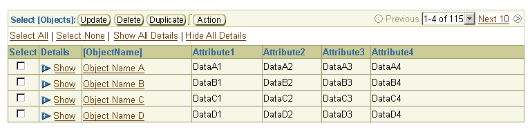
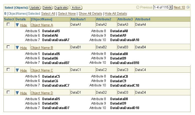
- "Hide All Details" or "Show All Details" link controls adjacent to the "Select All" and "Select None" controls allows a user to quickly hide or display all the row or cell details that use the Hide/Show control. Note: In an HGrid, this is akin to "Expand All" and "Collapse All". This functionality should NOT be automatically shown by default, but should be an option for development teams to expose only as necessary for their table, based on an evaluation of the context and tasks for that table.
- If a user selects "Show All Details" and navigates to the next record set, all the details should be shown.
- The text of the links is "Show All Details" and "Hide All Details".
- If Hide All/Show All functionality will cause performance problems, then it should not be used.
- Hide All/Show All functionality should not be displayed if a table shows many rows, and the details within the Hide/Show are very large. This may cause excessive scrolling and/or performance problems.
Example of Hide All Details/Show All Details Functionality: All Details Hidden
Example of Hide All Details/Show All Details Functionality: All Details Shown
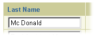
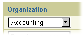
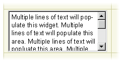
All the valid web widgets that can be placed in a table cell are shown below:
Field in a Cell
|
Choice List in a Cell
|
Radio Button in a Cell

|
Check Box in a Cell

|
Text Area in a Cell
|
List Box in a Cell
|
Section Contents
Below is a list of all the different types of icons that are used in tables. (These icons may be placed in cells, row headers, and column headers, depending on the type or specific icon.)
- Functional Icons
Examples:
- Functional Icons in Cell that Affect Row (i.e., Edit, Delete, Update)
- Functional Icons in Cell that Affect Cell Only (i.e., Date Picker access button, Search/LOV access button, Calculator access button)
- Functional Icons that Affect Column (i.e., Column Sort Icons - See Sorting of Column Data) (NOTE: This is the only functional icon in a column header.)
- Messaging Icons - See below under Inline Messaging Icons and Messaging Text in Tables.
- Status Icons - See below under Status Icons in Tables.
- For a list of all valid status icons see Icon Guideline
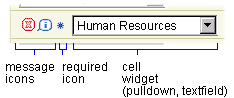
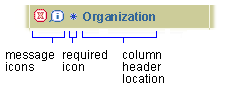
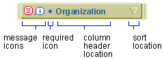
- A 'Required' icon is used in tables in:
- a table cell
- a column header
- and/or a row header
- A 'Required' icon signifies the cell, column or row must be filled in before the page is complete.
- If the field is not filled in or filled in incorrectly, an inline error message will be displayed. (See below, "Inline Messaging Icons and Messaging Text in Tables" for details.)
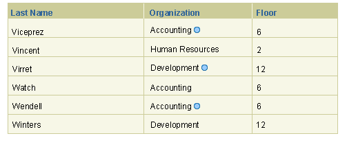
- A 'Changed Item' status icon signifies the data in a row has been changed. It is commonly seen on a review page. The 'Changed Item' icon is only used in a table cell with view only data, and is displayed after the data.
- Key or legend notation must be used on the page to signify the meaning of a status icon. See Key (Legend) Notation for details.
Below are examples of status icons in a table.
Required Icon in a Table Cell
|
Required Icon in a Column Header
|
Required Icon in a Row Header
|
Changed Item Icon in a Table Cell of View only Table
|
- Messaging icons are used in tables in:
- A table cell - Message is only applicable to a certain cell
- A column header - Message is applicable to entire column of cells
- And/or a row header - Message Is Applicable To Entire Row Of Cells
- Inline message icons that can be used in tables are:
- Error (status or active icon) - Error icon is used to indicate that updates need to occur for a cell, an entire column, or an entire row.
- Information (status or active icon) - Information icon is used to indicate more information is available describing the cell, column, or row. See Messaging Templates for more information regarding what type of page template to display when the information icon is selected.
- Warning (status or active icon) - Warning icon is used to indicate a situation that the user should be aware of regarding a cell, a column, or a row.
- An inline message icon may be a status icon or an active icon:
- An active icon can be selected to get more information regarding the message.
- A status icon only denotes status of the element. If a status icon is used, it is recommended to also have messaging text on the screen to help the user understand the purpose of the icon.
- See Icons Guideline for more information regarding icons.
- A message icon in a table may optionally have associated message text.
- The only valid combinations of message icons are error icon and information icon.
- Inline message for an entire table - An error, warning, or information message related to an entire table (but not specifically related to a table row, column or cell) is shown as an inline message icon with text directly above table.
Example of Message Icon (Information[Active]) in a Table Cell
![Example of Message Icon (Information[Active]) in a Table Cell](tables/iconsintables/mesicon_cell_infoactive.gif)
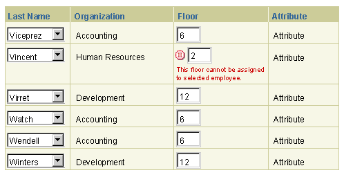
Example of Message Icon (Error[Status]) in a Table Cell
NOTE: If an Error[Status] icon is used, inline error text messaging must be present.
![Example of Message Icon (Error[Status]) in a Table Cell](tables/iconsintables/mesicon_cell_errorstatus.gif)
Example of Message Icon (Error[Active]) in a Table Cell
This example shows an error icon that is active, and can be selected for more information.
![Example of Message Icon (Error[Active]) in a Table Cell](tables/iconsintables/mesicon_cell_erroractive.gif)
Example of Message Icon (Information[Active]) in a Column Header
![Example of Message Icon (Information[Active]) in a Column Header](tables/iconsintables/mesicon_colhead_infoactive.gif)
Example of Message Icon (Error[Status]) in a Column Header
![Example of Message Icon (Error[Status]) in a Column Header](tables/iconsintables/mesicon_colhead_errorstatus.gif)
Example of Message Icon (Error[Active]) in a Row Header
![Example of Message Icon (Error[Active]) in a Row Header](tables/iconsintables/rowheaders_erroractive.gif)
Example of Multiple Message Icon and Required Icon (Error and Required) in a Table Cell

Example of Multiple Message Icon and Required Icon (Error, Information, and Required) in a Table Cell

Example of Multiple Message Icons(Error and Information) in a Table Cell

Detail Order of Multiple Message Icon and Required Icon in Table Cell
Detail Order of Multiple Message Icon and Required Icon in NonSortable Column Header
Detail Order of Multiple Message Icon and Required Icon in Sortable Column Header
Detail Order of Multiple Message Icon and Required Icon in Row Header

Example of Inline Messaging Text in Table Cell (Error Example Shown)
Example of an Error Message Box Referring to an Error for an Entire Table
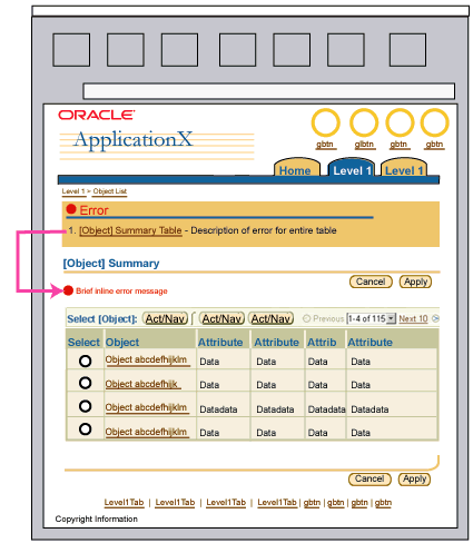
Note: If a user attempts to perform a selection dependent action without selecting a row in the selection column, an error message should be issued as a table level inline message in the table Title Area. See User Non-Selection Errors in the Selection Dependent Controls section.
Example of an Error Icon with Message Applied to an Entire Table and Control Bars

An icon may be placed in individual cell, and when selected, the icon affects the entire row in the table. The column header for should be labeled to reflect the action that happens when the icon is selected. Within a column, an icon in a table cell may be disabled if the action can not be performed on that particular row. Common icons used in table cells are:
- View Details - Column header is labeled "View Details." When the icon is selected, the user navigates to a new page displaying details regarding the selected row. The details that are displayed are more extensive than what is shown in the table.
- Update - Column header is labeled "Update." When the icon is selected, the user navigates to a new page displaying updateable fields of the selected row. There may be more editable fields on this page than what is shown in the table.
- Delete or Remove - Column header is labeled "Delete or Remove." When the icon is selected, depending on the application, a warning may be shown asking the user if it is ok to delete the row. (This is contextual to each application, but it is important to note that this action may delete a much larger set of data than what is shown just in the table row itself.) When the user affirms the warning, the page redraws with the row deleted from the table. If no warning is necessary, when the user selects the delete icon, the page redraws with the row deleted from the table.
- For information on all other icons used in table cells, see Icon Repository: Functional Icons.
- For more information on use of functional icons in tables, see the Table Action/Navigation Methods guideline.
Example of Update Icon in Cells of Column in Table

Example of Delete Icon in Cells of Column in Table
Example of Multiple Columns with Icons, Some Disabled

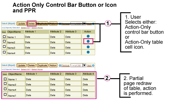
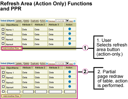
For icons that only perform an action (and do not navigate the user to another page) PPR may be used. (Note: These actions typically affect only the table of data, but not other areas of the page.) When the action only icon is selected, only the table redraws with new contents. If PPR is unavailable (unsupported browser, accessibility mode, etc) the interaction will revert to a full page redraw once the icon is selected. (Action-only global table buttons and control bar buttons act the same as action only icons with PPR).
Example of Action Only Icon and PPR
Functional icons that affect only a cell in a table are placed directly after the field they affect.
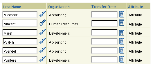
- Date Picker Access Button
- Search/LOV Access Button
- Calculator Access Button
Example of Date Picker Functional Button in Table Cell
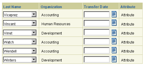
Example of Date Picker and Search/Find LOV Functional Button in Table Cell
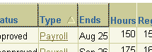
The only functional icon that affects a column of data is the Column Sort icon (Ascending and Descending). The ascending or descending icon is right aligned in the column header
Example of Column Sorting Indicator Icon in Column Header
Note: Sortable columns have both the indicator icon and beveled shading in the column header cell. The beveled treatment is only used for column sorting.
Section Contents
A link in a table cell should be used to drill down for more information or details of the linked item.
- Drill Down for Details (Micro): The drill down can be at a micro level, for example, the link is on an item in a column labeled "Item Description." When selected a new page is drawn displaying detailed information regarding an item that a user has placed into a shopping cart.
- Drill Down for Selection of Item to Update (Macro): The other possibility of a drill down can be at the macro level. For example if the table displays a list of projects that a project manager is managing. The first column may be labeled "Project Name." When the user selects one of the project name links, the page redraws to reveal all the functionality that is available to manage that specific project.
Example of Link in a Table Cell as Drill Down for More Information

Links or "a href" tags should not be used as a column header label. If the link is a drill down for more information or details regarding that column, use the information icon described above under "Icons in Column Headers." A link should not be used in a column header to perform an action on that column.
Buttons can be used in a control bar only. See below for details. Action/Navigation Buttons are not allowed in the column header.
Alignment of table data and column headers depends on the type of data displayed.
- In general, the alignment of table column headers is the same as that of the table cell data in the column.
- View-only text and column headers are left-aligned by default.
- Text within an updateable widget, such as a text field, and the related column header are also left-aligned by default.
- Numeric and alphanumeric values that are not used for totaling or comparisons across cells in columns are left-aligned together with their column headers.
- Numbers used for totaling or comparisons across cells in columns may be set as right-aligned together with their column headers.
- Numbers used for totaling or comparisons within updateable widgets, such as a text field, are right-aligned together with their column headers.
- Icons in table cells are center-aligned together with their column headers.
- The select column radio buttons or check boxes are center-aligned together with the "Select" column header.
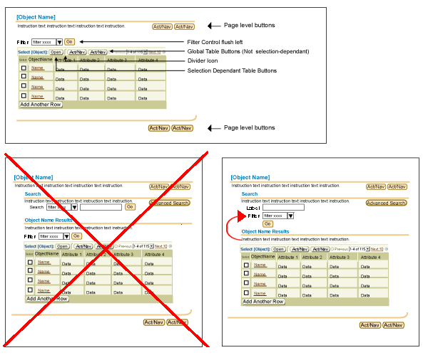
Tables are assembled from the following controls and components:
- Table Title Area
- Table Control Bar
- Selection Bar - Appears under Control Bar when Selection Column is present in table; and/or Hide/Show all controls are desired.
- Persistent Selection Counter - Appears when multi-selection is offered.
- Row Selection Controls - (Select All/None) - Allow user to quickly manipulate the row selection.
- Hide/Show All Controls - Hide/Show All links may be placed in the Selection Bar if Hide/Show controls appear in the Table Data area.
- Selection Column - First column of table reserved for row selection: Provides user with the ability to select one or many rows to act on. (Note: Control Bar is typically present with Selection Column, selection controls may be present.) If selection dependent functions appear in Control Bar, a Selection Column must appear in the table.
- Table of Data
- Table Footer - Refresh Action Area - For controls that refresh the data or state of table, but do not take the user to another page. Totals and Recalculate controls also appear here. This includes controls and components such as:
- Add a Row Control
- Add a Row with Choice Control
- Totaling
- Refresh Data
- Validate
- Repeat Control Bar - Table Control Bar and Record Set Navigation controls repeat at the bottom of the table after a certain number of rows are displayed. This provides quick access to information in long tables.
Table Example with Components and Subcomponents
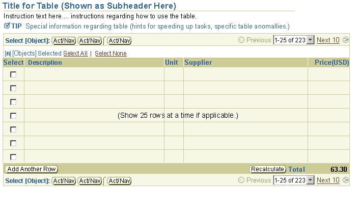
Table Button Placements - Global Table Actions, Selection Dependent Actions, Refresh Table Actions
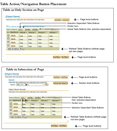
This section describes the five elements that may be placed at the top of tables.
Section Contents
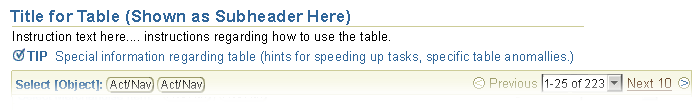
- A table must have a title that describes the table contents.
- Table titles consist of a Header/Subheader/or Subsubheader component that is placed directly above or otherwise in close proximity to the table.
- If there are more than 3-5 label/data pairs between the Header/Subheader and a table with a control bar, the page should be broken up into multiple sections, each with its own subheader.
- Table Instruction Text is the same as the standard Instruction Text component.
- Users may need instruction text to learn how to make use of a table.
- See Help Methods: Instruction Text for details.
- A table Tip is the same as the section level Tip component.
- Section level Tips may be appropriate to use with a table if there are special processes that occur when a table interaction is initiated (for instance, a certain action may take a long time to process).
- See Help Methods: Tip Text for details.
Example Image of Table Title, Table Instruction Text, and a Table Tip
See Inline Messaging in Tables above for detail description.
- A table filter control consists of a label, a choice list, and a "Go" button. A typical label is "Filter By". (A table filter may NOT contain a text field.)
- A table filter allows a user to view a subset of the data displayed in the table. It is NOT a search, and when initiated with the "Go" button, it does not search the entire database and retrieve new results; it only filters the current result set.
- Layout:
- The table filter control goes above the control bar of a table, if the table has selection dependent actions.
- The table filter control may be placed parallel, and to the left of the global table actions (i.e., global table buttons) if there are few global table actions. If there are too many global table actions, the table filter control should go above them.
Example Image of Table Filter Control Options
- The table filter should present an "All" choice. If the table is not filtered, "All" should be the active item in the choice list.
- The items in the table filter choice list typically reflect a reasonable set of choices within an attribute of the displayed object. For example:
- Status Filter: For a table representing a list of objects that have status, if status if an important aspect of the object, you may want to place a table filter labelled "Status" above the table. The contents of the filter choice list may be, for instance, "All, Urgent, Medium, Low". When the user selects a status in the choice list, and then the "Go" button, the table data is filtered to show only the subset of rows that contain the selected status.
It is NOT recommended to display a search section and a filter control with a table. The filter should be part of the search criteria, not in a separate area, and not controlled by a separate "Go" button. Search and filter controls in different sections of the same page can confuse users as to which data they are viewing.
Section Contents
The control bar is used for tables where the same actions/navigation can be performed on each row within the table. Both global non-selection dependent actions and selection dependant action controls are placed in the bar.
- A control bar contains: Succinct text directions and action/navigation controls applicable to every row in the table.
- The control bar defaults to repeat above and below the table when a table contains 10 or more rows. If the table has less than 10 rows, the control bar appears only on the top of the table. This option can be overridden by developers.
- The number of actions may vary in the control bar.
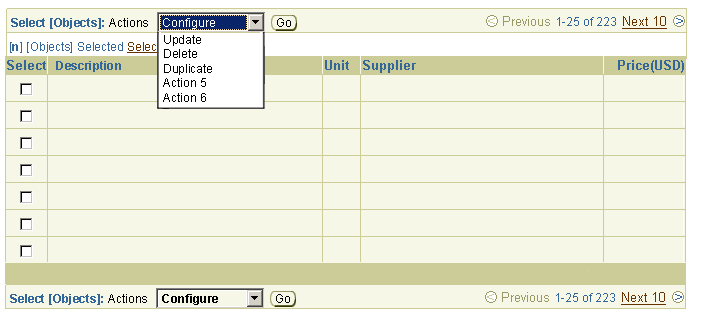
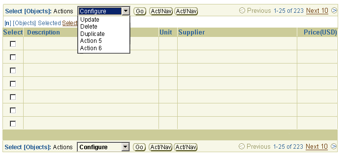
- It is recommended to show all actions as buttons, space permitting. This is scalable to up to 6-7 buttons maximum.
- If more actions exist, actions may be put in to a choice list with a "Go" button.
- It is NOT recommended to have action choicelists for BOTH selection dependent and selection independent global actions
- Action/Navigation buttons and a choice list with a "Go" button may be mixed together. The buttons should be the most frequent actions, and the rest of the actions can be in the choice list.
- If an action only table button only needs to redraw the contents of the table, it may use PPR technology to do so. See above under, Action Only Icons in Table Cell and PPR for more details.
- For more information on use of the control bar, see the Table Action/Navigation Methods guideline.
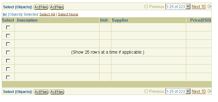
When there is a Single Select column present, the default text within the control bar is "Select {Objects}:", positioned to the left of the Act/Nav control (right for BiDi text implementations). For example, if the object type is a purchase order, the text would read "Select Purchase Order:"
- Select {Objects}:
- Example: "Select Purchase Order:"
When there is a Multi-Select column present, the default text within the control bar is plural, "Select {Objects}:", positioned to the left of the Act/Nav control (right for BiDi text implementations). For example, if the object type is a purchase order, the text would read "Select Purchase Orders:"
- Select {Objects}:
- Example: "Select Purchase Orders:"
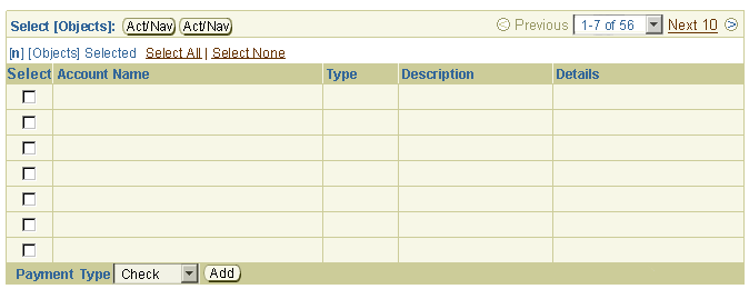
A Selection Column appears when row selection is offered. It appears as the first table column. It provides users with the ability to select one or many rows to act upon.
(Note: A Control Bar is typically present when Selection Column, selection controls may be present.) If selection dependent functions appear in Control Bar, a Selection Column must appear in the table.
For selection-dependent actions, if the user does not select a radio button or check box in the Selection Column, and then selects a selection dependent button or item in an actions choice list, an error message box with an inline error message should be displayed. See this example image in the Inline Messaging Icons and Messaging Text in Tables section of this guideline.
- Error message text may be as follows:
"You must select at least one [object name] in order to perform this action."
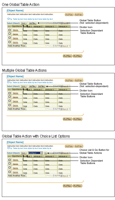
- A Global Table Action is placed in the Control Bar, to the right of the selection dependent table actions. If there are no selection dependent actions, global table actions are the first actions in the control bar, appearing flush left (right align when translated to BiDi languages).
- Typical Global Table Actions are "Create", and/or "Export" (exporting entire data within table.)
- A Global Table Action consists of only a button, or may be a Label/Choice List/Action with "Go" button if the Global Action first requires a selection of the type of action to be performed.
- If an action-only global table button only needs to redraw the contents of the table, it may use PPR technology to do so. See above under, Action Only Icons in Table Cell and PPR for more details.
Example Image of Global Table Action Options
Example of Table with Control Bar
Control Bar with Actions/Navigations in Choice List
Control Bar with Action/Navigations in Choice List and Action/Navigation Buttons
Example of Updateable Table with Control Bar and Record Navigation
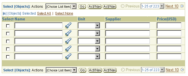
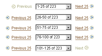
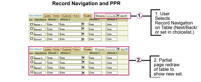
Table Previous/Next record navigation links appear when the number of records in the table exceed the maximum number per record set (usually 25). This subcomponent is described in full in the Locator Elements: Record and Page Navigation Guideline.
- Some detailed topics from that guideline include:
- Basic record navigation principles including visuals, view only vs. updateable, etc.
- Record navigation choice list behavior when more than 30 record sets exist ("More...")
- Record navigation choice list behavior when users need to show all records ("Show All")
- Partial Page Rendering use and record navigation
- Heuristics from the guideline include:
- Table Record Navigation can be used to navigate through record sets in view-only tables as well as updateable tables. Updateable tables can have editable or interactive widgets, such as choice lists or text fields.
- All updates to widgets in an updateable table are saved in temporary tables or cached; the page is redrawn according to the record navigation link selected (next or back). See the Save Model Guideline for more details.
- The recommended default for display of record navigation in a view only table (a table which a user can view and/or select from) is 25 rows -- if the total number of records does not exceed 25 rows, record navigation does not appear. This default can be overridden if necessary. Depending on the application's user profiles and the task that needs to be performed, an application's UI team, project managers, and developers can decide how many rows should be displayed within the table. (i.e., 25 rows at a time may be too overwhelming for certain tasks, so that application team may choose to show only 15 rows at a time.)
- Table Record Navigation may appear disabled, or may not be displayed. As a default, table record navigation should not appear when there is no data within the table, or fewer number of rows shown than the record set number.
- NOTE: The OA framework does not yet support all features of the record navigation component. In particular OA does not support total numbers, and uses view only record navigation. Also, OA has a limit on how many rows it fetches. See the (internal use only) Tech Matrix for details.
View only record navigation is used when the total number of records are not known.

Interactive record navigation is used when the total number of records is available. This navigation allows the user to quickly move between record navigation sets; the first set, all sets in between, and the last set.
For full details, see Locator Elements: Record and Page Navigation Guideline
Section Contents
The selection column provides users with the ability to select one or many rows on which to act:
- When present, the selection column is the first column of the table.
- The selection column contains either radio buttons to select a single row, or check boxes to select multiple rows.
- When multiple selection is enabled, the table may also feature Select All | Select None controls. If users do not have privileges for a row, the check box for that row is disabled.
- Selection columns may be table level or page level in scope:
- Table level selection: In this case, the selection column is paired with a control bar, to allow users to perform actions on the selected row(s). The page may also contain other action/navigation buttons that do not affect the selected row(s).
- Page level Selection: In this case, the table does NOT include a control bar, and actions are performed using page-level action/navigation buttons, such as Apply. This approach is used in LOV pages (the page where the user selects from the list, not the page containing the LOV icon), and can be used on other pages where the primary purpose of the page is also for selection from a table. On such pages, row-specific actions should be performed using functional icons.
- For more information on row selection, see the Table Action/Navigation Methods guideline.
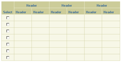
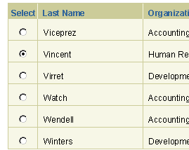
A radio button should be used in each table cell of the first column (labeled "Select") to select a single row from a table. Users can then perform actions on the selected row.
Table with Select Column for Single Row Selection
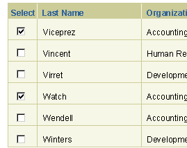
A check box should be used in each table cell of the first column (labeled "Select") to select multiple rows in a table. Users can then perform actions on all of the selected rows.
Table with Select Column for Multiple Row Selection
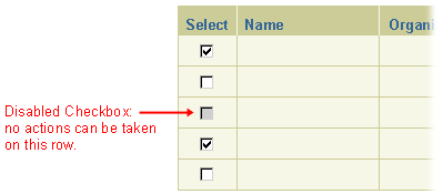
A row may not be selected because a user may not have privileges to modify the object. In this case, the radio button or check box appears disabled.
Table with Disabled Row in Selection Column
"Select All" or "Select None" functionality is used when a select column is present with check boxes. (This functionality is not to be used with radio buttons in a select column.) The "Select All" and "Select None" links are separated with 2 spaces on either side of the pipe "|" character. When "Select All" is chosen, all checkboxes (rows/records) become selected within the record set in view. When "Select None" is selected, all of the checkboxes (rows/records) within the displayed record set become deselected.
If the task requires that a user be able to invert the current selection, another link can be added to the string labeled "Invert Selection." ("Invert Selection" is not common and should not be used in many cases.)
Note: Check box selection across record sets is persistent (i.e., if the user checks some rows in one record set, then navigates to another record set using record navigation, the previously selected checkboxes are still selected.
Select All | Select None in Selection Bar, with Select Column in Table
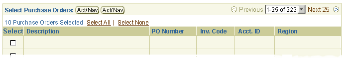
Persistent selection is the ability of a user to select items among two or more record sets and have the system remember the selection. This allows the user to perform a task on several selected objects at one time, even though they are not displayed on the same page. A record selection counter is displayed at the top of the table to inform the user how many rows have been selected. The selection counter is dynamically updated as records are selected or deselected.
Record Selection Counter Showing Persistent Selection of 10 Purchase Orders
Record Selection Counter Showing Persistent Selection of 1000 Employees
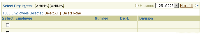
Syntax for the persistent record selection counter should be: "[Qty. Selected] [ObjectTypes] Selected"
- [Qty. Selected] = Quantity of records selected. The number should be stated in (Arabic) numerals.
- The [ObjectType] portion of the label should be stated in the plural even if one record is selected, unless an exception can be coded for the singular case.
- For example, "1 Employee Reports Selected."
If Hide/Show in a row or cell is shown, it may be appropriate to expose the "Hide All Details" and "Show All Details" links. These links are not shown by default if Hide/Show controls exist, but only if specified by the development team/interaction design. See above under Hide/Show All Controls in Table for details.
The refresh action area of a table is reserved for controls that refresh the data or state of the table,
but do not take the user to another page. This section describes the valid "refresh" actions can be used in this area of the table.
Section Contents
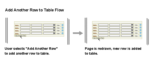
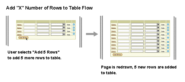
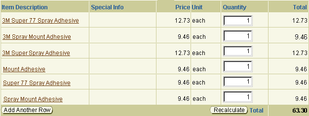
- An "Add Another Row" button is placed in the bottom row of a table, left aligned. When this button is selected, the page redraws with another row added to the table.
- The button label is configurable to read "Add 'X' Row(s)" where 'X' is an appropriate number for the current application task.
- The row(s) added should have precisely the same number of columns as the other rows in the table.
- The added row(s) can be either populated with default data, or left blank, depending on the context of the application.
- If more data needs to be entered than possible within the columns which are displayed in the table, use the "Create" global table button above the table. See the Table Flows guideline for details.
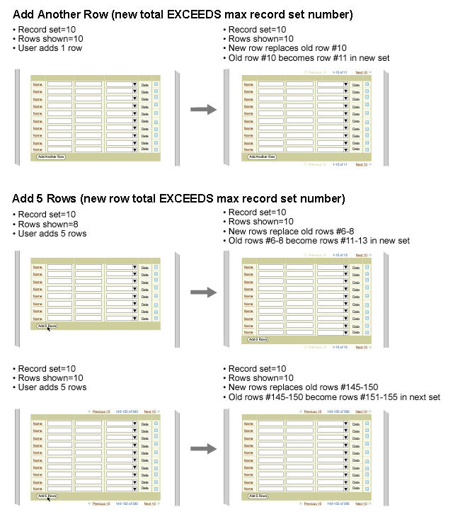
- If the added row(s) exceed the maximum record set number, the new row(s) will push old rows to the next record set and table record navigation will appear and/or update with new Total number of records after the page is redrawn.
- Table columns do not automatically re-sort after additional rows are added to the table.
- Avoid using "Add a Row with Controls" with the "Table Actions/Navigations Choice List", as both appear similar but are used for different purposes, and may therefore lead to usability problems.
- For functions in the refresh area that do not cause navigation to another page, but only affect the table data, PPR may be used. When the function (button) is selected, only the table will redraw with updated or new contents. If PPR is unavailable (unsupported browser, accessibility mode, etc) the full page will be redrawn when the icon is selected.
Example of Add Another Row Button in Refresh Table Area
Example of Add Another Row with Controls
Example of Add Another Row to Table Flow
Example of Add 5 Rows to Table Flow
Example of Adding Rows that Exceed Maximum Record Set
Example of Refresh Area Functions (Action Only) and PPR
Creating a new object is similar to adding an object but the user must enter more attributes than those in view in the table. See the Table Flows guideline for details.
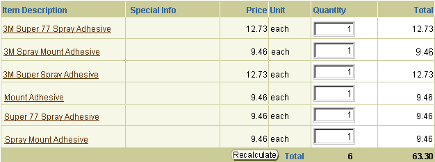
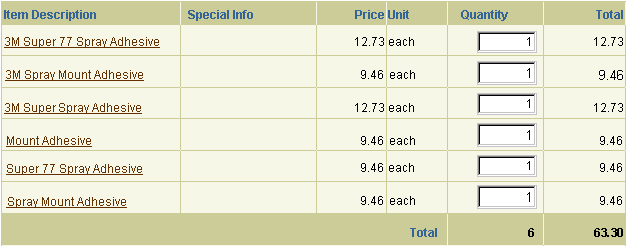
- Column(s) that display a total should be the rightmost column(s) of the table. (When translated to bidi languages, this becomes the left most column(s).)
- If the Total column has updateable fields, a "Recalculate" button should appear adjacent to the total. This must be selected to update the total number.
- The text label, "Total", is fixed.
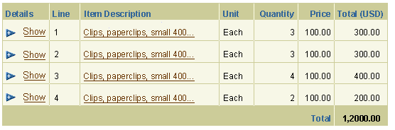
Displaying Total in One Column of a Table
Example of Total of Two Columns with No Banding
Example of Total of Two Columns with Banding to Emphasize Totaled Columns
"Add a Row" and a Total column may appear simultaneously, as shown below:
Displaying a Total and Add a Row in Bottom Row
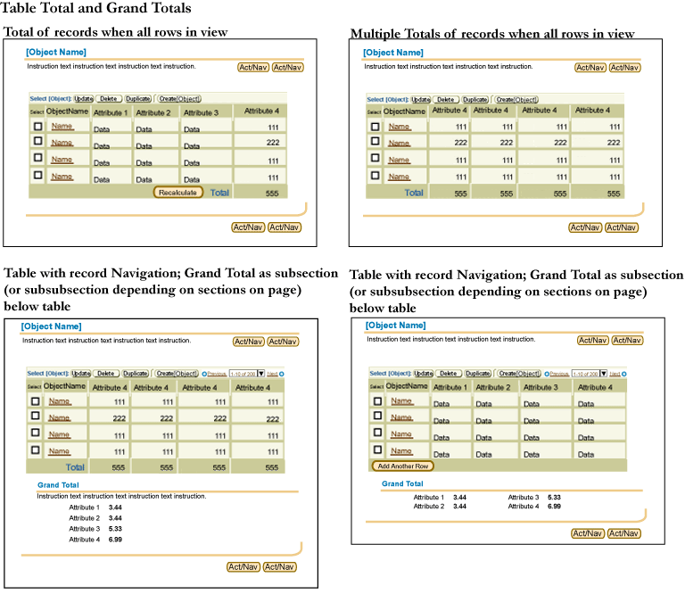
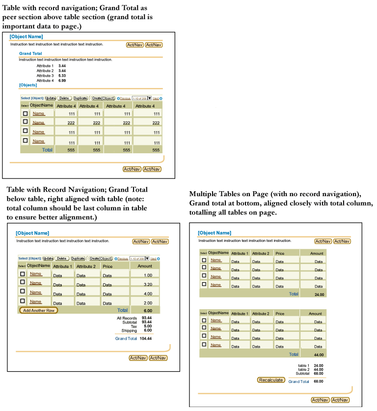
If a table shows a Total, and is shown in record sets, the total in the refresh area only shows the total of the records shown. To show the Grand Total, or total of ALL records, the result should be displayed outside of the table, and outside of the refresh table area. Below are multiple valid examples for showing grand total information.
Multiple Examples of Grand Total Figures Displayed With A Table (with Record Navigation)
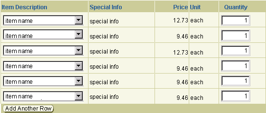
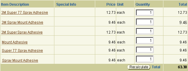
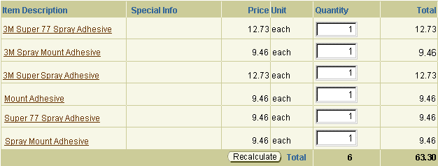
Basic auto calculation can be used in tables that feature Total columns.
- Auto calculation can be performed in two basic cases:
- To calculate the current column total. The total updates though PPR as the user enters/modifies values.
- To perform simple row calculations that may affect a row total or a total of all rows. For example, in the image below, if the user modifies the a value in the Quantity column, both the total for that row and the overall table Total will be updated.
- When auto calculation is implemented, the Recalculate button is omitted.
- The Total number must be read-only text (not an editable field).
- Auto Calculation should only be used if it will not cause a performance problem. In this case, calculation should be triggered by the Recalculate button.
- Like other features dependent on PPR, auto calculation is automatically disabled in accessibility mode, and the Recalculate button is inserted.
Example of Auto Calculation (without Recalculate Button)
A table may be displayed without data. This is commonly used for tasks where the user performs an action that returns results data in a table.
- A blank table is displayed to set user expectations for the type of results that will be returned once the action is performed.
- The object name column of the table (i.e., Category Name, Employee Name, Performance Measure, etc.) should contain a text string informing the user that there is no data. This text should be written by development teams based on the context of the page. Default examples that should be used for search and results Object Lists are:
- "(No results found.)" - Use when a search returns no results.
- "(No search conducted.)" - Use if a user comes to an object list and the table is empty, and/or no default search is conducted.
- The blank table includes specific column headers, and shows just one row of blank cells.
- When the action is performed the resultant data fills the table. Also, the text string (i.e., No results found.) is replaced by data.
- Record navigation does not appear if a table displays no items/rows of data.
- Tables with Add Another Row or global multi-select LOV and action button may also be presented as empty. In such cases, the informing text string in the object name column should appear in the following syntax:
- "(No [object types] added.)"
Example of Empty Table with Sample Text String

Users can configure data display by sorting column data, resizing and reordering columns, and filtering table data.
Section Contents
Below is a listing of implementation descriptions, and recommended rules of usage and behaviors for columnar data sorting controls. See sample images following.
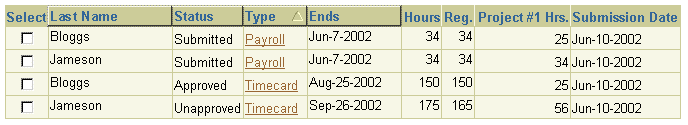
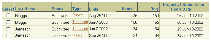
- The highlight and lowlight surrounding the column header indicate that the column is sortable.
- An icon is used to indicate which column is sorted.
- The sort icon toggles between ascending order (arrow pointing up) to descending order (arrow pointing down), depending on which way the data is sorted.
- By default, the first column that is sortable is sorted in descending order.
- If a table column is sorted when the user first navigates to a page, the table column must show the sort icon to indicate the sort direction.
- If the user sorts a column, the application remembers which column is sorted. When the user returns to that page, the column last sorted remains the active sorted column.
- If a row is selected, and then the user sorts a column, the active row remains selected and in view.
- A column does not automatically re-sort when a row or a number of rows are added to the table.
- If multiple sorts have been applied, the sort icon appears only on the sorted primary column.
- Descending Examples (Arrow Pointing Down)
- Numeric: 100 -> 0
- Alphabetic: Z -> A
- Chronological: future -> past
- Ascending Examples (Arrow Pointing Up)
- Numeric: 0 -> 100
- Alphabetic: A -> Z
- Chronological: past -> future
- Alphabetical Sorting is NOT case sensitive.
Here are correct and incorrect examples of an ascending mixed-case alphabetical sort:
-
Like this:
ape
Apple
banana
Bear
-
NOT like this:
Apple
ape
Bear
banana
-
AND NOT like this:
Apple
Bear
ape
banana
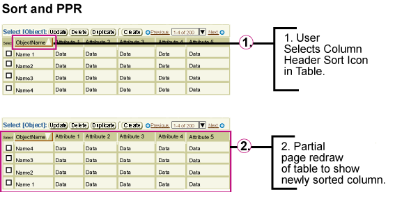
- The sort functionality of column data should use PPR technology. When the sort function is selected, only the table redraws, with contents sorted appropriately. If PPR is unavailable (unsupported browser, accessibility mode, etc) the full page is redrawn when a sort is performed.
Example of Sorting Column Data
Example of Wrapping and Header Alignment With Data in Sortable Columns
Ascending Column Header Icon

Descending Column Header Icon

Example of Sorting Column Data and PPR
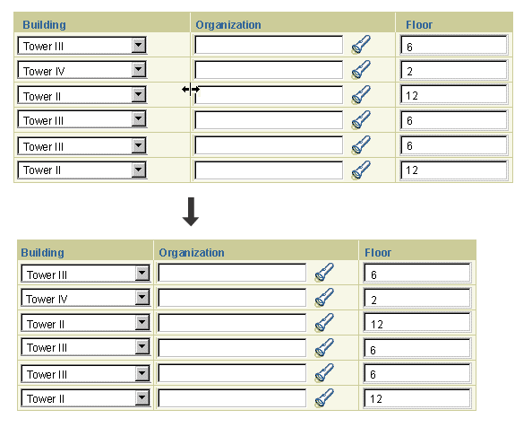
Users can resize the width of columns in a table to suit their requirements. Column resize can be provided as a standalone feature, or as part of the table personalization process. In both cases, column resize can be performed in one of two ways, depending on browser capabilities and accessibility requirements:
- Using drag and drop within the table: if supported by the browser.
- Specifying column widths in a separate page: if the browser does not support drag and drop, or if it is in accessibility mode.
Note: At this time, the only browsers that can support drag and drop are Internet Explorer 5 and higher, Mozilla, and Netscape 7.
There are several constraints on resizing columns in a table:
- A table may contain a mix of columns that can be resized and columns that cannot be resized. Column resize is not available for:
- Columns with the NOWRAP setting applied. In this case the column defaults to the width of the widest content element, and cannot be resized.
- Columns that are divided into two or more spanned columns (this case may be supported in future).
- The "Select" column.
- Users cannot save resized column settings for a table view created by an administrator. For details, see Personalizing Seeded Views in the Personalization of Views guideline.
Technical Note: The UIX team is currently developing drag and drop functionality for BLAF applications. Some of the behavior specified below may change to work around technical constraints.
Users can resize columns using drag and drop if the browser provides support for this functionality, and if the browser is not in accessibility mode. Column resize with drag and drop is implemented as follows:
- When a user places the pointer over the grid line separating columns, the pointer switches to a resize cursor. Both IE and Mozilla-based browsers will use the standard Windows resize cursor. The user can then click and hold down the mouse button to drag the grid line either to make the column wider or narrower.
- The resize cursor will not appear for columns that cannot be resized.
- To resize a column, the user must drag its right-side border, except in BiDi languages, where the user drags the left-side border.
- When the user starts to drag the grid line, a black grid line at 50 percent transparency is overlaid on the table, indicating the changed column boundary. The resize grid line appears and extends through all the rows currently displayed in the table. The appearance of the resize grid line may vary between browsers.
- While dragging, only change in the horizontal position of the cursor is registered; change in the vertical position of the cursor is ignored. As a result, the grid line can only move horizontally, even if the user moves the cursor above or below the table.
- When the user releases the mouse button, the column resizes.
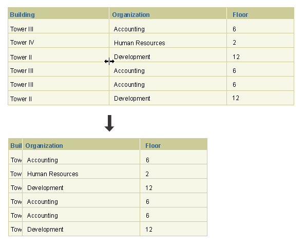
Cell content in resized columns is handled through truncation, clipping, and wrapping. In addition to the Constraints on Column Resize mentioned above, content in resized column cells is handled as follows:
- HTML does not provide automatic truncation. If the user makes a column narrower than the longest content element in that column (column header, data, field, data or field with icons, etc.), the result depends on the column content:
- If the column contains read-only data (no updateable fields), the data is wrapped.
- If the column contains updateable fields, the column will snap to the width of the widest element.
- Columns cannot be resized to less than 5 pixel widths, so users remain aware that a column exists, even though its data may not be readable. When the column width is too narrow to wrap read-only elements without breaking words, the elements are clipped and displayed on a single line, as shown below in Example of Clipped Fields in a Resized View-Only Column
- After resizing columns, the new state of the table is retained until the user again changes it, either by again resizing the columns, or selecting a (different) pre-saved view with different column widths.
Using Drag and Drop to Resize a View-Only Column
Using Drag and Drop to Resize an Updateable Column
Example of Clipped Fields in a Resized View-Only Column
An alternate method of resizing columns is provided if the browser does not support drag and drop, or if the browser is in accessibility mode. In either case, a global table button labeled "Reorder/Resize Columns" is provided to navigate to a properties page where users can resize the table's columns. For details, see Specifying Column Order and Size below.
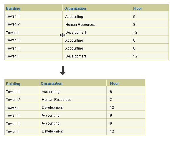
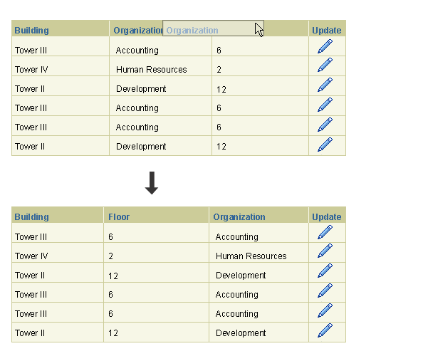
The column order of a table can be modified by individual users to suit their requirements. Column reorder can be provided as a standalone feature, or as part of the extensive table personalization process. In both cases, column reorder can be performed in one of two ways, depending on browser capabilities and accessibility requirements:
- Using drag and drop within the table
- Navigating to a separate properties page (for both column order and column width)
Note: At this time, the only browsers that can support drag and drop are Internet Explorer 5 and higher, Mozilla, and Netscape 7.
There are two constraints on reordering columns in a table:
- Users cannot change the position of a table's selection column or its primary object column. In most languages, primary objects always appear either in the left-most column position, or immediately to the right of the selection column. In BiDi languages the primary object column and selection column appear on the right.
- Users cannot save reordered column settings for a table view created by an administrator. For details, see Personalizing Seeded Views in the Personalization of Views guideline.
Technical Note: The UIX team is currently developing drag and drop functionality for BLAF applications. Some of the behavior specified below may change to work around technical constraints.
Drag and drop is the preferred method for reordering columns if it is supported by the browser, and if the browser is not in accessibility mode. Column reorder with drag and drop is implemented as follows:
- When users place the pointer over a column header, they can then click and hold down the mouse button to drag the column to another location in the table.
- When the user starts to drag the column, a replica of the column header is dragged along with the cursor location. The replica column header is surrounded by a black border, and includes the column header text along with any messaging or sorting icons.
- While dragging, only change in the horizontal position of the cursor is registered, and any change in the vertical position of the cursor is ignored. As a result, the transparent header can only move horizontally even if the user moves the cursor above or below the table column header region.
- When the user releases the mouse button, the column drops into the new position.
- The user must drag the column header at least 50 percent across the width of the adjacent column before the reorder can be implemented. If the user only drags the column header a few pixels to the side (less than 50 percent of the width of the adjacent column), the dragged column will snap back to its original position when the user releases the mouse button.
- After reordering columns, the new state of the table is retained until the user changes it again, either by reordering the columns again, or selecting a (different) pre-saved view with a different column order.
Note: At this time, the only browsers that can support drag and drop are Internet Explorer 5 and higher, Mozilla, and Netscape 7.
Using Drag and Drop to Reorder Columns
An alternate method of reordering columns is provided if the browser does not support drag and drop, or if the browser is in accessibility mode. In either case, a global table button labeled "Reorder/Resize Columns" is provided to navigate to a properties page where users can reorder and resize the table columns.
The Reorder and Resize Columns page includes all the common page elements, as well as an updateable table listing each column header in a separate row.
- The title of this page is "Reorder and Resize Columns".
- The page displays all the common page elements, as well as an updateable table listing each column header in a separate row.
- The page displays only the columns currently shown in the originating table, NOT all available columns.
- Each row contains Move Up and Move Down icons, as well as a Width field where users can enter column widths in percentages.
- If a column can be resized, the Width field is updateable. If a column cannot be resized, the Width field is view-only.
- A view-only Total field specifies the total width of the table in the originating page. If PPR is disabled, the field has a "Recalculate" button.
- Page level buttons are "Cancel", "Revert", and "Apply".
- Instruction Text is: "Move column headers up or down to change the order in which they are displayed in the table. To change column widths, specify the width of each column as a percentage of the total table width. Note that if you increase the total table width beyond 100 percent, the table will scroll beyond the right edge of the page."
Reorder and Resize Columns Page

Table personalization is described in full in the Personalization of Views (Tables and HGrids) guideline. With table personalization, users can modify table display as follows:
- Reorder Column Display
- Resize Columns
- Add or Delete Different Columns to Display
- Multiple Column Sort and Sort Order
- Rename Columns
- Configure Total Columns Shown
- Configure Number of Rows Shown
- Create and Save Custom Query to Filter Data
The Table Flows guideline provides details on the most common table interactions, as listed below. Each of the following links is a shortcut to the related section of the Table Flows guideline:
- Manipulate Data within a Table:
- Manipulate the Display of a Table:
- Selection from a Table
| Table Border Line |
Medium Beige; #cccc99 |
| Row and Column Header Background Color |
Medium Beige, #cccc99 |
| Row and Column Header Grid Color |
Sand, #f7f7e7 |
| Row and Column Header Text Style |
Arial Bold, 10pt CSS |
| Row and Column Header Text Color |
Dark Blue, #336699 |
| Table Cell Background Color |
Sand, #f7f7e7 |
| Table Column and Row Band Color |
White, #ffffff |
| Table Cell Grid Color |
Medium Beige, #cccc99 |
| Table Cell Text Style |
Arial Regular, 10pt CSS |
| Table Cell Header Text Color |
Black, #000000 |
| Alignment: Column Headers |
Aligned with data (Icon, Text and Numbers in all) |
| Alignment: Row Headers |
Always right aligned |
| Alignment: Cell Data |
Left aligned for text; right aligned for numeric alphanumeric values used for totaling and value comparisons |
| Alignment: Icons in Cells |
Icons in cells are center aligned |
| Alignment: Icons in Column Headers |
Icons in column headers are right aligned |
| Alignment: Action/Navigation Buttons in Cells |
Action/Navigation buttons in cells are center aligned |
| Alignment: Radio Button, or Check Box in Cell |
If cell contains only a radio button or check box, it is center aligned |
| Alignment: Text field, Choice List in Cell |
Text field or choice list is left aligned in a cell |
| Control Bar: Instruction Text in Control Bar |
Arial Bold, 11pt CSS; dark blue, #336699 |
Open Issues
10-Mar-2003: UIX team is currently developing drag and drop functionality. Currently specified behavior may need to change if technical issues arise.
03-Sep-2003: Clipping, Truncation, and Wrapping behavior in resized column cells needs clarification beyond that already provided in this Guideline. See Clipping, Truncation, and Wrapping.
Closed Issues
09-Mar-2004: Removed instruction to use Table Title Bean. Table titles are provided with header beans.
20-Mar-2003: Added constraint on column resize and reorder with seeded views.
10-Mar-2003: Added alternative method of reordering and resizing tables for browsers that do not support drag and drop.
13-Jan-2003: Added drag and drop methods for resizing and reordering columns, and edited entire document.