Instruction text is the primary method for directing users to perform a task on a page. Instruction text may be applicable to:
The contents of this Guideline are as follows:
Instruction text can be used both to explain domain or industry-specific issues, and/or to explain how to use certain user interface components.
Use the following guidelines when developing Instruction text:
No additional spacing is added above or below Instruction Text; however, spacing can result from the CSS text style. For spacing measurement details, see Content Layout Templates.
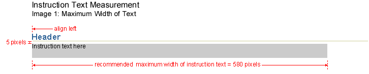
Long line lengths can be problematic for readability because the users eye has a hard time following from line to line. To prevent this, a maximum line width is recommended for Instruction Text. If the text exceeds this width, it will wrap to as many lines as necessary. The line width may be less than this width if there is little text.
Instruction Text Maximum Line Length
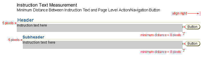
This image displays the recommended minimum width between the Instruction Text and a page level or section level action/navigation button.
Instruction Text with Action/Navigation Button
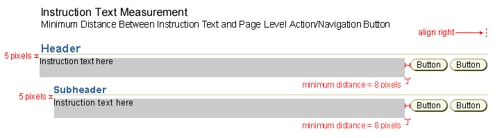
This image displays the Instruction Text with multiple page level or section level action/navigation buttons.
Instruction Text with Multiple Action/Navigation Buttons
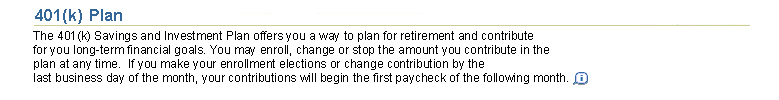
Example of Instruction Text Only (Shown with a Header Component)

Example of Instruction Text with Information Icon (Shown with a Header Component)
For detailed vertical placement of Instruction Text within a page see Component Order guideline for complete list of the vertical order of all components.
Instruction Text generally follows a header, subheader or subsubheader. When the Instruction Text follows the first header on the page (or page title) this text is usually regarding the whole page. If the Instruction Text is regarding a single field, pulldown list, etc, the placement will not necessarily be directly below a header component. See Header Component Guideline for details regarding headers. Also, note the difference between Instruction Text versus Inline Messages and Tips and use instruction text appropriately.
Example of Multiple Sections of Content all with Instruction Text
Action/Navigation button that will be placed near Instruction Text is an action/navigation button that is related to a section of content or repeated page level action/navigation buttons. This button is placed directly below and right aligned with the header/section it influences. If Instruction Text is also present, it is left aligned, directly under the header component. (See Action/Navigation Button Guideline for details regarding action/navigation button placement.)
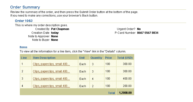
Example of Action/Navigation Button Specific to a Section of Content and Instruction Text

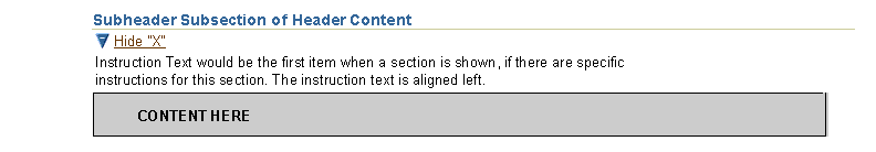
The Hide/Show component can be used to hide or show a section of content. The Hide/Show component is always located directly below the Header component. When the content section is hidden, the Instruction Text is not shown. When the content section is shown, the Instruction Text follows directly below the Hide/Show component.(See Hide/Show Component for details regarding Hide/Show.)
Example of Hide/Show Component Specific to a Section of Content and Instruction Text