Header Component
Last Updated 09.04.03
General Description
The header component is used to title and separate contents on a page. It may be used in the general
body of contents of a page, in a column, in a message area, or in a content container. There are three types
of headers: headers, subheaders, and subsubheaders. Each type of header has a rule (or line) underneath
the text. A subheader, and a subsubheader can be subdivided into a columnar format, or adjacent sub/subsubheaders.
A subheader, and a subsubheader can also be hidden or shown depending on the critical nature of the information
within the section. It is also optional whether or not to use a page title icon with a header or a subheader/content container icon with a subheader.
Guideline Attributes
Spec Version # - 3.1
Spec Contributors - Betsy Beier
UI Models - all models
Example Products - all products
Related Guidelines - Page Templates,
Content Containers in Page, Text
Standards, Dialogs: Messaging,
Content Layout Templates, Quick
Link, Language in UI, Hide/Show
Component
Interaction and Usage Specifications
General Principles of Headers, Subheaders, and Subheaders
- Each page must contain a header to enforce where the user is in the application.
Typically, the first header of a page is the page title.
- A sub header is used under a header.
- A subsubheader is used under a subheader.
- A header is flush left with the page contents, a subheader is indented
from header, and a subsubheader is indented from subheader. (For exact
measurements see Content Layout Templates)
- A header should be used to define the contents of a page.
- Subheaders are used to separate content within a specific header content, subsubheaders are yet another subdivision below subheaders.
- It is not recommended to subdivide content beyond three levels.
- A Page Title icon may be used for headers to add graphical element
and reinforce the header message. Page title icons are not recommended
to be used at subheader, and subsubheader levels. Content container
sized icons may be used on subheaders if necessary. For full list of
icons to use on headers; see Page
Title Icons or Subheader/Content
Container Icons.
- There is a vertical spacing measurement above each type of heading
to visually divide main sections with other main sections, as well as
subsections from subsubsections, etc. See Content
Layout Templates for exact vertical measurement details.
- Consistent language should be used for each level of header, on each
page and throughout the application. See Language
in UI for more details.
- Details of the Primary Header, First Header on Page (a.k.a. Page Title):
- There should only be one primary header on a page. This should be the title of the page, that summarizes the contents of all the section in the page.
- The page title should not be in the tab/horizontal navigation area, but in the contents of the page using the header component.
- The Contextual Switcher, when used is
placed only on the header. See Switcher guideline for details.
- Repeated page level action/navigation buttons are placed directly
below the primary header on the page. See Action/Navigation
Button guideline for details.
- Adjacent Subheaders and Subsubheader:
- Adjacent sub/subheaders may be used to split up information that is parallel in nature. Instead of using subsections that stack vertically, the adjacent subheaders may be used to
layout information of equal relationship horizontally. (Keep in mind, this layout is good for smaller amounts of content, since horizontal scrolling should be prevented.)
For instance, if adjacent headers are used to form columns of types of addresses
(shipping, general, work) the
- The main header or page title on a page can not be broken into an adjacent header,
only a subheader, and a subsubheader can be broken into columnar format or adjacent subheaders. (Note: There must be a main header on
all pages.)
- Adjacent sub/subsubheaders can not nest with more adjacent sub/subheaders, such that within a column (formed by one of the adjacent sub/subheaders), multiple columns can not be within this column.
- The adjacent sub/subsubheaders should be read in columnar format or newspaper style reading, thus the columns to not have to line up to read left to right between columns.
- Adjacent sub/subsubheaders can be broken into 1, 2, and 3 columns. 4 or more columns can induce horizontal scrolling which should be avoided. It is important to remember in translation that the adjacent header text strings can become much longer.
- Adjacent sub/subheaders do not have to be equal widths. Each column can be set to a percentage. There also must be a gap of a minimum of 15 pixels between columns.
- Adjacent sub/subsubheaders may have an icon. The icon should follow
the same criteria as a content container icon. See Icon
Repository for icons, see Icon Guidelines
for detailed visual information regarding icons.
- Typical types of content that can be under a column formed by an adjacent sub/subheader are: read only label/data formatting, label with updatable fields or widget, textual information, potentially a small table with few (3 or less) columns. Content containers should not be under an adjacent sub/subheader.
- Adjacent sub/subsubheaders should follow normal header guidelines such that, if the
subheader is being split underneath a header, use adjacent subheaders. If the subsubheader
is being split beneath a subheader, use adjacent subsubheaders.
- One column may have 2 adjacent sub/subheaders within it. See images below under "Visual Specifications: Adjacent Sub/Subheaders".
- A column may wrap, but an adjacent sub or subsubheader must be at the top of the next column information is wrapping to. That column adjacent sub/subheader should read "[XXX] Continued".
- Hide/Show Capability on Subheaders and SubSubHeaders:
- The hide or show icon can be placed on a subheader or subsubheader ONLY.
- The hide/show icon should never be used on a header (primary header on page) or page title.
- The hide/show icon is clickable. Clicking the toggle icon will perform the action. The subheader and subsubheader text is not a link and not clickable.
- When the "Show" arrow on a sub/subsubheader is selected, the page is refreshed with the section shown.
The user should not loose context of the specific section he/she opened, thus an anchor should be placed in the viscinity
of the opened sub/subsubheader. When the page is refreshed, the appropriate section will still remain in view. (Note: With partial
page rendering techniques, this anchor feature is not needed since the relative focus will remain once the "Show" icon is selected.
- When the "Hide" arrow on a sub/subsubheader is selected, the page is refreshed with the section hidden, yet the sub/subsubheader
is still visible. Again, the relative context of the specific section he/she closed should remain in view, thus an anchor should be placed in the viscinity
of the closed sub/subsubheader.(Note: With partial page rendering techniques, this anchor feature is not needed since the relative focus will remain once the "Hide" icon is selected.
- Each hide/show icon is an independent action. There may be multiple sub/subheader sections on a page with
hide/show. Each opens and closes independently of the other. (Multiple sections with hide/show functionality may needed to be visible on the page at one time.)
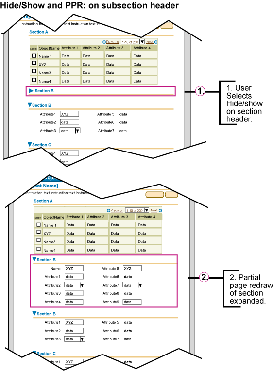
- The hide/show element for subheader and subsubheader sections should use Partial Page Rendering (PPR)
technology. When the hide/show element is selected, only the section of contents affected by the hide show should be redrawn, not the full page. If
PPR is not available (unsupported browser, or other reason), the behavior will default back to a full page redraw. See images below for details.
- A sub/subheader with hide/show functionality may also have a Quick
Link associated with it.
- A sub/subsubheader section with a hide/show icon should not have a display icon (subheader or content container icon).
- If a sub/subsubheader section is hidden, all the contents of the section are not shown (i.e., no section
level buttons, instruction text, content, etc., is shown.)
- The line underneath the sub/subsubheader extends below the hide/show icon. This is to ensure that the indentation per section is properly read (i.e., a subheader icon with a hide/show icon may look as indented as a subsubheader if the line is not extended underneath the icon.)
- The sub/subheader text should remain the same whether or not the contents of the section is hidden or shown.
- Below is the appropriate rollover or "alt" text for the hide/show icons used with the sub/subsubheader:
- info hidden icon = "Select to show section information."
- info shown icons = "Select to hide section information."
Usage of Headers (all types) on Color Backgrounds
- White Background - This is the primary background color for headers within the content of the page.
- Light Beige (Sand) Background - Headers rendered on this background color are:
- Dark Beige Background - Headers rendered on this background color are:
- Blue Background - Headers rendered on this background color are:
Header Visual Specifications
Header Type Font Size and Color Definitions
- Header

- text: Arial Bold 13pt (CSS)
- color: #336699 (R51 G102 B153)
- line: 1 pixel height, color: #cccc99
- flush left
- Subheader

- text: Arial Bold; 11pt (CSS)
- color: #336699 (R51 G102 B153)
- line: 1 pixel height, color: #cccc99
- indent: flush left;indented under header, see Content Layout Template for indentation measurements.
- Subsubheader

- text: Arial Bold; 10pt (CSS)
- color: #336699 (R51 G102 B153)
- line: 1 pixel height, color: #cccc99
- indent: flush left; under subheader see Content Layout Template for measurement details.
- Margins for Headers, Subheaders, Subsubheaders
Each level of header is indented to indicate whether it is a header,
subheader or subsubheader. The content that follows the specific header
is aligned with accordingly. See Content
Layout Templates for exact measurements and details of margins
for each level of header.
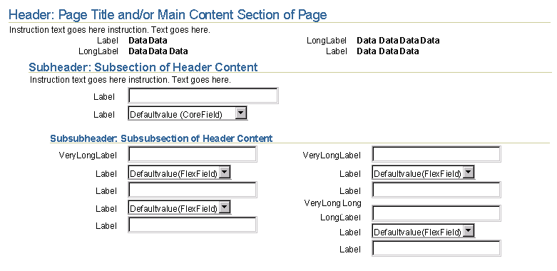
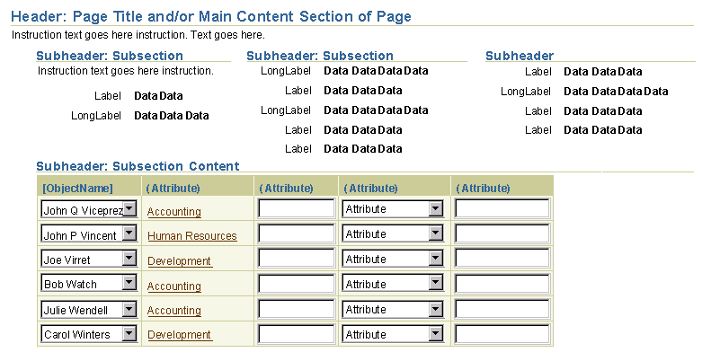
Typical Layout of Headers, Subheaders and Subheaders
The image below shows an example of a header, with a subheader, with a subsubheader. Note: items within the section may
or may not be shown in columnar format. If columnar format is used, if each column represents a different type of
information, adjacent sub/subsubheader is recommended. See below under "Adjacent Sub/Subsubheaders".
Headers with Icons
- Header with Icon Template

- icon: approximately 18x18 pixels. See Icon Guideline for graphic style specifications.
- Header with Icon Example: Information Page Header

- Header with Icon COLOR EXCEPTION: Error Page Header
(See Dialog: Messaging
guideline for more information.)

- THE ERROR ICON IS THE ONLY PAGE HEADER ICON THAT IS RENDERED IN A COLOR OTHER THAN BLUE.
Headers on Different Color Backgrounds
- Headers (all types) on Light Beige (Sand) (NOTE: this image is saved with exact palette)
see "Interaction and Usage Specifications" above for when to use this background color with headers.
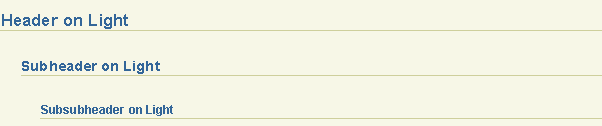
- Headers (all types) on Dark Beige
see "Interaction and Usage Specifications" above for when to use this background color with headers.

- Headers (all types) on Blue
see "Interaction and Usage Specifications" above for when to use this background color with headers.

Header Alignment and Content Spacing
- Each header level below the first header contains indentation properties. Depending on the type of head which is displayed (header, subheader, or subsubheader) the content below will left align according to the closest preceeding header.
- Proper indentation for each header level allows the user to quickly visualize the heirarchy of information on the page.
- There is vertical spacing measurements to separate each level of content (header content, subheader content and subsubheader content.)
- Proper vertical spacing between header, subheader, and subsubheader sections allows the user to see groupings of content easily.
Example of Indentation Spacing for Each Header Level
Header Text Color Exception (Error Header Only; not Subheader or Subsubheader)
- Header for Error
NOTE: This red color is only used for error Headers.
There are no subheaders or subsubheader for errors. (See Dialog:
Messaging guideline for more information.)

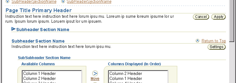
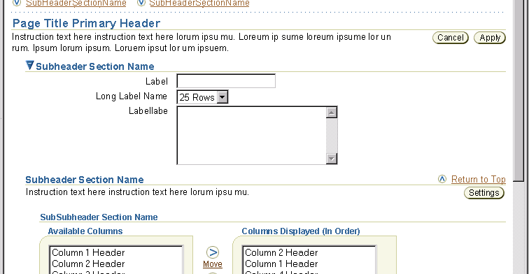
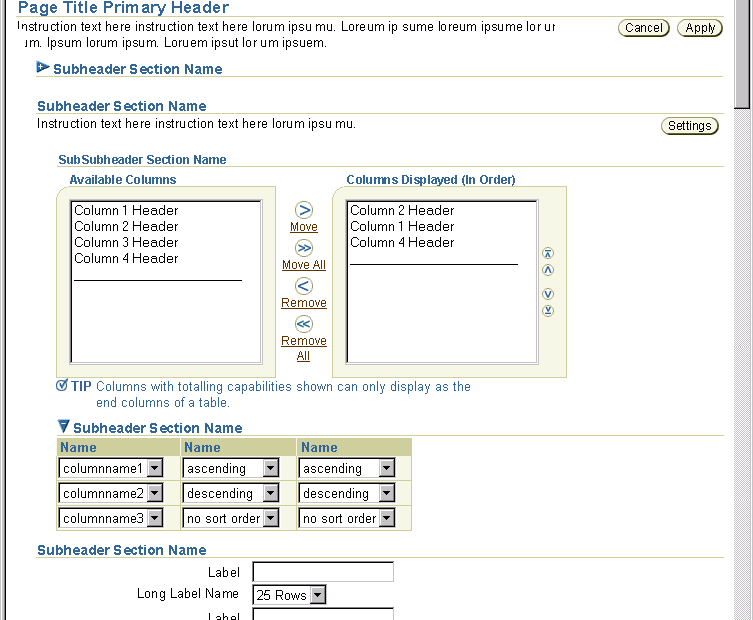
Adjacent Sub/Subsubheaders
Adjacent Subheaders forming 2 Columns
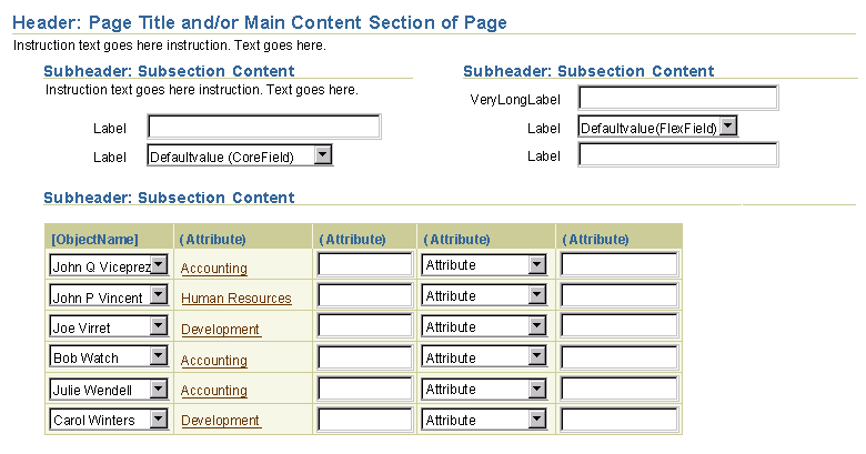
Adjacent Subheaders forming 3 Columns
Adjacent Subsubheaders with forming 2 Columns

Below are examples of Hide/Show used with a SubHeader and a SubSubHeader.
The hide/show icons (see Icon Repository for
exact icon) will automatically show when the hide/show option is set for
a subheader and subsubheader.
Example of Part of a Page - Hide/Show on SubHeader; Information Hidden
Example of Part of a Page - Hide/Show on SubHeader; Information Shown
Example of Part of a Page - Hide/Show on SubHeader and SubSubHeader; Information Hidden
Example of Part of a Page - Hide/Show on SubHeader and SubSubHeader; Information Shown

Example of Hide/Show on a Subheader (or subsubheader) with PPR
Background, Text, and Rule (Line) Colors
NOTE: Use the same header, subheader, and subsubheader font size and style specified above all header types on different background colors.
| |
on White |
on Sand |
on Beige |
on Blue |
| Background Color |
White; #ffffff |
light beige; #f7f7e7 |
dark Beige; #cccc99 |
medium blue; #6699cc |
| Text Color |
dark blue, #336699 |
dark blue, #336699 |
very dark blue, #003366 |
medium beige, #ffffcc |
| Rule Color |
dark beige, #cccc99 |
dark beige, #cccc99 |
very dark blue, #003366 |
very dark blue, #003366 |
Line/Rules Specifications
- Header, Subheader, and Subsubheader Rules - This line is used underneath the headers and subheaders of information.
It is a 1 x 1 pixel that is set to the width of the entire page. See each header description above for alignment and approximate indentation amount from left edge of browser window. See also table above for color definitions of the rule on different color backgrounds
example of header line (rule):

- Separator Line - See Separator Line Guideline
for details.
Open/Closed Issues